Update to Dark Nav design #178
Description
The OpenShift design team has expressed concerns about the dark navigation because the selected state provides little indication to the user about where they are in the nav.
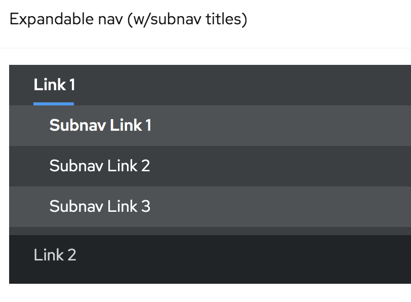
We have also had another contributor comment that the grouped nav weights are difficult to decipher " grouped navigation looks a little strange to me. The group title is stressed while the group items are light weight. It should be the opposite from my perspective."
Next steps would look like getting more feedback about the dark nav design to understand the requirements, confusion, and constraints.
This investigation should include an audit of the light theme and dark theme navigations. Were there any visual styles lost that could potentially cause usability problems in this migration?