Adds content to tabs component examples. #8678
Conversation
|
Preview: https://patternfly-react-pr-8678.surge.sh A11y report: https://patternfly-react-pr-8678-a11y.surge.sh |
|
carrying over a comment from the closed PR: Need input in particular on these examples: ty! |
 nicolethoen
force-pushed
the
docs-iss2990-tabs
branch
from
nicolethoen
force-pushed
the
docs-iss2990-tabs
branch
from
e2ffe50 to
f28ce50
Compare
 nicolethoen
force-pushed
the
docs-iss2990-tabs
branch
from
nicolethoen
force-pushed
the
docs-iss2990-tabs
branch
from
f28ce50 to
3a944ab
Compare
|
@edonehoo here's some explanation you can expand upon in the docs for the following examples:
This example is demonstrating the use of the
This example is demonstrating the use of the
This example demonstrates how you can use controls on a page - external to the Tabs component - to change which tabs are visible. In such cases, the Tab and the TabContent associated with that Tab should both only be rendered/mounted on the DOM when conditions are met to make the Tab visible. |
|
@nicolethoen thanks for that context! I made some additions to those examples. @ anyone there are still a couple of examples that I haven't added to. Does the following make sense for each?:
I'm making some assumptions/leaps here, so I'm not sure if this is accurate to the purpose and effect. Thanks! |
nicolethoen
force-pushed
the
docs-iss2990-tabs
branch
from
8d9fb91 to
98315e1
Compare
The uncontrolled tabs example shows how the Tabs component will manage setting the active tab and displaying the correct content itself, rather than the consumer needing to manually manage that business logic themself.
The Also, before you make subsequent updates to this PR, be sure to do a |
 tlabaj
left a comment
tlabaj
left a comment
tlabaj
left a comment
There was a problem hiding this comment.
I would have requested a change here. Can we please ope na follow up issue?
| - To add a tooltip to an aria-disabled tab, use the `tooltip` property. | ||
|
|
||
| When passing in a Tooltip component to the Tab component, the Tooltip can also be passed in directly to the `tooltip` prop. | ||
| Most tab variations can either be 'default' or 'boxed': |
There was a problem hiding this comment.
Which variations can not be boxed/default. I think the all can. I might reword this. To me it implies that isBoxed prop does not always apply the styling.
@mcoker are there any instances when isBoxed would not be applied?
There was a problem hiding this comment.
@tlabaj nope, isBoxed should work with any variation
| To enable closeable tabs, pass the `onClose` property to the `<Tabs>` component. To enable a button that adds new tabs, pass the `onAdd` property to `<Tabs>`. | ||
|
|
||
| To enable closeable tabs, pass the `onClose` property to `Tabs`, and to enable the add button, pass the `onAdd` property to `Tabs`. Aria labels may be controlled manually by passing `closeButtonAriaLabel` to `Tab` and `addButtonAriaLabel` to `Tabs`. | ||
| Aria labels may be controlled manually by passing the `closeButtonAriaLabel` property to a `<Tab>` and the `addButtonAriaLabel` property to `<Tabs>`. |
There was a problem hiding this comment.
I don't think this is necessary. Anywhere we have aria-labels in our code base, the consumer can override them (I would actually say it is encouraged).
|
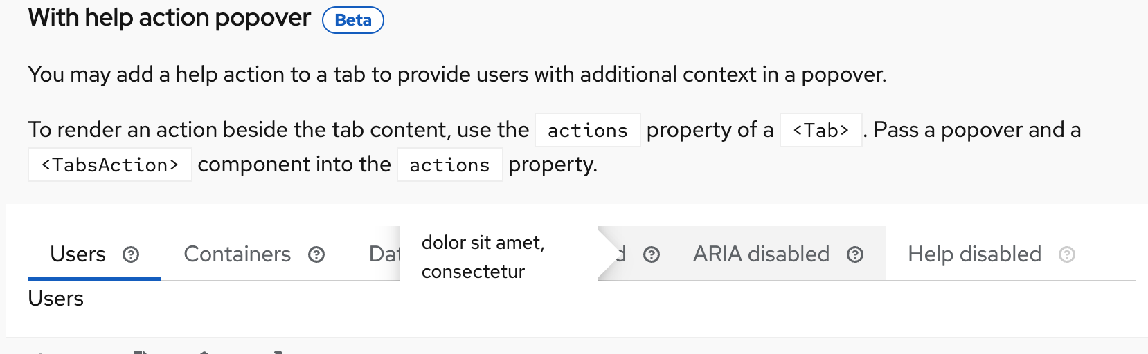
@kmcfaul @thatblindgeye The popovers ate nit displaying correctly here. Is that a known issue? |
|
@tlabaj Looks like it might be because it's being appended inline, and/or a combination of some overflow styling on Updating the Popover to append to document body resolves the issue best right now, but worth looking closer into if it can be resolved without doing that. |
|
Another way to resolve this would be to put each of the popovers outside of the |
9 participants
closes #2990