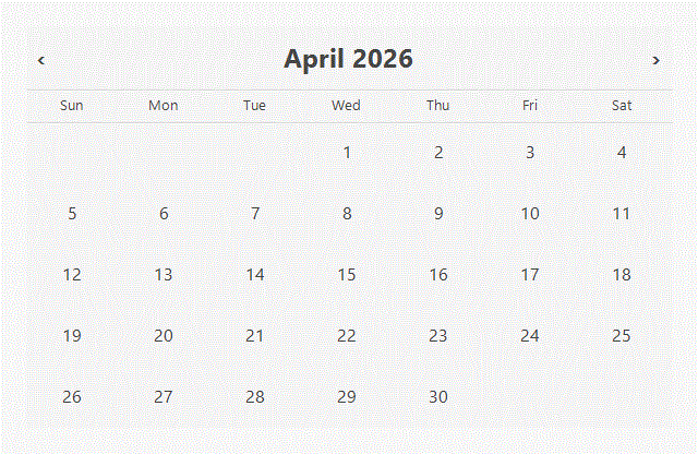
Single/Range/Multi‑select dates calendar for React
A lightweight calendar that supports single, range, and true multi‑select dates with easy CSS customization.
Live demo: https://6xwx48.csb.app/
- True multi‑select (pick any set of dates, not just range/single).
- Easy styling with CSS variables +
data-*attributes. - No runtime deps beyond React (simple, minimal footprint).
Option A: default styles (recommended)
import { Calendar } from "react-calendar-select";
import "react-calendar-select/styles.css";

export default function Demo() {
  return <Calendar />;
}
Option B: auto‑styles entry
import { Calendar } from "react-calendar-select/with-styles";

export default function Demo() {
  return <Calendar />;
}npm install react-calendar-selectPeer dependencies: react and react-dom (16.8+).
import { Calendar, CalendarValue } from "react-calendar-select";
import { useState } from "react";

export default function RangePicker() {
  const [value, setValue] = useState<CalendarValue>({
    start: null,
    end: null,
  });

  return (
    <Calendar
      mode="range"
      value={value}
      onChange={setValue}
      numberOfMonths={2}
    />
  );
}Exported types:
import type {
  CalendarValue,
  RangeValue,
  Mode,
  CalendarTheme,
} from "react-calendar-select";All props are optional.
| Prop name | Description | Default value | Example values |
|---|---|---|---|
mode |
Selection mode. | "single" |
"range", "multiple" |
value |
Controlled value. Types: Date | Date[] | { start: Date | null; end: Date | null } | null. |
null |
new Date()[new Date(), new Date()]{ start: new Date(), end: new Date() } |
onChange |
Called with next value on selection. | undefined |
(val) => setValue(val) |
renderDay |
Custom day renderer: (date, state) => ReactNode.state: isSelected, isInRange, isRangeStart, isRangeEnd, isRangeSelecting, isDisabled, onClick. |
undefined |
(date, s) => <button onClick={s.onClick}>{date.getDate()}</button> |
theme |
Theme overrides: background, text, selectedBackground, selectedText, rangeBackground, rangeText. |
undefined |
{ selectedBackground: "#111", selectedText: "#fff" } |
className |
Extra class on the root. | undefined |
"my-calendar" |
style |
Inline styles on the root (merged with theme vars). | undefined |
{ maxWidth: 420 } |
compact |
Tighter spacing layout. | false |
true |
locale |
Locale or fallback locales. | "en-US" |
"ja-JP", ["pt-BR", "en-US"] |
weekStartsOn |
First day of week (0=Sun … 6=Sat). Auto-resolved from locale when supported. |
auto → 0 |
1 |
weekdayFormat |
Weekday label format. | "short" |
"long", "narrow" |
monthLabelFormat |
Intl.DateTimeFormatOptions for the month label. |
{ month: "long", year: "numeric" } |
{ month: "short", year: "numeric" } |
labels |
Nav button labels: { previous?: string; next?: string }. |
{ previous: "Previous month", next: "Next month" } |
{ previous: "Prev", next: "Next" } |
minDate |
Earliest selectable date (inclusive). | undefined |
new Date(2026, 0, 1) |
maxDate |
Latest selectable date (inclusive). | undefined |
new Date(2026, 11, 31) |
isDateDisabled |
Disable specific dates. Return true to disable. |
undefined |
(date) => date.getDay() === 0 |
numberOfMonths |
Months shown side‑by‑side. | mode === "range" ? 2 : 1 |
2, 3 |
CSS variables
.my-calendar {
  --rcs-bg: #ffffff;
  --rcs-text: #222222;
  --rcs-selected-bg: #111111;
  --rcs-selected-text: #ffffff;
  --rcs-range-bg: rgba(17, 17, 17, 0.12);
  --rcs-range-text: #111111;
}
Data attributes
.my-calendar .rcs-day-cell[data-in-range="true"] {
  outline: 1px solid rgba(0, 0, 0, 0.08);
}

.my-calendar .rcs-day-cell[data-selected="true"] {
  box-shadow: inset 0 0 0 2px rgba(0, 0, 0, 0.35);
}- Roving tab focus within the grid
- Arrow keys move by day/week
- Home/End jumps to week start/end
- PageUp/PageDown moves by month
- Enter/Space selects
Disabled dates are skipped by keyboard navigation.
Pass a stable locale to avoid hydration mismatches:
<Calendar locale="en-US" />Next.js (app router): import CSS in app/layout.tsx for zero‑flash styles.
npm run dev
npm run test
npm run buildMIT