Plotly.js 1.43.0 upgrade #808
Conversation
833ad95 to
74d071c
Compare
|
Let’s ignore Percy for now, I think the test failures are due to the way I pointed package.json to master. Should go away when 1.43.0 actually comes out |
|
|
|
Hover template really needs to show a list of available variables and whatever formatting options are there. |
|
Yeah we need something more discoverable for hover templates, and in a few other places with "magic formatting text". I'm fine with just making it available for now and waiting for the documentation page to be added so we can link to it or something like that. We could/should also consider making a flyout/tooltip/info component for long help text |
|
Hey, I see that in the panelTest.json, that Percy uses I think?, there's references to titlefont |
|
In streambed, I think that we should set that watermark config option to false.. it's a bit annoying to see that plotly logo on the plot and on the header of the EditModeMenu no? |
|
I think we should find a way to make this be centered |
|
The watermark config option is false by default... You want to hide the logo in streambed? It's been there forever AFAIK... |
|
Re centeredness ... I don't think this is going to be possible, as we'd have to rejig the label/content heirarchy. I remember you looked at this for a while when we redid it the first time :) |
|
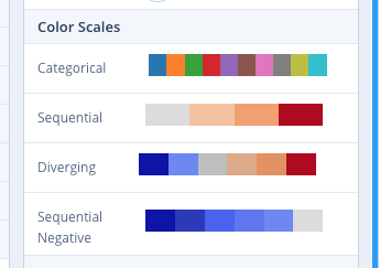
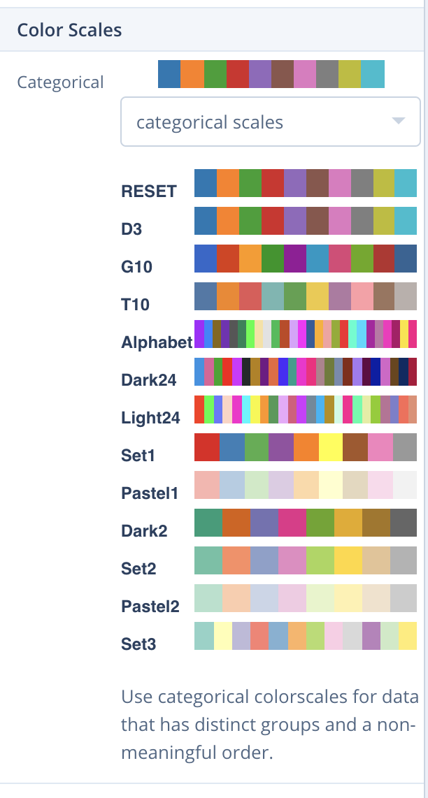
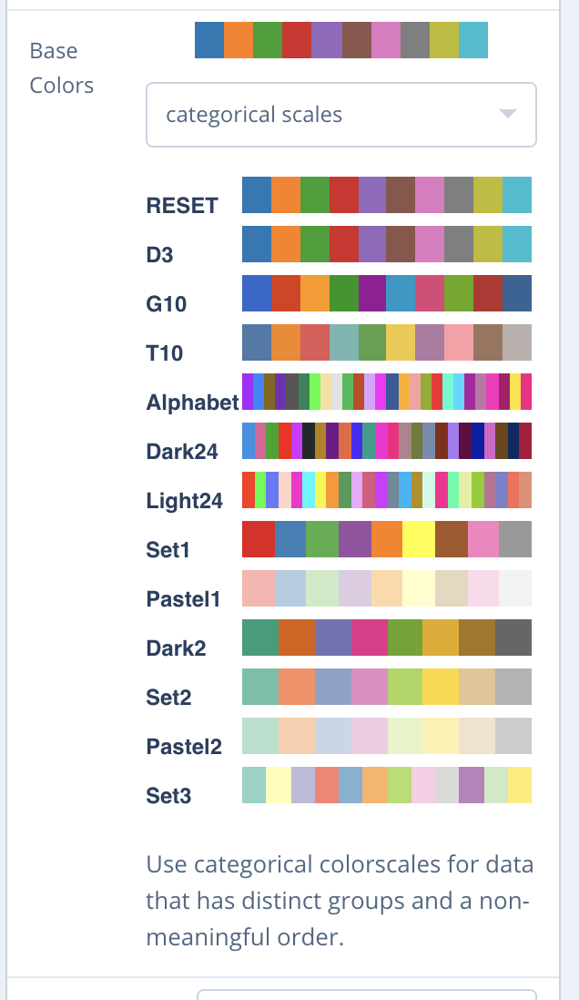
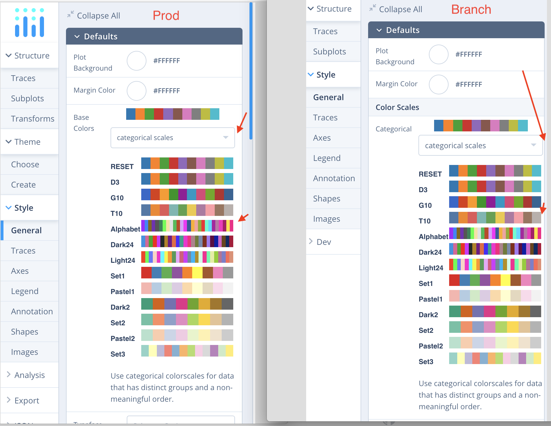
well, I went through the api changes and code and played around with this a little locally, it seems good. Except I think a little more attention should be given to colorscales.. and we should review the json example figures to see if there's anything more to add or adjust there to take into account the new api additions.. I think worst case, for colorscales, we could maybe remove the dropdown for the different colorscale types, as the title says that the colorscales presented to us should be of a specific type? |
|
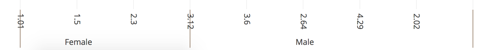
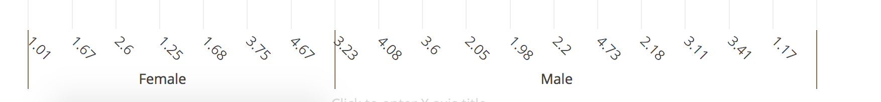
My labels and dividers are superposed, I'm not sure which option would enable me to adjust that. Ah, I see, well with rotation it's better Was just wondering if we had exposed everything related to those dividers positioning |
|
that divider-positioning thing seems like a plotly.js bug, or you reset tickson to be 'labels' ? by default it's 'boundaries' for multicat, which is how this is avoided. |
say more? |
I think it just recently got restyled or something, it's a lot more visible than I remember it to be.. I don't know, just felt like overbranding. But I guess that maybe it should stay, because then that plot is saved, and wherever its used, if people don't mind it being there, its good branding for us.. Just thought it looked more visible than I remember it |
well, maybe this:
Would make it look less jammed, since the colorscale category is in the label? This section is more jammed than its currently on prod: |
|
The logo was updated to match our current branding a couple of versions ago I think, and yeah, the color is punchier and no longer matches the modebar buttons so it's more visible. I think we'll keep it for now. The watermark feature is much more invasive: when turned on, the logo is always there/doesn't fade away with the modebar. We'll likely turn it on for Community-plan embeds only. Re colorscale pickers, I agree that the dropdown feels a bit redundant here, but people do like using sequential scales instead of categoricals even though they really shouldn't etc, so let's just keep them for now :) |
|
Can you show side-by-side what's more jammed now than in prod? |
|
|
|
Ah I see. that's probably related to @dmt0's fix for alignment. although arguably there's less spacing but the scales themselves have more room. I'm OK with the current state of affairs but if we can easily add some spacing I'd be fine too. |
|
💃 |
Known RCE issues:
is2Dand array adjustments inDataSelector