Restructure modal/dialogs #883
Description
cc/ @manuelpuyol
Related to: github/primer#366
Modal/Dialog
Primer Modal/Dialogs are currently structured with <details>/<summary>, which I believe was a good solution at the time (did not want to rely on JS), but we have since discovered that JS is in fact needed and <details>/<summary> is not the solution for everything.
Recommendation
Based on MDN's <details> docs, and WAI ARIA's Dialog(Modal) docs, I'm suggesting we use a semantic button to trigger the modal/dialog and use appropriate ARIA attributes to ensure coverage and usage for all of our users.
| Current Annotation | Proposed Annotation |
|---|---|
 |
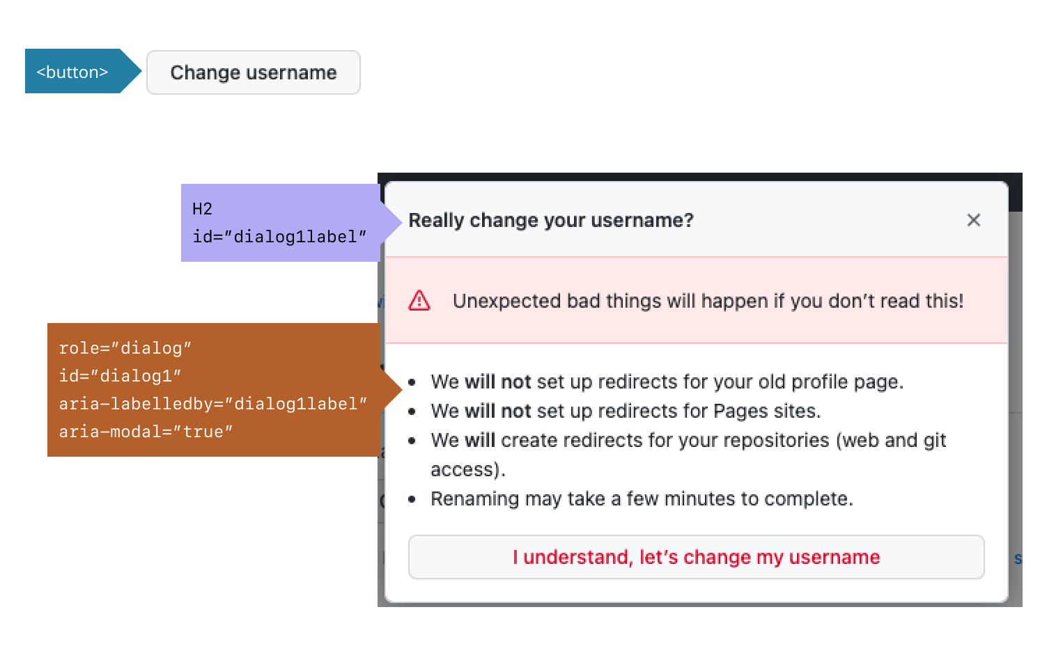 |
Additional considerations
Keyboard
<button>
- Give buttons keyboard focus with the
tabkey orshift + tabwhen tabbing backwards - Activate buttons with the
enter/returnkey or thespacekey
modal/dialog container
- When a dialog opens, focus moves to an element inside the dialog.
Tab:- Moves focus to the next tabbable element inside the dialog.
- If focus is on the last tabbable element inside the dialog, moves focus to the first tabbable element inside the dialog.
Shift+Tab:- Moves focus to the previous tabbable element inside the dialog.
- If focus is on the first tabbable element inside the dialog, moves focus to the last tabbable element inside the dialog.
Escape: Closes the dialog.
Focus
- All interactive elements receive visual focus
- All focus indicators, in all color themes (including windows high contrast mode), have a minimum 4.5:1 color contrast ratio.
- Related to Global focus styles github/primer#410 cc/ @vdepizzol
Design
- Always use a descriptive label and list items to ensure users know what to expect once they've made a selection.