rcaferati_flutter_awesome_button is the current Flutter package for this repo.
The library exports:
AwesomeButtonThemedButtongetTheme- typed Dart models such as
AwesomeButtonStyle,AwesomeButtonThemeData,ThemeName,ButtonVariant,ButtonSize,ThemeButtonStyle,ThemeSizeStyle,ThemeDefinition, andRegisteredThemeDefinition
|
|
|
dependencies:
  rcaferati_flutter_awesome_button: ^0.9.0
Then install dependencies:
flutter pub getCurrent Flutter support:
flutter >= 3.24.0dart >= 3.5.0 < 4.0.0
import 'package:flutter/material.dart';
import 'package:rcaferati_flutter_awesome_button/rcaferati_flutter_awesome_button.dart';

class SaveButton extends StatelessWidget {
  const SaveButton({super.key});

  @override
  Widget build(BuildContext context) {
    return const AwesomeButton(
      child: 'Save',
    );
  }
}
AwesomeButton supports both plain string labels and arbitrary Flutter
widgets.
animateSize is enabled by default.
- fixed
width/heightchanges animate with125ms cubic-bezier(0.3, 0.05, 0.2, 1) ThemedButtonsize preset changes animate because they resolve to fixed width and height updates- auto-width string labels grow and shrink when their measured target width changes
- with
textTransitionplus auto width, wider labels animate text while growing and narrower labels start text first, then shrink width50mslater animateSize: falsekeeps size changes instant- fixed-to-auto and auto-to-fixed changes remain instant
Flutter keeps auto-width target measurement in-tree. The hidden probe is an offstage sibling of the visible shell, so it does not use an overlay or route surface and it cannot intercept input.
import 'package:flutter/material.dart';
import 'package:rcaferati_flutter_awesome_button/rcaferati_flutter_awesome_button.dart';

class SizeExample extends StatelessWidget {
  const SizeExample({
    required this.isLong,
    super.key,
  });

  final bool isLong;

  @override
  Widget build(BuildContext context) {
    final label = isLong ? 'Open analytics dashboard' : 'Open';

    return Column(
      mainAxisSize: MainAxisSize.min,
      children: [
        ThemedButton(
          name: ThemeName.basic,
          autoWidth: true,
          textTransition: true,
          child: label,
        ),
        const SizedBox(height: 12),
        ThemedButton(
          name: ThemeName.basic,
          autoWidth: true,
          animateSize: false,
          child: label,
        ),
      ],
    );
  }
}When progress is enabled, onPress receives a next callback. Call it when
your work is done to complete the progress animation and release the button.
import 'dart:async';

import 'package:flutter/material.dart';
import 'package:rcaferati_flutter_awesome_button/rcaferati_flutter_awesome_button.dart';

class SubmitButton extends StatelessWidget {
  const SubmitButton({super.key});

  @override
  Widget build(BuildContext context) {
    return AwesomeButton(
      progress: true,
      onPress: (next) {
        unawaited(
          Future<void>.delayed(const Duration(milliseconds: 800), () {
            next?.call();
          }),
        );
      },
      child: 'Submit',
    );
  }
}
Progress uses the typed completion contract:
typedef AwesomeButtonNext = void Function([VoidCallback? callback]);
typedef AwesomeButtonPressCallback = void Function([AwesomeButtonNext? next]);import 'package:flutter/material.dart';
import 'package:rcaferati_flutter_awesome_button/rcaferati_flutter_awesome_button.dart';
class ThemeExample extends StatelessWidget {
const ThemeExample({super.key});
@override
Widget build(BuildContext context) {
return const Column(
mainAxisSize: MainAxisSize.min,
children: [
ThemedButton(
name: ThemeName.rick,
type: ButtonVariant.primary,
child: 'Rick Primary',
),
SizedBox(height: 12),
ThemedButton(
name: ThemeName.rick,
type: ButtonVariant.secondary,
child: 'Rick Secondary',
),
],
);
}
}If you need the full registered theme object, use getTheme.
import 'package:flutter/material.dart';
import 'package:rcaferati_flutter_awesome_button/rcaferati_flutter_awesome_button.dart';

class ThemeConfigExample extends StatelessWidget {
  const ThemeConfigExample({super.key});

  @override
  Widget build(BuildContext context) {
    final theme = getTheme(index: 0);

    return ThemedButton(
      config: theme,
      type: ButtonVariant.anchor,
      child: theme.title,
    );
  }
}
getTheme() safely falls back to the default basic theme if the provided
index or name is invalid.
Use before and after for inline content that should animate with the label,
and extra for content rendered behind the button body.
import 'package:flutter/material.dart';
import 'package:rcaferati_flutter_awesome_button/rcaferati_flutter_awesome_button.dart';

class ButtonContentExample extends StatelessWidget {
  const ButtonContentExample({super.key});

  @override
  Widget build(BuildContext context) {
    return AwesomeButton(
      before: const Icon(Icons.arrow_back_rounded, color: Colors.white),
      after: const Icon(Icons.arrow_forward_rounded, color: Colors.white),
      extra: const DecoratedBox(
        decoration: BoxDecoration(
          gradient: LinearGradient(
            colors: [
              Color(0xFF4C63D2),
              Color(0xFFBC3081),
              Color(0xFFF47133),
              Color(0xFFFED576),
            ],
          ),
        ),
        child: SizedBox.expand(),
      ),
      child: const Text(
        'Continue',
        style: TextStyle(color: Colors.white, fontWeight: FontWeight.w700),
      ),
    );
  }
}transparent is supported on ThemedButton. It removes the visible shell
layers while preserving the content, hit target, and active/progress feedback.
import 'package:flutter/material.dart';
import 'package:rcaferati_flutter_awesome_button/rcaferati_flutter_awesome_button.dart';
class TransparentExample extends StatelessWidget {
const TransparentExample({super.key});
@override
Widget build(BuildContext context) {
return const ThemedButton(
name: ThemeName.bruce,
type: ButtonVariant.anchor,
transparent: true,
child: 'Transparent',
);
}
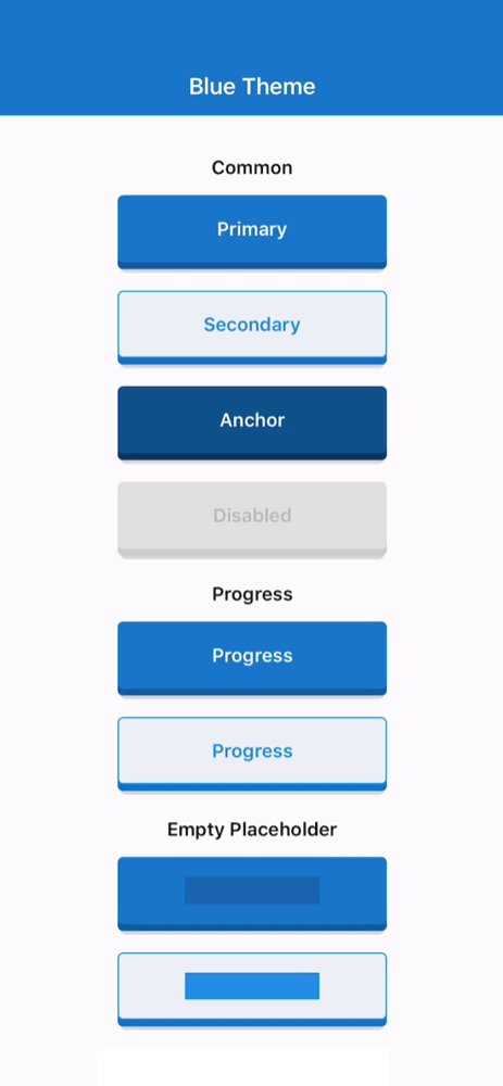
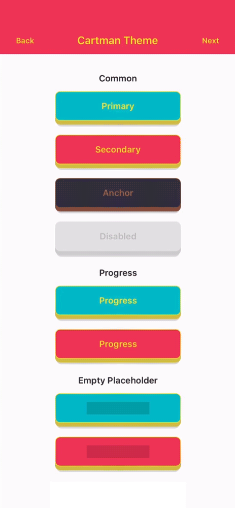
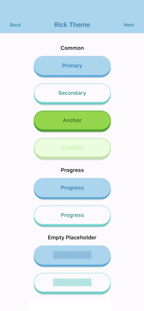
}basicbojackcartmanmysterionc137ricksummerbruce
primarysecondaryanchordangerdisabledflattwittermessengerfacebookgithublinkedinwhatsappredditpinterestyoutube
Unknown variants fall back safely at runtime instead of crashing, but only the variants above are part of the typed built-in API.
iconsmallmediumlarge
The public prop surface is typed through AwesomeButton and ThemedButton.
| Attribute | Type | Default | Description |
|---|---|---|---|
child |
Object? |
null |
Button label or custom content. Plain string labels also support textTransition. |
onPress |
AwesomeButtonPressCallback? |
null |
Main press callback. In progress mode it receives the completion handler. |
onLongPress |
VoidCallback? |
null |
Optional long-press callback. |
disabled |
bool |
false |
Disables interactions and semantics. |
width |
double? |
null |
Fixed width, or leave null for auto width. Pair with stretch for full width. |
height |
double |
52 |
Face height before the raise layer is added. |
paddingHorizontal |
double? |
16 resolved |
Horizontal content padding. |
paddingTop |
double? |
0 resolved |
Additional top content padding. |
paddingBottom |
double? |
0 resolved |
Additional bottom content padding. |
before |
Widget? |
null |
Content rendered before the main label inside the button face. |
after |
Widget? |
null |
Content rendered after the main label inside the button face. |
extra |
Widget? |
null |
Content rendered behind the active/content layers, useful for gradients and custom backgrounds. |
stretch |
bool |
false |
Makes the button fill the available horizontal space. |
style |
AwesomeButtonStyle? |
null |
Immutable visual override surface for colors, border, raise, animation, and typography. |
focusNode |
FocusNode? |
null |
Optional focus node for keyboard/focus control. |
autofocus |
bool |
false |
Requests initial focus when the widget tree is built. |
activeOpacity |
double |
1 |
Opacity applied while the non-progress button is pressed. |
debouncedPressTime |
Duration |
Duration.zero |
Debounces onPress dispatch. |
progress |
bool |
false |
Enables the progress-button flow. onPress receives a next callback in this mode. |
showProgressBar |
bool |
true |
Renders the loading bar during progress. When false, progress keeps the spinner and lifecycle but hides the bar. |
progressLoadingTime |
Duration |
3000ms |
Duration of the loading bar travel in progress mode. |
animateSize |
bool |
true |
Animates fixed-size geometry changes and auto-width string-label changes. |
textTransition |
bool |
false |
Enables the built-in scramble/reveal animation when a plain string label changes after mount. |
animatedPlaceholder |
bool |
true |
Enables the shimmer loop when the button has no child. |
onPressIn |
VoidCallback? |
null |
Observer callback fired when press-in begins. |
onPressOut |
VoidCallback? |
null |
Observer callback fired when press-out begins. |
onPressedIn |
VoidCallback? |
null |
Fires when the internal pressed state is armed. |
onPressedOut |
VoidCallback? |
null |
Fires after the internal release animation completes. |
onProgressStart |
VoidCallback? |
null |
Fires when progress mode transitions into loading. |
onProgressEnd |
VoidCallback? |
null |
Fires when progress mode finishes and the button releases. |
| Attribute | Type | Default | Description |
|---|---|---|---|
config |
ThemeDefinition? |
null |
Explicit theme object. When provided, it takes precedence over name and index. |
index |
int? |
null |
Theme index used by getTheme(index: ...) when config and name are not provided. |
name |
ThemeName? |
null |
Named built-in theme selector. Falls back safely to basic if invalid. |
type |
ButtonVariant |
ButtonVariant.primary |
Built-in variant to resolve from the selected theme. |
size |
ButtonSize |
ButtonSize.medium |
Built-in theme size preset: icon, small, medium, or large. |
flat |
bool |
false |
Requests the flat theme variant when available. |
transparent |
bool |
false |
Makes the visible shell layers transparent while keeping content, press, and progress feedback active. |
autoWidth |
bool |
false |
Requests in-tree measured auto width instead of the size preset width. String labels can animate width changes. |
Primary package quality gates:
flutter analyze
flutter test
To validate the package page and publication metadata locally:
dart format --output=none --set-exit-if-changed .
dart pub publish --dry-runThe example/ app mirrors the RN demo structure:
Themed Buttonstab with nested theme navigation, character art, and the full themed showcaseProgresstab with dedicated progress-button demosSocialtab with the social-button demos
Run it from the package root with:
cd example
flutter runRafael Caferati
Website: https://caferati.dev
LinkedIn: https://linkedin.com/in/rcaferati
Instagram: https://instagram.com/rcaferati
MIT.