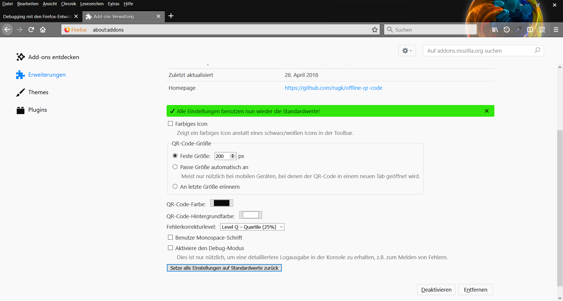
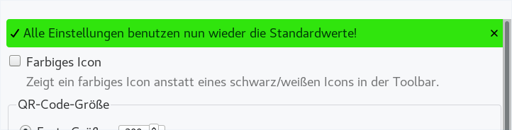
Allow messages to be dismissable#64
Conversation
 rugk
left a comment
rugk
left a comment
rugk
left a comment
There was a problem hiding this comment.
Basically nice change… also good you made it as an extra class.
However, not all messages should be dismissable automatically. Basically, it would be great if I one could pass a simple (boolean) parameter (with a default value) to the function of the message handler.
E.g. the errors shown when the qr code cannot be generated must not be hidden.
But in the same popup the tips shown as info messages must be dismissable.
I think currently that is not really possible, is not it?
(If you think otherwise, just try to convince me. 😉 )
| elMessage.appendChild(iconDismiss); | ||
|
|
||
| iconDismiss.addEventListener("click", () => { | ||
| elMessage.classList.add("invisible"); |
There was a problem hiding this comment.
I think the event listener should send an event parameter, so better use that for hiding it. IMHO the scope is then much clearer. 😄
| .icon-dismiss { | ||
| background-image: url('/common/img/close.svg'); | ||
| position: absolute; | ||
| right: 10px; |
There was a problem hiding this comment.
this "margin" should be 4px, see https://design.firefox.com/photon/components/message-bars.html#sizes-and-grid
but remember that the button/icon itself also already has a margin…
| .success::before { | ||
| background-image: url('/common/img/check.svg'); | ||
| } | ||
| .icon-dismiss { |
There was a problem hiding this comment.
(I don't really know whether it should have a transparent background or really that grey one as specified)
| <meta name="viewport" content="width=device-width, initial-scale=1.0"> | ||
|
|
||
| <link rel="stylesheet" href="../common/common.css"> | ||
| <link rel="stylesheet" href="common/common.css"> |
There was a problem hiding this comment.
I doubt that works…
You can of course make the path an absolute one.
There was a problem hiding this comment.
But the path for the JS file does look like this common/common.js...
There was a problem hiding this comment.
Well I thought just make it explicitly relative (like/commons/…) then, but well… yeah. Just strange why it worked then in the past.
Well… basically does not really matter.
An hour ago it was not possible, but now it should work without any problems 😏 |
| } | ||
|
|
||
| if (elMessage.classList.contains("dismissible")) { | ||
| if (typeof args[1] === "boolean" && args[1]) { |
There was a problem hiding this comment.
This needs to be adjusted in the JSDoc, also in all functions, which call showMessage.
There was a problem hiding this comment.
Also better use a const here for code style reasons (who knows what arg1 is, otherwise?). (or, better, shift as I've done before…)
Also this codes likely needs to be moved some lines up, because in line 515 I already use all other arguments for the translation of the message – so this would include the boolean…
| if (elMessage.classList.contains("dismissible")) { | ||
| if (typeof args[1] === "boolean" && args[1]) { | ||
| // add an icon which dismisses the message if clicked | ||
| const iconDismiss = document.createElement("span"); |
There was a problem hiding this comment.
Okay, it creates this button – but it does not remove it (or at least make it invisible) when another message without "dismissable" set to true is shown.
As such maybe generally do it in another way: Add the HTML to the html file and only hide/unhide it when needed. This has two other advantages:
- if a message may never get a dismissable button, because of the way it is shown or so, it could just not be added to the HTML (such a case would be the Popup QR code error, IMHO). So in the JS you need to check for the existence of that element!
- That would also make customization easier.
There was a problem hiding this comment.
But all contents of the message box are replaced by setting elMessage.textContent = localizedString; here...
|
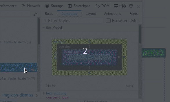
I tested it out and the right margin at border looks strange. I also made a thought mistake here reading the Photon guide. The 4px "margin" to the right is actually the padding of the message box, which is already applied in the style – just because you use absolute positioning you are overwriting it there, as it seems. However, it would be preferably if you could not use absolute positioning there anyway. Maybe something like this. Note the element is already in a flex, so you can happily use Flexbox there. Generally, BTW, you can test out whether an auto-width (not 100%) looks better. I actually have no strong option on this (and Photon allows both styles based on vague "small/high width" definition), but currently I feel the "close" (dismiss) button is a bit too far away from the actual message. |

|
Also another problem: Based on the screenshots I think the hover area needs to be actually include the 4px margin around the icon, i.e. be large enough, so that only the 4px padding of the message container is around the clickable area. Currently the clickable area is just too small: |

| .icon-dismiss:active { | ||
| background-color: rgba(12, 12, 13, 0.2); | ||
| } | ||
| .icon-dismiss:focus { |
There was a problem hiding this comment.
I just tested around a bit and the element is not even focusable by default. You need to add tabindex="1" to make it actually focusable. Then we can see the design.
Also, I think here yet again, a rounded border should be used (4px), although not explicitly specified in the Photon guide, but the screenshots look like this.
There was a problem hiding this comment.
As for the rounded border, I have now complained here.
There was a problem hiding this comment.
Isn't this documented here? There they say "Corner Radius: 2px"
There was a problem hiding this comment.
Hmm, only for the default (big) button as far as I see, nothing is said for ghost buttons.
But yes, maybe use 2px, because if the other buttons have two pixels then this one may have, too.
rugk
left a comment
rugk
left a comment
There was a problem hiding this comment.
Oh and another thing: Make the close button actually accessible, i.e. add some aria attribute, I think.
IMO this looks strange... I would also only search for a dismiss icon in the top right corner. |
Do you have an idea how this can be achieved? |
|
I'll have a look, i.e. I take it over… |
|
TODO/ideas:
|
|
Animation is done: |

|
So I moved the dismiss icon into the HTML source code, and basically that resulted in a larger refactoring than I thought. I also added some rules, which I did not thought of, to the contributing doc. |
|
For some very strange reason box-sizing is actually set to That is contrary of what it is for websites, where So basically I think, @ENT8R, that was your issue when trying to use padding for the 4px difference there… Ugh… As said here:
Well… yeah, but unfortunately this is not what we want here, because padding with non-fixed height etc. is then totally useless as it is just calculated into the height and thus does not apply. Now I understand why it is useful though. When I reset the As I think the top and bottom padding is actually not intended, I changed the CSS a bit to match that. …wtf… I tried around it even more and the
Sorry for the random thoughts, but this thing just totally caught me in surprise… 😵 It seems to cause both good and bad as you can see from the examples. Padding can go anywhere and be ignored – or even worse – minimize the content you actually want to have a fixed width, but you can have other good things… |
|
So I created a thread, because it should not happen that I have to discover it this way. That fundamental change is just not-documented anywhere. |
|
@ENT8R BTW, just wanted to make you aware of one issue that slipped though… See e4af72d Currently you just have to always add the basic attribute to make the element being recognized by the i18n translation module; and the attribute to change needs to be prefixed. (Of course, feel free to improve that behavior. That would be one step for #46. Note that prefixing is deliberate, so we can have a no-JS fallback.) |
Oh... Thank you for correcting this! |
2 participants
This PR fixes #11