Chapter 2 ggplot入门 #1
Description
190902
Chapter 2 ggplot入门
2.3 Key Components
每一张ggplot图都包含有三个要素
- data
- 图形属性映射,设定变量如何映射到图形属性上
- 几何对象,至少一层,用于指定绘图所用的几何对象
-data usedmpg
> head(mpg)
# A tibble: 6 x 11
  manufacturer model displ  year   cyl trans      drv     cty   hwy fl    class
  <chr>        <chr> <dbl> <int> <int> <chr>      <chr> <int> <int> <chr> <chr>
1 audi         a4      1.8  1999     4 auto(l5)   f        18    29 p     compact
2 audi         a4      1.8  1999     4 manual(m5) f        21    29 p     compact
3 audi         a4      2    2008     4 manual(m6) f        20    31 p     compact
4 audi         a4      2    2008     4 auto(av)   f        21    30 p     compact
5 audi         a4      2.8  1999     6 auto(l5)   f        16    26 p     compact
6 audi         a4      2.8  1999     6 manual(m5) f        18    26 p     compact
ggplot(mpg,aes(x=displ,y=hwy))+
  geom_point()
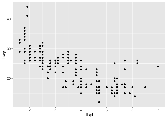
- data=mpg
- 映射: engine size= x, fuel economy=y
- layer: points
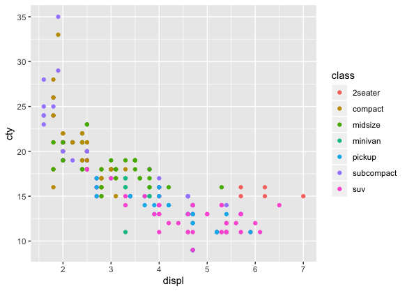
2.4 颜色,尺寸,形状以及其他的几何属性
- aes(displ, hwy, colour = class)
- aes(displ, hwy, shape = drv)
- aes(displ, hwy, size = cyl)
ggplot(mpg,aes(displ,hwy))+geom_point(aes(colour="blue"))

ggplot(mpg, aes(displ, hwy)) + geom_point(colour = "blue")
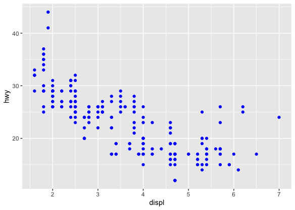
geom_point(aes()): 设置标签
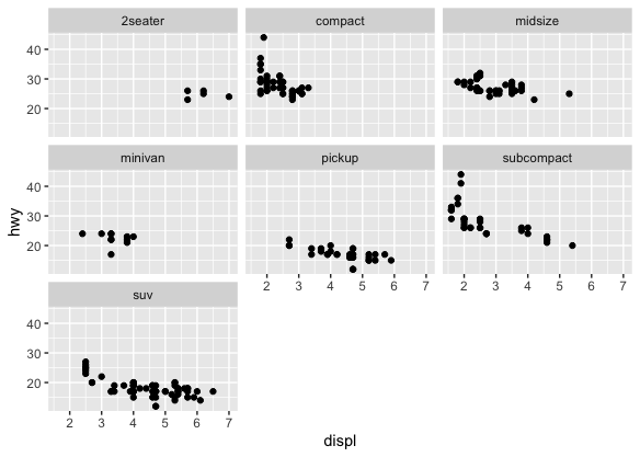
2.5 Facetting
ggplot(mpg, aes(displ,hwy))+
  geom_point()+
  facet_wrap(~class)
2.6 Plot Geoms
geom_smooth(): 添加平滑曲线geom_boxplot()geom_histogram()geom_bar()geom_path()andgeom_line():添加数据间的连接线
2.6.1 在点线图上添加平滑曲线
ggplot(mpg,aes(displ,hwy))+
  geom_point()+
  geom_smooth()
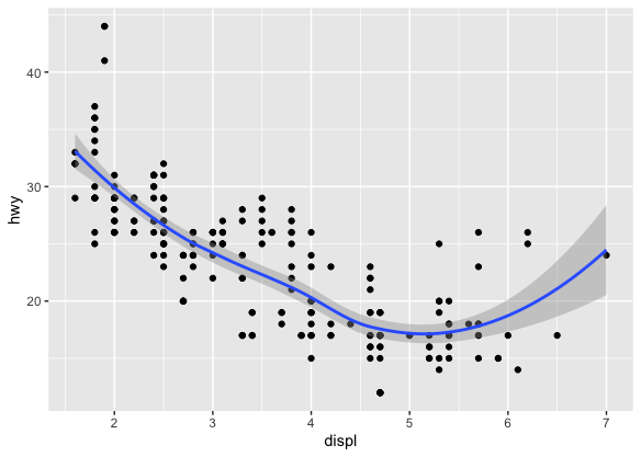
添加平滑曲线成功,顺便带入了信赖区间。如果无所谓信赖区间的话,可以用se=FALSE来选择关闭。
geom_smooth()
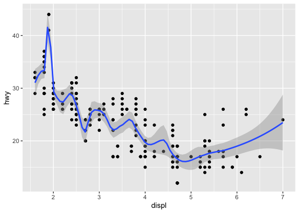
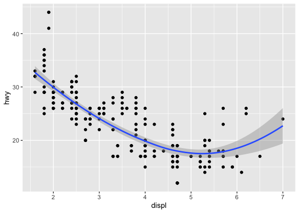
method="loess"
geom_smooth(span=0.2) |
geom_smooth(span=1) |
|---|---|
 |
 |
-
method="gam"
? 意味不明
需要用到mgcv包,需要指定formulay~s(x) 是一个glm? -
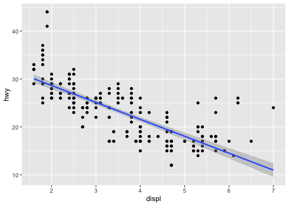
method="lm"
> ggplot(mpg, aes(displ, hwy)) + geom_point() + geom_smooth(method = "lm")
method="glm"
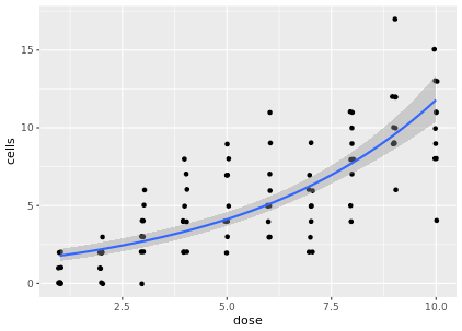
# Use geom_smooth to plot a continuous predictor variable
ggplot(data = dat, aes(x = dose, y = cells)) +
	geom_jitter(width = 0.05, height = 0.05) +
	geom_smooth(method = 'glm', method.args = list(family = 'poisson'))
2.6.2 Boxplots and jittered points
当一组数据包含了名义变量和数值连续变量的时候,我们可能会对数值变量是跟随名义变量而变化感兴趣。 比如说,油耗和车种类的关系。
ggplot(mpg, aes(drv, hwy)) + geom_point()
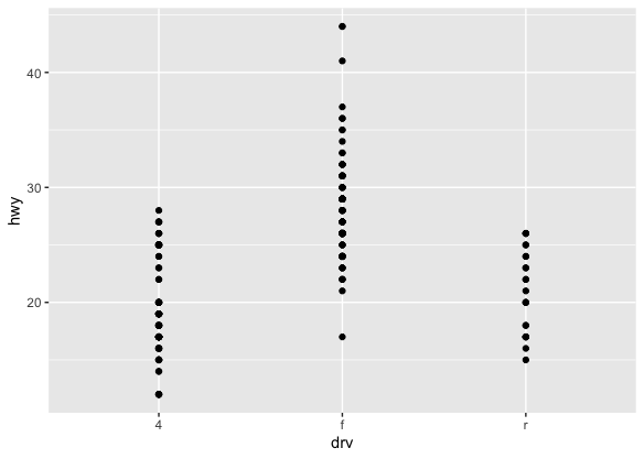
由于很多点都产生了重合,很难判断数据的分布。这里就可以用到以下三个工具。
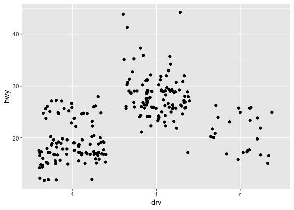
- Jittering ,
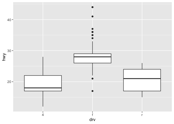
geom_jitter(): 为了避免overplotting, 加入了随机噪音 - Boxplots,
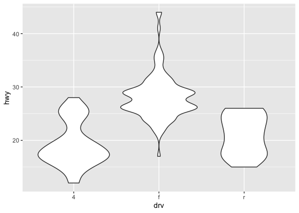
geom_boxplot() - Violin plots,
geom_violin()
| Jittering | boxplot | violin |
|---|---|---|
 |
 |
 |
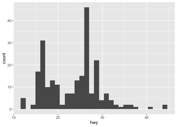
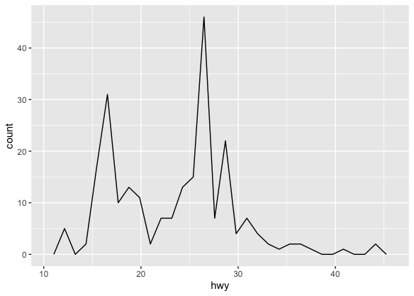
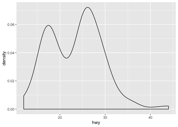
2.6.3 Histograms and Frequency Polygons
ggplot(mpg, aes(hwy)) + geom_histogram()
ggplot(mpg, aes(hwy)) + geom_freqpoly()
ggplot(mpg, aes(hwy)) + geom_density()
- 还可以对多组数据进行比较
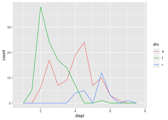
ggplot(mpg, aes(displ, colour = drv)) + geom_freqpoly(binwidth = 0.5)
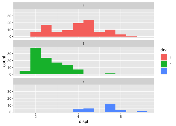
ggplot(mpg, aes(displ, fill = drv)) + geom_histogram(binwidth = 0.5) + facet_wrap(~drv, ncol = 1)
2.6.4 Bar Charts
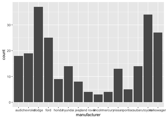
ggplot(mpg, aes(manufacturer)) + geom_bar()
2.6.5 Time series with Line and Path Plots
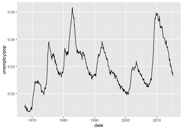
ggplot(economics, aes(date, unemploy / pop)) + geom_line()
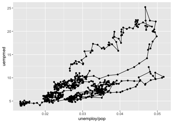
ggplot(economics, aes(unemploy / pop, uempmed)) + geom_path() +
geom_point()
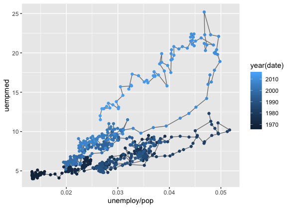
year <- function(x) as.POSIXlt(x)$year + 1900
ggplot(economics, aes(unemploy / pop, uempmed)) +
geom_path(colour = "grey50") +
geom_point(aes(colour = year(date)))
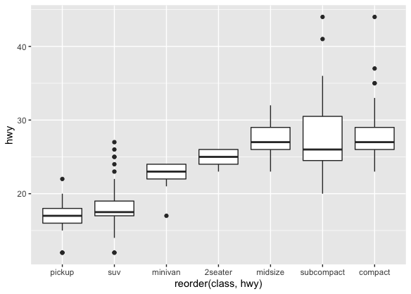
- 用
recorder()排序
ggplot(mpg, aes(reorder(class, hwy), hwy))+
  geom_boxplot()
2.7 修改坐标轴
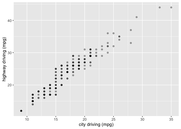
ggplot(mpg, aes(cty, hwy)) +
  geom_point(alpha = 1 / 3) +
  xlab("city driving (mpg)") +
  ylab("highway driving (mpg)")
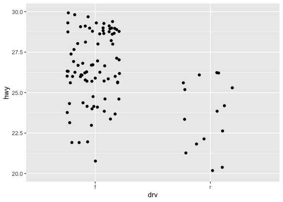
- 比较下面两组图
ggplot(mpg, aes(drv, hwy)) +
  geom_jitter(width = 0.25)
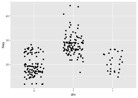
ggplot(mpg, aes(drv, hwy)) +
  geom_jitter(width = 0.25) +
  xlim("f", "r") +
  ylim(20, 30)
2.8 Output
p <- ggplot(mpg, aes(displ, hwy, colour = factor(cyl))) + geom_point()
print(p)
ggsave("plot.png", width = 5, height = 5)
summary(p)
2.9 Quick Plots
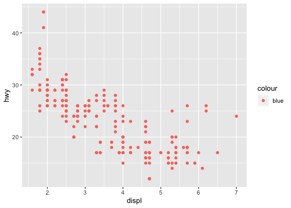
qplot
qplot(displ, hwy, data = mpg, colour = "blue")
qplot(displ, hwy, data = mpg, colour = I("blue"))

以上