I post here some idea on Subsurface Mobile UI reworks to make it more compliant with Android and IOS UI design guidelines.
Long story is here: https://goo.gl/Xju6rN
Following suggestions are mainly taken study this docs: (https://developer.android.com/design/index.html) and (https://developer.apple.com/ios/human-interface-guidelines/overview/design-principles/)
All original mockups made with moqups and are online at: (https://app.moqups.com/Bocio/3SSyFCoEwP)
Action Bar
The app bar, also known as action bar, maybe is one of the most familiar piece of an Android app. A classic action bar makes your app consistent with other Android apps, allowing users to quickly understand how to operate your app and have a great experience. Not having the action bar has forced to put the main sidebar drawer (hamburger) in that weird position. I don’t find difficult to use it but It’s the first time I see it there. Again, I think you should try to be consistent with the majority of app out there.
My proposal:
Restore the original classic and familiar action bar. We have the hamburger on the left and a search icon on the right. At the center we have the function name (sort of breadcrumb). What is the most common function of a dive-log app like Subsurface on a phone? View dives and create dives. To view them you have to search for them so I guess that the most important function on a title bar would be the ubiquitous search icon. Another useful feature is the menu option (three dots) on the action bar: menu option could open a contextualized dropdown menu based on content we are displaying i.e. dive list or dive details.
Basically the layout would be:
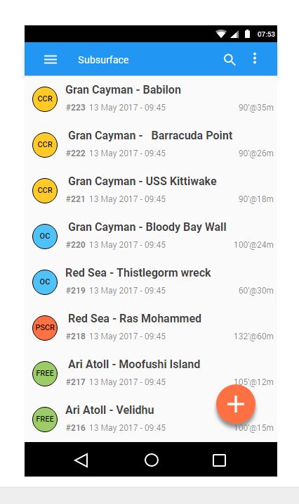
Further idea: I added some fancy icons to highlight each dive type (we already have them in our data model)
More to follow...
I post here some idea on Subsurface Mobile UI reworks to make it more compliant with Android and IOS UI design guidelines.
Long story is here: https://goo.gl/Xju6rN
Following suggestions are mainly taken study this docs: (https://developer.android.com/design/index.html) and (https://developer.apple.com/ios/human-interface-guidelines/overview/design-principles/)
All original mockups made with moqups and are online at: (https://app.moqups.com/Bocio/3SSyFCoEwP)
Action Bar
The app bar, also known as action bar, maybe is one of the most familiar piece of an Android app. A classic action bar makes your app consistent with other Android apps, allowing users to quickly understand how to operate your app and have a great experience. Not having the action bar has forced to put the main sidebar drawer (hamburger) in that weird position. I don’t find difficult to use it but It’s the first time I see it there. Again, I think you should try to be consistent with the majority of app out there.
My proposal:
Restore the original classic and familiar action bar. We have the hamburger on the left and a search icon on the right. At the center we have the function name (sort of breadcrumb). What is the most common function of a dive-log app like Subsurface on a phone? View dives and create dives. To view them you have to search for them so I guess that the most important function on a title bar would be the ubiquitous search icon. Another useful feature is the menu option (three dots) on the action bar: menu option could open a contextualized dropdown menu based on content we are displaying i.e. dive list or dive details.
Basically the layout would be:
Further idea: I added some fancy icons to highlight each dive type (we already have them in our data model)
More to follow...