The purpose of this challenge was to showcase a citibike trip analysis through Tabeleau to our investors that a bike-sharing program in Des Moine is a great business proposal.
The anlaysis helped the investors understand:
- The length of time that bikes are checked out for all riders and genders
- The number of bike trips for all riders and genders for each hour of each day of the week
- The number of bike trips for each type of user and gender for each day of the week.
Tableau Analysis Story - link to dashboard
During the course of the module - We created mutiple visualizations. The two I'd like to showcase are below:
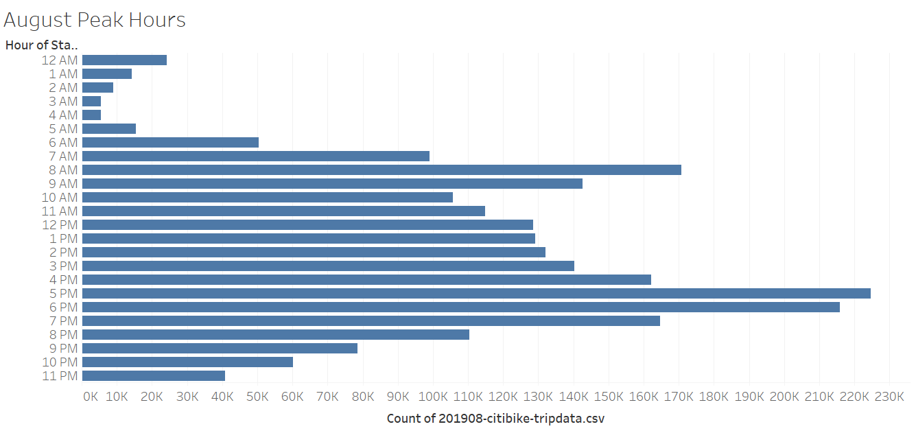
- This bar graph shows the hours throughout the month of August citibikes were most utlized. There is a spike in usage from 7-9pm.
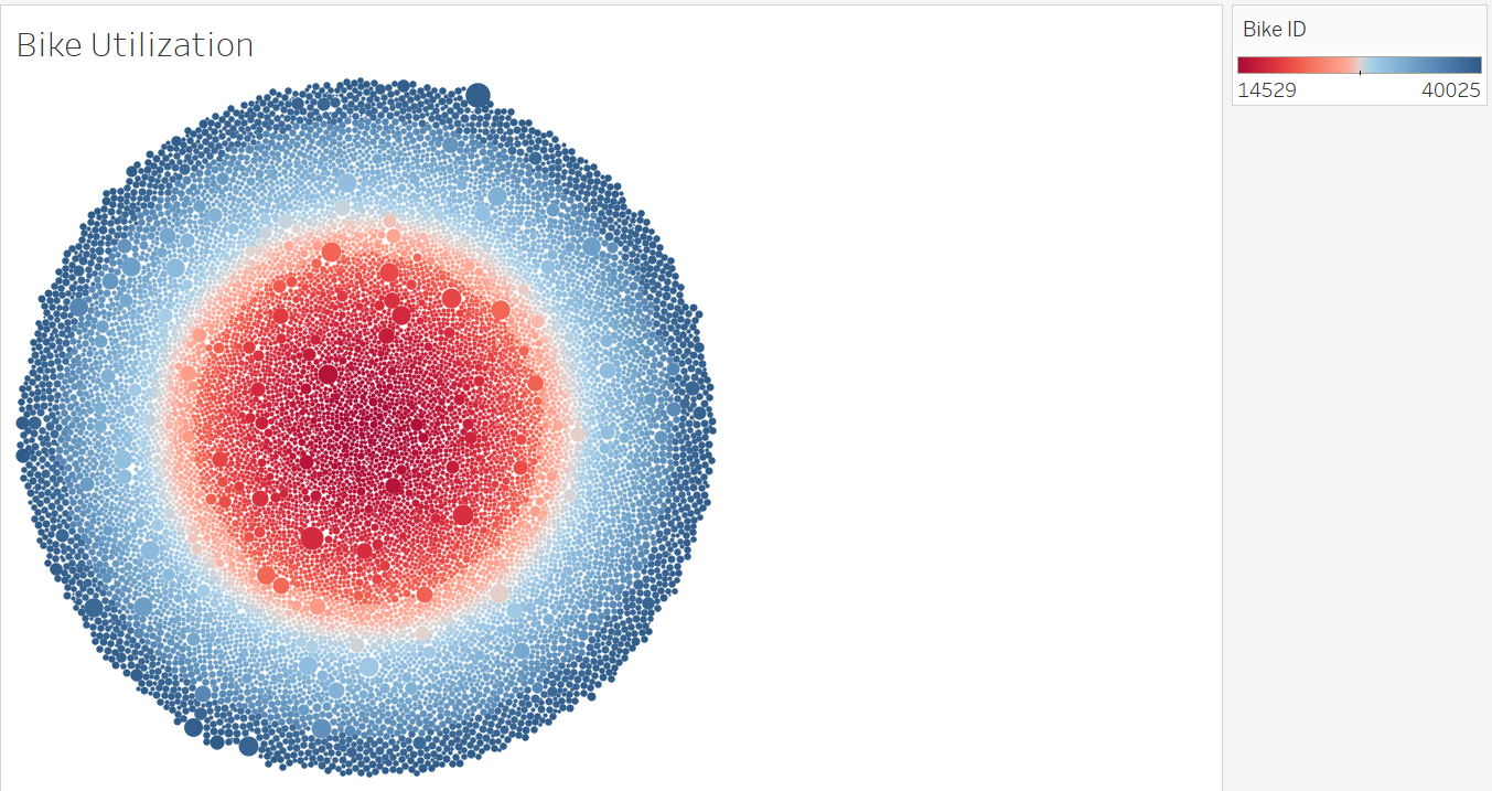
- This circle heatmap shows what proportion of the bikes are getting spikes in usage. It showcases usage by the size, color, and shade. The colors in the outer ring are getting more usage and will need more replairs.
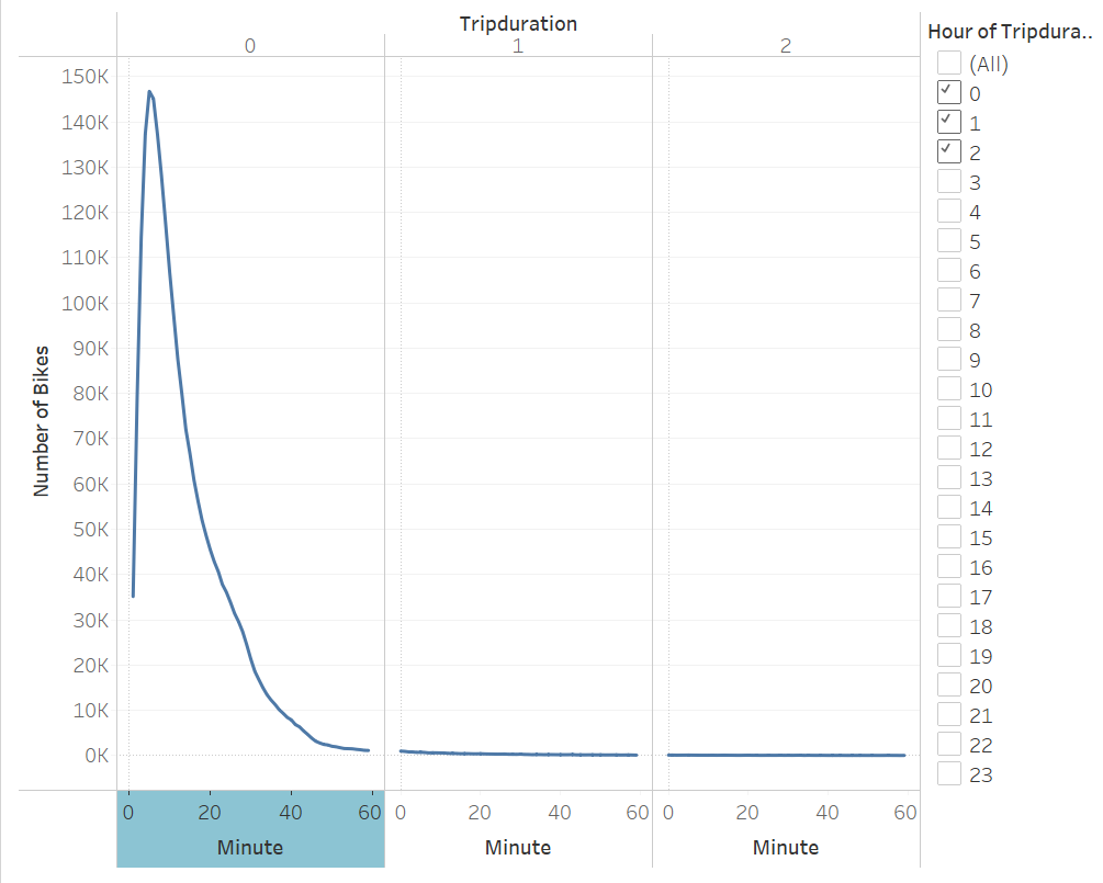
- Citibikes are used for a longer period of time in the morning than the afternoon.

- Citibikes are used during commute times - 9AM or 5PM. By gender, it is shown that Men utlize the service more.
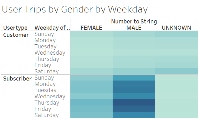
- From reviewing the data, it shows there are more subscribers using the bikes than there are customers of the service. Especially during the weekends.
In conclusion, CitiBike is an extremely popular service for large cities. The users of this particular service is made of male subcribers. They utlize the service habitually on their commutes.
To bolster up the proposal to the innvestors, I would recommend exploring:
- Trip starting and ending locations during morning and evening rush hour (9am to 5pm), to showcase peak hours.
- Average trip duration - by birth year and by gender. This will help showcase which of our audience we can tap into for marketing/ads.