The TreeView component is a flexible and customizable tree view component built with React. It allows you to display hierarchical data in a tree structure and handle node selection events.
You can install the optimal-react-treeview package via npm or yarn:
npm install optimal-react-treeviewimport React, { useState } from 'react';
import TreeView from 'optimal-react-treeview';
const treeData = [
{
id: '49da57b8-4104-43a4-ac36-7bb4ca28378b',
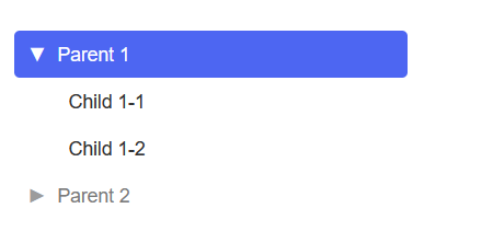
label: 'Parent 1',
disabled: false,
children: [
{ id: '59fa00b8-4102-43b4-zc30-0xz3cb25388b', label: 'Child 1-1' },
{ id: 'a1bf2b62-f9c2-4095-aafe-8140e5b63f2d', label: 'Child 1-2' },
],
},
{
id: '3f0cce85-0256-49fb-a2e3-df75d70fbd19',
label: 'Parent 2',
disabled: true,
children: [
{
id: '81c99b34-765a-4899-a688-2d7b4a88cf92',
label: 'Child 2-1',
children: [{ id: 'ddb23ebe-8df0-48c9-83a8-8bd68aa46514', label: 'Child 2-1-1' }],
},
],
},
];
const App: React.FC = () => {
const [selectedNode, setSelectedNode] = useState<string | null>(null);
const handleNodeSelect = (node: any) => {
setSelectedNode(node);
};
return (
<div className="App">
<TreeView data={treeData} onNodeSelect={handleNodeSelect} />
</div>
);
};
export default App;
The TreeView component accepts the following props to configure its behavior and appearance:
-
id(string):- Description: A unique identifier for the node. This is required for each node in the tree structure.
- Example:
'1'
-
label(string):- Description: The label or text displayed for the node.
- Example:
'Parent 1'
-
disabled(boolean, optional):- Description: A flag indicating whether the node is disabled. If
true, the node will be visually distinct and unselectable. - Default:
false - Example:
true
- Description: A flag indicating whether the node is disabled. If
-
data(TreeNode[]):- Description: An array of nodes. Each node should follow the same structure as the parent node.
- Example:
  [
      {
        "id": "49da57b8-4104-43a4-ac36-7bb4ca28378b",
        "label": "Parent 1",
        "disabled": false,
        "children": [
          { "id": "f7c4512e-5a80-4d3a-b141-9b526635e34c", "label": "Child 1-1" },
          { "id": "a1bf2b62-f9c2-4095-aafe-8140e5b63f2d", "label": "Child 1-2" }
        ]
      },
      {
        "id": "3f0cce85-0256-49fb-a2e3-df75d70fbd19",
        "label": "Parent 2",
        "disabled": true,
        "children": [
          {
            "id": "81c99b34-765a-4899-a688-2d7b4a88cf92",
            "label": "Child 2-1",
            "children": [
              { "id": "ddb23ebe-8df0-48c9-83a8-8bd68aa46514", "label": "Child 2-1-1" }
            ]
          }
        ]
      }
    ]
-
collapsedIcon(string | React.ReactElement, optional):- Description: An icon or string representing the icon to be displayed when the node is collapsed. This allows customization of the collapsed state icon.
- Default: A default icon or empty if not specified.
- Example:
'🔽'or<Icon name="chevron-down" />
-
notCollapsedIcon(string | React.ReactElement, optional):- Description: An icon or string representing the icon to be displayed when the node is expanded. This allows customization of the expanded state icon.
- Default: A default icon or empty if not specified.
- Example:
'🔼'or<Icon name="chevron-up" />