feat(ProductTour): new component - #449
Conversation





|
How does your API deal with the JF use case for remembering not to show this modal again? I see how to render that checkbox but how do you intend to deal with the business logic. |

It is up to the application. The state of the checkbox is passed to the application during the |

| onCancel={handleCancel} | ||
| onFinished={handleFinished} | ||
| > | ||
| {slides.slice(0, numberOfSlides)} |

There was a problem hiding this comment.
I think this can be simplified:
{ Array(numberOfSlides).fill(0).map((_, i) => <div key={slide-${ i }}>Lipsum...</div>) }
There was a problem hiding this comment.
I also changed it now, so that different slides are a bit different to see what happens if the text is too long for the fixed size window, so this approach won't work very well. In addition the mock is reused in tests.
 eszthoff
changed the title
eszthoff
changed the title
|
|
||
| &__footer { | ||
| position: absolute; | ||
| bottom: 0; |
There was a problem hiding this comment.
Not sure that position: absolute, bottom: 0 and width: 100% are necessary.
The previous sibling will already push the footer down since it has a fixed height.
And the footer seems to be a block level element, so it should take up full width without explicit definition.
There was a problem hiding this comment.
I had it without it, and this solution seemed to me a pix better, but indeed it would work without it as well
| const isMultiSlide = numberOfSlides > 1; | ||
|
|
||
| return ( | ||
| <ProductTour |
There was a problem hiding this comment.
Maybe consider making it possible to dismiss the modal in the story, otherwise I can't read the documentation behind the backdrop ;)
There was a problem hiding this comment.
You can :-) just click the show tour checkbox in the knobs. I think adding an actual implementation story for it will be misleading a bit - it is clearer this way that you have to control it from the outside.
| }; | ||
|
|
||
| const handleFinish = () => { | ||
| onFinished(isChecked); |
There was a problem hiding this comment.
Very much of a corner case but still FYI:
Consider you have checked the checkbox, then prop checkboxLabel is changed to undefined, isChecked will still be true while there is no checkbox.
There was a problem hiding this comment.
Indeed an edge case. I can add code to not return anything if there is no checkbox. For now I assumed the application knows if they want to read this variable or not. It might make it easier for TS if the def always have the (last) value of the checkbox sent over. But if you think there is real danger here, I can remove it.
There was a problem hiding this comment.
No danger :) just so you know
| isOpen={isOpen} | ||
| isPositionFixed | ||
| {...rest} | ||
| {...block()} |
There was a problem hiding this comment.
Should this not be {...block(props)}?
There was a problem hiding this comment.
Normally yes. But with modal classname is used a bit differently, so no need. They are passed with {...rest}.

|
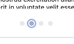
There's a blue outline around the dot once it's clicked. I think it should be removed. |

| {cancelLabel || ''} | ||
| </Button> | ||
| <Button context="brand" onClick={handleNext}> | ||
| {continueLabel || ''} |

There was a problem hiding this comment.
I think these two label values can be set to '' as default parameters during props object deconstruction
It does help with keyboard navigation, otherwise you don't know you are on the button. As far as I can tell, it is only visible during the click, so I think it is fine. @carlobernardini ? |
For me it remains there even after the click is done. I agree it might get in handy in terms of accessibility but I'm just checking since it's something which was not in the original AC. |
|
The outline can stay, it's actually an accessibility best practice. It remains after the click because the element is still focused. |
|
Nevermind, it just disappeared for me as well while I was trying to record a demo. |
|
Just found how to reproduce that navigating thing. I was testing it in Safari and there you can (hopefully) reproduce it. But I'm not sure how crucial it is for now. |
4 participants


Please include a summary of the change and which issue is fixed. Please also include relevant motivation and context. Use imperative, present tense in your commit description ("change", not "changed" or "changes") without uppercases or period (.) at the end.
Checklist