Skip to content

feat(Toggle): new component - #450

Merged
alinahorodetska merged 4 commits into
masterfrom
ONEUI-241-toogle
Mar 1, 2021
Merged

feat(Toggle): new component#450
alinahorodetska merged 4 commits into
masterfrom
ONEUI-241-toogle

Conversation

@alinahorodetska

@alinahorodetska alinahorodetska commented Feb 18, 2021

Copy link
Copy Markdown
Contributor

Add a new Toggle component.
Related story: https://jira.textkernel.nl/browse/ONEUI-241

Checklist

  • The implementation has been manually tested and complies with Textkernel browser support guidelines
  • The implementation complies with accessibility standards.
  • The component has a displayName defined.
  • The component comes with a detailed PropTypes (and defaultProps) definition.
  • Component PropTypes are sufficiently described / documented.
  • There is a story in Storybook.

Comment thread src/components/Toggle/Toggle.tsx
Comment thread src/components/Toggle/Toggle.scss Outdated
@carlobernardini

Copy link
Copy Markdown
Contributor

When the toggle is switched on and disabled, it looks like it's switched off. Can you apply --color-green-25 when it's on + disabled?

Comment thread src/components/Toggle/Toggle.scss Outdated
@alinahorodetska

Copy link
Copy Markdown
Contributor Author

When the toggle is switched on and disabled, it looks like it's switched off. Can you apply --color-green-25 when it's on + disabled?

sure, I can!
but again I did the same as we have in Checkbox (color natural if it checked), but yeah in Checkbox it is more obvious that it is checked =)

@carlobernardini

carlobernardini commented Feb 19, 2021

Copy link
Copy Markdown
Contributor

but again I did the same as we have in Checkbox

While indeed it's more obvious for Checkbox, I think we can do the same there. I'll look into it + focus state.

@alinahorodetska
alinahorodetska marked this pull request as ready for review February 23, 2021 15:11
Comment thread src/components/Toggle/Toggle.tsx
Comment thread stories/Toggle.js Outdated
@mukiienko

mukiienko commented Feb 28, 2021

Copy link
Copy Markdown
Contributor

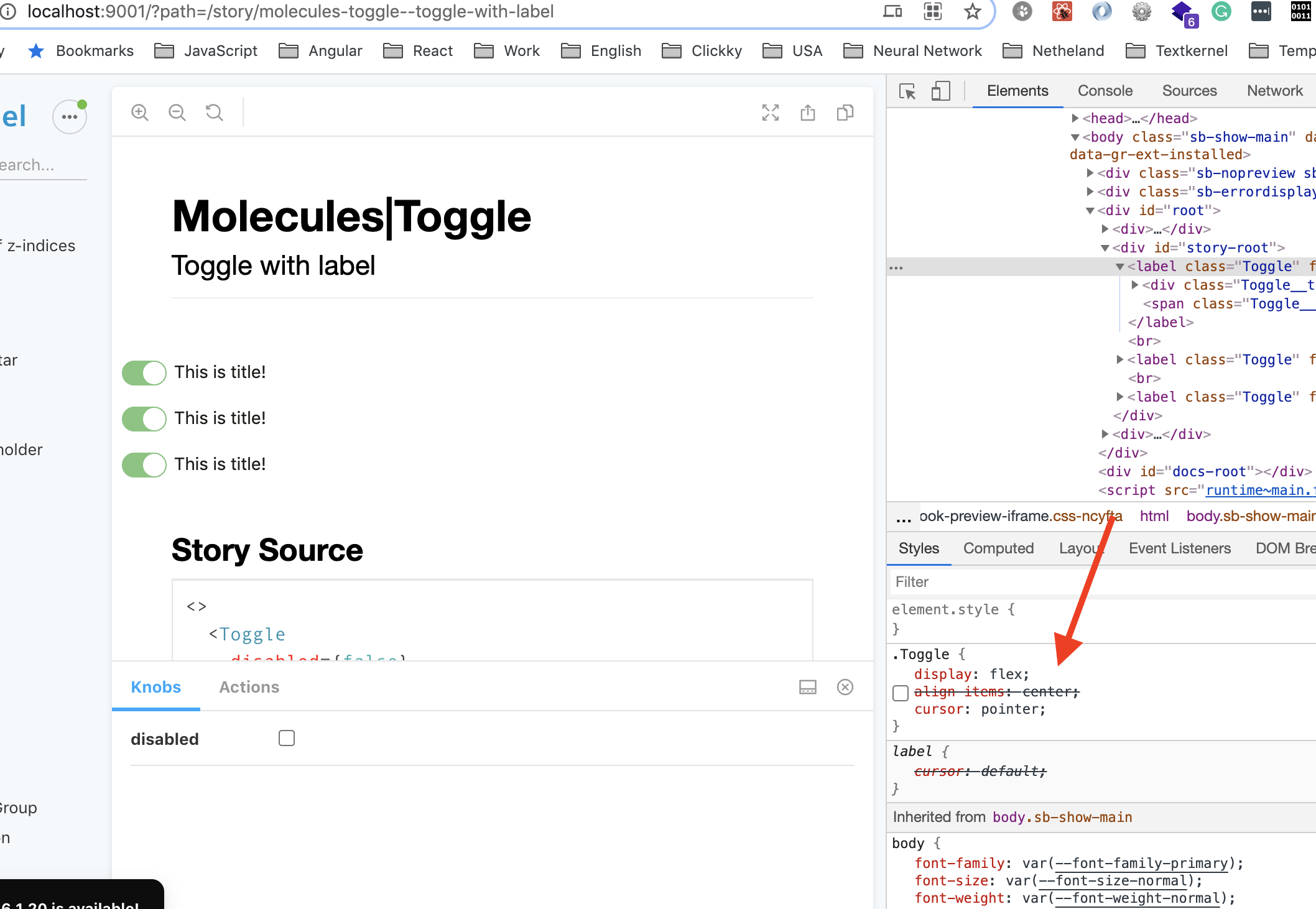
For me, Toogle label looks more aligned without align-items: center;
Screenshot 2021-02-28 at 12 33 07

@mukiienko

Copy link
Copy Markdown
Contributor

Animation doesn't work smoothly the first time:

Screen.Recording.2021-02-28.at.12.36.05.mov

@alinahorodetska

Copy link
Copy Markdown
Contributor Author

For me, Toogle label looks more aligned without align-items: center;


@mukiienko
Well, for me it is more aligned with align-items: center;

Screen.Recording.2021-03-01.at.10.31.32.mov

@carlobernardini what do you think?

@alinahorodetska

Copy link
Copy Markdown
Contributor Author

Animation doesn't work smoothly the first time:

@mukiienko interesting. For me it works smoothly in all browsers.

Screen.Recording.2021-03-01.at.10.41.47.mov

What browser and what version do you use?

@carlobernardini

Copy link
Copy Markdown
Contributor

@agorodetskaya For me it also seems to be better aligned without align-items: center in Chrome. In Safari I'm not sure, but the difference is more subtle.

What seems to work for me is when I apply the same styling as for Checkbox:

  1. Apply var(--spacing-normal) 0 var(--spacing-normal) var(--spacing-2x) to the label text.
  2. Keep align-items: center.

@alinahorodetska
alinahorodetska merged commit dc20ca2 into master Mar 1, 2021
@alinahorodetska
alinahorodetska deleted the ONEUI-241-toogle branch March 1, 2021 14:50
Sign up for free to join this conversation on GitHub. Already have an account? Sign in to comment

Labels

None yet

Projects

None yet

Development

Successfully merging this pull request may close these issues.

4 participants