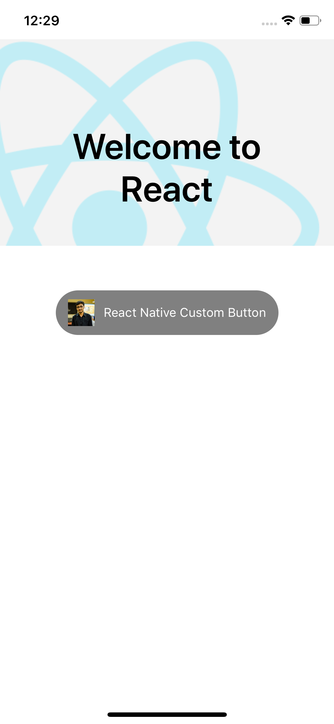
A customizable button component allowing you to create visually appealing buttons, utilising images, text or a combination of both.
npm install rn-icon-button
import { CustomButton } from 'rn-icon-button';
<CustomButton buttonStyles={styles.buttonStyle} onPress={onPress} title='LOGIN' buttonTextStyles={styles.buttonText} icon={require(PATH_TO_ICON)} iconSize={25} />
| Prop | Type | default | Required | Note |
|---|---|---|---|---|
| title | string | NA | Optional | title of the dialog |
| onPress | function | NA | Optional | To perform task on press of the button |
| buttonTextStyles | object | NA | Optional | Styles for button title text.See example |
| buttonStyle | object | NA | Optional | Styles for button.See example |
| icon | image | NA | Optional | Use image to your buttons with or without text(button titles) |
| iconSize | number | NA | Optional | use this to make the icon fit with your buttons |