


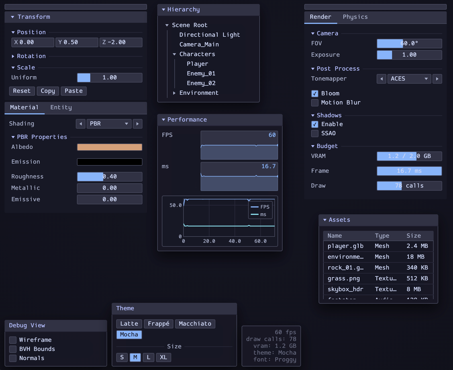
A Flutter widget kit mirroring the compact immediate-mode style of Rust's egui. Dark-mode-first, compact, and built for inspector panels, debug overlays, editor tools, and game-engine style interfaces.
- Compact, pixel-dense widgets that look at home in game-engine overlays, dev tools, and debug UIs
- Four Catppuccin themes out of the box: Mocha, Macchiato, Frappé, Latte (light)
- Custom palette support via
EguiPalette - ProggyVector bitmap font bundled — swap any font at runtime without rebuilding
- Draggable/collapsible windows, inspector columns, and docked panel layouts
- Inputs, tables, plots, sparklines, tree views, and an inline HSV color picker
- Custom controls styled independently from Material and Cupertino widgets
| Widget | Description |
|---|---|
EguiButton |
Push button with toggled/active state |
EguiSlider |
Drag-to-change slider with label and value |
EguiDragValue |
Inline number field — drag to scrub, tap to type |
EguiNumberInput |
Integer spinner with explicit minus/plus buttons |
EguiVec2 / EguiVec3 |
Paired drag-value fields for 2D/3D vectors |
EguiProgressBar |
Read-only fill bar with optional value label |
EguiSparkline |
Mini line chart for time-series data |
EguiPlot / EguiSeries |
XY line chart with grid, labels, and legend |
EguiCheckbox |
Compact checkbox |
EguiToggle |
Sliding on/off switch |
EguiRadio / EguiRadioGroup |
Single-select radio buttons |
EguiCombo |
Compact dropdown with prev/next arrows |
EguiTextField |
Single-line text input |
EguiColorPicker |
Expandable HSV color picker with optional alpha |
EguiLabel |
Plain and key/value row labels |
EguiSeparator |
Horizontal rule with optional label |
EguiSection |
Collapsible group with heading and divider |
EguiTree / EguiTreeNode |
Collapsible hierarchy/tree rows |
EguiTable |
Headered table with selectable rows |
EguiScrollArea |
Egui-styled scroll area with thin scrollbar |
EguiTabBar |
Compact tab strip with content panels |
EguiPane |
Collapsible titled panel for use inside EguiColumn |
EguiColumn |
Draggable inspector column — stacks panes, auto-scrolls |
EguiWindow |
Standalone floating window — draggable, collapsible |
EguiPanel |
Bare floating panel (no title bar) |
EguiDockLayout |
Top/bottom/left/right docked panel layout |
EguiStatusText |
Single-line status/info bar |
EguiThemeChooser |
Built-in palette picker |
Add to your pubspec.yaml:
dependencies:
  egui: ^0.1.2
Wrap your UI in EguiScope to provide the active theme to all descendant widgets:
import 'package:egui/egui.dart';

EguiScope(
  palette: EguiPalette.mocha,
  child: YourWidget(),
)EguiScope(
palette: EguiPalette.mocha,
child: EguiWindow(
title: 'Inspector',
collapsible: true,
draggable: true,
maxWidth: 260,
child: Padding(
padding: EdgeInsets.all(8),
child: Column(
crossAxisAlignment: CrossAxisAlignment.stretch,
children: [
EguiSlider(
label: 'Opacity',
value: opacity,
min: 0, max: 1,
valueLabel: opacity.toStringAsFixed(2),
onChanged: (v) => setState(() => opacity = v),
),
EguiCheckbox(
label: 'Visible',
value: visible,
onChanged: (v) => setState(() => visible = v),
),
],
),
),
),
)EguiColumn(
maxWidth: 260,
children: [
EguiPane(
title: 'Transform',
child: Column(
crossAxisAlignment: CrossAxisAlignment.stretch,
children: [
EguiVec3(
x: px, y: py, z: pz,
speed: 0.05,
onChanged: (x, y, z) => setState(() { px = x; py = y; pz = z; }),
),
],
),
),
EguiPane(
title: 'Material',
child: EguiSlider(
label: 'Roughness', value: roughness,
min: 0, max: 1, valueLabel: roughness.toStringAsFixed(2),
onChanged: (v) => setState(() => roughness = v),
),
),
],
)When a pane collapses, the panes below slide up automatically.
EguiWindow can host any Flutter widget. For canvas-style content such as InfinityCanvas, make the window resizable and give it explicit bounds:
EguiWindow(
  title: 'Node Graph',
  draggable: true,
  resizable: true,
  initialWidth: 900,
  initialHeight: 560,
  minWidth: 420,
  minHeight: 280,
  maxWidth: 1200,
  maxHeight: 800,
  contentPadding: EdgeInsets.zero,
  child: InfinityCanvas(
    controller: controller,
    enableCulling: true,
    layers: [
      CanvasLayer.positionedItems(
        id: 'nodes',
        items: nodes,
      ),
    ],
  ),
)EguiDockLayout(
top: EguiTopPanel(child: toolbar),
left: EguiLeftPanel(
initialWidth: 220,
collapsible: true,
child: sceneTree,
),
right: EguiRightPanel(child: inspector),
bottom: EguiBottomPanel(
resizable: true,
initialHeight: 140,
child: console,
),
center: viewport,
)EguiScrollArea(
maxHeight: 160,
child: EguiTable(
columns: const ['Name', 'Type', 'State'],
rows: rows,
selectedRow: selected,
onRowTap: (i) => setState(() => selected = i),
),
)
EguiPlot(
height: 120,
yMin: 0,
series: [
EguiSeries(name: 'FPS', points: fpsPoints),
EguiSeries(name: 'Frame ms', points: frameMsPoints),
],
)
EguiColorPicker(
label: 'Albedo',
color: albedo,
onChanged: (c) => setState(() => albedo = c),
)Switch theme at runtime by changing the palette passed to EguiScope:
EguiScope(
  palette: _palette,           // EguiPalette.mocha / .macchiato / .frappe / .latte
  child: ...
)
Switch to any font family registered by your app without rebuilding:
final palette = EguiPalette.mocha.withFont('MyInspectorFont', fontSize: 13);Build a custom palette:
const myPalette = EguiPalette(
  name: 'My Theme',
  panelBg:   Color(0xEF1a1a2e),
  widgetBg:  Color(0xFF16213e),
  widgetHov: Color(0xFF0f3460),
  widgetPrs: Color(0xFF533483),
  sliderFill: Color(0xFFe94560),
  sliderHov:  Color(0xFFff6b81),
  text:      Color(0xFFe0e0e0),
  subText:   Color(0xFF9e9e9e),
  border:    Color(0xFF2a2a4a),
  borderHov: Color(0xFF4a4a8a),
  separator: Color(0xFF1a1a3e),
  heading:   Color(0xFFe94560),
);
Disable window/panel drop shadows:
EguiPalette.mocha.withFont('Proggy', shadows: false)
// or in a const palette:
const EguiPalette(... shadows: false)ProggyVector is bundled and registered as family 'Proggy' — it's the default and requires no extra configuration. The example app uses the same default font. To use your own font, pass it via EguiPalette.withFont or set fontFamily/fontSize on a custom palette.
A full showcase is in the example/ directory. From the repository root, run:
cd example && flutter runThere is also a docking-focused demo:
cd example && flutter run -t lib/dock_demo.dartMIT — see LICENSE.
This package is inspired by Rust's egui, but is not affiliated with or endorsed by the egui project.
It includes Catppuccin color palettes and bundles Proggy fonts. See THIRD_PARTY_NOTICES.md for third-party credits and license notes.