feat: add new VueFire logo #589
Conversation
Codecov Report✅ All modified and coverable lines are covered by tests. Additional details and impacted files@@ Coverage Diff @@
## master #589 +/- ##
=======================================
Coverage 99.73% 99.73%
=======================================
Files 14 14
Lines 377 377
Branches 69 69
=======================================
Hits 376 376
Misses 1 1 ☔ View full report in Codecov by Sentry. 🚀 New features to boost your workflow:
|
|
Thank you!! Can we make wider and smaller in height though? It doesn't have to be squared, but similar proportions to the Firebase logo would be better |
|
@posva If we make it wider it will increase the height as well, unless we alter the illustration itself. I could do it but I think it's a better idea for @geneparcellano to take care of it 🙂 |
|
I see. Yes, I want the illustration to be altered, it's too vertical right now |
|
I've actually tried to alter the illustration a few times and it just looked skewed. Changing it to be closer to square also changes the relationship of each shapes to each other and to the negative space around it. My thought was to completely redesign it, come up with another logo that would fit a square. I just never got around to it. @sarahdayan If you would like to take a shot at redesigning or altering that logo, you're more than welcome to do so. I just wasn't able to come up with a better alternative and I won't have much time to do so anytime soon 😞. |
|
I will try take a spin at it 👍 |
|
Thank you Sarah! |
|
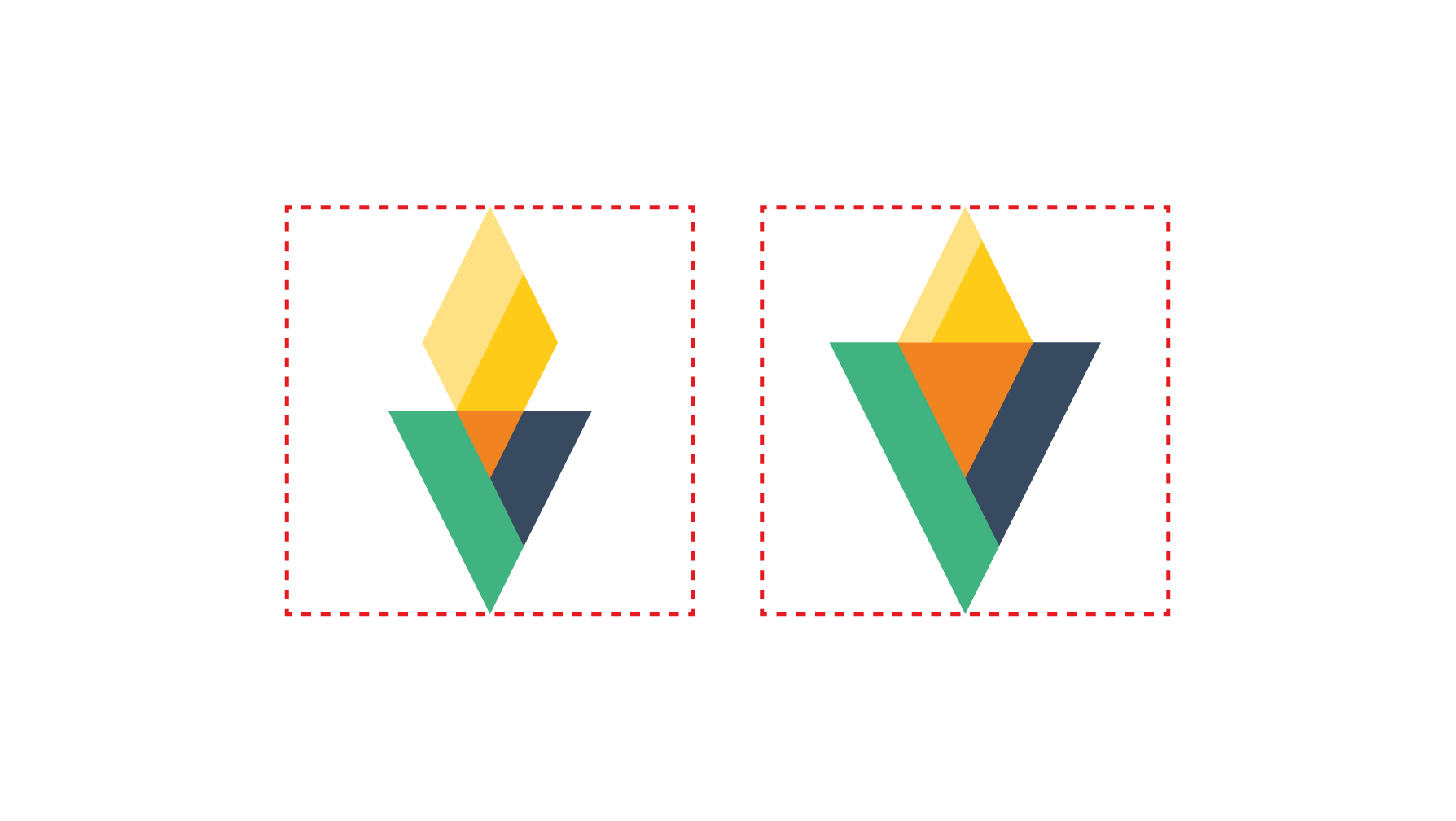
What do you think @posva @geneparcellano? The logo is wider (see before/after), without skewing the angles.
|
|
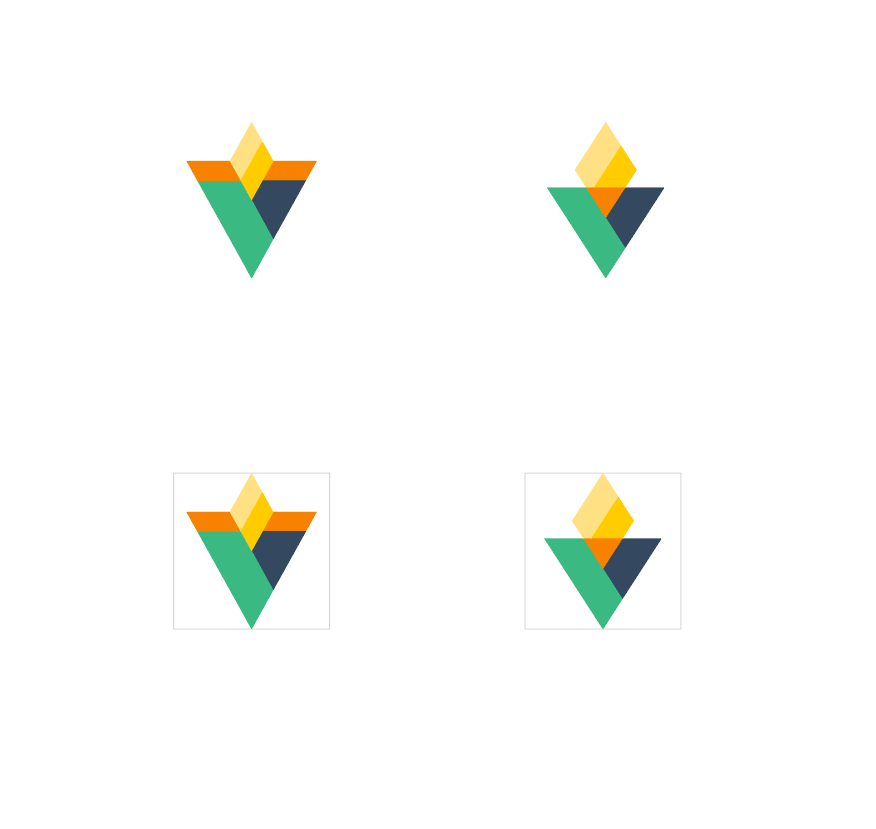
@sarahdayan your changes gave me some ideas on how to make it even a little more square using some minor adjustments. I hope you don't mind me making some additional tweaks. Please see below. On the left, I took your idea and adjusted the angles of the lines a little bit and moved some of the colors around. On the right, I also changed the angles a little but kept the original configuration. I did have have to move the line on the fire a little to the right to compensate. Let me know what you think. Also, feel free to make additional changes to these wherever you feel necessary.
|
|
@geneparcellano Neaaato! I think number 2 is definitely winning. @posva ? |
|
I do like the one with a bigger flame more :) |
|
@posva @sarahdayan here's a zip with the svg file of the logo on the right. Just let me know if there's anything else I can do. |
|
Thanks @geneparcellano, I've updated the PR 🙂 This looks badass. |
|
That looks awesome, thank you! |
|
Thanks to both of you! |
|
@posva This can definitely be iterated on! |
This adds the new logo by @geneparcellano to the repository and documentation.
Before
After
fix #158