Start DateInput#398
Conversation
 Ladsgroup
force-pushed
the
date_component
branch
from
Ladsgroup
force-pushed
the
date_component
branch
from
6ab3b52 to
a1e9865
Compare
| <b>{{ parsedValue }}</b> | ||
| </p> | ||
| <BouncingDots v-if="!parsedValue && value" type="small" /> | ||
| <div class="wikit-DateInput--CalendarNotice" v-if="calendarNotice && parsedValue"> |
There was a problem hiding this comment.
I think this class should be wikit-DateInput__CalendarNotice - it is an element, not a modifier, right?
There was a problem hiding this comment.
Yes, I'm terrible at BEM. Fixed now.
Ladsgroup
force-pushed
the
date_component
branch
from
a1e9865 to
79c88f3
Compare
| :label="label" | ||
| :value="value" | ||
| :error="error" | ||
| :feedback-type="feedbackType" |
There was a problem hiding this comment.
InputWithExtender doesn't have a prop "feedback" type. The error prop is good enough
There was a problem hiding this comment.
oh nice. Thanks. done now.
 micgro42
left a comment
micgro42
left a comment
micgro42
left a comment
There was a problem hiding this comment.
Solid job! just one little detail to fix and it can have my approval 👍
Ladsgroup
force-pushed
the
date_component
branch
from
79c88f3 to
9b52687
Compare
|
This is really great! 💯 There's a Reference error that prevents the Basic story from being displayed in Chromatic. Adding some comments here after checking the components in the All story:
|
|
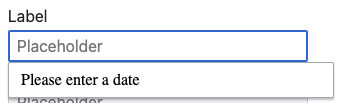
Charlie made a good point regarding the default active state of the DateInput component that made me think the interaction flow could be improved in the following way: Current: Once the user focuses on the DateInput, the extender menu opens to display the prompt text.
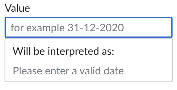
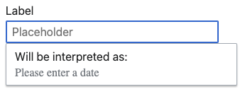
This removes a step from the flow and concentrates all interaction in a single menu, that now displays the different states (pre-input, during input, and result). Since the component is still in the last stages of development, I thought we still are on time to make this improvement 🙏 |
Added
Isn't it |
Ladsgroup
force-pushed
the
date_component
branch
from
9b52687 to
6b36d1d
Compare
|
Thanks for all the changes and fixes, @Ladsgroup!
This error still persists: the text-styles applied to the prompt are ignored in MacOS (checked Safari, Firefox and Chrome)
Yes, that token is defining the internal padding of the menu, but the elements inside are unaffected. Maybe we should define their spacing separately, like in the options menu? I can update the tokens file (#400) |
| <slot v-if="!value" name="prompt" /> | ||
| <BouncingDots v-if="!parsedValue && value" type="small" /> | ||
| <div class="wikit-DateInput__CalendarNotice" v-if="calendarNotice && parsedValue"> | ||
| <Icon type="info" size="small" /> |
There was a problem hiding this comment.
can we apply color="subtle" to the icon or make it inherit the color of the text it accompanies? Any of the options are fine
There was a problem hiding this comment.
We don't have "subtle" color type. The ones are 'base', 'warning', 'error', 'notice', 'success', 'inherit'. I change it to inherit.
There was a problem hiding this comment.
thanks! inherit makes sense. I'm opening a small PR to add those missing colors to the icon component (I was convinced they were there, but maybe mixed up colors and sizes), but no further change is needed here.
Ladsgroup
force-pushed
the
date_component
branch
from
ab6c389 to
14cc24e
Compare
 Ladsgroup
force-pushed
the
date_component
branch
from
Ladsgroup
force-pushed
the
date_component
branch
from
14cc24e to
e2cba29
Compare
|
yay! looks so good! I would approve right away if it weren't (again) for that missing style:
Is there anything we can try there? Should we create a class for that text element too? The style literally matches that of the input placeholder. |
| <p class="wikit-DateInput__ParsedValue" v-if="parsedValue"> | ||
| <b>{{ parsedValue }}</b> | ||
| </p> | ||
| <slot v-if="!value" name="prompt" /> |
There was a problem hiding this comment.
Not blocking this PR: But since we now show the intro text always, do we want the prompt to actually still be a slot? That is where the application can inject whatever markup it wants. Or would we not prefer for this now to be a text-only prop? @SaiSan-WMDE
Though, this is not blocking the merge and can still be adjusted later on.
There was a problem hiding this comment.
@Ladsgroup and I just discussed this and originally agreed to keep the slot. But you're right, this is some static text that will always be displayed, so using a text-only prop like in the other cases makes more sense and is more consistent?
There was a problem hiding this comment.
You tell me 🙃
This really depends on what you envision might be inserted there by the application.
If it is only ever going to be plain text that is always supposed to be styled the same way, then a prop makes more sense.
On the other hand, if you want to keep the possibility open that the application might want to provide some copy that includes a "learn more" link, then we should keep the slot.
If you two discussed this and decided that to keep the slot, then I'm confident that this is the right decision and am very happy to approve this as soon as we have the note in the CHANGELOG.md :)
There was a problem hiding this comment.
I believe this should be a text prop for now, since I cannot foresee any use cases that justify the use of a slot at the moment. A slot could be introduced later if that changed.
Last change and we should be done with this component!
There was a problem hiding this comment.
Implemented as requested.
|
This still needs a line in the CHANGELOG.md, I think :) |
Co-authored-by: Sai_San <sarai.sanchez@wikimedia.de>

3 participants
Bug: T273002