Change navigation bar color to white on api 27+ #10713
Conversation
|
You can test the changes on this Pull Request by downloading the APK here. |
|
@malinajirka Just played with a test build, and this already feels much better. I'd be happy to ship as-is, but there might be refinements to be made with regards to the semi-transparency. One tiny thing I'm wondering if we should try is maybe putting a dim separator on top of the on the |
|
Also, I'm not sure what this means for our progress on Dark Theme, but we'll want to make sure it looks nice in that theme as well. // cc @khaykov |
|
FWIW, I've been considering moving to a white background (instead of gray) in light mode as part of the work I'm doing with @khaykov, so there may not be a need for a separator if we end up doing that. |
|
@iamthomasbishop @mattmiklic This should not be an issue with a light mode, but in dark mode, the bottom bar has an "elevated" color, so we will need to match it. Also, elements like this (comment input area)look a bit funky to me: This probably goes for light mode too. |
 jd-alexander
left a comment
jd-alexander
left a comment
There was a problem hiding this comment.
Tested on Pixel 4 XL device and it's looking good. Saw the same grey background on the Achievements page as shown below.

so yes, in the future would probably be good to make it all consistent but for now this change suits the light theme better.
As I mentioned in the description, if we decide to make this change, I'd rather plan it as it won't be a matter of a couple of hours. We'll need to define which screens need to behave this way and we'll need to make sure actionable items don't appear bellow the bar.
Unless I'm missing a simply solution, I believe we'd need to modify layouts of all the screens in the app. So it might not be worth it. @khaykov If it makes more sense for you to implement this in the dark-theme branch, please feel free to close this PR or change the target branch. |
I don't see this being an issue, to be honest. However, Google does do this in its own apps by putting a line on the system navigation bar itself. |
@malinajirka Of course, I just mean the above solves the bulk of the issue so if/when we're ready we can move forward.
@mattmiklic Ah, that's right. With that in mind, this approach should blend in nicely. 👍
@SylvesterWilmott I wondered this, and when I checked out a handful of Google's apps, I found there isn't consistency – about half of them do have a separator and half don't, so I didn't know what would be preferred. I think it's fine without the separator as well, so we can roll with this. |
|
@theck13 @jd-alexander I believe all the discussion are settled => it's ready for review/merge.
Thank you all ;)! |
…le/WordPress-Android into issue/10695-nav-bar-color
Fixes #10695
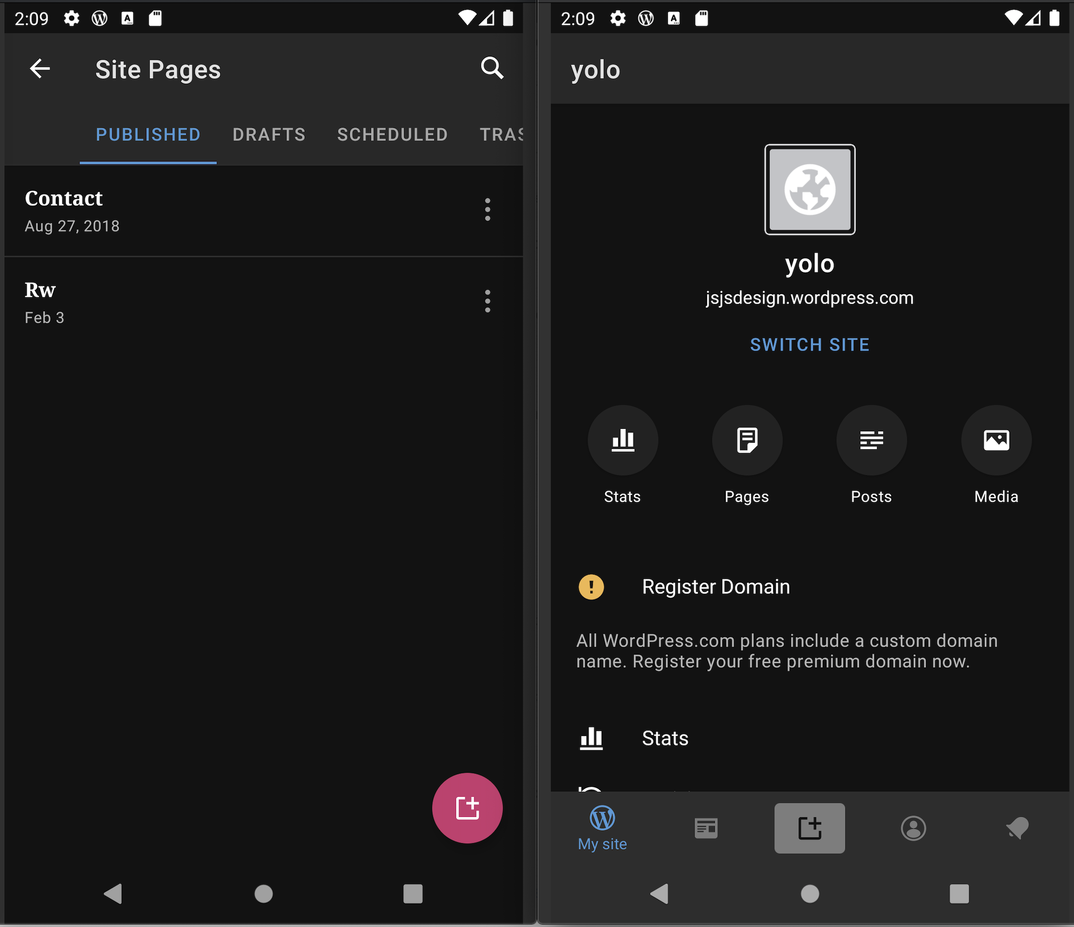
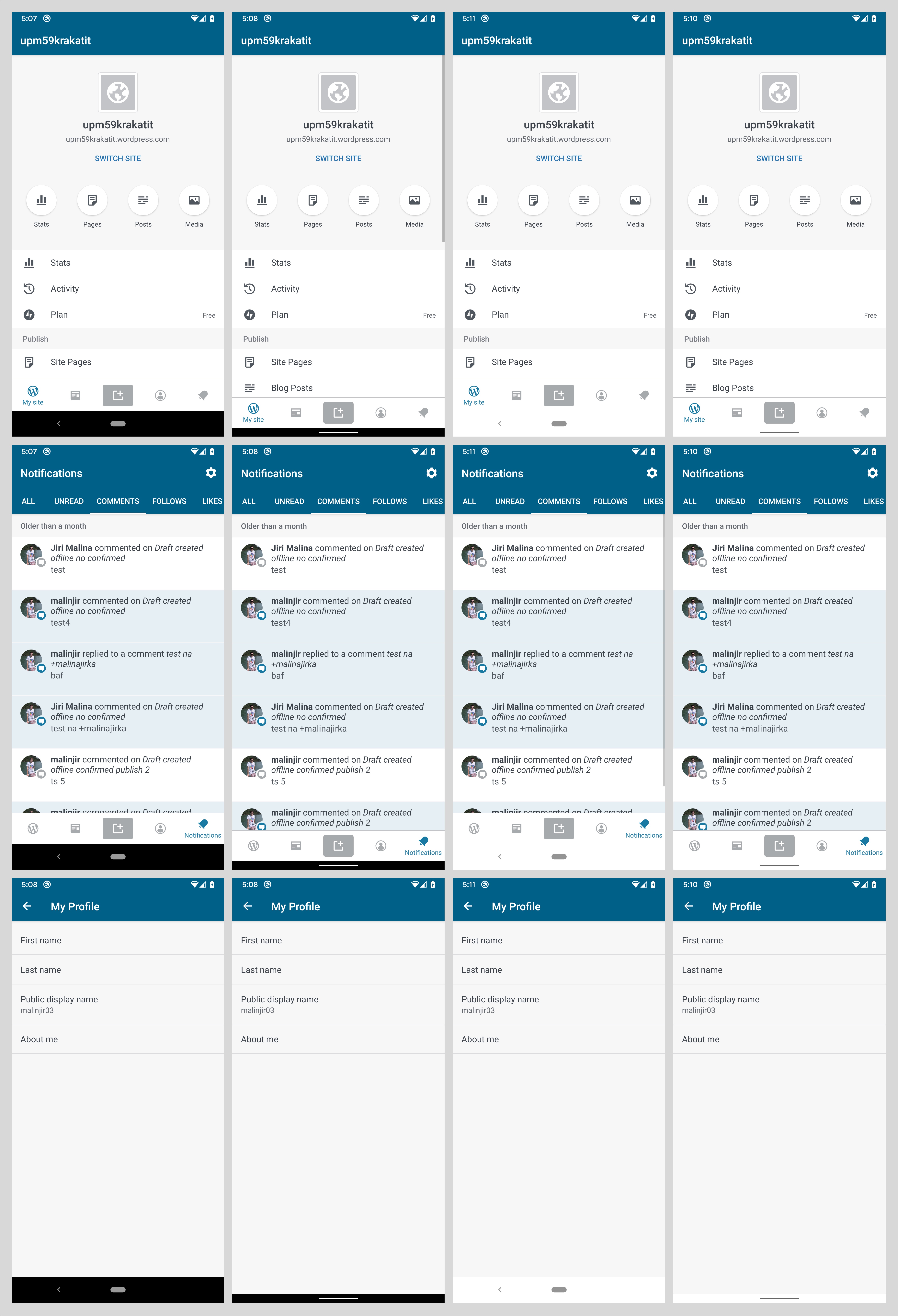
Changes color of navigation bar to white on Android 8.1+.
The first two columns are API < 27 (without change), the last two columns are API >= 27:
@iamthomasbishop I decided to keep the color white on all the screens for the sake of simplicity - it seems the only screens with grey-only background are the settings screens which aren't used that often anyway.
We can enable drawing content below the navigation bar so scrolling content doesn't get cut off as part of another ticket. I tried to quickly implement it and I encountered several issues. So I think this change would need to be planned as part of a sprint.
To test:
PR submission checklist:
I have considered adding unit tests where possible.
I have considered if this change warrants user-facing release notes and have added them to
RELEASE-NOTES.txtif necessary.