
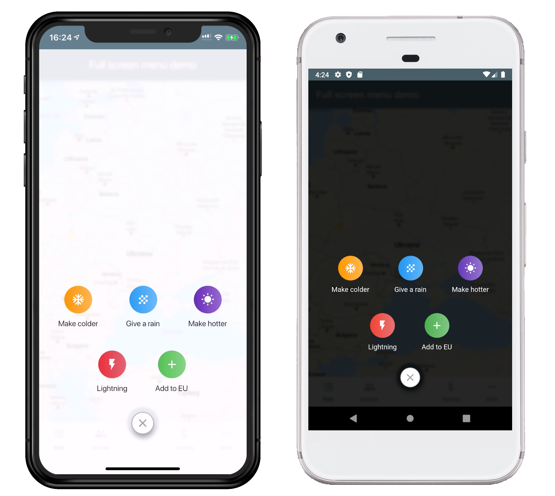
Requirements: Flutter 3.47+ (the package uses material_ui).
On older Flutter versions, use full_screen_menu: ^2.0.1.
- Add the dependency in your
pubspec.yamlfile.
dependencies:
full_screen_menu: ^3.1.0- Import the
full_screen_menupackage.
import 'package:full_screen_menu/full_screen_menu.dart';FullScreenMenu.show(
context,
items: [
Image.asset('assets/image.png'),
FSMenuItem(
icon: const Icon(Icons.ac_unit, color: Colors.white),
text: const Text('Make colder'),
gradient: blueGradient,
onTap: () => print('The weather is colder now'),
),
FSMenuItem(
icon: const Icon(Icons.wb_sunny, color: Colors.white),
text: const Text('Make hotter'),
gradient: orangeGradient,
onTap: () => print('The weather is hotter now'),
),
],
);Close the menu from code with FullScreenMenu.hide(), and check whether it is
open with FullScreenMenu.isVisible.
The Android back button and back gesture close the menu and keep the screen
open, with MaterialApp and MaterialApp.router (for example go_router), so you
don't need a PopScope for it. One you added for this in earlier versions still
works and can be removed. This applies to the screen (route) of the context
passed to show. A PopScope with canPop: false on that screen still gets
the back first, as with a Drawer: call FullScreenMenu.hide() from it to
close the menu. To handle back yourself, pass closeMenuOnBackButton: false.
Shows the menu over the whole screen. The items and the close button stay inside the safe area.
| Parameter | Description | Required |
|---|---|---|
| BuildContext context | A context below the Overlay (for example below MaterialApp) |
+ |
| List<Widget> items | The menu items. Any widget works, not just FSMenuItem |
- |
| Color backgroundColor | Background color, drawn at 85% opacity. Defaults to black in a dark theme and white otherwise | - |
| bool closeMenuOnBackgroundTap | Close the menu when the user taps outside the items. Defaults to true |
- |
| bool closeMenuOnBackButton | Close the menu on the system back (Android back button or back gesture) instead of leaving the screen. Defaults to true |
- |
A round gradient icon with a label below it.
| Parameter | Description | Required |
|---|---|---|
| VoidCallback onTap | Called when the user taps the item | + |
| Text text | The label below the icon | - |
| Icon icon | The icon inside the circle | - |
| Gradient gradient | Fills the circle behind the icon. Defaults to blueGreyGradient |
- |
Predefined gradients: orangeGradient, blueGradient, deepPurpleGradient,
redGradient, greenGradient, lightBlueGradient, purpleGradient,
lightGreenGradient and blueGreyGradient.
This project is licensed under the Apache License 2.0 - see the LICENSE file for details