
#Objectives/Business case
This website is designed to provide an online platform for an already established business called Flavaz Shisha. The business specialises in shisha hire in the city of Cardiff and for events across the UK. It involves facilities for clients to learn about the business offerings, with operating times, service areas and concise yet informative business information.
This website is made up of the following pages:
1.Home 2.FAQs 3.Menu 4.Get In Touch 5.Areas 6.Socials
The business objectives for this website:
To advise users on details regarding shisha hire and event bookings. To educate users on the basics of shisha. To bring and promote the traditional shisha business clients to smoke in the convenience of their home. To make shisha a bridge between different cultures at events or at home. To generate business leads and a database of users to send information to regarding events, promotions and updates. To provide clients with a large catalogue of flavours and shishas not available elsewhere. Provide a cost-effective service by minusing overheads that traditional businesses face and by leveraging the multitude of previous clients to provide what is most effective.
The user goals of this website are:
- As a first-time visitor, I want to easily find useful information regarding the business and what it offers.
- As a first-time visitor, I want to know I'm in good hands and be comfortable in selecting my shisha provider.
- As a first-time user, I want to be able to navigate through flavour options.
- As a first-time user, I want to know if my delivery area is covered.
- As a first-time user, I want to be able to get a quote as quickly as possible.
- As a first-time user, I want to be able to navigate to the businesses social media.
- As a first-time user, I want to be able to connect with the business in as little time as possible. 8.As a First Time Visitor, I want to be able to easily be able to navigate throughout the site to find content.
#User Experience —
Considering the core UX principles I first started to think about the strategy for this website and defined who the target users would be and what features/technologies they would want.
Flavaz Shisha target demographics are:
- Male and Female
- Aged 18-60 *Multi-ethnic
- Interested in smoking at home
- Interested in booking for an event, military, birthday, graduation balls, weddings etc
- People interested in good quality shisha.
What these users would be looking for:
- Clear, concise, easy-to-find information
- Informative website with visible options
- Method of contact *Quick access to menu for future orders
- Find out more about shisha *Find out more about the business.
This website will offer all of these things whilst also allowing for intuitive navigation and comfortability of use. An effort was taken to not provide an overwhelming amount of information at first glance as this is can deter clients from booking.
Due to the multitude of age groups, the site traffic is likely to come from a variety of different devices. Thus, a responsive design will be undertaken for success with a mobile first approach.
In order to achieve the desired user & business goals, the following features will be included in this release:
- Header and menu bar, to navigate to the various pages
- Alert banner for latest updates
- Brief gallery of different shisha images
- Information page regarding home deliveries
- Information page regarding flavour menu
- Method of contact/enquiries via a contact page
- Links to social media pages/Socials
- Footer giving our location details and opening times.
This is a multi-page website to allow for desired flow; the navigation bar at the top allows for users to easily move to whatever section of the site they are interested in or they can simply scroll through the information as it is displayed. It is dynamic to toggle between an arrow dropdown and navigational links.
I chose the following order for the information
1.Home 2.FAQs 3.Menu 4.Get In Touch 5. Social section on the footer of all pages 6. Linked sections in the our services section of homepage.
This flow kept a conscious effort in maintaining what a normal enquiry to a shisha business may look like, what is it that you do? What do you offer? What is Flavaz about? How can I order? Each section is broken down to allow digestible chunks of info. Finally, there is a simple sign up form for users to sign up and contact the coach.
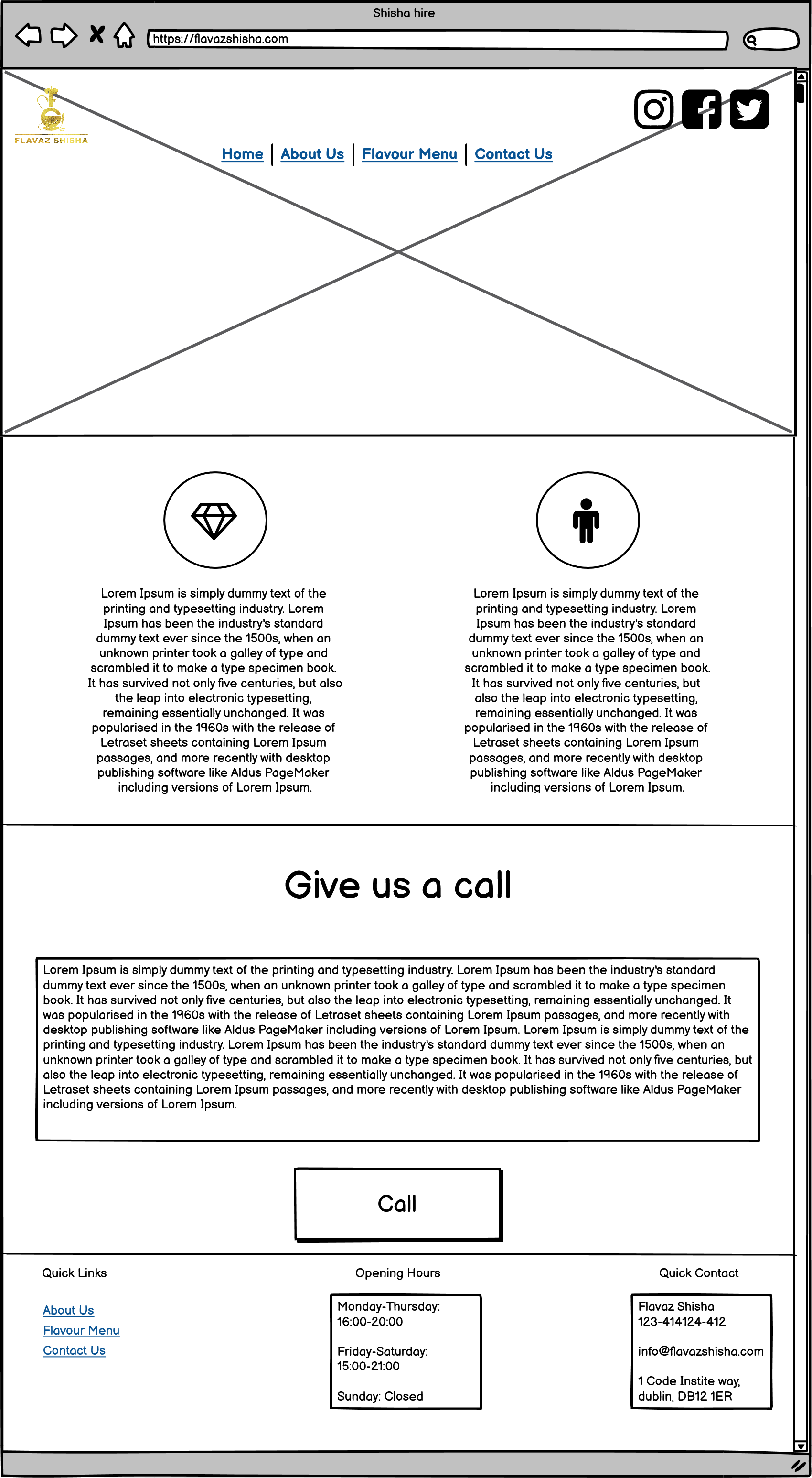
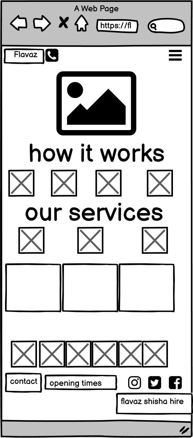
Please note the actual website has changed slightly from these wireframes. These are high level and with more time the would be more define and would have more details. The end result came out looking far better than the initial design. A more recent draft looks similar to below, wireframe designed to be mobile friendly
With more time I would have had a more detailed design with colors and images.
Whilst building the website I felt that there were sections with too much information, for this reason, I opted to install the read more button on all devices and not just the mobile. This allows for user's to only read on if they would like the more detailed information; I felt giving the user this control would provide a positive user experience.
I also decided to change my photo slideshow with a bootstrap carousel to switch it also allowed for better responsiveness and the images looked better on larger screens.
In addition to these changes I also decided to add a socials section using font awesome with some hover animation.
The colour palette is based around a balance between gold and black, typical colours found with luxury higher end products. With backgrounds mimicking a rustic black leather effect to give the site a bit more character. The users should find clear and concise information presented in a clean contrasting design principle to enable the text to shine.
Google fonts outfit was used as I researched clear easy to read sans-serif fonts on websites using google developer tools. I tried to keep it simple and used out of the box bootstrap classes to hide/emphasise text.
This is a fully responsive website that was designed mobile-first. With the rise of smartphones, this is the most likely way it will be viewed;
1.Home 2.FAQs 3.Menu 4.Get In Touch 5. Social section 6. Linked sections in the our services section of homepage.
All of the headings use the font Outfit and the body text is Outfit, this consistency has been used across the website to create a coherent design.
The navbar is placed on top of a responsive image which acts as a header, when viewed on smaller screens I opted for the menu to collapse into a arrow icon as I still wanted the image to be seen. Initially, the icon was a bong but users may not be familiar with what the icon represents so it was removed. The images I have chosen is representative of the businesses offerings, it was kept simple and clear - to emphasise the gallery below.
This is where I introduced all the most frequently asked questions, a brief insight the history of shisha and booking inforation for clients. I have used an H2 class element for the main heading, followed by a p tag line using bootstrap for the descriptive paragraph. I wanted to keep this section simple and clean as there is plenty of information that follows. The design was based off an online accordion that adhered to the websites overall design. I chose to limit the number of questions so not to deter clients from ordering.
Menu comprises of an P, and an embedded iframe for the viewable PDF. After numerous attempts at sourcing a responsive pdf viewer, it seems to be the only one fit for my needs. This structure is used to provide clarity of the large number of flavours within this section and make the graphics easy to understand at a glance.
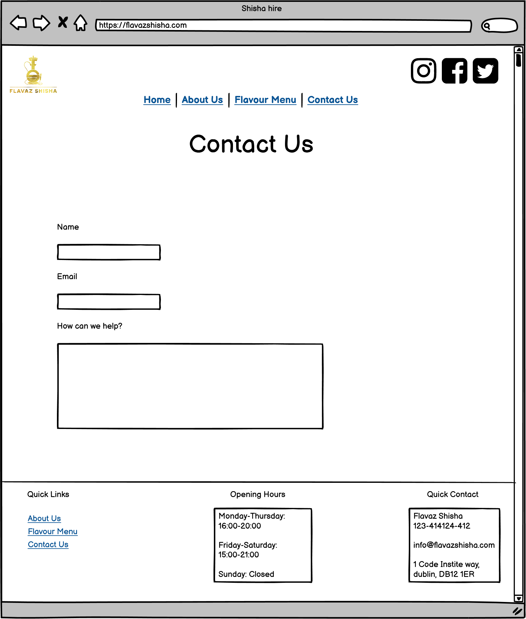
A simple bootstrap form was used and central to emphasis its important, after seeing all the information. It contains key information for clients looking to get a quote. It is responsive and dynamic.
Large font awesome icons were used to emphasise our social presence and footprint accross all digital platforms.
###Areas is accessible from the homepage section, our services. It provides valuable information for clients looking to book in Cardiff but the information requires a seperate page. It is layed out in a clear and concise fashion, easily understandble by the end user.
I have used several technologies that have enabled this design to work:
- HTML
- Used as the basic building block for the project and to structure the content.
- CSS
- Used to style all the web content across the project.
- Google Fonts
- Used to obtain the fonts linked in the header, fonts used were Playfair and Cookie
- Font Awesome
- Used to obtain the social media icons used in the footer and the icons in La Petite Review.
- Google Developer Tools
- Used as a primary method of fixing spacing issues, finding bugs, and testing responsiveness across the project.
- GitHub
- Used to store code for the project after being pushed.
- Git
- Used for version control by utilising the Gitpod terminal to commit to Git and Push to GitHub.
- Gitpod
- Used as the development environment.
- Balsamiq
- Used to create the wireframes for the project.
- AutoPrefixer
- Grammarly
- Check text and linguistics
- W3C Markup Validation Service
- Used to validate all HTML code written and used in this webpage.
- W3C CSS Validation Service
- Used to validate all CSS code written and used in this
- Freeformatter HTML Formatter
- Used to accurately format my HTML code.
- AmIResponsive
- Used to generate repsonsive image used in README file.
-
As a first-time visitor, I want to easily find useful information regarding the business and its offerings. Users can navigate quickly through our information from the navbar and find out more.
-
As a first-time visitor, I want to get a quote as fast as possible Upon entering the site, the user has two options, click the call to action button or scroll down, both of which will lead to the same place, the latter provides more information but a quotation form can still be accessed quickly.
-
As a returning user, I want to be able to view the range of flavours easily and order Users can navigate directly to the menu and contact us to place an order.
-
As a frequent user, I want to see the the latest offerings Users can navigate through the updated information, a blog post will be added to update all present and future clients of any news/changes.
Lighthouse is a feature of Google Chrome developer tools and is used to assess the performance of the website and its features. I achieved a low-performance score initially, as you can see below:

I achieved fantastic results by minimising the amount of data needed on the page. I have nearly achieved 90 across the board. In fact the site scored better in all areas than the businesses current website which costs £22 a month

I validated both my HTML and CSS code multiple times whilst building the website, I did this so that there were not a huge amount of errors/warnings at the final stages of development for me to deal with. This allowed me to incrementally improve my code and upon completion, there were 0 errors found.


As part of my testing I wanted to ensure that all of my clickable links worked & opened up in a new page, I found that social links opened in the same window. I used the target _blank to open a new window and used the 'rel="noreferrer"' to all external links as this is considered best practice.
I removed the social icons from the top navbar to deter people from clicking away from the site.
Continuosly adjusting the .col- to achieve the perfect responsive layout.
I converted all .png types to .webp for faster loading. I'm not satisfied with the quality, it has been drastically reduced. The fix would be to remove the carousel but for added visual appeal it remained until a fix is found.
The pdf viewer on menu.html sometimes needs to be refreshed to display, it also has border that cannot be removed. In future versions I aim to provide a fix for this.
In future implementation I would look to add more pages but as this is time sensitive there is not much more I can do.
Throughout the entire process, I used Google Dev Tools to debug the website and its layout, this allowed me to check the responsiveness of the site and quickly debug any issues that I came across.
I deployed this website by using GitPages and following the below steps:
GitHub pages deployment
- Log in to GitHub
- In your Repository section, select the project repository that you want to deploy
- In the menu located at the top of this section, click 'Settings'
- Select 'Pages' on the left-hand menu - this is around halfway down
- In the source section, select branch 'Master' and save
- The page is then given a site URL which you will see above the source section, it will look like the following:
Please note it can take a while for this link to become fully active.
Forking the GitHub Repository
If you want to make changes to your repository without affecting it, you can make a copy of it by 'Forking' it. This ensures your original repository remains unchanged.
- Find the relevant GitHub repository
- In the top right corner of the page, click the Fork button (under your account)
- Your repository has now been 'Forked' and you have a copy to work on
Cloning the GitHub Repository
Cloning your repository will allow you to download a local version of the repository to be worked on. Cloning can also be a great way to backup your work.
- Find the relevant GitHub repository
- Press the arrow on the Code button
- Copy the link that is shown in the drop-down
- Now open Gitpod & select the directory location where you would like the clone created
- In the terminal type 'git clone' & then paste the link you copied in GitHub
- Press enter and your local clone will be created.
##Credits
have used a number of resources to produce this website, where code has been used found from another source this is credited as a comment within the HTML, CSS and JS files.
The following websites/articles were used for research and guidance:
[ToggleBar] (https://www.youtube.com/channel/UCtXGz0MBuqZUC8rmGddc07Q)
[BootstrapComponents] (https://getbootstrap.com/docs/4.0/customize/components/)
[keep text wrapped] (https://developer.mozilla.org/en-US/docs/Web/CSS/overflow-wrap/)
I would like to thank my course mentor Caleb for his support and guidance throughout the course of the project.
Stackoverflow and Mohibur for their gems of knowledge.