一、 三个可爱的小球
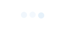
1.首先 border-radius: 50%; 三个小圆出来
2.然后主要用了 css3 中的 @Keyframes
@Keyframes 让开发者通过指定动画中特定时间点必须展现的关键帧样式(或者说停留点)来控制CSS动画的中间环节。这让开发者能够控制动画中的更多细节而不是全部让浏览器自动处理。
关键帧可以从0%到100%定义多个,这里由于动画效果简单,仅使用了 from (等于0%)和 to (等于100%)两个属性
动画的开始小圆球在起始位置且不透明,动画的结束小球向上平移了lrem,并且透明度为10%
3.另外用到了 animation-delay
animation-delay CSS属性定义动画于何时开始,即从动画应用在元素上到动画开始的这段时间的长度。
用 animation-delay 给三个小球分别设定不同的开始时间,这样看起来就是三个小球在不停的依次上下跳动了
代码:
html:
<div class="bouncing-loader">
  <div></div>
  <div></div>
  <div></div>
</div>
css:
@keyframes bouncing-loader {
    from {
        opacity: 1;
        transform: translateY(0);
    }
    to {
        opacity: 0.1;
        transform: translateY(-1rem);
    }
}

.bouncing-loader {
    display: flex;
    justify-content: center;
}

.bouncing-loader>div {
    width: 1rem;
    height: 1rem;
    margin: 3rem 0.2rem;
    background: #8ebfe7;
    border-radius: 50%;
    animation: bouncing-loader 0.6s infinite alternate;
}

.bouncing-loader>div:nth-child(2) {
    animation-delay: 0.2s;
}

.bouncing-loader>div:nth-child(3) {
    animation-delay: 0.4s;
}
二、 圆形加载
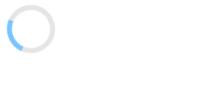
其实原图就是

有了上面那个动画的经验,这个就很简单了,把原图不停的旋转就可以了
直接上代码:
html:
<div class="donut"></div>
css:
@keyframes donut-spin {
    0% {
        transform: rotate(0deg);
    }
    100% {
        transform: rotate(360deg);
    }
}

.donut {
    display: inline-block;
    border: 4px solid rgba(0, 0, 0, 0.1);
    border-left-color: #79c3ff;
    border-radius: 50%;
    width: 30px;
    height: 30px;
    animation: donut-spin 1.2s linear infinite;
}
以上两个例子均来自著名的 30-seconds-of-css
一、 三个可爱的小球

1.首先 border-radius: 50%; 三个小圆出来
2.然后主要用了 css3 中的 @Keyframes
关键帧可以从0%到100%定义多个,这里由于动画效果简单,仅使用了 from (等于0%)和 to (等于100%)两个属性
动画的开始小圆球在起始位置且不透明,动画的结束小球向上平移了lrem,并且透明度为10%
3.另外用到了 animation-delay
用 animation-delay 给三个小球分别设定不同的开始时间,这样看起来就是三个小球在不停的依次上下跳动了
代码:
html:
css:
二、 圆形加载


其实原图就是
有了上面那个动画的经验,这个就很简单了,把原图不停的旋转就可以了
直接上代码:
html:
<div class="donut"></div>css:
以上两个例子均来自著名的 30-seconds-of-css