SliderButtonCard for Home Assistant
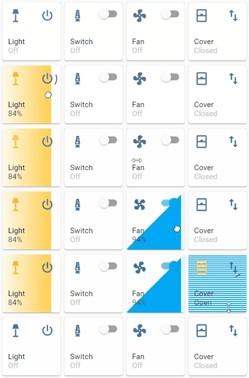
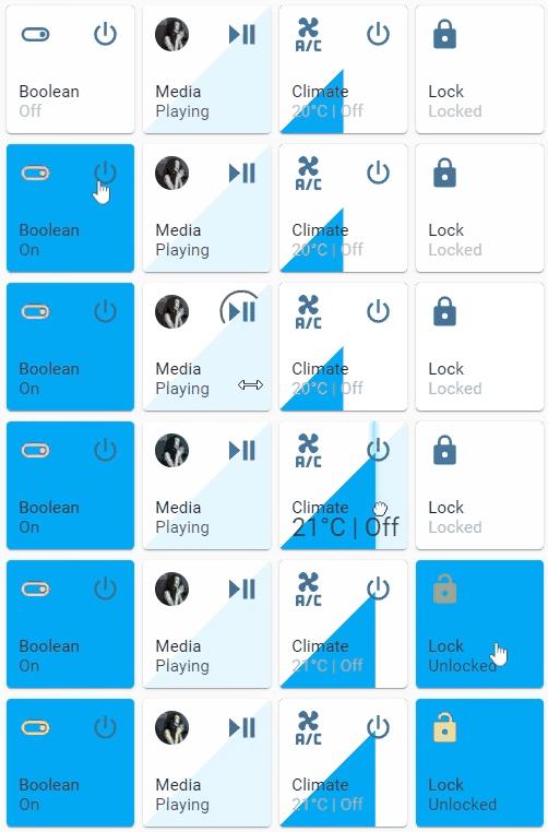
A button card with integrated slider for automation, light, switch, fan, cover, input_boolean, input_number, media_player, number, climate, lock entities.
This card is available in HACS (Home Assistant Community Store).
Just search for SliderButtonCard in Frontend tab.
Download slider-button-card.js file from the latest-release .
Put slider-button-card.js file into your config/www folder.
Go to Configuration → Lovelace Dashboards → Resources → Click Plus button → Set Url as /local/slider-button-card.js → Set Resource type as JavaScript Module.
Add custom:slider-button-card to Lovelace UI as any other card (using either editor or YAML configuration).
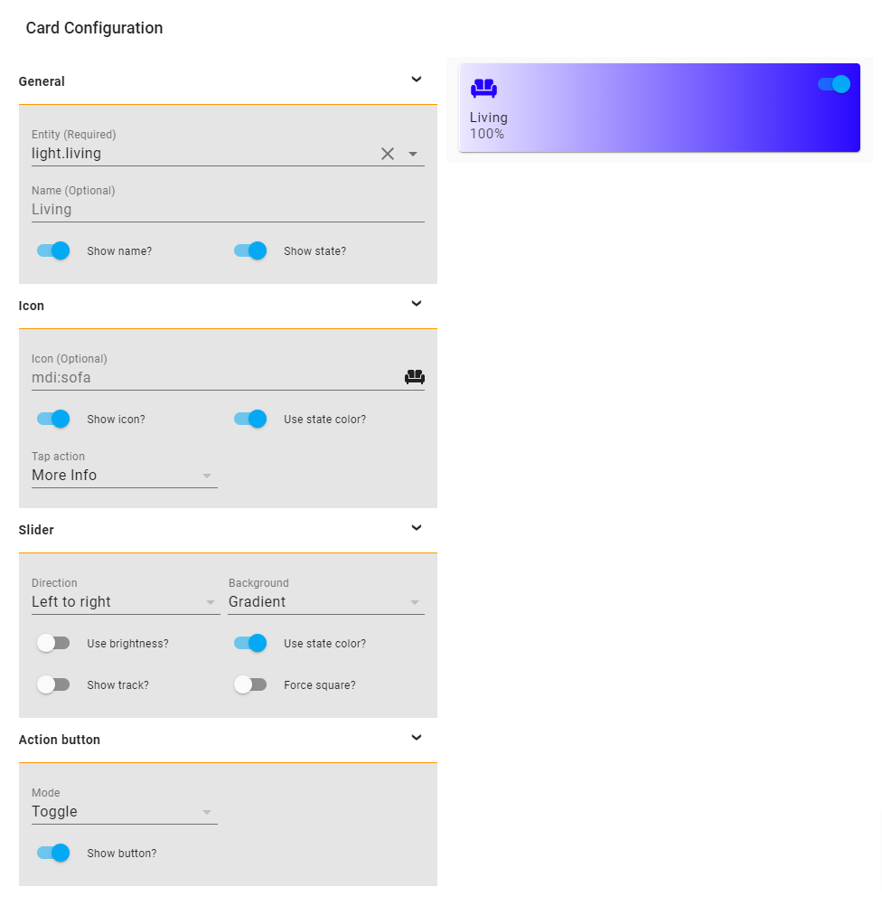
SliderButtonCard supports Lovelace's Visual Editor.
Show screenshot
Name
Type
Requirement
Description
Default
type
string
Required custom:slider-button-card
entity
string
Required HA entity ID from domain automation, light, switch, fan, cover, input_boolean, input_number, media_player, number climate, lock
name
string
Optional Name
entity.friendly_name
show_attribute
boolean
Optional Show attribute
false (except for media_player entities)
show_name
boolean
Optional Show name
true
show_state
boolean
Optional Show state
true
compact
boolean
Optional Compact mode, display name and state inline with icon. Useful for full width cards.
false
attribute
string
Optional Name of the attribute to display if show_attribute is true.
icon
object
Optional Icon options
slider
object
Optional Slider options
action_button
object
Optional Action button options
Name
Type
Requirement
Description
Default
icon
string
Optional Icon
default entity icon
show
boolean
Optional Show icon
true
use_state_color
boolean
Optional Use state color
true
tap_action
object
Optional Action to take on tapaction: more-info
Name
Type
Requirement
Description
Default
direction
string
Optional Direction left-right, right-left, top-bottom, bottom-top
left-right
background
string
Optional Background solid, gradient, triangle, striped, custom
gradient
use_state_color
boolean
Optional Use state color
true
use_percentage_bg_opacity
boolean
Optional Apply opacity to background based on percentage
true
show_track
boolean
Optional Show track when state is on
false
force_square
boolean
Optional Force the button as a square
false
toggle_on_click
boolean
Optional Force the slider to act as a toggle, if true sliding is disabled
false
attribute
string
Optional Control an attribute for light or cover entities
invert
boolean
Optional Invert calculation of state and percentage, useful for cover entities
falsetrue for cover
Light:
brightness_pct default brightnesscolor_temphuesaturation
Warning options other than brightness_pct and brightness may give strange results
For example when color_temp is selected as attribute and the current color_mode of the light is not color_temp there is no value available for the slider, so the min value will be displayed. Same for hue and saturation, slider will only show correct value when the color_mode is hs.
Cover:
Name
Type
Requirement
Description
Default
mode
string
Optional Mode toggle, custom
toggle
show
boolean
Optional Show the action button
true
icon
string
Optional Icon when mode is custom
mdi:power
show_spinner
boolean
Optional Show spinner when mode is custom
true
tap_action
object
Optional Action to take on tapaction: toggle
Name
Type
Requirement
Description
Default
action
string
Required Action to perform (more-info, toggle, call-service, navigate url, none)
more-info
navigation_path
string
Optional Path to navigate to (e.g. /lovelace/0/) when action defined as navigate
none
url
string
Optional URL to open on click when action is url. The URL will open in a new tab
none
service
string
Optional Service to call (e.g. media_player.media_play_pause) when action defined as call-service
none
service_data
object
Optional Service data to include (e.g. entity_id: media_player.bedroom) when action defined as call-service
none
haptic
string
Optional Haptic feedback for the Beta IOS App success, warning, failure, light, medium, heavy, selection
none
repeat
number
Optional How often to repeat the hold_action in milliseconds.
non
Custom styles can be set by using Card mod
style : |
:host {
--VARIABLE: VALUE;
}
Variable
Description
Default
--icon-colorColor of the icon when icon.use_state_color === false
var(--paper-item-icon-color)
--label-color-onColor of the label when state is on
var(--primary-text-color, white)
--label-color-offColor of the label when state is off
var(--primary-text-color, white)
--state-color-onColor of the state value when state is on
var(--label-badge-text-color, white)
--state-color-offColor of the state value when state is off
var(--disabled-text-color)
--action-icon-color-onColor of the action button icon when state is on
var(--paper-item-icon-color, black)
--action-icon-color-offColor of the action button icon when state is off
var(--paper-item-icon-color, black)
--action-spinner-colorColor of the spinner action button
var(--label-badge-text-color, white)
Minimal working config
type : custom:slider-button-card
entity : light.couch
slider :
direction : left-right
background : gradient
icon :
tap_action :
action : more-info
action_button :
mode : toggle
Compact, best used in full width (not in grid)
Minimal config
icon :
tap_action :
action : more-info
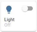
Icon override
icon :
icon : mdi:lightbulb
tap_action :
action : more-info
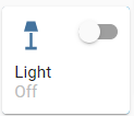
Minimal config
action_button :
mode : toggle
show : true
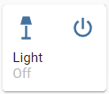
Custom
action_button :
mode : custom
show : true
tap_action :
action : toggle
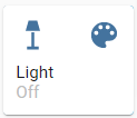
Custom icon and tap action
action_button :
mode : custom
show : true
icon : mdi:palette
tap_action :
action : call-service
service : scene.turn_on
service_data :
entity_id : scene.test
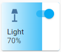
Minimal config
slider :
direction : left-right
background : gradient
Background uses color or color_temp if available
slider :
direction : left-right
background : gradient
use_state_color : true
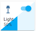
Show track, best used in full width or triangle
slider :
direction : left-right
background : triangle
use_state_color : true
show_track : true
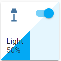
Force square
slider :
direction : left-right
background : triangle
use_state_color : true
show_track : true
force_square : true
For fan entities the icon auto rotates based on the speed of the fan.
Icon rotate animation
type : custom:slider-button-card
entity : fan.living_fan
slider :
direction : left-right
background : triangle
show_track : true
icon :
tap_action :
action : more-info
action_button :
tap_action :
action : toggle
mode : custom
name : Fan
Use slider.toggle_on_click: true so the slider acts as a toggle (sliding is disabled).
Toggle on click
type : custom:slider-button-card
entity : switch.socket
slider :
direction : left-right
background : custom
toggle_on_click : true
icon :
use_state_color : true
tap_action :
action : more-info
action_button :
tap_action :
action : toggle
mode : custom
name : Switch
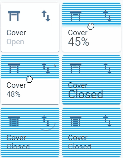
For most use cases: set slider.direction: top-bottom and slider.background: striped;
Direction top to bottom, custom action icon
type : custom:slider-button-card
entity : cover.living_cover
slider :
direction : top-bottom
background : striped
icon :
show : true
tap_action :
action : more-info
action_button :
tap_action :
action : toggle
mode : custom
icon : mdi:swap-vertical
name : Cover
Default behavior: slider is used for volume control, when there is an entity picture it will be used instead of the icon.
In this example the action button is used to toggle play/pause.
Action button to toggle play/pause
type : custom:slider-button-card
entity : media_player.spotify_mha
slider :
direction : left-right
background : triangle
show_track : true
icon :
tap_action :
action : more-info
action_button :
mode : custom
icon : mdi:play-pause
tap_action :
action : call-service
service : media_player.media_play_pause
service_data :
entity_id : media_player.spotify_mha
name : Media
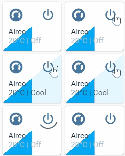
Default behavior: slider is used to set target temperature, it doesn't alter state.
Target temperature and state disabled in card
type : custom:slider-button-card
entity : climate.harmony_climate_controller
slider :
direction : left-right
background : triangle
show_track : true
icon :
tap_action :
action : more-info
action_button :
mode : custom
tap_action :
action : toggle
name : Airco
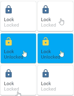
Default behavior: slider.toggle_on_click: true
Action button hidden
type : custom:slider-button-card
entity : lock.virtual_lock
slider :
direction : left-right
background : solid
toggle_on_click : true
icon :
use_state_color : true
tap_action :
action : more-info
action_button :
show : false
name : Lock
4 columns, square: false
type : grid
cards :
- type : custom:slider-button-card
entity : light.couch
slider :
direction : left-right
background : gradient
use_state_color : true
icon :
tap_action :
action : more-info
use_state_color : true
action_button :
mode : toggle
- type : custom:slider-button-card
entity : switch.socket
slider :
direction : left-right
background : custom
toggle_on_click : true
icon :
use_state_color : true
tap_action :
action : more-info
action_button :
tap_action :
action : toggle
mode : toggle
name : Switch
- type : custom:slider-button-card
entity : fan.living_fan
slider :
direction : left-right
background : triangle
show_track : true
icon :
tap_action :
action : more-info
action_button :
tap_action :
action : toggle
mode : custom
name : Fan
- type : custom:slider-button-card
entity : cover.living_cover
slider :
direction : top-bottom
background : striped
icon :
show : true
tap_action :
action : more-info
action_button :
tap_action :
action : toggle
mode : custom
icon : mdi:swap-vertical
name : Cover
square : false
columns : 4
To build the card yourself, you will need to have Node.js and npm installed.
Clone the repository and navigate to the project directory.
Install the necessary dependencies:
Run the build script:
The compiled file will be generated at dist/slider-button-card.js.