Important
Bytecat fork notice
This package is a Bytecat-maintained fork of Glide Data Grid. It was prepared quickly to satisfy Bytecat code-audit requirements by addressing security/audit findings, dependency version bumps, and compatibility updates. It is not intended to be a long-term independently maintained fork.
The upstream glideapps/glide-data-grid repository remains the one true source for Glide Data Grid. Please use the upstream project for the canonical implementation, documentation, issue tracking, and contribution workflow. This fork may be useful if you also need a Glide Data Grid package with these code-audit-oriented updates applied, but it is not a replacement for upstream governance or support. Pull requests and issues opened here will not be accepted or processed.
The changes in this fork are available for anyone who wants to contribute the relevant work back upstream. Because the work was done under time pressure, it was not organized as a clean sequence of upstream-ready pull requests. Bytecat is happy to help structure the relevant changes into suitable PRs for upstream review if that would be useful to the Glide maintainers or other contributors.
Testing for this fork was focused on the features and integration paths that Bytecat actively uses. It was not a comprehensive validation of every Glide Data Grid capability, so some functionality may have regressions or breaking behavior in this fork. If you depend on behavior outside Bytecat's usage, we recommend using the upstream package directly.
This fork is not affiliated with, sponsored by, or endorsed by Glide. The original MIT license and copyright notices are preserved. See ACKNOWLEDGEMENTS.md. The dependency/security upgrade work was performed primarily with assistance from Codex/AI, with human review and verification by Bytecat. Bytecat: https://bytecat.ai.
Items addressed from the upstream package in this fork:
- Dependency and compatibility updates for React 19, React DOM 19, React types 19, TypeScript 6, Babel 8, Linaria 8 / wyw-in-js 2, Storybook 10, Vitest 4, ESLint 10 flat config, and related test harness changes.
- Security/audit follow-up for the root workspace and test projects, including documented remaining advisories that require manual judgement rather than force-level downgrades.
- Test-project updates for Next 16 compatibility checks. The obsolete CRA 5
test project was removed because its unmaintained
react-scripts@5.0.1toolchain carried unresolved transitive audit findings. - Package publishing metadata changed from the upstream
@glideappsscope to the Bytecat@bytecatscope.
The detailed upgrade notes and verification list are in .bytecat/UPGRADE_ISSUES.md.
Before, using the upstream package:
npm i @glideapps/glide-data-gridimport DataEditor from "@glideapps/glide-data-grid";
import "@glideapps/glide-data-grid/dist/index.css";After, using this Bytecat fork:
npm i @bytecat/glide-data-gridimport DataEditor from "@bytecat/glide-data-grid";
import "@bytecat/glide-data-grid/dist/index.css";The section below is preserved from upstream for context. Its upstream badges, links, screenshots, and marketing text describe the original Glide project, not Bytecat ownership, affiliation, or endorsement.

A canvas-based data grid, supporting millions of rows, rapid updating, and native scrolling.
Built as the basis for the Glide Data Editor. We're hiring.
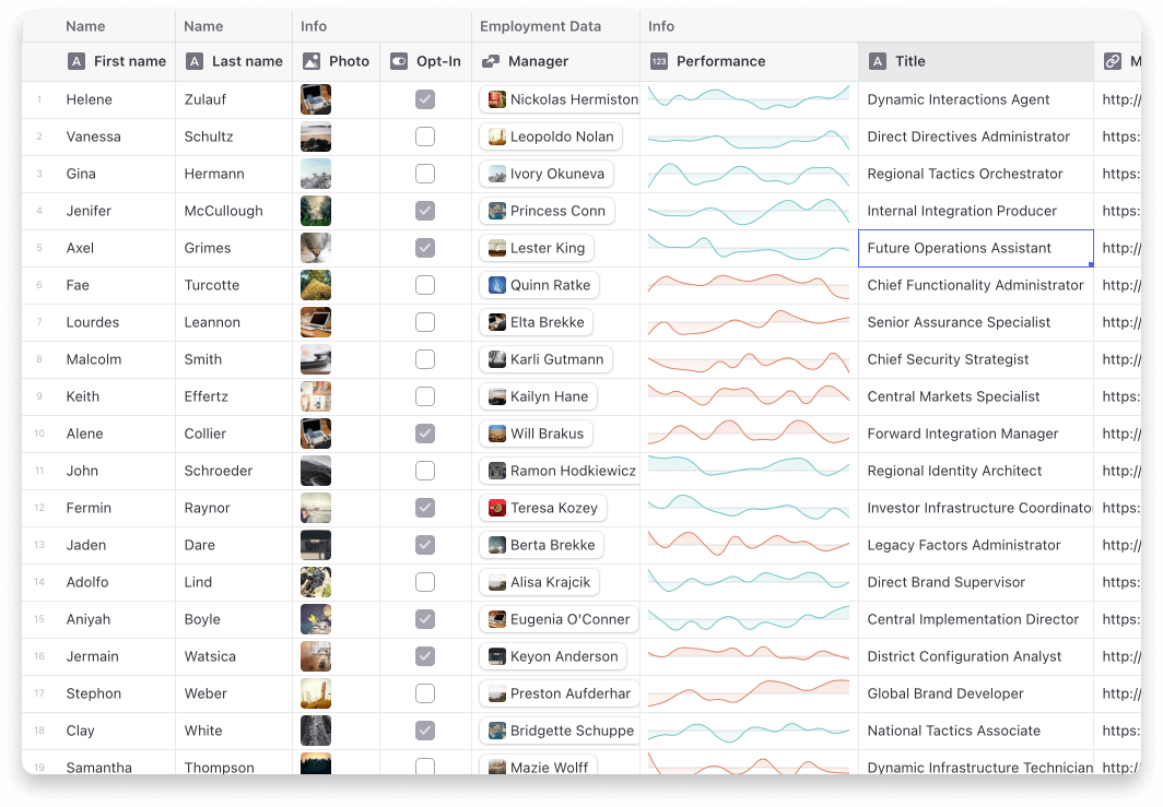








Lots of fun examples are in our Storybook.
You can also visit our main site.
- It scales to millions of rows. Cells are rendered lazily on demand for memory efficiency.
- Scrolling is extremely fast. Native scrolling keeps everything buttery smooth.
- Supports multiple types of cells. Numbers, text, markdown, bubble, image, drilldown, uri
- Fully Free & Open Source. MIT licensed, so you can use Grid in commercial projects.
- Editing is built in.
- Resizable and movable columns.
- Variable sized rows.
- Merged cells.
- Single and multi-select rows, cells, and columns.
- Cell rendering can be fully customized.
First make sure you are using React 16 or greater (including React 17, 18, and 19). Then install the data grid:
npm i @glideapps/glide-data-gridYou may also need to install the peer dependencies if you don't have them already:
npm i lodash marked react-responsive-carouselCreate a new DataEditor wherever you need to display lots and lots of data
<DataEditor getCellContent={getData} columns={columns} rows={numRows} />Don't forget to import mandatory CSS
import "@glideapps/glide-data-grid/dist/index.css";Making your columns is easy
// Grid columns may also provide icon, overlayIcon, menu, style, and theme overrides
const columns: GridColumn[] = [
    { title: "First Name", width: 100 },
    { title: "Last Name", width: 100 },
];
Last provide data to the grid
// If fetching data is slow you can use the DataEditor ref to send updates for cells
// once data is loaded.
function getData([col, row]: Item): GridCell {
    const person = data[row];

    if (col === 0) {
        return {
            kind: GridCellKind.Text,
            data: person.firstName,
            allowOverlay: false,
            displayData: person.firstName,
        };
    } else if (col === 1) {
        return {
            kind: GridCellKind.Text,
            data: person.lastName,
            allowOverlay: false,
            displayData: person.lastName,
        };
    } else {
        throw new Error();
    }
}
You can edit this example live on CodeSandbox
The full API documentation is on the main site
Nothing shows up!
Please read the Prerequisites section in the docs.
It crashes when I try to edit a cell!
Please read the Prerequisites section in the docs.
Does it work with screen readers and other a11y tools?
Yes. Unfortunately none of the primary developers are accessibility users so there are likely flaws in the implementation we are not aware of. Bug reports welcome!
Does it support my data source?
Yes.
Data Grid is agnostic about the way you load/store/generate/mutate your data. What it requires is that you tell it which columns you have, how many rows, and to give it a function it can call to get the data for a cell in a specific row and column.
Does it do sorting, searching, and filtering?
Search is included. You provide the trigger, we do the search. Example in our storybook.
Filtering and sorting are something you would have to implement with your data source. There are hooks for adding column header menus if you want that.
The reason we don't add filtering/sorting in by default is that these are usually very application-specific, and can often also be implemented more efficiently in the data source, via a database query, for example.
Can it do frozen columns?
Yes!
Can I render my own cells?
Yes, but the renderer has to use HTML Canvas. Simple example in our Storybook.
Why does Data Grid use HTML Canvas?
Originally we had implemented our Grid using virtualized rendering. We virtualized both in the horizontal and vertical direction using react-virtualized. The problem is simply scrolling performance. Once you need to load/unload hundreds of DOM elements per frame nothing can save you.
There are some hacks you can do like setting timers and entering into a "low fidelity" rendering mode where you only render a single element per cell. This works okay until you want to show hundreds of cells and you are right back to choppy scrolling. It also doesn't really look or feel great.
I want to use this with Next.js / Vercel, but I'm getting weird errors
The easiest way to use the grid with Next is to create a component which wraps up your grid and then import it as a dynamic.
home.tsx
import type { NextPage } from "next";
import dynamic from "next/dynamic";
import styles from "../styles/Home.module.css";

const Grid = dynamic(
    () => {
        return import("../components/Grid");
    },
    { ssr: false }
);

export const Home: NextPage = () => {
    return (
        <div className={styles.container}>
            <main className={styles.main}>
                <h1 className={styles.title}>Hi</h1>
                <Grid />
            </main>
        </div>
    );
};
grid.tsx
import React from "react";
import DataEditor from "@glideapps/glide-data-grid";

export default function Grid() {
    return <DataEditor {...args} />;
}