Adding components
This guide will show you how to add new components to the project.
Most components are based on MUI components to keep a uniform design. It is recommended to use MUI if the intended component is available from their API.
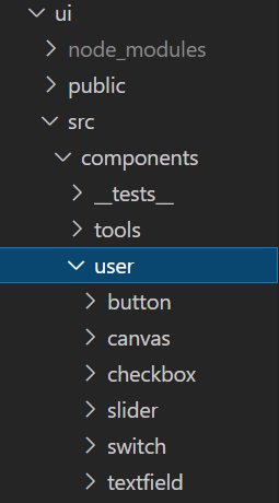
The first step in making a new component is to create a new directory inside ui/src/components/user. Give the directory the same name as the component, e.g. 'button'.
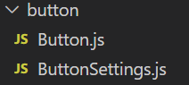
Once the new directory is created, add two files <ComponentName>.js and <ComponentName>Settings.js.
Inside the <ComponentName>.js file, most components will have a similar boilerplate, meaning that the code will need little to no alteration.
This is a general blueprint of a functional component:
export const <ComponentName> = ({ prop1, prop2, prop3... }) => {
    ...
}
The following imports are used for all components:
import { useRef } from 'react'
// Important craft.js hooks
import { useNode, useEditor } from '@craftjs/core'
// For dragging functionality
import Draggable from 'react-draggable'
// Tooltip for components
import { Tooltip } from '../../tools/Tooltip'
// Utility functions
import { handleStop, getX, getY } from '../Utilities'
The general solution of creating a component is to:
- Import the component (from e.g. MUI) and return it inside the functional component.
- Wrap the component in the following way:
<Draggable>
   <div>
      <Tooltip>
<MyComponent>- Add all props.
All functional components will have the following variables:
const { enabled } = useEditor((state) => ({
    enabled: state.options.enabled
}))

const {
    id,
    name,
    connectors: { connect },
    actions
} = useNode((node) => ({
    name: node.data.custom.displayName || node.data.displayName,
}))

const nodeRef = useRef()
And the following return blueprint:
<Draggable
    disabled={!enabled}
    onStop={() => handleStop(actions, nodeRef)}
    nodeRef={nodeRef}
    bounds='parent'
    position={{
        x: getX(pageX, nodeRef),
        y: getY(pageY, nodeRef)
    }}
>
    <div
        style={{ position: 'absolute' }}
        ref={nodeRef}
    >
        <Tooltip
            name={name}
            id={id}
        >
            <MyComponent
                ref={connect}
                {...props}
            >
                {children}
            </MyComponent>
       </Tooltip>
    </div>
</Draggable>
This means that the only thing that needs to be changed here is <MyComponent>.
Lastly, initialise the component using .craft in the following way:
<ComponentName>.craft = {
    displayName: '<ComponentName>',
    props: {
        prop1: ...,
        prop2: ...,
        prop3: ...
    },
    related: {
        toolbar: <ComponentName>Settings
    }
}Now it's time to add code to the settings file.
If you need a refresher on the EditSection and EditItem components, click here.
import { EditSection } from "../../tools/editbox/EditSection"
import { EditItem } from "../../tools/editbox/EditItem"
import React, { useState } from 'react'
import { useNode } from '@craftjs/core'
import { capitalize } from '../Utilities'

export const <ComponentName>Settings = () => {
    const [copied, setCopied] = useState(false)

    const { id } = useNode()

    const copyId = () => {
        setCopied(true)
        navigator.clipboard.writeText(id)
    }

    return (
        <React.Fragment>
            <EditSection
                title='Id'
                summary={id}
            >
                <EditItem
                    type='button'
                    onClick={copyId}
                    disabled={copied}
                >
                    {copied ? 'Copied' : 'Copy'}
                </EditItem>
            </EditSection>
        </React.Fragment>
    )
}
All that needs to be done here is to add an EditSection for every setting that should be available.
Open Toolbox.js inside ui/src/components/tools.
Import and add the newly created component to the three variables components, count, and icons. Add a suitable MUI icon for the component.
Open Home.js and Simulator.js inside ui/src/pages.
Import and add the newly created component to the Editor resolver inside Home and Simulator. An error will appear if this step is not performed.
Try out your new component and make sure that it works as intended.
You're done!