Howto make icons
Thinking how to make icons that were different to the "hyper-realism" or superflat trends, we wanted something easy to understand specially for people migrating from non GNU/Linux systems.
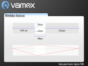
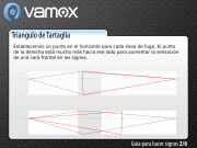
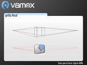
It tooks months to define a good system, a perspective for every icon, small or large. Vamox uses a two-point perspective.

Final design for the perspective by hand (Sept. 2008).
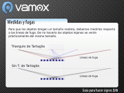
The main issue we had, was that some icons looked distorted. The reason for that is skiping a step in the measure or the object was the cause of this problem, that you can see in other icons [1]

Top: Icons badly drawn.
Bottom: Icons drawn Correctly using Tartaglia's Triangle.
Color palette reduced to some basic color, bright and shadows effects.
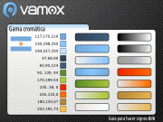
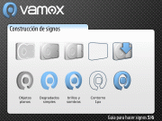
The technique we created to the icons was inspired by "fileteado". we use the main color of the theme, then lights and shadows are added. Finally a contour makes the shape easier to see, and provides contrast for dark or clear backgrounds. Other advantage of the system is, its easier to replace colors to create another theme, by batch replacing the colors using Geany.
[1] I mean Windows Vista icons by Icon Factory