Skip to content

[No QA][INP] Improve UserListItem-Checkbox INP: paint the checkmark optimistically and run the selection update as a transition - #97140

Open
dilshodmackbook-sketch wants to merge 5 commits into
Expensify:mainfrom
dilshodmackbook-sketch:dilshod/fix-94722-checkbox-inp
Open

[No QA][INP] Improve UserListItem-Checkbox INP: paint the checkmark optimistically and run the selection update as a transition#97140
dilshodmackbook-sketch wants to merge 5 commits into
Expensify:mainfrom
dilshodmackbook-sketch:dilshod/fix-94722-checkbox-inp

Conversation

@dilshodmackbook-sketch

@dilshodmackbook-sketch dilshodmackbook-sketch commented Jul 27, 2026

Copy link
Copy Markdown
Contributor

Explanation of Change

Improves the INP of the UserListItem-Checkbox interaction (the selection checkbox on user/list rows). Profiling on a production build (2,000 contacts, /new/chat group multi-select, 4x CPU throttle) showed the tap's next paint is blocked by a single ~51 ms React commit: the selection state update re-runs the whole options pipeline (getValidOptions -> filterAndOrderOptions -> section flattening -> every visible row re-render) synchronously before the toggled checkmark can be shown.

The change splits the tap into an urgent, tiny update and a deferred one — the same urgent-feedback + startTransition split used for the PrevNextButtons-NextButton INP issue (#94721, PR #95737):

  1. ListSelectionButton — the checkmark is painted optimistically on press via local state, so it flips on the tap frame even while the parent's selection update is still pending. The optimistic value is dropped as soon as the item.isSelected prop catches up (state-adjustment-during-render, per the React docs). Since this component backs every SelectionList checkbox/radio, the instant feedback applies app-wide.
  2. NewChatPage.toggleOption — the heavy selection update (setSelectedOptions + setGroupDraft) now runs inside startTransition, so the full pipeline re-render lands one frame later without blocking the tap's paint. Membership is read from a ref tracking the latest selection so back-to-back toggles compose off the newest list instead of a stale render snapshot while a previous transition is still catching up.

The change is behavior-preserving: selection results, group draft contents, search clearing, and focus handling are unchanged; only the scheduling of the re-render moves.

Metrics improvement

Interaction: UserListItem-Checkbox (data-sentry-label).

Captured on a production (staging) web build with the INP-approximating window from the INP Improvement Workflow — 10 samples before and 10 after, /new/chat group multi-select seeded with 2,000 contacts under 4x CPU throttle (recording starts on the checkbox press and stops on the next animation frame after the click):

Average total duration
Before (main) 57.57 ms
After (this PR) 16.75 ms
Diff -40.82 ms (-70.9%)

The ~51 ms options-pipeline commit is moved off the tap frame (optimistic checkmark + startTransition), so the toggled checkmark paints on the press frame and the heavy selection re-render commits one frame later. Selection results are unchanged, so there is no visual or behavioral regression. Full trace details are in this comment.

React Profiler comparator

React Profiler comparator summary

Fixed Issues

$ #94722
PROPOSAL: #94722 (comment)

Tests

  1. Go to FAB > Start chat.
  2. Press "Add to group" on a contact.
  3. Verify the row shows a checked checkbox and the "Next" button appears.
  4. Tap the checkbox of the selected contact to unselect it, then select it again — verify the checkmark toggles instantly on every tap and the selection state (rows, "Next" button) stays correct.
  5. Rapidly tap the same contact's checkbox several times in a row — verify the final checked state matches the number of taps (even taps = unselected, odd = selected) and no contact is duplicated or stuck.
  6. Add several contacts to the group, type in the search field, select/unselect from the filtered results — verify search clearing and selection behave as before.
  7. Continue to the group confirmation page and create the group — verify all selected members are present.
  • Verify that no errors appear in the JS console

Offline tests

Same as Tests — the change only affects render scheduling of local selection state; no network calls are involved. Selection must behave identically while offline.

QA Steps

[No QA] — performance-only change with no user-facing behavior change. The interaction produces the same result in the same order; only the scheduling relative to paint changes, verified by the before/after React Profiler metrics above and the Tests section.

  • Verify that no errors appear in the JS console

PR Author Checklist

  • I linked the correct issue in the ### Fixed Issues section above
  • I wrote clear testing steps that cover the changes made in this PR
    • I added steps for local testing in the Tests section
    • I added steps for the expected offline behavior in the Offline steps section
    • I added steps for Staging and/or Production testing in the QA steps section
    • I added steps to cover failure scenarios (i.e. verify an input displays the correct error message if the entered data is not correct)
    • I turned off my network connection and tested it while offline to ensure it matches the expected behavior (i.e. verify the default avatar icon is displayed if app is offline)
    • I tested this PR with a High Traffic account against the staging or production API to ensure there are no regressions (e.g. long loading states that impact usability).
  • I included screenshots or videos for tests on all platforms
  • I ran the tests on all platforms & verified they passed on:
    • Android: Native
    • Android: mWeb Chrome
    • iOS: Native
    • iOS: mWeb Safari
    • MacOS: Chrome / Safari
  • I verified there are no console errors (if there's a console error not related to the PR, report it or open an issue for it to be fixed)
  • I followed proper code patterns (see Reviewing the code)
    • I verified that comments were added to code that is not self explanatory
    • I verified that any new or modified comments were clear, correct English, and explained "why" the code was doing something instead of only explaining "what" the code was doing.
    • I verified any copy / text that was added to the app is grammatically correct in English. It adheres to proper capitalization guidelines (note: only the first word of header/labels should be capitalized), and is either coming verbatim from figma or has been approved by marketing (in order to get marketing approval, ask the Bug Zero team member to add the Waiting for copy label to the issue)
  • If a new code pattern is added I verified it was agreed to be used by multiple Expensify engineers
  • I followed the guidelines as stated in the Review Guidelines
  • I tested other components that can be impacted by my changes (i.e. if the PR modifies a shared library or component like Avatar, I verified the components using Avatar are working as expected)
  • If a new CSS style is added I verified that:
    • A similar style doesn't already exist
    • The style can't be created with an existing StyleUtils function (i.e. StyleUtils.getBackgroundAndBorderStyle(theme.componentBG))
  • If new assets were added or existing ones were modified, I verified that:
    • The assets are optimized and compressed (for SVG files, run npm run compress-svg)
    • The assets load correctly across all supported platforms.
  • If the PR modifies code that runs when editing or sending messages, I tested and verified there is no unexpected behavior for all supported markdown - URLs, single line code, code blocks, quotes, headings, bold, strikethrough, and italic.
  • If the PR modifies a generic component, I tested and verified that those changes do not break usages of that component in the rest of the App (i.e. if a shared library or component like Avatar is modified, I verified that Avatar is working as expected in all cases)
  • If the PR modifies a component related to any of the existing Storybook stories, I tested and verified all stories for that component are still working as expected.
  • If the PR modifies a component or page that can be accessed by a direct deeplink, I verified that the code functions as expected when the deeplink is used - from a logged in and logged out account.
  • If the PR modifies the UI (e.g. new buttons, new UI components, changing the padding/spacing/sizing, moving components, etc) or modifies the form input styles:
    • I verified that all the inputs inside a form are aligned with each other.
    • I added Design label and/or tagged @Expensify/design so the design team can review the changes.
  • I added unit tests for any new feature or bug fix in this PR to help automatically prevent regressions in this user flow.
  • If the main branch was merged into this PR after a review, I tested again and verified the outcome was still expected according to the Test steps.

Screenshots/Videos

Android: Native
Screen.Recording.2026-07-28.at.18.43.13.mov
Android: mWeb Chrome
94722-android-mweb-chrome.mp4
iOS: Native
Screen.Recording.2026-07-28.at.19.08.18.mov
iOS: mWeb Safari
94722-ios-mweb-safari.mp4
MacOS: Chrome / Safari
94722-macos-chrome.mp4

@dilshodmackbook-sketch dilshodmackbook-sketch changed the title Improve UserListItem-Checkbox INP: paint the checkmark optimistically and run the selection update as a transition [No QA][INP] Improve UserListItem-Checkbox INP: paint the checkmark optimistically and run the selection update as a transition Jul 28, 2026
@dilshodmackbook-sketch
dilshodmackbook-sketch marked this pull request as ready for review July 28, 2026 07:58
@dilshodmackbook-sketch
dilshodmackbook-sketch requested review from a team as code owners July 28, 2026 07:58
@melvin-bot
melvin-bot Bot requested a review from aimane-chnaif July 28, 2026 07:59
@melvin-bot

melvin-bot Bot commented Jul 28, 2026

Copy link
Copy Markdown

@aimane-chnaif Please copy/paste the Reviewer Checklist from here into a new comment on this PR and complete it. If you have the K2 extension, you can simply click: [this button]

@melvin-bot
melvin-bot Bot requested review from joekaufmanexpensify and removed request for a team July 28, 2026 07:59
@dilshodmackbook-sketch

Copy link
Copy Markdown
Contributor Author

@codex review

@chatgpt-codex-connector chatgpt-codex-connector Bot left a comment

Copy link
Copy Markdown

Choose a reason for hiding this comment

The reason will be displayed to describe this comment to others. Learn more.

💡 Codex Review

Here are some automated review suggestions for this pull request.

Reviewed commit: df2eb9eb10

ℹ️ About Codex in GitHub

Codex has been enabled to automatically review pull requests in this repo. Reviews are triggered when you

  • Open a pull request for review
  • Mark a draft as ready
  • Comment "@codex review".

If Codex has suggestions, it will comment; otherwise it will react with 👍.

When you sign up for Codex through ChatGPT, Codex can also answer questions or update the PR, like "@codex address that feedback".

onPress={() => onSelectRow(item)}
isChecked={isChecked}
onPress={() => {
setOptimisticChecked(!isChecked);

Copy link
Copy Markdown

Choose a reason for hiding this comment

The reason will be displayed to describe this comment to others. Learn more.

P2 Badge Preserve checked state for selected radio rows

Because this shared button also backs ListRadioButton, tapping an already-selected radio now runs setOptimisticChecked(!isChecked) and immediately renders it unchecked. In single-select pickers that stay on the page and leave the value unchanged on a repeated tap (for example the spend rule merchant match-type selector, whose handler just calls setMatchType(item.value)), item.isSelected never changes, so the reset block does not run and the selected radio remains visually unchecked until another option/remount changes the prop. Restrict this optimistic toggle to checkboxes or avoid inverting an already-checked radio.

Useful? React with 👍 / 👎.

Copy link
Copy Markdown
Contributor Author

Choose a reason for hiding this comment

The reason will be displayed to describe this comment to others. Learn more.

Good catch. Fixed in the latest commit. Since a radio press only ever selects (never toggles off), the optimistic paint now sets true for radios instead of inverting the current value, so re-pressing an already-selected radio keeps it checked. Only checkboxes flip. Added a unit test covering the re-press-selected-radio case.

dilshodmackbook-sketch and others added 2 commits July 28, 2026 13:09
The optimistic checkmark also backs radio rows. Re-pressing an already-
selected radio inverted it to unchecked, and since its isSelected prop
never changes the reset never fired, leaving it stuck unchecked. A radio
press only ever selects, so paint it checked instead of toggling.

Co-Authored-By: Claude Opus 4.8 (1M context) <noreply@anthropic.com>
@codecov

codecov Bot commented Jul 28, 2026

Copy link
Copy Markdown

Codecov Report

✅ Changes either increased or maintained existing code coverage, great job!

Files with missing lines Coverage Δ
...s/SelectionList/components/ListSelectionButton.tsx 100.00% <100.00%> (ø)
src/pages/NewChatPage/index.tsx 81.48% <80.95%> (+3.00%) ⬆️
... and 729 files with indirect coverage changes

@dilshodmackbook-sketch

Copy link
Copy Markdown
Contributor Author

@codex review

@chatgpt-codex-connector chatgpt-codex-connector Bot left a comment

Copy link
Copy Markdown

Choose a reason for hiding this comment

The reason will be displayed to describe this comment to others. Learn more.

💡 Codex Review

Here are some automated review suggestions for this pull request.

Reviewed commit: d136ff4b4c

ℹ️ About Codex in GitHub

Codex has been enabled to automatically review pull requests in this repo. Reviews are triggered when you

  • Open a pull request for review
  • Mark a draft as ready
  • Comment "@codex review".

If Codex has suggestions, it will comment; otherwise it will react with 👍.

When you sign up for Codex through ChatGPT, Codex can also answer questions or update the PR, like "@codex address that feedback".

Comment on lines +351 to +352
startTransition(() => {
setSelectedOptions(newSelectedOptions);

Copy link
Copy Markdown

Choose a reason for hiding this comment

The reason will be displayed to describe this comment to others. Learn more.

P2 Badge Build the draft from the latest selection

When a user already has at least one selected member, the Next button remains tappable while this new transition is still pending. In the slow-list case this change targets, tapping “Add to group” for another user and then quickly tapping Next can run createGroup from the previous render, which rebuilds NEW_GROUP_CHAT_DRAFT from stale selectedOptions and can overwrite the draft without the just-added participant. Use latestSelectedOptionsRef.current for confirmation, or otherwise prevent confirmation until the deferred selection has committed.

Useful? React with 👍 / 👎.

Copy link
Copy Markdown
Contributor Author

Choose a reason for hiding this comment

The reason will be displayed to describe this comment to others. Learn more.

Good catch. Fixed - createGroup now reads from latestSelectedOptionsRef.current instead of the render snapshot, so tapping "Add to group" and then quickly tapping Next while the deferred selection transition is still pending rebuilds the draft from the newest list (including the just-added participant), rather than a stale selectedOptions.

Comment on lines +59 to +62
if (prevCheckedProp !== isCheckedProp) {
setPrevCheckedProp(isCheckedProp);
setOptimisticChecked(null);
}

Copy link
Copy Markdown

Choose a reason for hiding this comment

The reason will be displayed to describe this comment to others. Learn more.

P2 Badge Reset optimistic checks when rows are recycled

This reset only watches item.isSelected, so an optimistic value survives if the same component instance receives a different item with the same selected state. SelectionList rows are rendered through FlashList and can be recycled during filtering/scrolling; after pressing an unchecked row, a recycled cell for another unchecked row will keep optimisticChecked === true and display the wrong checkmark until some later selection prop change. Track item.keyForList/identity as part of the reset as well.

Useful? React with 👍 / 👎.

Copy link
Copy Markdown
Contributor Author

Choose a reason for hiding this comment

The reason will be displayed to describe this comment to others. Learn more.

Good catch. Fixed - the reset now tracks item.keyForList identity alongside isSelected, so when FlashList recycles a cell to a different item with the same selected state the stale optimisticChecked is dropped instead of leaking onto the recycled row. Added a unit test covering the recycle-to-different-item case.

… latest selection

Address two Codex P2 findings:
- ListSelectionButton: the optimistic-check reset only watched item.isSelected,
  so a FlashList-recycled cell could keep a stale optimisticChecked=true and show
  the wrong checkmark. Track item.keyForList identity in the reset too.
- NewChatPage.createGroup: read from latestSelectedOptionsRef so tapping "Add to
  group" then quickly Next (while the deferred selection transition is still
  pending) doesn't rebuild the draft from a stale selectedOptions snapshot.

Co-Authored-By: Claude Opus 4.8 (1M context) <noreply@anthropic.com>
@joekaufmanexpensify

Copy link
Copy Markdown
Contributor

No product review needed.

@joekaufmanexpensify
joekaufmanexpensify removed their request for review July 28, 2026 20:59
@dilshodmackbook-sketch

Copy link
Copy Markdown
Contributor Author

@aimane-chnaif Gentle bump - the PR is ready for review whenever you get a chance. Thanks!

@aimane-chnaif

Copy link
Copy Markdown
Contributor

@codex review

@aimane-chnaif

Copy link
Copy Markdown
Contributor

Reviewer Checklist

  • I have verified the author checklist is complete (all boxes are checked off).
  • I verified the correct issue is linked in the ### Fixed Issues section above
  • I verified testing steps are clear and they cover the changes made in this PR
    • I verified the steps for local testing are in the Tests section
    • I verified the steps for Staging and/or Production testing are in the QA steps section
    • I verified the steps cover any possible failure scenarios (i.e. verify an input displays the correct error message if the entered data is not correct)
    • I turned off my network connection and tested it while offline to ensure it matches the expected behavior (i.e. verify the default avatar icon is displayed if app is offline)
  • I checked that screenshots or videos are included for tests on all platforms
  • I included screenshots or videos for tests on all platforms
  • I verified that the composer does not automatically focus or open the keyboard on mobile unless explicitly intended. This includes checking that returning the app from the background does not unexpectedly open the keyboard.
  • I verified tests pass on all platforms & I tested again on:
    • Android: HybridApp
    • Android: mWeb Chrome
    • iOS: HybridApp
    • iOS: mWeb Safari
    • MacOS: Chrome / Safari
  • If there are any errors in the console that are unrelated to this PR, I either fixed them (preferred) or linked to where I reported them in Slack
  • I verified proper code patterns were followed (see Reviewing the code)
    • I verified that comments were added to code that is not self explanatory
    • I verified that any new or modified comments were clear, correct English, and explained "why" the code was doing something instead of only explaining "what" the code was doing.
    • I verified any copy / text that was added to the app is grammatically correct in English. It adheres to proper capitalization guidelines (note: only the first word of header/labels should be capitalized), and is either coming verbatim from figma or has been approved by marketing (in order to get marketing approval, ask the Bug Zero team member to add the Waiting for copy label to the issue)
  • If a new code pattern is added I verified it was agreed to be used by multiple Expensify engineers
  • I verified that this PR follows the guidelines as stated in the Review Guidelines
  • I verified other components that can be impacted by these changes have been tested, and I retested again (i.e. if the PR modifies a shared library or component like Avatar, I verified the components using Avatar have been tested & I retested again)
  • If a new component is created I verified that:
    • A similar component doesn't exist in the codebase
    • All props are defined accurately
    • The component has a clear name that is non-ambiguous and the purpose of the component can be inferred from the name alone
    • The only data being stored in the state is data necessary for rendering and nothing else
    • The component has the minimum amount of code necessary for its purpose, and it is broken down into smaller components in order to separate concerns and functions
  • If a new CSS style is added I verified that:
    • A similar style doesn't already exist
    • The style can't be created with an existing StyleUtils function (i.e. StyleUtils.getBackgroundAndBorderStyle(theme.componentBG)
  • If the PR modifies code that runs when editing or sending messages, I tested and verified there is no unexpected behavior for all supported markdown - URLs, single line code, code blocks, quotes, headings, bold, strikethrough, and italic.
  • If the PR modifies a generic component, I tested and verified that those changes do not break usages of that component in the rest of the App (i.e. if a shared library or component like Avatar is modified, I verified that Avatar is working as expected in all cases)
  • If the PR modifies a component related to any of the existing Storybook stories, I tested and verified all stories for that component are still working as expected.
  • If the PR modifies a component or page that can be accessed by a direct deeplink, I verified that the code functions as expected when the deeplink is used - from a logged in and logged out account.
  • If the PR modifies the UI (e.g. new buttons, new UI components, changing the padding/spacing/sizing, moving components, etc) or modifies the form input styles:
    • I verified that all the inputs inside a form are aligned with each other.
    • I added Design label and/or tagged @Expensify/design so the design team can review the changes.
  • For any bug fix or new feature in this PR, I verified that sufficient unit tests are included to prevent regressions in this flow.
  • If the main branch was merged into this PR after a review, I tested again and verified the outcome was still expected according to the Test steps.
  • I have checked off every checkbox in the PR reviewer checklist, including those that don't apply to this PR.

Screenshots/Videos

Android: HybridApp
Android: mWeb Chrome
iOS: HybridApp
iOS: mWeb Safari
MacOS: Chrome / Safari

@chatgpt-codex-connector chatgpt-codex-connector Bot left a comment

Copy link
Copy Markdown

Choose a reason for hiding this comment

The reason will be displayed to describe this comment to others. Learn more.

💡 Codex Review

Here are some automated review suggestions for this pull request.

Reviewed commit: 8d4940fd56

ℹ️ About Codex in GitHub

Codex has been enabled to automatically review pull requests in this repo. Reviews are triggered when you

  • Open a pull request for review
  • Mark a draft as ready
  • Comment "@codex review".

If Codex has suggestions, it will comment; otherwise it will react with 👍.

When you sign up for Codex through ChatGPT, Codex can also answer questions or update the PR, like "@codex address that feedback".

Comment thread src/pages/NewChatPage/index.tsx Outdated
// Read membership from the latest selection (not the item or a render snapshot) so rapid toggles stay
// correct while the deferred list update below is still catching up to a previous press.
const currentSelectedOptions = latestSelectedOptionsRef.current;
const isOptionInList = currentSelectedOptions.some((selectedOption) => selectedOption.login === option.login);

Copy link
Copy Markdown

Choose a reason for hiding this comment

The reason will be displayed to describe this comment to others. Learn more.

P2 Badge Make stale Add presses idempotent

When the list render is slow enough that the transition has not committed yet, the stale Add to group button is still visible after the first press. A second tap on that same visible Add button now sees the option in latestSelectedOptionsRef.current and takes the removal branch, so the user’s retry/double-tap silently cancels the pending add even though the UI never changed to a remove control. Treat presses from an unselected Add button as an add, or disable/optimistically replace the button until the deferred selection render catches up.

Useful? React with 👍 / 👎.

Comment thread src/pages/NewChatPage/index.tsx Outdated
// Read from the latest-selection ref (not the render snapshot): the Next button stays tappable while the
// deferred selection transition is still pending, so tapping "Add to group" then quickly Next must not rebuild
// the draft from a stale selectedOptions that drops the just-added participant.
const selectedParticipants: SelectedParticipant[] = latestSelectedOptionsRef.current.map((option) => ({

Copy link
Copy Markdown

Choose a reason for hiding this comment

The reason will be displayed to describe this comment to others. Learn more.

P2 Badge Guard confirmation after the last member is removed

If the only selected member is unchecked, toggleOption updates latestSelectedOptionsRef.current to an empty list immediately, but the Next button is hidden only by the deferred setSelectedOptions transition. During that pending window the stale Next button can still be tapped, and this code then writes a draft containing only the current user and navigates to the group confirmation page. Return early when the latest selection is empty, or gate/disable confirmation from the same latest-selection source.

Useful? React with 👍 / 👎.

@MelvinBot

Copy link
Copy Markdown
Contributor

Review — looks solid ✅

I reviewed the code, checked the app-wide blast radius of the shared ListSelectionButton change, and drove the group multi-select flow on web. No blocking issues.

What's good

  • The optimistic-feedback + startTransition split mirrors the accepted PrevNextButtons precedent, and the comments explain the why clearly.
  • toggleOption reading and advancing latestSelectedOptionsRef synchronously correctly composes back-to-back taps off the newest list, and createGroup reading the same ref avoids building the draft from a stale snapshot.
  • Strong test coverage — the new ListSelectionButtonTest covers optimistic paint, drop-on-prop-catchup, second-press revert, FlashList recycle reset, and radio-stays-checked; the added NewChatPage test covers the deferred-toggle semantics. All CI green, 100% patch coverage on the new component.

Verification I ran

  • Live web test of Start chat → group multi-select: single toggle, unselect/re-select, rapid-tap parity (4 taps → unselected, 5 → selected), and a 3-member confirm page all behaved correctly — no stuck or duplicated checkmarks, no visible error state.
  • Blast-radius check: since ListSelectionButton backs every SelectionList checkbox/radio, I checked whether any list can reject a press while leaving the row rendered (which would strand the optimistic value). Found none — the multi-select handlers I sampled flip isSelected unconditionally, and the two real selection caps (SPLITS_LIMIT, BULK_DUPLICATE_LIMIT) are enforced off the row-press path / on rows that don't use ListSelectionButton.

One boundary condition worth noting (non-blocking)
The optimistic checkmark only self-corrects when the row's isSelected eventually changes (or its keyForList identity changes). That invariant holds across the app today, but it's an implicit contract of this component now: if a future list ever rejects/caps a checkbox press while keeping the row visible, the checkmark would stick to the optimistic value until the row re-renders differently. The closest existing paths are the !isFocused early-return and the small-screen onSelectionButtonPress branch in BaseSelectionList.selectRow — both flip selection in normal use, so no bug today. A one-line comment documenting the contract on ListSelectionButton would be a nice-to-have.

Minor observations
  • setGroupDraft(...) inside startTransition (toggleOption): startTransition only lowers the priority of React state updates scheduled in its callback. The Onyx write in setGroupDraft isn't actually deferred by it — it runs synchronously when the callback executes. Harmless (the intended deferral of setSelectedOptions still works), just noting it isn't buying anything for the Onyx call.
  • isOptionInList now uses .some((sel) => sel.login === option.login) (here). This is more consistent with the reject(...) removal (which already matched on login), which is good — but it does assume every selectable option has a defined login (two undefined logins would compare equal). Not reachable for the contact lists here; just flagging the assumption.

Nice, careful PR — the comments and tests made it easy to follow.

Test evidence (web)

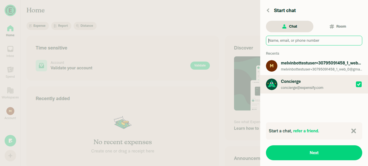
Add to group → checked checkbox + Next button
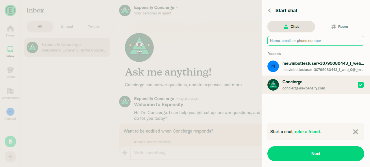
Concierge row selected via Add to group, checked checkbox and Next button visible

Three contacts selected — all checked, no duplicates
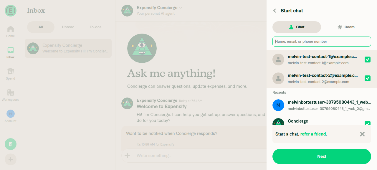
Three contacts selected, all checkboxes checked, no duplicates

Group confirm page lists all selected members
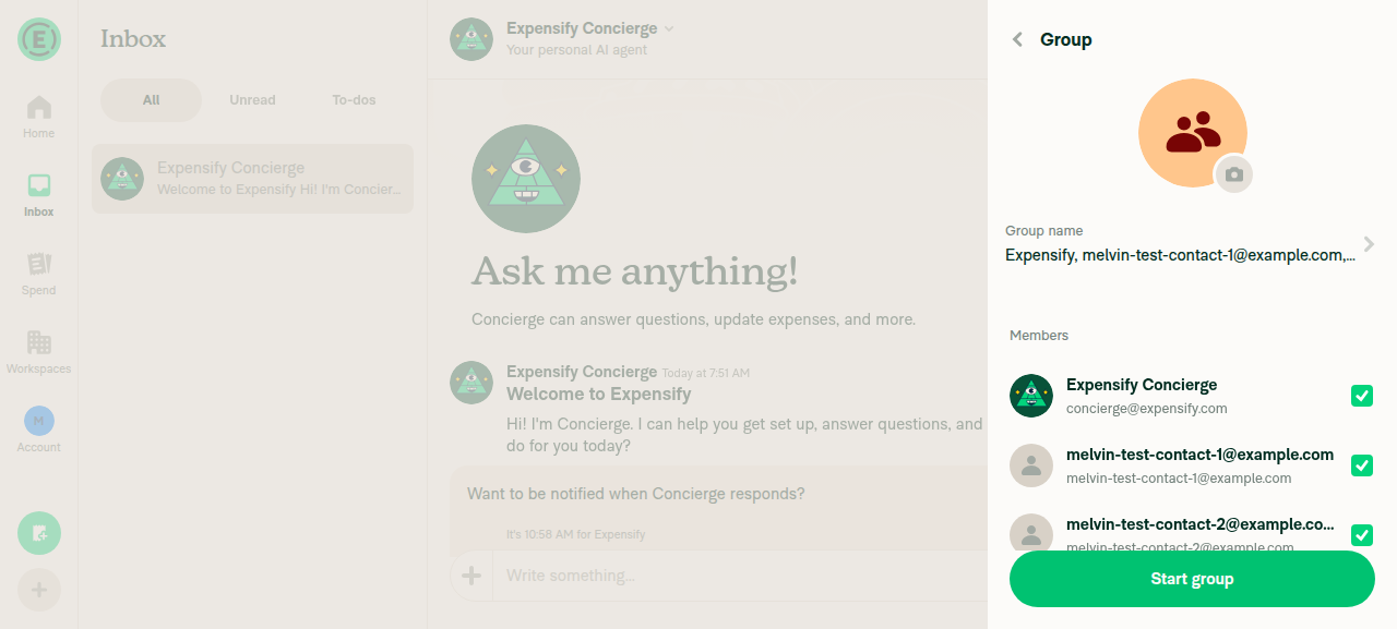
Group confirm page listing all selected members with checked checkboxes

@MelvinBot

Copy link
Copy Markdown
Contributor

Regression hunt

I traced the app-wide blast radius of the shared ListSelectionButton change and drove several non-group-chat SelectionList surfaces on web. One genuine (narrow) correctness regression, plus one cosmetic sub-frame nit. Everything else is clean.

🐞 Regression — NewChatPage.toggleOption misclassifies login-less options

toggleOption now decides membership purely by login equality at NewChatPage/index.tsx:329 (and the removal reject at L334). Because undefined === undefined is true, two distinct options that both have login: undefined compare as equal.

The old code gated the add/remove branch on the item's own !!option.isSelected flag, so an unselected login-less option was always correctly added. The new some((o) => o.login === option.login) check means: once one login-less option is selected, pressing a different login-less option is misclassified as "already in list" and takes the remove branch — it drops the first option instead of adding the second.

Repro: enter group mode (via a normal login-bearing user), then from the row body select two different 1:1 DMs whose participants both lack a login. Login-less 1:1 DMs survive the option filter into recentReports, and in group mode a row-body press routes to toggleOption at L391 regardless of login. The second press removes the first instead of adding the second.

Severity: narrow — needs 2+ login-less selectable DMs (uncommon; can also surface transiently while personal details are still loading), frontend-only. Note the removal path already collided on login pre-PR; this PR extends the collision to the add path.

Suggested fix: when login is empty, fall back to a stable identity (accountID / reportID / keyForList) for both the membership check and the reject, rather than matching on login alone.

🟡 Very minor — sub-frame double-check on Onyx-backed radio lists (cosmetic, not stuck)

A pressed radio paints optimisticChecked = true immediately, while the previously-selected radio only unchecks when its isSelected flips false. For radio lists whose isSelected comes from a synchronously-updated source (draft/local state) both flip in the same render — never two checked. For an Onyx-backed radio list that stays mounted (e.g. WorkspaceSettlementFrequencyPage), there's a ≤1-frame window where both the old and new option show checked before the Onyx update propagates. It self-corrects on the next microtask — not stuck, not persistent, purely cosmetic. Live radio tests (Theme, Language, Priority mode) never showed two checked at once.

Risks checked that are NOT regressions
  • Disabled rows — a disabled press cannot reach the new onPress: disabled is gated at every entry point in GenericPressable (onPress/onKeyDown set to undefined when disabled), and the optimistic flip lives inside that gated handler. ✅ Verified live: the disabled self (You) row in group mode never becomes checked on tap.
  • Async / Onyx-backed pickers (theme, priority mode, settlement frequency) — onSelectRow dispatches an action whose optimisticData flips the Onyx value immediately, so item.isSelected catches up in the same cycle and the optimistic override is dropped. On a server rejection, failureData reverts and the row honestly re-renders from the reverted isSelected — it does not get stuck.
  • Missing keyForListkeyForList is a required typed field and is already the FlashList key everywhere; a missing key would break focus/scroll before it could leak an optimistic checkmark. Theoretical only.
  • Radio permanent double-check — no radio list found where selecting a new option leaves the old one permanently checked (see the sub-frame nit above for the only transient case).
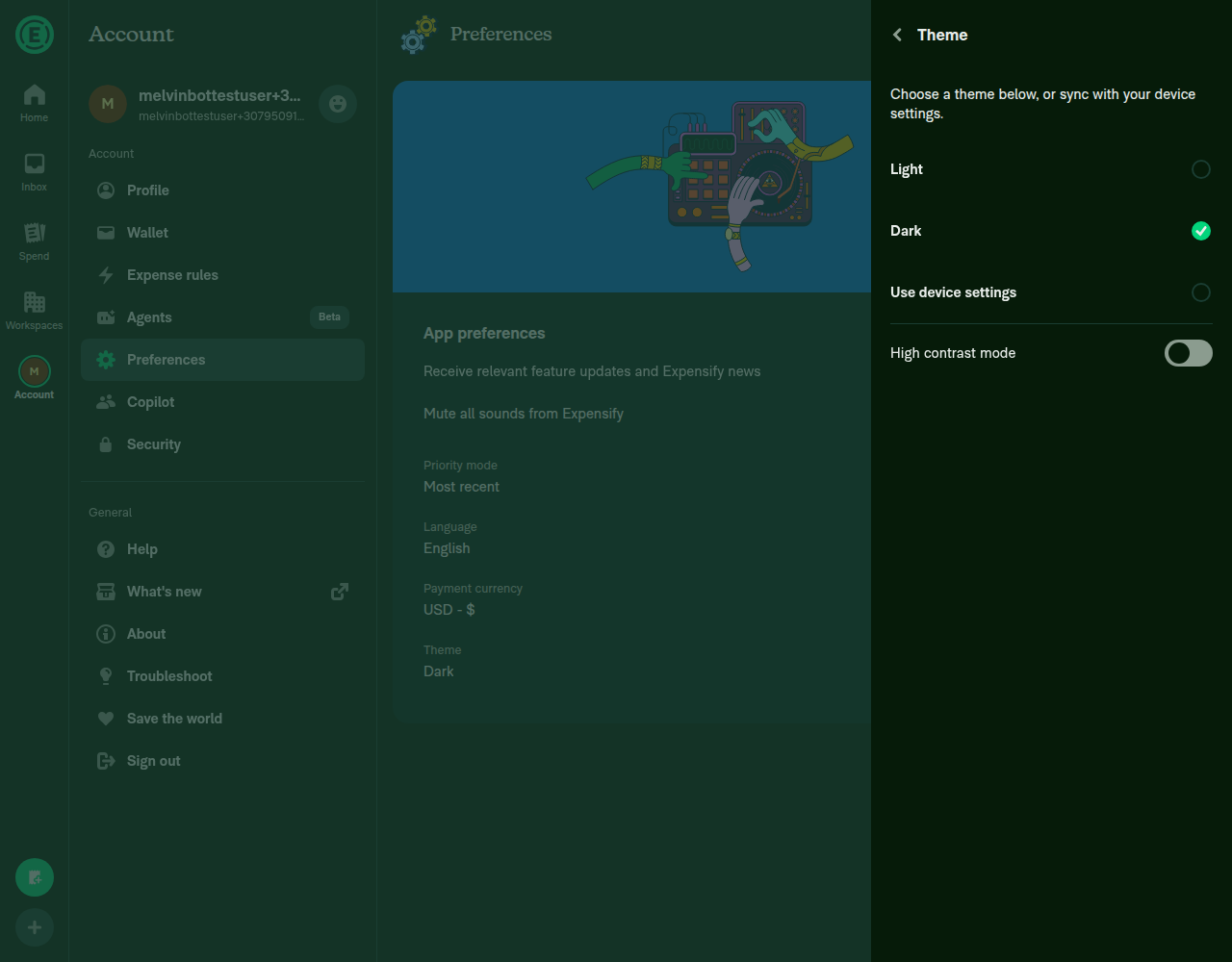
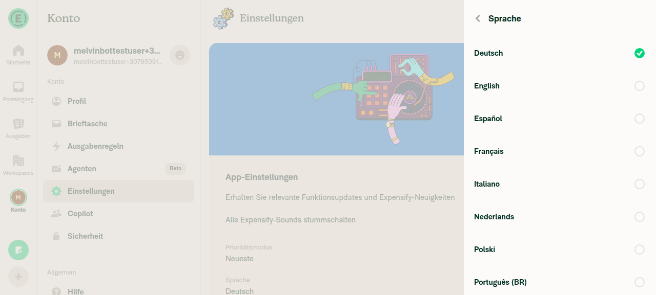
Live test evidence (web — Theme/Language/Priority radios + disabled self row)

Radio lists showed exactly one selection at all times across repeated switches; the disabled self row never became checked.

Theme radio — exactly one option selected

Theme radio list — exactly one option selected

Language radio — single selection, no double-check

Language radio list — single selection, no double-check

Disabled self row in group mode — no checkmark on tap

Disabled self row in group mode — no checkmark appears on tap

Net: safe to ship for the primary flow; I'd address the login-less toggleOption collision (or confirm login-less selectable DMs can't occur here) before merge.

- A re-press on a still-visible Add to group button while the deferred
  selection update is pending now stays an idempotent add instead of
  silently cancelling the pending one; removal intent comes from the
  pressed row's rendered state.
- createGroup returns early when the latest selection is empty, so a
  stale Next press right after removing the last member no longer
  builds a draft containing only the current user.
- Membership matching falls back to accountID/reportID for login-less
  options so two distinct login-less DMs no longer collide on
  undefined === undefined.

Co-Authored-By: Claude Fable 5 <noreply@anthropic.com>
@dilshodmackbook-sketch

Copy link
Copy Markdown
Contributor Author

Addressed in 865a2b0: membership matching now falls back to accountID/reportID for login-less options, so two login-less DMs no longer collide on login equality. Same commit also makes a re-press on a stale "Add to group" button an idempotent add and guards createGroup against confirming with an empty latest selection. Added regression tests for all three cases.

@dilshodmackbook-sketch

Copy link
Copy Markdown
Contributor Author

Done.

Sign up for free to join this conversation on GitHub. Already have an account? Sign in to comment

Labels

None yet

Projects

None yet

Development

Successfully merging this pull request may close these issues.

4 participants