CSS guideline

- FLOCSS
- Naming rules for files and classes
- BEM
Foundation Layout Object CSS - design concept that takes advantage of OOCSS, BEM, and SMACSS. CSS design concept often used in Japan devised by Hiroki tani CSS organization methodology.
style
   └── foundation                /* Manages the default style of the entire site
   |     ├── _reset.sass
   |     ├── _base.sass
   |     ├── _variable.sass      /* Variables that can be used throughout the site
   |     └── _mixins.sass        /* Manages mixns that can be used throughout the site
   └── layout                    /* Manages areas that make up each page and common to the entire site
   |     ├── _base.sass
   |     ├── _variable.sass
   |     └── _mixins.sass
   └── object                    /* Manages modules with reusable throughout the entire site patterns
         ├── component           /* Manages small units of modules (buttons, etc.)
         |     ├── button.sass
         |     ├── card.sass
         |     ...
         ├── project             /* Manages a big unit module composed of several ↑ components and other elements
         |     ├── _card.sass
         |     ├── _profile.sass
               ...
         ├── utility             /* Manages styles that cannot be solved by Component and Project modifiers (patterns) and useful classes for adjustment.
         |     ├── _utility.sass
         |     ├── _color.sass
         |     ├── _margin.sass
         |     └── _padding.sass
         └── theme               /* Color switching by theme, different colors for page units
               ├── _blue.sass
               ...
Manages default style of the entire site
| File | Contains |
|---|---|
| _reset.sass | Defines css to reset the default style of the browser. |
| _base.sass | Defines style, which is the basic foundation when constructing a site. |
- Basically, the style should be defined in the tag itself.
- Keep in mind that it will be minimally displayed even without a class.
Manages the styles of headers, main content areas, sidebars, footers, etc., that make up each page, for each area.
- Define the style for the layout as seen from the entire page
- Only the outer frame is defined. Do not include child elements as much as possible
- The contents of the header and footer are defined by p-
//Style for layout as seen from the entire page

.l-header
  position: fixed
  top: 0
  left: 0
  z-index: 100
  width: 100%

//Style of the header part
.p-header
  display: flex
  &__logo
    width:100px
height:50px| File | Contains |
|---|---|
| _header.sass | Defines the style of the header. l-nav.sass - depending on the screen structure, nav may be included in l-header as p-nav, but if the outline of l- is easier to do, Layout is okay. |
| _main.sass | Defines a common style for the main content area - Offsets and margins for fixed headers, etc. - Here, only the common top, bottom, left, and right margins are defined. |
| _container.sass | Specifies the content width in the main area of the site. |
| _footer.sass | Define the style of the footer area. |
All repeating visual patterns throughout the site are defined as Objects.
-
-
Defines a small unit module as a reusable pattern.
_button.sass _grid.sass _input.sass -
!!! Margins and positions are not defined !!!. They should be treated as parts to the last
<div className="c-card">
  <div className="c-card__button c-button"></div>
</div>
//Bad
.c-button
  margin-bottom: 30px
  margin-left: 20px

//Good
.c-card
  display: flex
  &__button
    margin-bottom: 30px
    margin-left: 20px
-
Flexbox layout system is also componentized.
- The flexbox layout system (row, col etc. in Bootstrap4) seems to be managed as Layout, but it is managed as Component.
- The reason is that it is not always a common area on each page.
- Container is definitely on the page, but the row is not always there. It comes out without regularity, so don't make it Layout.
-
-
- Flexbox layout system is also componentized.
- Manages what is composed of several Components and elements that do not correspond to them.
In other words:
- when you want to collect small units of Components and treat them as one Object
- when the Object is too large to be a Component
-
-
Difference between Component and Project - Ozlink LAB | Marketing Agency Co., Ltd. Oz link
-
Problems and solutions in CSS design using FLOCSS - Qiita
-
Let’s suppose a small unit be a Component and a collection of Components to be a Project.
-
Since Component must be treated as a Project (aggregate), it is recommended to give the class name that represents the hierarchy to the text or icon class name as a Project.
-
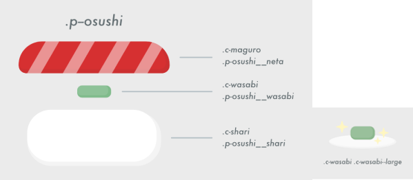
Example (when changing the material, assume that sushi is a component)
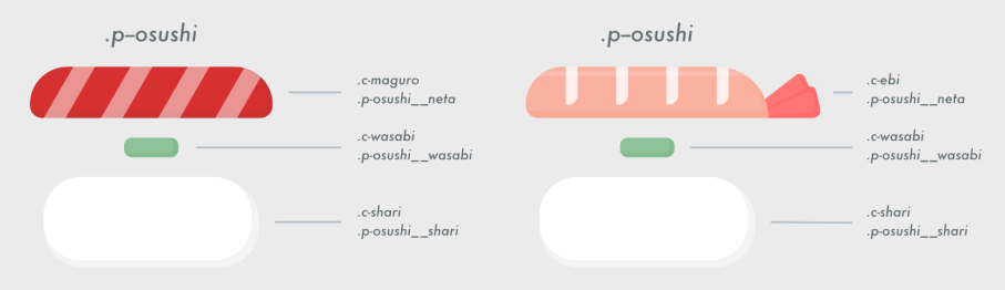
- (When increasing wasabi) ↓ By doing this, you can use [Wasabi large serving] many times alone.
-
-
-
_hidden.sass _color.sass _fontsize.sass _clearfix.sass- Prevents the number of Components and Project Objects from increasing unnecessarily.
- The role of creating a space between adjacent modules such as .u-mb10 {margin-bottom: 10px;} instead of the margin that the Object itself should not have.
- Not all margins should be added in the Utility class.
- It should only serve as an aid. Used when there are few elements to define as Project or when use component alone.
-
Filenames start with a (_) underscore, according to the rails asset pipeline style.
//File name _header.sass _footer.sass _button.sass _card.sass -
Prefix - Put a prefix with {initial letter} +- (hyphen) in the class name to make it easier to judge which one is which, such as l- for layout and c- for Component.
//class name
.l-header
.l-footer
.c-button
.p-card
-
Do not use abbreviations and short names. The names should reflect the purpose of the component and be understandable.
//bad
.c-nb

//good
.c-navigation-bar
BEM (Block, Element, Modifier) is a component-based approach to web development. The idea behind it is to divide the user interface into independent blocks. This makes interface development easy and fast even with a complex UI, and it allows reuse of existing code without copying and pasting.
- BEM Quick start - Introduction
- Differences in naming conventions between BEM and MindBEMding - MindBEMding
-
Block with element
.block
  span.block__element
- Usually, id is not used and it's specified by class.
- Block is the smallest part of UI.
- Element indicates the component of block.
- The block and element are connected by two underscores.
-
Block with modifiers
.block.block--modifier
  span.block__element.block__element--modifier
- modifier indicates a version difference or a temporary state.
- modifier is connected with two hyphens.
- modifier can be attached to both block and element.
-
Element nesting is prohibited!
-
The names don’t depend on the DOM nesting.
-
It's an anti-pattern because the element dependencies get more complicated.
// Bad
.block
  ul.block__list
    li.block__list__item
-
There are two correct methods. Please use them properly according to the situation.
// Good
.block
  ul.block__list
    li.block__list-item
It's OK to have element of the same level inside element as in correct pattern 1. In this case, the list cannot be reused outside the block.
// Good
.block
  .block__list
    ul.list
      li.list__item
Also, it is OK to put another block inside the block like in the correct pattern 2. In this case, list can be reused as a similar UI part outside the block.
-
-
Blocks can include other blocks
// Good
.block
  .block__element.another-block
    .another-block__element
-
If a block is element of another block - we can set only position & visibility parameters to the element(position, display, visibility, opacity, margin, top, left, right, bottom). If we need to change styles, please use modifiers or create another block!
.another-block
  .another-block__element.block
    .block__element
// Bad
.another-block
  &__element
    color: #556454

// Bad
.block
  margin-left: 30px

// Bad
.another-block
  .block__element
    margin-left: 30px
    color: #536565

// Good
.another-block
  &__element
    margin-left: 30px

.block
  color: #fff
  &--green
    color: #556454
  &__element
    background: #fff
-
Use element outside the block is prohibited!
// Bad
.block
  p.block__element

.another-block
  .another-block__element
  p.block__element   /* It's prohibited! Element can`t be use outside the block.
-
Please never mix blocks! The styles for the block should always be in one place. If we need modification, we can use modifiers, or create another block. Mixing blocks will always lead to bugs in the future and uncontrolled behavior!!
// Bad - profile page and media component styles mix
.p-profile.c-media
  img.p-profile__avatar.c-media__image src="user.jpg"
  .c-media__body

// Good
.p-profile--media
   img.p-profile__avatar
   .p-profile__body

// Good
.p-profile
  .p-profile__media.c-media
    img.c-media__avatar
  .p-profile__body
-
Cascading is a mechanism that defines the "strength" relationship of declarations when there are multiple declarations for a property of an element so that only one of them is valid.
-
Cascading between modules and cascading using selectors whose parents are other modules is prohibited.
-
This is because it should be able to be reused independently as a module without depending on a specific module, and by mixing it should not behave unexpectedly for other developers. In other words, it is NG to define a style in another Project that has a Project as a parent as shown below.
// Example of bad component
.c-button
   color: #321234
   …

.c-dialog > .c-button
  color: 355444
/*Only the style for c-button that has c-dialog as a parent is specified! No good!*/
However, it is OK for Project to change Component's When managing a group of Components as an Object in Project, you may change the Component that has Project as the parent to adjust the margins etc. when defining it, but be sure to change the class name.
// Good
.c-button
   &--green
     color: #554545
 …

.c-dialog
   &__button
     margin-top: 30px
-
You can add up to two modifier classes.
<!--Button-->
button.c-button

<!--Button color difference + size difference modifier-->
button.c-button.c-button--blue.c-button--small
-
Please, don`t use @extend for blocks. It speeds up writing, but will create some problems in the future and is difficult to understand and find all styles and dependences. For example, if we change the styles of the block and some other blocks are inherited it, we will get some bugs.
// Not good
.c-button
  ...
.c-button--blue
  @extend .c-button
  background-color: blue

// Good
.c-button  // in layout (.c-button.c-button--blue)
  &--blue
    background-color: blue
-
Please use modifiers or create a new block instead @extend. BEM modifiers: multiple classes vs @extend
-
You should put 'is-' in prefix and define it.
-
In this case, in order to prevent the style from being applied to changes to other Objects, do not define the style in is-click itself, but always define the style in .c-button.is-click.
<!--Button-->
button.c-button.is-click