Skip to content

new design #1#2

Merged
atrisovic merged 1 commit into
IQSS:masterfrom
erikbuunk:1-newdesign
Mar 4, 2021
Merged

new design #1#2
atrisovic merged 1 commit into
IQSS:masterfrom
erikbuunk:1-newdesign

Conversation

@erikbuunk

Copy link
Copy Markdown

updated css, html and added svg image

image

I hope you like it.

updated css, html and added svg image
@pdurbin pdurbin self-assigned this Feb 27, 2020

@pdurbin pdurbin left a comment

Copy link
Copy Markdown
Member

Choose a reason for hiding this comment

The reason will be displayed to describe this comment to others. Learn more.

The changes look good (I can reformat the HTML later with the script in "util"). I tested it locally and it looks great! Thanks, @erikbuunk 🎉 🎉 😄

Here's a screenshot from my laptop (I didn't test it on a phone):
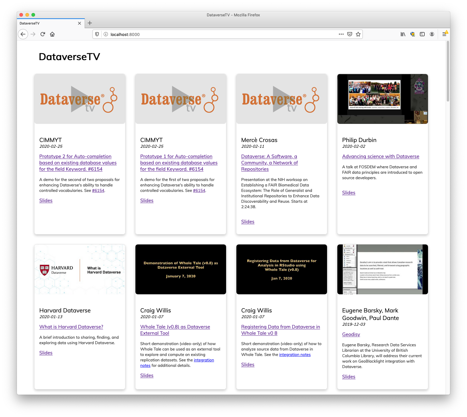
Screen Shot 2020-02-27 at 2 51 47 PM

@pdurbin pdurbin removed their assignment Feb 27, 2020
@pdurbin

pdurbin commented Feb 27, 2020

Copy link
Copy Markdown
Member

@TaniaSchlatter @mheppler @djbrooke I moved this to QA but you are welcome to take a look! Merging this pull request will update the iframe at https://dataverse.org/dataversetv (and the fonts should match now).

@kcondon

kcondon commented Feb 27, 2020

Copy link
Copy Markdown

@pdurbin Not sure whether I should be getting this in QA, plus I have no perm to merge/assign in this repo

@djbrooke

Copy link
Copy Markdown

I'll take it for now, thanks!

@djbrooke djbrooke self-assigned this Feb 27, 2020
@poikilotherm

Copy link
Copy Markdown
Contributor

This indeed does look very good and promising! Great work @erikbuunk, I like it 😄

@michbarsinai

Copy link
Copy Markdown
Member

Very nice work. Thanks, @erikbuunk!

@metasj

metasj commented Mar 3, 2020

Copy link
Copy Markdown

I like this a lot :) However it does add a fair bit of whitespace, and I really liked the density of the old format. Thoughts:
~ Reduce whitespace between the bottom of the video and the title
~ Move the 'Slides' link to the same line / just below the title, to save another linebreak
~ Reduce whitespace padding at the very bottom by a half-line: the grey border allows less whitespace [else drop the border + shadow]

@erikbuunk

erikbuunk commented Mar 3, 2020

Copy link
Copy Markdown
Author

@metasj

Normally I like whitespace, but I agree with your suggestions 😄

I like this a lot :) However it does add a fair bit of whitespace, and I really liked the density of the old format. Thoughts:
~ Reduce whitespace between the bottom of the video and the title
~ Move the 'Slides' link to the same line / just below the title, to save another linebreak
~ Reduce whitespace padding at the very bottom by a half-line: the grey border allows less whitespace [else drop the border + shadow]

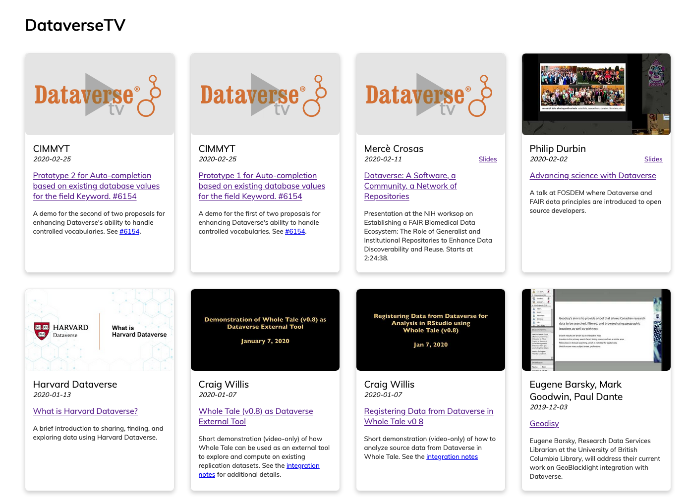
How about this:
image

I also found a bug in the slide links (it was shown on every card). This will be fixed.

@erikbuunk

Copy link
Copy Markdown
Author

@pdurbin Tomorrow a year that we have opened this item! Curious about the next steps of this improvement :)

@pdurbin

pdurbin commented Feb 26, 2021

Copy link
Copy Markdown
Member

@erikbuunk I'm not sure but I still think it's a huge improvement!

@atrisovic atrisovic left a comment

Copy link
Copy Markdown
Member

Choose a reason for hiding this comment

The reason will be displayed to describe this comment to others. Learn more.

LGTM!

Sign up for free to join this conversation on GitHub. Already have an account? Sign in to comment

Labels

None yet

Projects

None yet

Development

Successfully merging this pull request may close these issues.

8 participants