





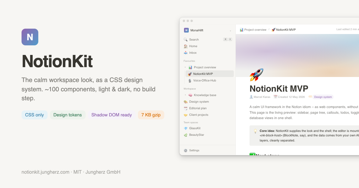
The calm workspace look, as a CSS design system.
~100 Components · Light & Dark Mode · Design Tokens · No Dependencies · No Build Step
Installation · Quick Start · Components · Theming · Editor · Web Components · Docs · Changelog · License
Part of the NotionKit family: NotionKit Elements (web components, planned) · NotionKit Web (Astro template, planned)
NotionKit is a pure CSS component library in the idiom of Notion: the quiet, document-centric surface – sidebar and page tree, document shell, callouts and todos, database tables and boards, settings, command palette, comment threads and AI conversations – as a ready-made, drop-in design system.
One CSS file. No build tools. No JavaScript. No framework lock-in.
There is no established UI framework that ships the Notion look as a system. What exists are editors (BlockNote, Novel), generic component kits (shadcn/ui) or full clones. NotionKit fills the middle: an opinionated design system with a clear optical signature that lets you build your own product in that ecosystem – familiar feel, own application.
NotionKit is the CSS foundation of a three-layer family. NotionKit Elements will wrap this markup in vanilla web components; NotionKit Web will be an Astro template for complete websites on the same foundation.
- 🎨 Pure CSS – works with plain HTML, Flask, Rails, Laravel, Astro, React, anything that emits class names
- 🌗 Light & dark, complete – both themes specified down to tag colours and shadows; switch with one attribute on
<html> - 🎛️ Design tokens – every value is a
--nk-*custom property; re-branding is one declaration (--nk-accent), everything else is mixed from it withcolor-mix() - 📐 Desktop and mobile equally – fluid layouts, exactly one breakpoint (860px), horizontal scrolling where tables and boards need it; no device mockups, no fixed viewport widths
- 🧩 Shadow DOM ready – ships a constructable stylesheet split into tokens and components, plus
::slotted()twins, so web components adopt it without breaking branding - ✍️ Editor adapter – no editor of its own; a themed adapter layer for TipTap, BlockNote and Novel inside
.nk-block-host - 🤖 AI-ready – ships with
SKILL.md, a structured reference for LLMs and coding agents, including six complete app skeletons - 🪶 Lightweight – 53 KB raw / 37 KB minified / 7.2 KB gzipped, no dependencies
- 🎯 Prefixed naming –
nk-*classes,--nk-*tokens, no unprefixed global rules
<link rel="stylesheet" href="https://cdn.jsdelivr.net/npm/@jungherz-de/notionkit@1/notionkit.min.css">Pin a version for production:
<link rel="stylesheet" href="https://cdn.jsdelivr.net/npm/@jungherz-de/notionkit@1.1.0/notionkit.min.css"># npm
npm install @jungherz-de/notionkit
# yarn
yarn add @jungherz-de/notionkit
# pnpm
pnpm add @jungherz-de/notionkitimport '@jungherz-de/notionkit/notionkit.css';Grab notionkit.css or notionkit.min.css from the latest release and link it locally.
<html lang="en" data-theme="light">   <!-- light is the default; the attribute may be omitted -->
<html lang="en" data-theme="dark">document.documentElement.setAttribute('data-theme', 'dark');<!DOCTYPE html>
<html lang="en" data-theme="light">
<head>
<meta charset="UTF-8">
<meta name="viewport" content="width=device-width, initial-scale=1.0">
<link rel="stylesheet" href="https://cdn.jsdelivr.net/npm/@jungherz-de/notionkit@1/notionkit.min.css">
</head>
<body class="nk-body">
<div class="nk-app">
<aside class="nk-sidebar">
<div class="nk-workspace"><div class="avatar">A</div>Acme Inc<span class="chev">⌄</span></div>
<div class="nk-sidebar-scroll">
<div class="nk-tree-item active"><span class="icon">🚀</span><span class="label">Roadmap</span></div>
<div class="nk-tree-item"><span class="icon">📚</span><span class="label">Knowledge base</span></div>
</div>
</aside>
<main class="nk-main">
<header class="nk-topbar">
<div class="nk-breadcrumb"><span class="crumb current">🚀 Roadmap</span></div>
</header>
<div class="nk-page-scroll">
<div class="nk-page">
<h1 class="nk-page-title">Roadmap</h1>
<div class="nk-callout"><span class="c-icon">💡</span><div>One stylesheet, no build step.</div></div>
<label class="nk-todo"><input type="checkbox" checked><span>Ship v1.0</span></label>
</div>
</div>
</main>
</div>
</body>
</html>class="nk-body" is opt-in: it sets font, size, background and text colour on <body>. Without it NotionKit touches nothing outside its own classes.
About 100 component classes across eleven groups. Every one of them is documented with a live preview, copy-paste markup and its behaviour on a small screen.
| Class | Description |
|---|---|
nk-app, nk-sidebar, nk-main |
Full-height app shell: sidebar left, main column right |
nk-workspace, nk-sidebar-scroll, nk-sidebar-footer |
Workspace switcher, scrolling tree area, pinned footer |
nk-topbar, nk-topbar-actions, nk-topbar-btn, nk-share-btn, nk-theme-toggle |
45px top bar with actions |
nk-breadcrumb (crumb, sep, current) |
Page trail |
nk-section-label |
Small uppercase caption between sidebar groups |
nk-tree-item (icon, label, actions, active) |
Page-tree row with hover actions |
nk-tree-children (collapsed), nk-toggle-arrow (open) |
Nested subtree and its arrow |
nk-kbd-hint, nk-kbd |
Keyboard shortcut caps |
| Class | Description |
|---|---|
nk-page-scroll, nk-cover, nk-page, nk-page-icon, nk-page-title, nk-page-meta |
Document shell: 760px column with auto margins |
nk-heading, p.lead |
Section heading, intro paragraph |
nk-callout (c-icon) |
Tinted block with icon |
nk-todo |
Checkbox with custom mark and strike-through |
nk-toggle (toggle-body) |
<details>-based collapsible block |
nk-divider, nk-quote (q-cite) |
Horizontal rule, block quote |
nk-mention (person, page, date) |
Inline mentions |
nk-inline-code, nk-code (lang, tag, attr) |
Inline and block code |
| Class | Description |
|---|---|
nk-database, nk-db-tabs, nk-db-tab (active, badge) |
View tabs with counts |
nk-table-wrap, nk-table (th-icon, row-title, date-cell, person-cell), nk-new-row |
Horizontally scrolling table with add row |
nk-tag (blue, green, orange, purple) |
Semantic tags, tuned per theme |
nk-progress, nk-progress-label |
Progress bar |
nk-board (active), nk-board-col, nk-board-col-header, nk-card |
Board view with scrolling columns |
| Class | Description |
|---|---|
nk-input, nk-textarea, nk-select (wide) |
Text controls with a token-derived focus ring |
nk-btn (primary, secondary, danger, danger-solid, small) |
Buttons |
nk-switch (aria-checked / :checked) |
iOS-style switch |
nk-check |
Checkbox and radio |
nk-slider, nk-slider-value |
Native range input |
nk-field (f-label, f-desc, f-control) |
Settings row |
nk-profile-row, nk-model-card (selected), nk-danger-zone, nk-member-list, nk-member-row |
Settings building blocks |
nk-modal-backdrop (open), nk-modal, nk-settings-nav, nk-settings-user, nk-settings-content, nk-settings-pane (active) |
Settings modal |
| Class | Description |
|---|---|
nk-pop, nk-menu, nk-menu-item (m-icon, m-shortcut, danger), nk-menu-sep, nk-menu-label |
Popover and context menu |
nk-emoji-search, nk-emoji-grid, nk-emoji-cats |
Emoji picker |
nk-cmdk-backdrop (open), nk-cmdk, nk-cmdk-input-row, nk-cmdk-list, nk-cmdk-group, nk-cmdk-item (selected), nk-cmdk-empty, nk-cmdk-footer |
Command palette |
nk-toast (show) |
Toast |
nk-gallery-grid, nk-g-item, nk-tabs, nk-tab, nk-tab-panel, nk-template-btn |
Gallery grid, tabs, template buttons |
nk-stats, nk-stat (up, down), nk-synced, nk-segmented, nk-banner (info, success, warning), nk-avatar-group, nk-skeleton, nk-empty |
Productivity blocks |
nk-comments, nk-comment, nk-comment-input |
Comment thread |
nk-ai-thread, nk-ai-msg (user), nk-ai-actions, nk-ai-input-row, nk-ai-send |
AI conversation |
| Class | Description |
|---|---|
nk-block-host (nk-block-actions, nk-block-handle, nk-drop-target) |
Optical shell an editor is mounted into |
nk-slash-menu, nk-slash-item, nk-bubble-menu |
Slash menu and bubble toolbar in the popover look |
(scoped inside the host) .ProseMirror, .bn-*, .novel-* |
Themed overrides for TipTap, BlockNote, Novel |
The theme is one attribute on <html>. The token blocks also set color-scheme, so browser-drawn UI – date pickers, selects, scrollbars, autofill – follows without extra work.
<html data-theme="dark">Re-branding is one declaration. Focus rings, checked states, the selected model card, the primary button and the danger hover are all color-mix()ed from tokens:
:root {
  --nk-accent: #16a34a;
}
Declare on :root, not on a subtree. theme-override.css ships three example palettes (Forest, Slate, Sunset), a high-contrast block and templates for metrics and typography. The 🎨 button on the demo pages applies them live.
Body text clears WCAG AA in both themes (12.3:1 light, 11.8:1 dark). The secondary layers – secondary and tertiary text, the four tag pairs, white on the accent, the danger colour – keep Notion's own values and sit below 4.5:1. The full measured table is in the docs; the high-contrast block in theme-override.css lifts every pair to ≥ 4.5:1 with the rest of the design untouched.
All visual values are custom properties on :root (light) and [data-theme="dark"]. A selection – the full table, read straight out of the stylesheet, is in the docs and in SKILL.md:
| Token | Light | Dark |
|---|---|---|
--nk-bg |
#ffffff |
#191919 |
--nk-bg-sidebar |
#f7f6f3 |
#202020 |
--nk-bg-hover |
rgba(0,0,0,0.045) |
rgba(255,255,255,0.055) |
--nk-text |
#37352f |
rgba(255,255,255,0.81) |
--nk-text-secondary |
rgba(55,53,47,0.65) |
rgba(255,255,255,0.46) |
--nk-border |
rgba(55,53,47,0.09) |
rgba(255,255,255,0.094) |
--nk-accent |
#2383e2 |
#529CCA |
--nk-danger |
#eb5757 |
– |
--nk-tag-blue-bg / -text |
#e7f3f8 / #337ea9 |
#133040 / #529CCA |
--nk-sidebar-width |
260px |
– |
--nk-radius |
6px |
– |
--nk-font |
system stack | – |
NotionKit ships no editor – a block editor is its own product, and half an editor would damage the library in real apps. It ships .nk-block-host, the optical shell, plus a themed adapter layer scoped inside it. The contract is one class on the host:
<div class="nk-block-host" id="editor"></div>

<script type="module">
  import { Editor } from 'https://esm.sh/@tiptap/core@2.27.3';
  import StarterKit from 'https://esm.sh/@tiptap/starter-kit@2.27.3';
  new Editor({ element: document.getElementById('editor'), extensions: [StarterKit], content: '<p>Hello NotionKit.</p>' });
</script>
TipTap/ProseMirror is the vanilla-JS path; BlockNote (React) and Novel (Next.js) are covered by the same adapter. The full recipe with slash menu, bubble toolbar and a Notion-style + / ⠿ block handle with drag & drop is docs-editor.js – about 300 lines of plain JavaScript that only put NotionKit classes on their DOM. See it running in the docs and the demo.
A shadow root that adopts the whole stylesheet also adopts the :root / [data-theme] token blocks. Inside that root the selectors match the element's own theme wrapper, every token is re-declared locally – and a matching rule always beats an inherited value. A consumer's own :root { --nk-accent: … } never arrives.
The build splits the stylesheet at the two token blocks and ships both halves as constructable stylesheets:
import { componentsSheet, tokensCss } from '@jungherz-de/notionkit/notionkit-styles.js';

// Tokens once, on the document, inside a layer – a brand stylesheet wins regardless of load order.
const tokens = new CSSStyleSheet();
tokens.replaceSync(`@layer notionkit-defaults { ${tokensCss} }`);
document.adoptedStyleSheets = [...document.adoptedStyleSheets, tokens];

class NkCallout extends HTMLElement {
  constructor() {
    super();
    const root = this.attachShadow({ mode: 'open' });
    root.adoptedStyleSheets = [componentsSheet];   // components only
    root.innerHTML = `<div class="nk-callout"><slot name="icon"></slot><div><slot></slot></div></div>`;
  }
}
customElements.define('nk-callout', NkCallout);| Export | Content |
|---|---|
css / nkSheet |
The whole stylesheet |
tokensCss / tokensSheet |
Only the :root and [data-theme="dark"] blocks |
componentsCss / componentsSheet |
Everything else |
Content passed in from outside stays in the light DOM, so .nk-callout .c-icon cannot reach it. Every such rule has a twin next to it – .nk-callout ::slotted(.c-icon) – 92 in total, including a [slot="…"] twin for every part NotionKit Elements exposes as a named slot. Two limits: ::slotted() matches only the assigned node (pass icons directly, never wrapped), and for slotted content the outer document's rules win.
A working proof of concept ships as elements-poc.html / nk-callout.js: it measures live that class and element render identically, re-theme together and take the page's branding.
notionkit/
├── notionkit.css            # Source of truth: token block + component block
├── notionkit.min.css        # Generated by npm run build (gitignored)
├── notionkit-styles.js      # Generated: constructable stylesheet + split exports (gitignored)
├── build-styles-js.mjs      # Build + split verification
├── theme-override.css       # Theme template: 3 palettes, high-contrast block
├── SKILL.md                 # AI/LLM reference, generated from the same sources as the docs
├── index.html               # Landing page              (de/index.html)
├── app.html                 # Demo app with live editor (de/app.html)
├── showcase.html            # Every component, isolated (de/showcase.html)
├── docs.html                # Documentation            (de/docs.html)
├── docs-editor.js           # TipTap recipe used by docs and demo
├── elements-poc.html        # Web-components proof of concept
├── nk-callout.js            #   … its two elements
├── tools/                   # Page/SKILL generators, catalog, contrast helper
└── .github/workflows/       # verify-build · release · pages
npm install
npm run build            # minify, split, pages, SKILL.md
npm run check:coverage   # every class documented?
npx http-server -p 8080 -c-1
Serve the folder rather than opening files directly: the elements proof of concept imports an ES module, which browsers block on file://. The -c-1 flag disables caching – without it the demo iframes on the landing page may show a stale app.html for an hour.
- Landing page – the library as a full-surface app preview, desktop and mobile side by side
- Documentation – every component with live preview, markup, classes, mobile behaviour; tokens, states, contrast, editor and web-component integration
- Showcase – every component isolated, both themes
- Demo – a realistic workspace app with a live TipTap editor
- German versions under
/de/
NotionKit is the CSS foundation of a three-layer family. The layers share one design language and one naming stem: .nk-callout becomes <nk-callout>, a modifier class becomes an attribute, a state class becomes a boolean attribute.
Vanilla-JS custom elements (<nk-app>, <nk-sidebar>, <nk-tree-item>, <nk-callout>, <nk-database>, <nk-cmdk>, <nk-editor> …) that wrap this markup, built on the constructable stylesheet shipped here. Package: @jungherz-de/notionkit-elements. The proof of concept in this repository is its seed.
An Astro template for complete websites – documentation, knowledge bases, product pages – on the same foundation.
SKILL.md is a structured reference for coding agents and AI assistants, generated from the same catalog as the documentation so it cannot drift:
- copy-paste markup for every component with nesting rules and classes
- complete token tables for both themes, read straight from the stylesheet
- the state-class contract
- six complete app skeletons – workspace app, database app, settings modal, AI chat page, form/onboarding page, landing/docs page – each with a "When to use this skeleton?" block
- editor recipes, rules and common mistakes, the web-component contract, the Elements roadmap
Point your assistant at it: "Use NotionKit classes as documented in SKILL.md." It has been validated blind – an agent given nothing but the file produced a working app whose 61 classes all existed.
| Browser | Version |
|---|---|
| Chrome / Edge | 111+ |
| Safari | 16.4+ |
| Firefox | 113+ |
The floor is set by color-mix() and constructable stylesheets. :where(), inset, min(), accent-color and color-scheme are older. Emoji are rendered by the operating system's emoji font; NotionKit ships no icon set and no web font – nothing to license.
| Class / attribute | Applies to | Effect |
|---|---|---|
.active |
nk-tree-item, nk-db-tab, nk-tab, nk-settings-pane, nk-segmented button, nk-board |
Where the user is |
.open |
nk-modal-backdrop, nk-cmdk-backdrop, nk-toggle-arrow |
Overlay visible / arrow rotated |
.collapsed |
nk-tree-children |
Subtree folded |
.selected |
nk-cmdk-item, nk-model-card, nk-slash-item |
Transient highlight or chosen option |
.show |
nk-toast |
Toast slides in |
aria-checked="true" |
nk-switch (button form) |
Switch on |
.primary .secondary .danger .danger-solid .small |
nk-btn |
Button variants |
.blue .green .orange .purple |
nk-tag |
Tag colours |
.info .success .warning |
nk-banner |
Banner tones |
NotionKit ships states, not behaviour: toggle these yourself. The demo pages contain reference implementations in plain JavaScript.
Issues and pull requests are welcome.
- Keep the two-block structure: no
--nk-*declaration outside the token blocks (the build fails otherwise). - No hex literals in component rules – derive from a token with
color-mix(). - Every rule that styles slottable content gets a
::slotted()twin. - Add new components to
tools/catalog.mjs; docs, showcase andSKILL.mdare generated from it, andnpm run check:coverageinsists every class is documented. - Code and comments in English; the pages exist in English and German.
A plain push to main updates the website (Verify Build + Deploy Pages) and touches nothing on npm. A release is a tag:
# 1. write the CHANGELOG entry  ## [1.1.0] – YYYY-MM-DD  (the release workflow refuses to publish without it)
# 2. bump – this also updates the version header in notionkit.css, commits and tags
npm version minor          # or patch / major
# 3. push branch and tag
git push && git push --tags
The tag triggers release.yml: it checks that tag, package.json and CHANGELOG.md agree, builds, creates the GitHub release with the artefacts and publishes to npm through trusted publishing (OIDC, provenance, no token).
MIT © 2026 Jungherz GmbH
See CHANGELOG.md.
Built by Jungherz GmbH. NotionKit is not affiliated with or endorsed by Notion Labs, Inc.; it is an independent design system in a familiar idiom.