Clarity into current editing modes#1147
Conversation


|
@faiza-a, could you help us out with the styling on this? The intent is to make that red X a dismissal button. My initial thought was to use styling similar to Vuetify dismissible chips, and this mockup isn't quite that. Your expertise would be very useful in guiding us toward the right look. |

|
Stepping back a second, I want to establish how this works:
I think @BryonLewis's proposed solution may conflict with some rules of locality, because you enter a state by pressing a button in one part of the application, but you get out of it by pressing a button in another place. The editing mode radio buttons have the same problem. I dislike the "Editing Mode" chip because it confuses everyone. I think the information it presents is important, but we should think about where to best represent that information. I also like what you've done with the differentiation between creating and editing. |
|
Would it be better to place a banner across the annotation widget? Or is that too intrusive/disruptive? Something like "you are now in continuous editing mode". |

|
@waxlamp I am trying to understand the ask here. having a look at it. will see what solution i can come up with. Do you think we should meet for this to discuss the concerns/options as group you guys are suggesting above and come to conclusion of how we want to resolve this with minimal changes? |


|
I think this looks great and is a huge improvement. Just a few thoughts: @BryonLewis @waxlamp @subdavis @faiza-a
No Outline Static Outline added that is the same color as active button |


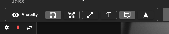
I think so. I haven't gotten around to submitting the change.
You're right, it's kinda unusual. It requires the user to understand that all annotations have a rectangle, and deleting is the same as deleting the whole annotation. However, I think most users won't understand that, and will be surprised when deleting a rectangle actually removes all their annotations. I think the potential to negatively surprise the user is worse than the confusion they might experience from not seeing "delete rectangle", but I could be wrong.
I like this option best. |
Obligatory Wikipedia link: https://en.wikipedia.org/wiki/Principle_of_least_astonishment I think this may be as simple as referring to the rectangle as a track, or otherwise tying the rectangle to the full track. Or perhaps this is just the quantum of training/understanding that users need to have, and there may not be a way to make it simpler via the UI. But I agree that we should not make it easy for the user to accidentally do something they almost certainly don't intend to do (delete a whole track because they think the rectangle is just another form of annotation like polygon or linestring).
Agreed. |
That's a good point, I forgot to change the internal names editing/visible modes to user friendly names. LineString doesn't really make sense should it be something like Head/Tail? |
Keep it as One idea would be to call it a "line segment" since that's what it is in geometric terms. But I don't think we should be making too many ad hoc changes to the language while improving other UI aspects. |
It just occurred to me that making ad hoc changes to language might not be an issue here because I don't think there is currently any user-facing terms for these shapes. Meaning currently it's just the editing buttons but there are no tooltips or descriptions. Am I wrong? |

* Switch out tooltip

* Editing bar tweaks

* Remove pre tags

* Visibility spelling


In the delete buttons, the names for the shapes appear. Is that what you mean? |
The delete button is using also the internal names, like LineString instead of HeadTails. I was specifically talking about the text that is like "Creating LineString" and if that should be "Creating HeadTails" instead. |
* initial test changes

* adding editing Canary for updated info

* Updating styling to match mockup

* minor changes to behavior

* Editing Bar Tweaks (#1175)

* Switch out tooltip

* Editing bar tweaks

* Remove pre tags

* Visibility spelling

* fix 1px shift on visibilty buttons (#1179)

Co-authored-by: Brandon Davis <git@subdavis.com>
Co-authored-by: Mary Salvi <40494088+marySalvi@users.noreply.github.com>
* initial test changes

* adding editing Canary for updated info

* Updating styling to match mockup

* minor changes to behavior

* Editing Bar Tweaks (#1175)

* Switch out tooltip

* Editing bar tweaks

* Remove pre tags

* Visibility spelling

* fix 1px shift on visibilty buttons (#1179)

Co-authored-by: Brandon Davis <git@subdavis.com>
Co-authored-by: Mary Salvi <40494088+marySalvi@users.noreply.github.com>
5 participants


fixes #697
fixes #1172 (Thanks Mary)
Latest update has changed how this works based on mockups.
Switching between different modes (being Creating/Editing OR rectangle/Poly/Line) will display a tooltip for 3 seconds giving information about the mode like "Hit ESC to exist creation", or "select midpoints to add new points to polygon"
These tooltips are still there when returning to hover over the main title section.
Implementation:
useModeManagerhas a canary variable used to determine creating vs editing modes and provides that to theEditorMenu.vue. This is a prop in EditorMenu.vue callededitingDetails = 'disabled' | 'Creating' | 'Editing'.EditorHeaderwhich provides the text and coloring for the buttons based on the editing mode and theeditingDetails(I.E When creating a polygon it needs to say creating and the polygon should be colored green).EditorMenu.vuenow contains a slot for the deletion controls because they are inside of the Editor gray box in the mockup