Releases: Lirum-Labs/ha-power-gauge
Release list
v0.2.3 — First release with HACS validation workflow included

Functionally identical to v0.2.2; bundle behaviour unchanged. This release exists to satisfy the HACS default-index submission requirement that a release tag include the HACS validation workflow file. The workflow is green on this commit: https://github.com/Lirum-Labs/ha-power-gauge/actions/runs/25619393843
v0.2.2 — README polish for the background option
Documentation polish over v0.2.1 — same bundle behaviour, clearer story.
What's new
- The
backgroundoption (added in v0.2.1) is now called out at the top of the README features list, including the dark/light HA theme adaptation whenbackground: transparent. - The two Usage sections gain a short YAML example showing how to make either card adopt the HA theme background.
- The "Direct from JSDelivr" install URL now pins to the latest tag (
v0.2.2) instead of the stalev0.2.0.
Install
URL:  https://cdn.jsdelivr.net/gh/Lirum-Labs/ha-power-gauge@v0.2.2/dist/ha-power-gauge.js
Type: JavaScript Module
Or download ha-power-gauge.js below for self-hosting.
Full changelog
- docs: surface
backgroundoption in the README features list and add usage examples. - docs: bump install URL pin from v0.2.0 → v0.2.2.
The compiled bundle is functionally identical to v0.2.1 (same Lit component, same CSS, same behaviour) — only the README and version metadata changed. v0.2.1 install URLs continue to work; v0.2.2 is just clearer for new users.
v0.2.1 — Configurable background + dark/light theme reactivity
Adds a background config option to both cards.
What's new
background(string, optional, both cards). Any CSS background — color, gradient, ortransparent. Defaults to the card's signature dark gradient.- Theme-reactive text colours. When
background: transparent, the title / labels / status text automatically swap to HA's--primary-text-colorand--secondary-text-color, so the cards stay readable on both dark and light HA themes. - Translucent overlays use
currentColor. Subtle row tile washes, the bar track, the card border, and the radial card's tiny header sparkles are now mixed againstcurrentColor(viacolor-mix(in oklab, currentColor X%, transparent)) instead of hardcoded white. They naturally invert when the text colour changes. - The gauge instrument stays dark. The radial card's central core, the knob, and the SVG arc/glow keep their dark aesthetic regardless of background — they're a styled meter face, not theme chrome.
Examples
type: custom:power-gauge-card
entity: sensor.grid_power_watts
background: transparent # let HA's theme show throughtype: custom:power-gauge-bar-card
entities:
- sensor.kitchen_power
- sensor.living_room_power
background: '#1a1a2e' # solid deep indigotype: custom:power-gauge-card
entity: sensor.grid_power_watts
background: 'linear-gradient(180deg, #2d0050, #0a0014)' # custom gradientInstall
JSDelivr — paste this URL in Settings → Dashboards → Resources (JavaScript Module):
https://cdn.jsdelivr.net/gh/Lirum-Labs/ha-power-gauge@v0.2.1/dist/ha-power-gauge.js
Or download ha-power-gauge.js below for self-hosting.
Full changelog (v0.2.0 → v0.2.1)
- feat:
backgroundconfig option on bothpower-gauge-cardandpower-gauge-bar-card. - internal: translucent overlays refactored to
color-mix(currentColor, transparent)so they adapt to the active text colour. - dev: preview page gets a Background dropdown with handy presets including a light-grey option to verify light-theme contrast.
v0.2.0 — Two cards in one bundle: radial + linear
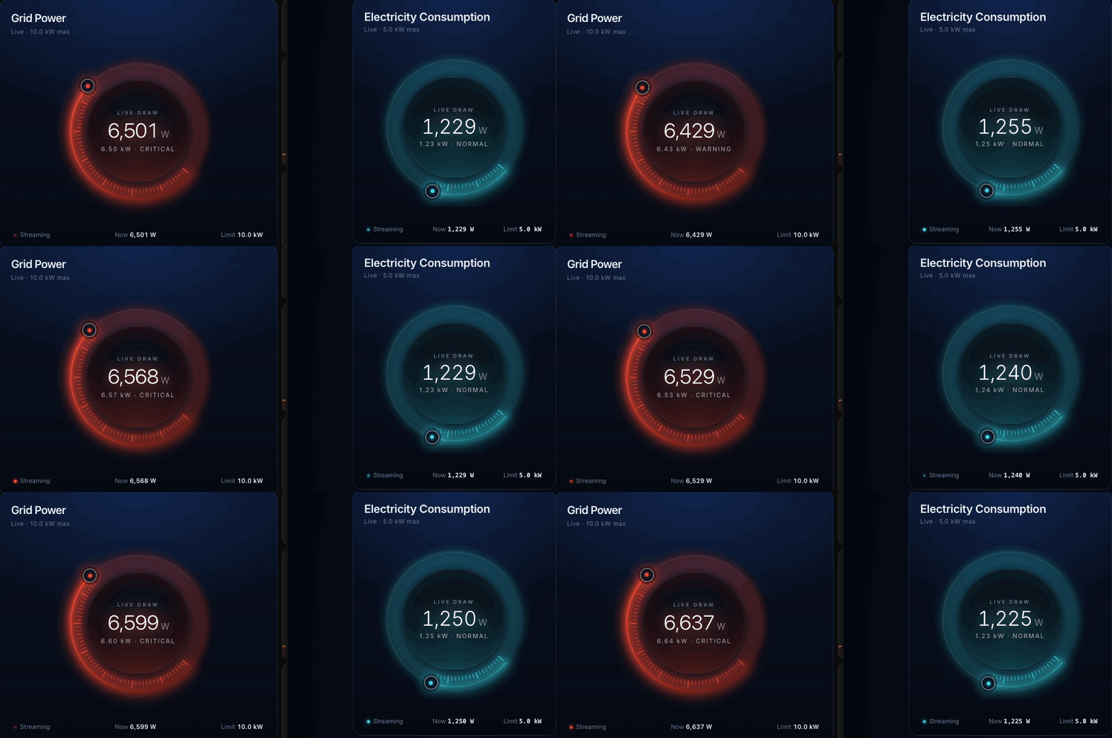
First public release. Two cards in one bundle: a glowing animated radial Power Gauge Card plus the new linear multi-entity Power Gauge Bar Card.
Install
JSDelivr (no install needed) — Settings → Dashboards → Resources → Add Resource:
URL:  https://cdn.jsdelivr.net/gh/Lirum-Labs/ha-power-gauge@v0.2.0/dist/ha-power-gauge.js
Type: JavaScript Module
HACS (custom repository) — add https://github.com/Lirum-Labs/ha-power-gauge under HACS → Frontend → ⋮ → Custom repositories with category Lovelace.
Manual — download ha-power-gauge.js below, drop into <config>/www/community/ha-power-gauge/, register as /local/community/ha-power-gauge/ha-power-gauge.js.
What's in the box
power-gauge-card — radial
- Three configurable thresholds (
normal/warning/critical) with smooth channel-wise colour blending — the gauge transitions between blue / orange / red instead of snapping at level boundaries. - Animated tick ring (80 ticks lighting sequentially), rotating outer aura, counter-rotating dashed inner ring, shimmering halo, pulsing "streaming" indicator.
- Optional
rolling_numbersflicker (defaulttrue) — switch off if you'd rather see only what the entity reports. - Tabular-monospace bottom readout so digit churn doesn't reflow surrounding labels.
- Robust to slow data: renders
—withWAITING FOR DATAuntil the entity actually arrives, then snaps to the real value (no animating up from0).
power-gauge-bar-card — linear, multi-entity
- One thin glowing row per entity, stacked. Same threshold logic and colour ramp as the radial card.
- Card-level options (
max,normal,warning,critical, colours,rolling_numbers) act as defaults; any entry underentities:can be{ entity, name?, max?, normal?, … }to override per row. - Single shared
requestAnimationFrameloop drives ramps and drift across every row — a stack of 12+ entities is essentially free.
type: custom:power-gauge-bar-card
title: Heavy appliances
unit: W
max: 14400
normal: 1000
warning: 6000
critical: 12000
entities:
  - entity: sensor.tesla_watts
    name: Tesla EV (60A)
  - entity: sensor.dryer_watts
    name: Dryer (30A)
    max: 7200
    critical: 6500
Both cards register in window.customCards and show up as separate options in HA's Add Card picker.
Behaviour notes
- Loading / unavailable. Entities that are missing,
unavailable,unknown, or non-numeric render—. The card snaps to the real value the moment it shows up — no stuck-at-zero. - Reduced motion. Decorative motion (rotating aura, dashed ring, shimmer, pulse-dot) is disabled when
prefers-reduced-motion: reduce. Value-change ramps are kept (informational, not decorative). - Smooth blending. Between any two thresholds the c1/c2/c3 stops are mixed channel-wise so the arc, ticks, halo and central glow shift together as the load crosses bands.
Local dev / preview
dev/index.html is a self-contained sandbox that opens straight off disk (it loads the IIFE build via a classic <script src> so file:// works) — no Home Assistant required to iterate.
npm install
npm run build       # → dist/ha-power-gauge.js (ES module) + .iife.js
npm run dev         # rollup --watch + static server on :8000
Licence
Apache 2.0 — see LICENSE and NOTICE. Section 4(d) of the licence requires downstream redistributors to keep the NOTICE attribution in their derivative's NOTICE / docs / credits surface — a single line "Includes Power Gauge Card by Lirum Labs (https://github.com/Lirum-Labs/ha-power-gauge)" satisfies it.
Full changelog (v0.1.0 → v0.2.0)
- feat: linear
power-gauge-bar-cardvariant with multi-entity stacks and per-row overrides. - feat:
rolling_numbersconfig option to toggle the ambient ±1.2 % drift. - feat: three configurable thresholds with smooth colour blending replacing the original 5-stop hard-coded ramp.
- fix: only initialise once the entity is actually present in
hass.states(handles the case where the first hass push lands before the entity is registered). - fix: snap to entity value on first read instead of animating from 0.
- fix(dev): ship an IIFE bundle alongside the ES module so the dev preview works over
file://. - chore: switch licence MIT → Apache 2.0 with explicit NOTICE-based attribution requirement.
- docs: README rewrite with hero gif and per-card screenshots.