Analyses
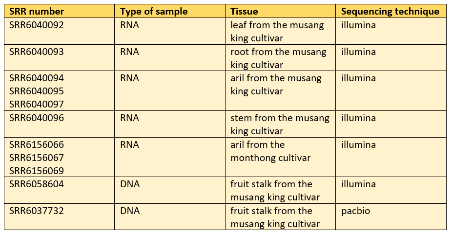
Table 1: The metadata, information about the data.
In table 1, the metadata can be observed. All the SRR numbers per tissue, type of sample, type of tissue and the sequencing technique can be seen.
The raw data obtained were quality checked by using the software fastQC. The commands used for this step can be seen in the code page section fastaqc. Thereafter, a scaffold was chosen to continue the other analyses with. The scaffold 10 was chosen and a script was done using the program multiQC (the script can be seen in the code page section multiqc) so that the quality reports for scaffold 10 were gathered into a summary report instead for illumina reads and the trancriptomic reads. The quality reports were downloaded and opened in the browser since they were in html format. Below, one can observe results of the fastQC report for pacbio as well as some results of the multiQC for illumina and the transcriptome.
Illumina quality report
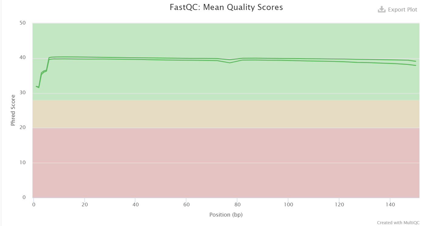 Figure 1: A graph of the mean quality scores of the illumina reads.
As one can see in figure 1, the quality of the illumina reads are quite high, since the curves are located in the green area. These might have a high quality due to the fact that illumina reads have a low error rate. It is important that these reads have a high quality since the reads are later going to be used for correcting the genome assembly by mapping the reads to the genome assembly and use pilon. Since the quality is good, the correcting of the genome assembly will probably be good as well.
Pacbio quality report
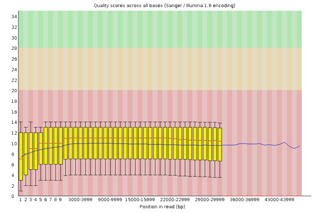 Figure 2: A graph of the mean quality score of the pacbio read.
From figure 2, one can conclude that the quality of the pacbio read across the base pairs is pretty bad since the curve is located in the red area. This can be due to the fact that the pacbio read has a higher error rate than the illumina reads.
Transcriptomic quality report
Trimmed:
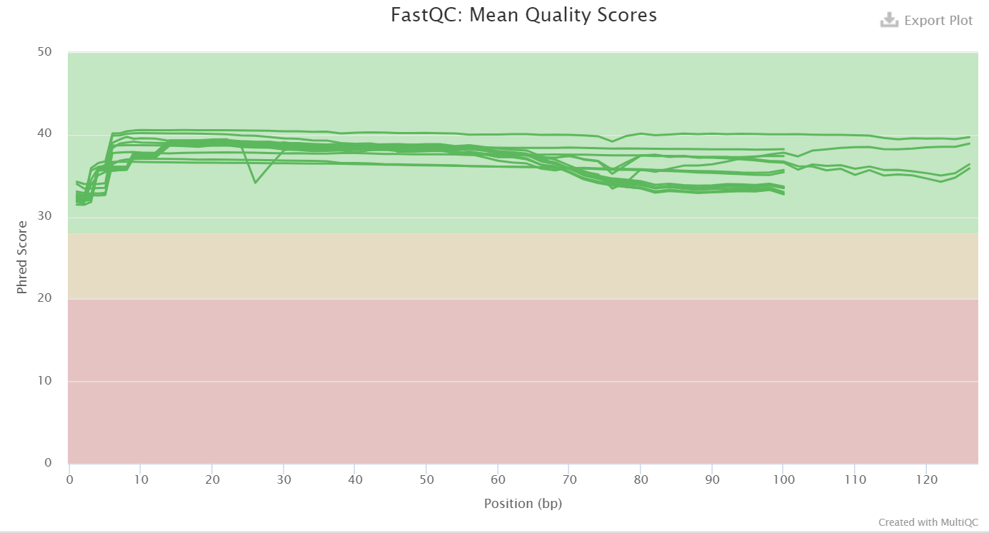 Figure 3: A graph of the mean quality scores of the trimmed transcriptomic reads.
The trancriptomic reads have high quality across the base pairs since the curves are located in the green area, as one can see in figure 3 above. This high quality is important for the analysis step when the reads are supposed to be mapped against the genome assembly. This will hopefully result in a good mapping since the quality is high!
Untrimmed:
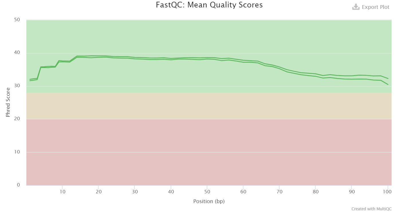 Figure 4: A graph of the mean quality scores of the untrimmed transcriptomic reads.
As one can see in the figure 4 above, the quality of the untrimmed transcriptomic reads across the base pairs are quite high. The quality is good since the curves are located in the green area.
Trimmed data that previously was untrimmed:
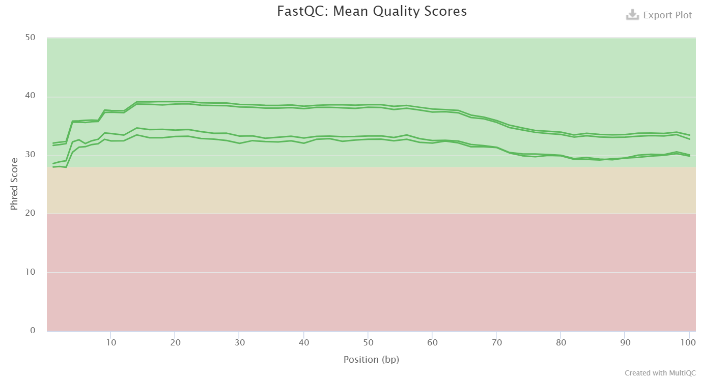 Figure 5: A graph of the mean quality scores of the newly trimmed transcriptomic reads.
In this figure, figure 5, one can see the newly trimmed transcriptomic reads that have been trimmed with trimmomatic. The quality of these trimmed transcriptomic reads are quite high since the curves are located in the green area. If comparing with figure 4, there are four reads now instead of two reads. These are forward and reverse for unpaired reads as well forward and reverse for paired-end reads.
The pacbio scaffold 10 data was assembled using the program canu. A script was made and can be seen in the code page section canu and was run with the command sbatch. A file that was generated from this step and used in other analyses was ass_pb.contigs.fasta, containing the assembled genome.
The untrimmed transcriptomic data was trimmed using the program trimmomatic. A script was made and can be seen in the code page section trimmomatic and was run with the command sbatch. This was done in order to crop and trim the reads, as well as remove adapters. This lead to better results for the future analyses, since otherwise adapters can cause some problems. Trimmed transriptomic reads were generated from this step.
Mapping of the illumina reads (scaffold 10 1P and scaffold 10 2P) against the assembled pacbio scaffold 10 data was done with the program BWA so that the assembly could be corrected with the illumina reads. The code can be seen in the code page section mapping with bwa and the script was run with the command sbatch. A bam file with reads aligned to the assembled genome was generated from this step.
Improvement of the assembly was made by using the program pilon that required the assembly as imput as well as the aligned bam file from the previous step. A script was made and can be seen in the code page section pilon. A file named pilon.fasta was generated containing the corrected genome assembly.
Quality assessment was made with QUAST and the output from the previous analysis (pilon) was used as input. The script can be seen in the code page section quast. A quality report was obtained from this step and could be seen by downloading the file and open it in the browser, since it was a html file.
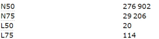
Table 2: A table showing the values for N50, N75, L50 and L75 for the corrected genome assembly.
As can be seen in table 2, the value for N50 is the contig length that produces at least half of the assembly, so using contig lengths of at least 276 902 bp produces 50 % of the assembly. N75 is similar to N50 but accounts for 75 % of the assembly instead, so using contig lengths of at least 29 206 bp produces 75 % of the assembly. The value for L50 is 20, which means that 20 contigs are needed to produce at least half of the assembly. The value for L75 is 114, so 114 contigs are needed to at least produce 75 % of the assembly. These values are quite high and none of these values seems totally out of the blue.
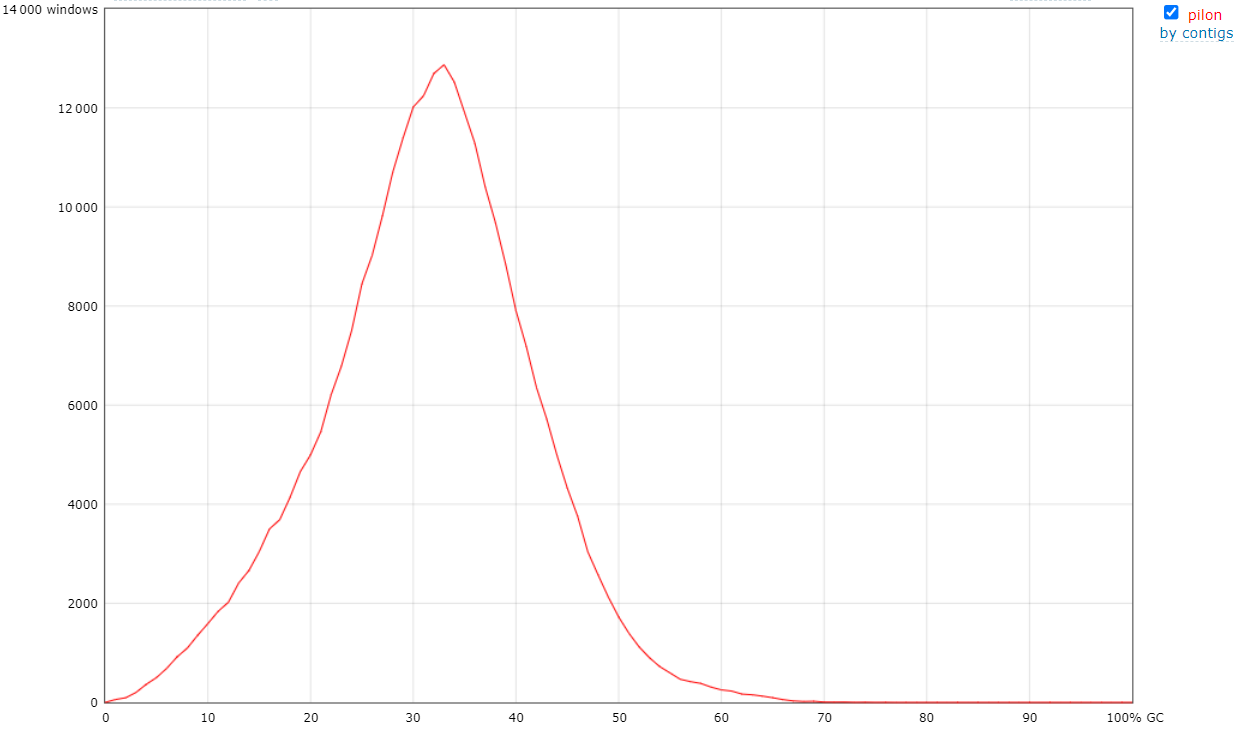 Figure 6: The figure is visualizing the GC content for the corrected genome assembly.
As one can see from figure 6, the GC content is around 31-33 %, and it looks like a normal distribution. It is good that there is only one peak, since that means that there is probably no contamination of other species. The conclusion is that the quality of the assembled genome is quite good because of this!
The program repeatMasker was used on the fasta file obtained from the pilon analysis. This program was used in order to improve the prediction accuracy by masking the repeats in the genome. The type of masking used was hardmasking, which means that the letter N replaced repetitive regions. A script was made and can be seen in the code page section repeatmasker. A file named pilon.fasta.masked was generated, which contained the masked assembled genome.
The program STAR was used in order to map the trimmed RNA-seq reads to the masked assembled genome. A script was made and can be seen in the code page section star. Bam-files were generated containing the reads aligned to the masked assembled genome.
BRAKER was used to do a structural annotation of the genome. The masked genome obtained from the repeatMasker analysis and all bam files from the previous step when STAR was used were inputs when doing this analysis. A script was made and can be seen in the code page section braker. A file was generated called augustus.hints.gff3, which contained the structural annotation of the genome and was important for finding out which positions the upregulated genes were located in the genome.
The program eggNOGmapper was used to do a functional annotation of the assembled masked genome obtained from the repeatMasker analysis. A script was made and can be seen in the code page section eggnogmapper. Two files that were important for the interpretation of the functions of genes were generated named functional_annotation.emapper.annotations and functional_annotation.emapper.gff.
HTseq was used to count how many genes each transcriptomic read mapped to. As a result from this analysis, one can determine the expression level of specific genes. The bam-files from the program STAR was used as input as well as a gff3 file from BRAKER. A script was made and can be seen in the code page section htseq. Files containing the read counts were generated from this step and used in the DESeq2 analysis.
A script was done in R where the packages DESeq2, gplot, genefilter and RcolorBrewer were used in order to do some gene expression analyses with the output from HTseq. The output from HTseq was the amount of gene counts each transcriptomic read had. The expression analyses were visualized with one heatmap and one PCA plot. The script can be seen in the code page section deseq2.
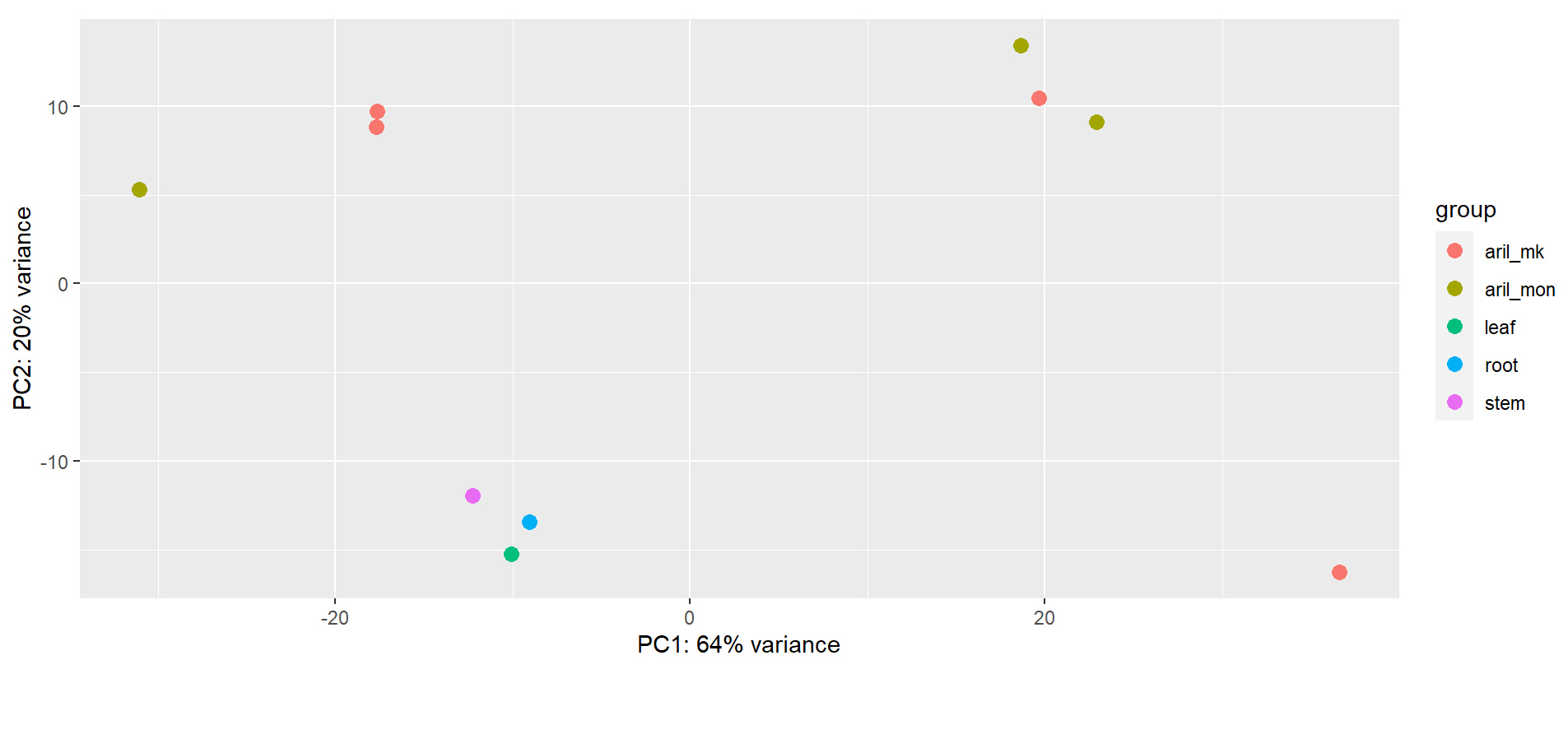
Figure 7: A PCA plot showing how similar and different each sample are. One sample corresponds to a dot and the colours correspond to a tissue type. Aril_mk corresponds to aril from the musang king cultivar and aril_mon corresponds to aril from the monthong cultivar.
In figure 7, one can see that the samples from leaf, root and stem are pretty similar and have low variance since these dots are close to one another in the plot. This could be due to the fact that the gene expressions are similar in these tissues and that is why these dots vary only a little. Similarly, if one look at the three dots close to each other that correspond to two aril from monthong and one aril from the musang king, one can conclude that the expression for those are quite similar. However, these are far away from the rest of the dots, which may be due to the fact that these dots express more than for example the tissues leaf, stem and root. Furthermore, two dots are also close to each other, and these are arils from musang king. These probably also have similar expression level. There is also one dot corresponding to aril from musang king that is far away from all the other dots, which propably means that this sample has a high variance compared to the other samples. Similarly, there is also one dot corresponding to aril from monthong that is far away from the others, and the conclusion is that this sample also differ a lot in expression level in comparsion with the others.
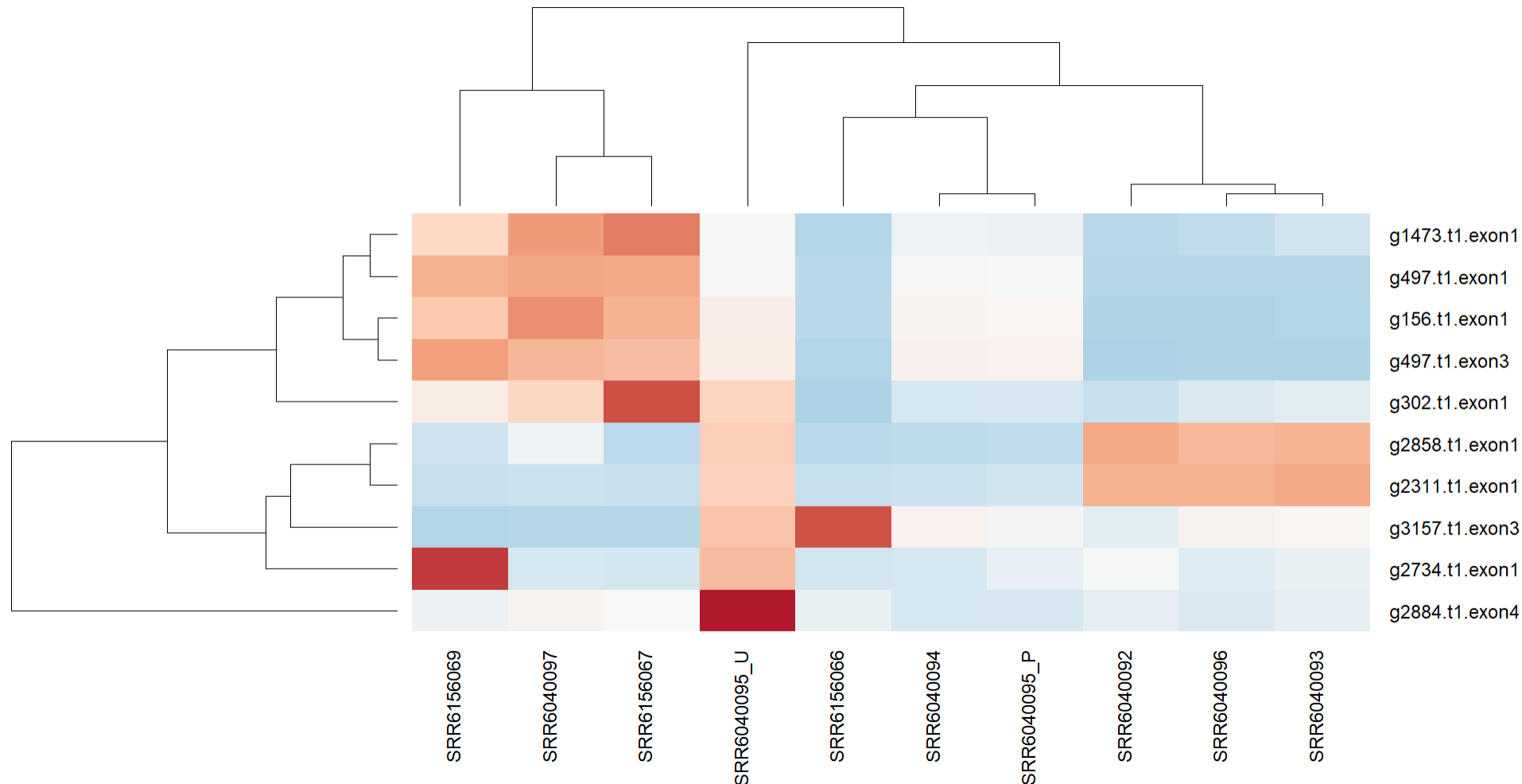
Figure 8: Heatmap showing the 10 most varied genes across the samples.
In figure 8, one can see a heatmap of the genes with the highest variance in expression level. The gene 2884.t1.exon4 has a dark red colour for sample SRR604005_U, which corresponds to the tissue aril from the musang king cultivar. Another gene that has a dark red colour is g2734.t1.exon1 for the sample SRR6156069. This corresponds to a gene in tissue aril from the monthong cultivar. Two more genes that have a red colour are g3157.t1.exon3 and g302.t1.exon1 for the samples SRR6156066 and SRR6156067 respectively, and these correspond to the tissue aril from the monthong cultivar. This means that these four genes have a high variance in expression compared to the other samples as well as compared to the other genes.
When searching on these four genes in the augustus.hints.gff3 from BRAKER, the positions of these were obtained. Thereafter, the file functional_annotation.emapper.gff from eggNOGmapper was used to find the ID of these genes by searching on the positions and see if a result showed up. However, when searching on these four genes in the functional_annotation.emapper.gff3 file, only a result for g2734.t1.exon1 showed up. The ID that was obtained from the functional_annotation.emapper.gff3 file was used by searching on the ID in the functional_annotation.emapper.annotations file from eggNOGamapper to find out the function of the gene. The result showed that the gene has the function transcription factor. Furthermore, when searching on the other six genes that were in the heatmap, results for g497.t1.exon1 and g1473.t1.exon1 showed up, but not for the other ones. Unfortunately, the function of the gene g1473.t1.exon1 was not described which may be due to artifacts in the database. However, the function of the gene g497.t1.exon1 was described at least and the function is that it creates methionine.