QuickSight Dashboards
Amazon QuickSight(QS) is a cloud-scale business intelligence (BI) service that you can use to deliver easy-to-understand insights to the people who you work with, wherever they are. Amazon QuickSight connects to your data in the cloud and combines data from many different sources. In a single data dashboard, QuickSight can include AWS data, third-party data, big data, spreadsheet data, SaaS data, B2B data, and more. As a fully managed cloud-based service, Amazon QuickSight provides enterprise-grade security, global availability, and built-in redundancy. It also provides the user-management tools that you need to scale from 10 users to 10,000, all with no infrastructure to deploy or manage.
To learn more, view the QuickSight User Manual
- JPL (Commercial or GovCloud) Account
- AWS Athena
- AWS QuickSight
The PDS QuickSight Dashboard references the prd_vw_all_agg dataset imported from AWS Athena. This table aggregates PDS Node server logs for each day from 11-29-20 to 3-22-22. We've filtered out requests for the data archives contained within each site so we could focus on the tools and web services. See "Filters" below for more info on that.
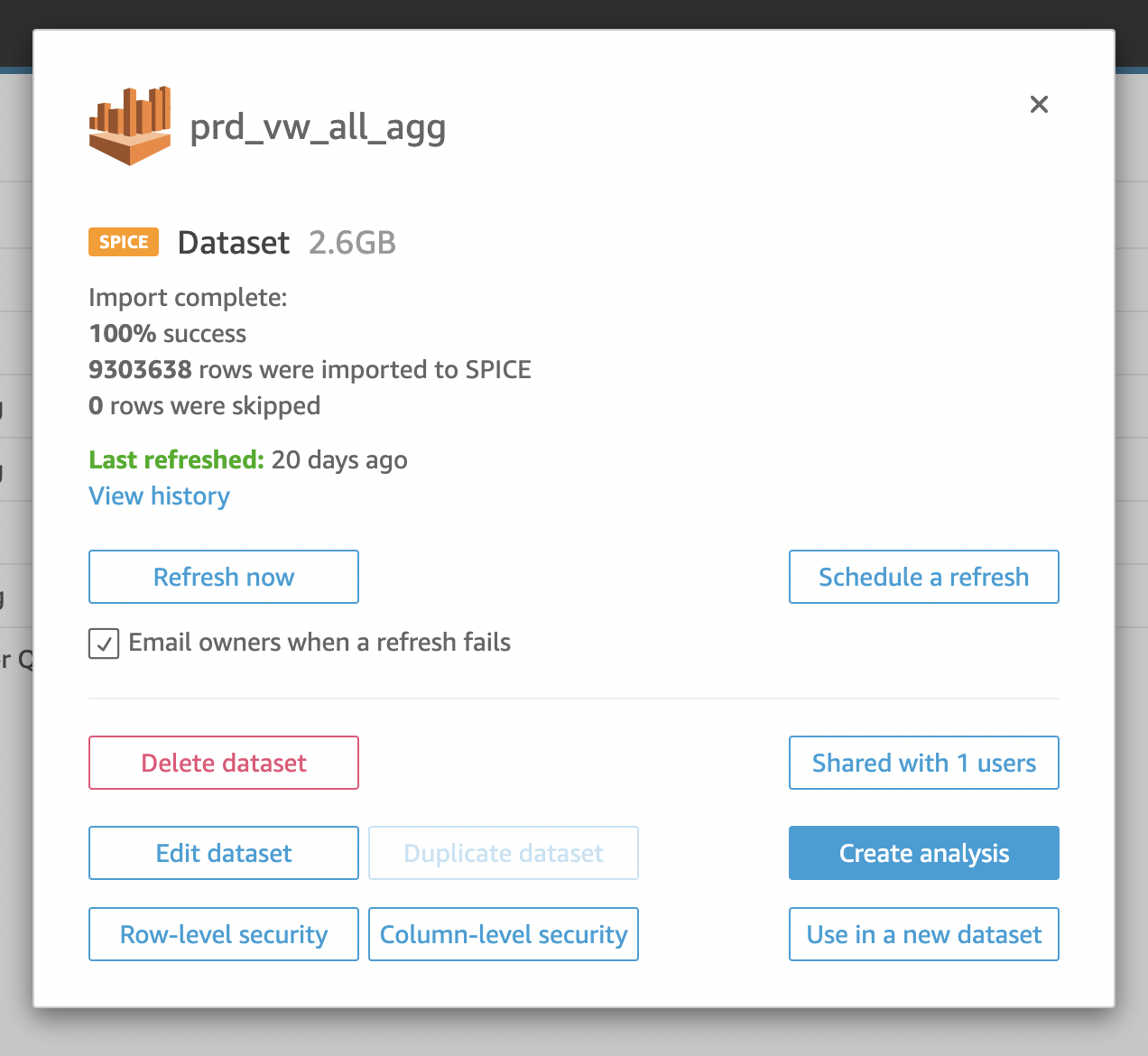
You can schedule refreshes for a dataset in QS so that any updates in AWS will be automatically pushed to the respective dashboard. The following illustration shows this basic workflow:
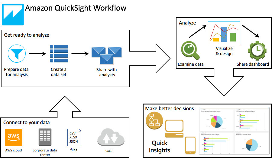
For more info on scheduling refreshes, view the documentation here.
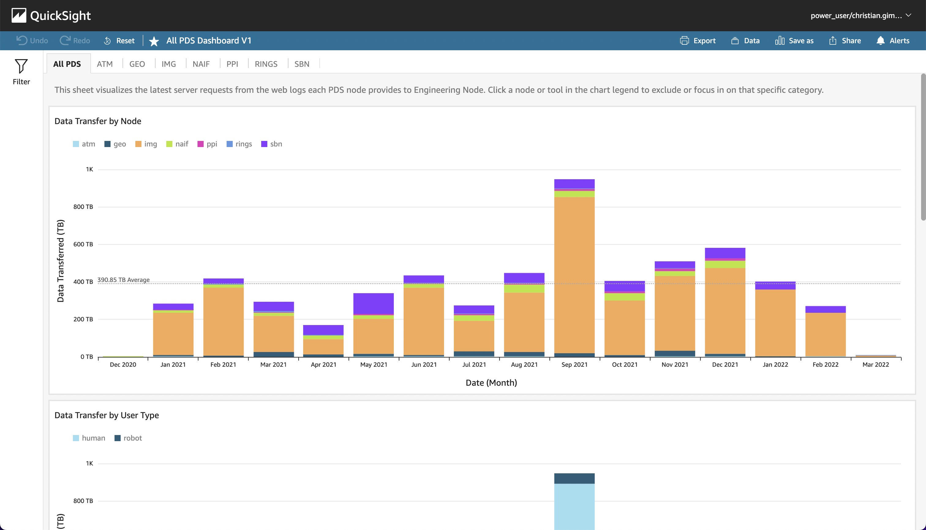
The All PDS Dashboard is organized into several pages, each containing visuals created from the PDS dataset. The first page displays usage and metrics aggregated across all the PDS Nodes while the others focus on the information coming from a single Node.
To get a better look at a visual, click it once to "select" it in the sheet. Then, click the "fullscreen" icon in the top right menu. Click the icon again to reset the size.
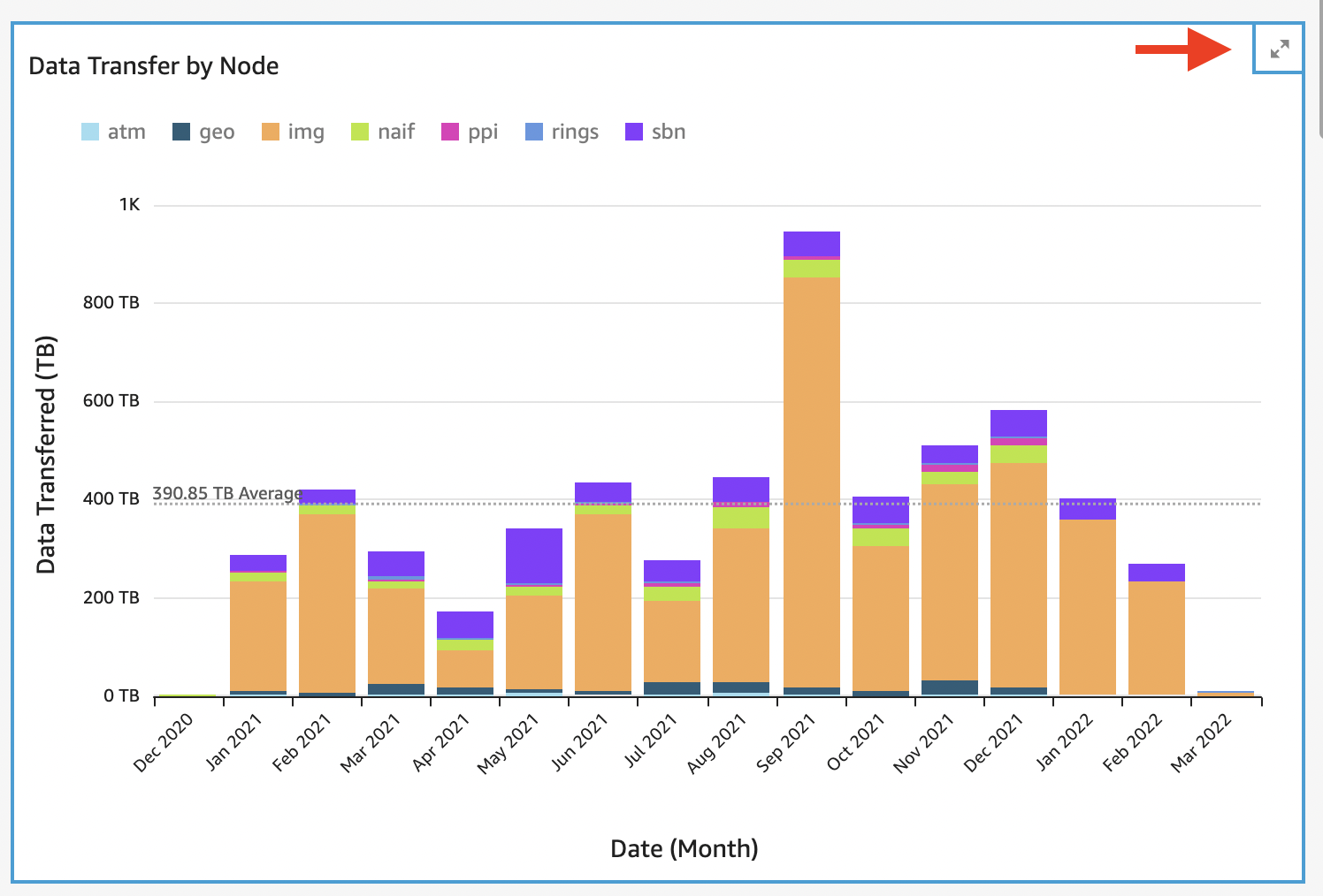
By default, each bar chart aggregates data transfer by month over the entire timespan of the dataset. To change the time interval, click a bar on the chart and select one of the "Drill down" or "Drill up" options that appears in the menu.
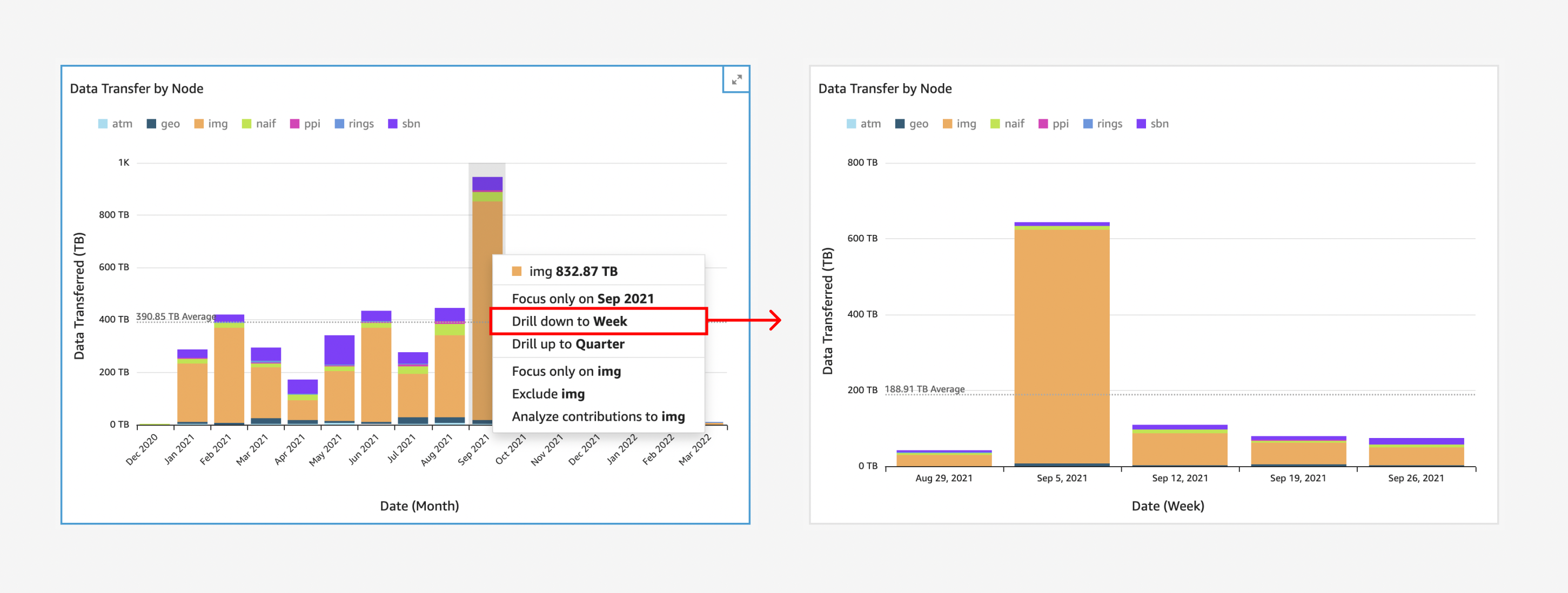
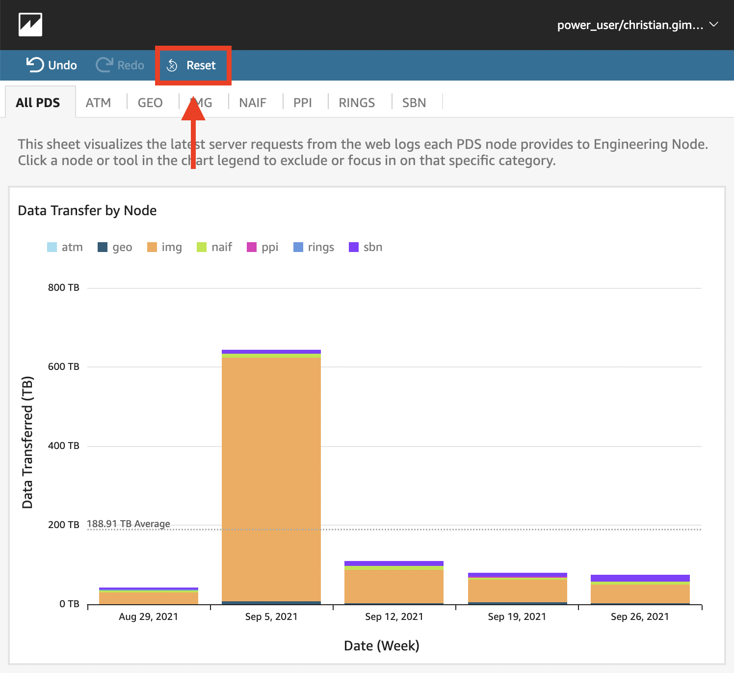
You can view by Quarter, Month, Week, and Day. To return to the default view, click the "Reset" button in the top left of the QS UI.
There are two ways to exclude data types from a dashboard visual:
- In the dashboard, click a data type in the visual or it's key.
- Select one of the "Focus only on" or "Exclude" options that appears in the menu.
- To return to the original visual, click the "Reset" button in the top left of the QS UI.
-
In the dashboard, click the visual you would like to filter.
-
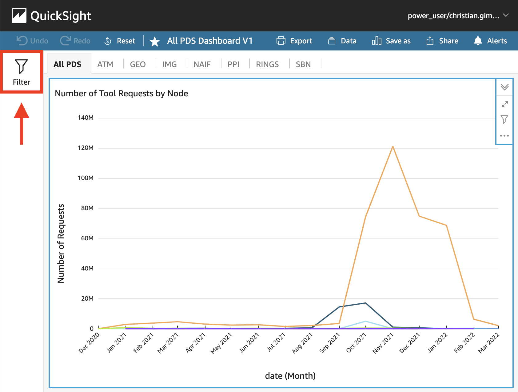
Click "Filter" on the left side the dashboard to open the Filters panel.
NOTE: The filter pane is hidden on smaller browser windows you don't see it right away, try increasing the width of your browser window.
-
Click the "+" icon to create a new filter for the selected visual and then choose a field that you want to filter.
-
Click the new filter in the pane to configure it. You can also click the three dots icon to the right of the new filter and select "Edit".
-
In the Edit filter pane that opens, for Applied to, choose one of the following options.
-
Only this visual – The filter applies to the selected item only.
-
Some visuals – The filter applies to visuals with valid column mappings.
-
All visuals of this dataset – The filter applies to all the items based on this dataset.
-
All applicable visuals – The filter applies to any visuals that have valid column mappings.
Depending on the data type of the field, your remaining options for configuring the filter vary. For more information about the types of filters you can create and their configurations, see Filter types in Amazon QuickSight.
-
Formula used for calculated field with normalized score (gb_score etc.)
(sum(gigabytes) - minOver(sum(gigabytes), [date])) /
(maxOver(sum(gigabytes), [date]) - minOver(sum(gigabytes), [date]))