Blocks
As mentioned in the Basic Rock Concepts section, BlockTypes are simply ASP.NET User Controls that inherit from Rock.Web.UI.RockBlock.
Blocks are simply instances of BlockTypes and can have admin/user controlled, configurable properties which are often used to change the behavior or default functionality of the BlockType. Blocks are added to a page by adding them a zone on a page or by adding them to a zone in a layout. Adding a block to a zone in a layout will cause all pages which use that layout to automatically include that block instance.
Here are several basic things to know about when developing your own custom block types:
- The
CurrentPersonproperty represents the currently authenticated (logged in) person and theCurrentPersonIdis that person's ID. - The
CurrentPageproperty represents the page the block is currently on.
The Rock framework gives you an amazingly easy way to have configuration settings for each instance of the BlockTypes you develop with very little coding. The framework even handles building the UI that's needed for setting these configuration values. This powerful feature lets you develop Blocks that are flexible, generic and configurable. We call this Block Field Attributes or simply Block Attributes for short.
When a BlockType class is decorated with one or more Rock.Attribute field attributes, administrator users can configure values for each instance of the BlockType. For example, the "Cache Duration" setting on the HtmlContent BlockType is used to let the administrator decide how many minutes to keep the block's html content data cached. The administrator may want to cache some block instances for long periods while not caching other instances at all. Block Attributes provide configuration flexibility.
using Rock.Attribute;
[IntegerField( "Cache Duration", "Number of seconds to cache the content.", false, 0 )]
public partial class HtmlContent : RockBlock
{
// ...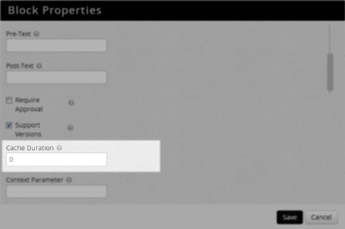 Rock's Framework UI allows admins to configure block attributes
Based on the parameters given in the declaration, the attribute can be ordered, named, categorized/grouped, described, required, and a default value can be provided.
To retrieve the stored property value use the GetAttributeValue( attributeName ) method.
int pageId = Convert.ToInt32( GetAttributeValue( "RootPage") );NOTE: There is different kind of configurable property, called Global Attributes, which are not block instance specific but instead are used to store configurable values that can be shared and used in any and all blocks and code (Scheduled Jobs, Transactions, etc.). See the Global Attributes section for more information about these settings.
The following are the different types which can be used in your blocks. Generally speaking, Rock renders some appropriate input UI (which corresponds to the datatype of the field) along with the description you provide.
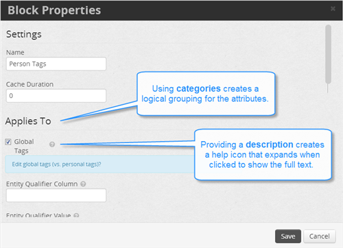
Each type will generally have a name, description, default value, required, category, and order, but some types will have additional properties you can control. You can provide these as named arguments which may make it a bit easier to read in your code. Here are the parameters that are common to all field attribute types:
-
name - (string) This is the title of the field which is shown to the administrator user. This is different than the programmatic key you use when you call
GetAttributeValue( string )described earlier. If you don't specify a key argument, by convention, the name (stripped of all spaces) is used as the key. - description - (string) This is the text that is shown in the help bubble.
- required - (boolean) Indicates whether or not a value must be provided/configured.
- defaultValue - (mixed) Holds a default value which is appropriate for the field type.
- category - (string) Used to group field attribute types into logical sets. This is useful when you have many fields which are related.
- order - (int) Used to order the field attribute types. The order is used first to determine the ordering for the category groupings and then it's used to order fields within the group. As such, you may wish to adopt the "tens" strategy whereby your first field category group uses the orders 10, 11, 12, etc. and your next field category uses 20, 21, etc.
-
key - (string) As mentioned earlier, the key is used to access the stored values for the attributes via the
GetAttributeValue( string )method.
BooleanField will render a checkbox.
Example 1 - a simple checkbox.
[BooleanField( "Show Notification" )]
Example 2 - This will render a checkbox, which defaults to true (checked), within a grouping category called "Applies To" and with a helpful description.
[BooleanField( "Global Tags", "Edit global tags (vs. personal tags)?", true, "Applies To" )]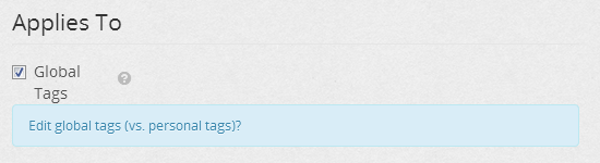
Renders a set of checkboxes of each campus allowing for multiple selection.
Example 1 - This will render the campus checkboxes with the required value set to false allowing the administrator to select/check none of them if desired.
[CampusesField( "Campuses", "Display Ads for selected campus" )]
This field type lets you define a custom list of values from which the administrator can pick. It will render the list as a group of checkboxes allowing one or more items to be selected.
The format of the listSource (values) field is a comma delimited set of [value]s or [value]:[text] pairs or a SQL Select statement that returns result set with a Value and Text column. The [text] part will be shown to the user while the value will be used internally and stored/saved. In the defaultValue parameter you can default select one or more items by using a comma delimited set of [value]s as shown below.
Example 1 - an Audience to Target option will be shown with two checkboxes, "Primary" and a "Secondary", and by default they will both be selected/checked.
   [CustomCheckboxListField( "Audience to Target", "The audience to display marketing items for.",
       "1:Primary,2:Secondary", false, "1,2" )]
In order to make things clearer to you and other developers, you can also use named parameters as shown here with the required and defaultValue parameters:
   [CustomCheckboxListField( "Audience to Target", "The audience to display marketing items for.",
"1:Primary,2:Secondary", required: false, defaultValue:"1,2" )]Similar to the previous field, this field type lets you define a custom list of values from which the administrator can pick. It will render the list as a dropdown list allowing an item to be selected.
The format of the listSource (values) field is a comma delimited set of [value]s or [value]:[text] pairs or a SQL Select statement that returns result set with a Value and Text column. The [text] part will be shown to the user while the value will be used internally and stored/saved. In the defaultValue parameter you can default select and item by providing the value as shown below.
    [CustomDropdownListField( "Start Time", "the time at which the notice will be processed",
        "1:6 AM,2:7 AM,3:8 AM", false, "2" )]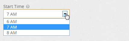
Example 2 - Using a SQL select statement for the listSource.
    [CustomDropdownListField( "Primary Role", "the main role for this request",
        listSource:"SELECT [Id] as 'Value', [Name] as 'Text' FROM [GroupRole] ORDER BY [SortOrder]")]
Similar to the Custom Checkbox and Dropdown attribute fields, this field type lets you define a custom list of values from which the administrator can select one. It will render the list as a radio button group allowing a single item to be selected.
The format of the listSource (values) field is a comma delimited set of [value]s or [value]:[text] pairs or a SQL Select statement that returns result set with a Value and Text column. The [text] part will be shown to the user while the value will be used internally and stored/saved. In the defaultValue parameter you can default select and item by providing the value as shown below.
Example 1 - A static list of radio buttons for Yes and No that defaults to No and is required.
    [CustomRadioListField( "Radio Options", "a list of options", "1:Yes,2:No", required: true,
        defaultValue: "2" )]
Example 2 - Using a SQL select statement for the listSource to get a list of Rock Campuses.
    [CustomRadioListField( "Choose Campus", "a list of campuses",
        listSource: "SELECT [Id] as 'Value', [Name] as 'Text' FROM [Campus] ORDER BY [Name]" )]
This field will build a drop down selector listing all the values for the given DefinedType. Whether your in need of a well known value or a custom value from a custom DefinedType you added into the system, this attribute field simplifies getting & setting the administrator configured value.
    [DefinedValueField( Rock.SystemGuid.DefinedType.MARKETING_CAMPAIGN_AUDIENCE_TYPE, "Audience",
        "The audience you wish to target with ads." )]
Use this Block attribute when you have a grid that needs to link to a page that handles the details for the grid's item as seen in the Grid -> Item Details UX pattern. It currently renders as a dropdown list selector of pages.
Example:
[DetailPage]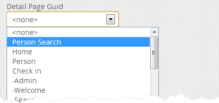
This will render a drop down list of all known Rock Entities. It's useful if your block has some general purpose functionality which can be applied to specific entities.
[EntityType( "Selected Type", "Select the entity type you wish to bind to the tree view." )]
Renders a flat list of all groups in the form of a dropdown list.
[GroupField( "Group", "Select the root group to show in this block." )]Renders all known group types in the form of a set of checkboxes.
[GroupTypesField( "Group Types", "Select group types to show in this block." )]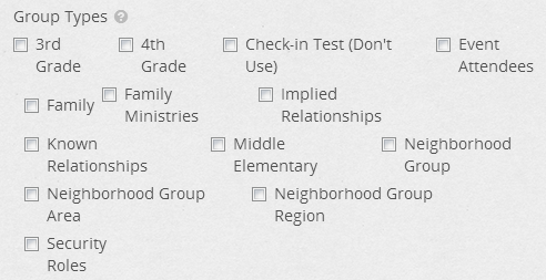
An integer field renders as a textbox that accepts only whole number (integer) values as input.
Example 1 - An empty field that accepts a whole number but does not require a setting.
[IntegerField( "Max Items", "Maximum number of items to display; otherwise shows all." )]
Example 2 - Defaults to the value of 0 and requires a number to be set.
    [IntegerField( "Cache Duration", "Number of seconds to cache the content.",
        required: true, defaultValue: 60)]
Similar to the DetailPage described above, this attribute renders dropdown list of pages. It lets the administrator wire up pages to your block that may be unknown to you (the developer) and is handy when your block has a relationship to something but does not handle the functionality for that thing.
Note: You can only use one LinkedPage attribute per block.
[LinkedPage( "Calendar Page", "The page that holds the calendar for viewing upcoming events." )]Renders a simple textbox useful for collecting a miscellaneous value from the administrator.
Example 1 - a textbox with no default and requiring no value.
[TextField( "License Key", "The Service Objects License Key" )]
Example 1 - a textbox with a default and also requires a value.
    [TextField( "XSLT File", "The path to the XSLT File ", required: true,
        defaultValue: "~/Assets/XSLT/PageList.xslt" )]
Note: Creating custom field attributes is considered an advanced topic.
By extending Rock.Attribute.FieldAttribute, custom field types can be created (that exist in other assemblies) and utilized in block properties. See the Custom Field Attributes and FieldTypes for details.
Rock uses DotLiquid internally for merging field values into string templates. That means you can store a "template" and Rock using Liquid can replace your output tokens (things like {{ person.Person.Name }}) with the actual values of from your item (like "John Smith").
In Rock there is an extension method on string called ResolveMergeFields() so any string that is a liquid template can easily be merged with a collection of objects to be merged. Let's look at a simple example where we have the text for an email message and a person that we're sending it to.
Example 1
    var emailBody = "{{person.GivenName}}, pretend this msgBody was stored somewhere.";
    Person person = new PersonService().Get( 1 );

    var mergeObjects = new Dictionary<string, object>();

    // Add a person to the mergeObjects dictionary
    mergeOjects.Add( "person", person );

    // output will be "Admin, pretend this msgBody was stored somewhere."
    var output = emailBody.ResolveMergeFields( mergeObjects );
TODO Explain this next example
Example 2
    {% for location in groupType.Locations %}
        {% for group in location.Groups %}
            {% for schedule in group.Schedules %}
                {{ schedule.Schedule.Name }}
            {% endfor %}
        {% endfor %}
    {% endfor %}
See http://wiki.shopify.com/UsingLiquid and http://dotliquidmarkup.org/ for reference.
Use the PageParameter( string ) method when fetching values from the QueryString or route. This method hides the complexity of having to find the value in either the QueryString or the URL route.
            if ( !Page.IsPostBack )
            {
                string itemId = PageParameter( "categoryId" );
                if ( !string.IsNullOrWhiteSpace( itemId ) )
                {
                    ShowDetail( "categoryId", int.Parse( itemId ) );
                }
                else
                {
                    pnlDetails.Visible = false;
                }
}As seen in the above code example, we're encouraging the use of a ShowDetail( string parameter, int value ) method when appropriate to to handle the displaying of the detail of your block's 'item'. This method is required if your block implements the IDetailBlock interface. See the List Detail Pattern in the UI Guidelines section for more.
The Rock framework has a mechanism for storing and retrieving preferences (settings) for the current user. For example, let's say your block has options for sorting or filtering, and you'd like to "remember" how the user sets them each time they use the block. This is an ideal case for using this mechanism. See the user's preferences document for more details.
When you save a new entity using the service layer, be aware that Entity Framework will not automatically hydrate any related entities unless you use a new service. For example, a PrayerRequest has a relationship to a Category entity, and when we save a new PrayerRequest after setting its CategoryId property as shown below, the Category property is not automatically populated/hydrated -- even if you try to Get it using the same service after saving it:
    prayerRequest.CategoryId = 9;
    prayerRequestService.Save( prayerRequest, CurrentPersonId );
    prayerRequest = prayerRequestService.Get( prayerRequest.Id ); // Warning!
    var category = prayerRequest.Category; // THIS IS NULL
Instead, you need to use a new service object as shown here:
    // prayerRequest = prayerRequestService.Get( prayerRequest.Id );
    prayerRequest = new PrayerRequestService().Get( prayerRequest.Id ); // Good.
    var category = prayerRequest.Category; // Now it's there.
Securing functionality access within your block is easy to do. To test whether the current user (if there is one) is allowed to perform the requested action just use the IsUserAuthorized (string action) method
where action is one of "View", "Edit", or "Administrate" as seen here:
    if ( ! IsUserAuthorized( "View" ) )
    {
        message = "You are not allowed to see this content.";
        ...

    if ( IsUserAuthorized( "Edit" ) || IsUserAuthorized( "Administrate" ) )
    {
        rGrid.Actions.IsAddEnabled = true;
        ...
If you need to define additional custom action names to control your custom functionality, you can simply decorate your block with [AdditionalActions()] like this:
[AdditionalActions( new string[] { "Approve" } )]NOTE: You will need to include using Rock.Security; in your block. Once you do this, you can then use the IsUserAuthorized(string action) method to verify user authorization.
- "View" - grants the ability to view the item's public properties
- "Edit" - includes view access and the ability to change the item's name and other properties
- "Administrate" - means the block's security and block's settings can be changed.
When validating a user's input, you'll need to provide some feedback to let them know when they've entered something incorrectly. Use a ValidationSummary control at the top of an edit panel with the Bootstrap standard class:
<asp:ValidationSummary ID="ValidationSummary1" runat="server" CssClass="alert alert-error" />
It will look something like this when the user runs into trouble with their input:

The standard data field controls (DataTextBox, DataDropDownList, etc.) in your UI Toolkit will also render appropriate error conditions with the proper Bootstrap validation states as seen here:

If using a custom or regular input control, be sure to follow the Bootstrap documentation on Form control Validation states.
Both the BlockType and the Page entities have a public CurrentTheme property that can be used in either a block or template file to get the resolved path to the current theme folder. Here's an example of how to use this property:
Markup:
<img src="<%= CurrentTheme %>/Images/avatar.gif">
Code Behind:
myImg.ImageUrl = CurrentTheme + "/Images/avatar.gif";If trying to reference a resource that is not in the theme folder, you can use the ResolveUrl() method of
the System.Web.UI.Control object. For example:
<link type="text/css" rel="stylesheet" href='<%# ResolveUrl("~/CSS/reset-core.css") %>' />
When a block needs to add a reference into the page Head for another asset (JavaScript, CSS, etc.) it should use one of these methods from the Page class. The path should be relative to the layout template.
JavaScript - CurrentPage.AddScriptLink( this.Page, "../../../scripts/ckeditor/ckeditor.js" );
CSS - CurrentPage.AddCSSLink( this.Page, "../..//css/cms-core.css" );
Custom – CurrentPage.AddHtmlLink( this.Page, linkObject );
Example Usage:
 System.Web.UI.HtmlControls.HtmlLink rssLink = new System.Web.UI.HtmlControls.HtmlLink();
 rssLink.Attributes.Add( "type", "application/rss+xml");
 rssLink.Attributes.Add( "rel", "alternate" );
 rssLink.Attributes.Add( "href", blog.PublicFeedAddress );
 rssLink.Attributes.Add( "title", "RSS" );
CurrentPage.AddHtmlLink( this.Page, rssLink );Blocks can communicate with each other through the sharing of objects. The base Block class has a CurrentPage object that is a reference to the current Cms Page object. This object has two methods for saving and retrieving shared objects specific to current page request. Within your block, you can call:
   CurrentPage.SaveSharedItem( string key, object item )`
   CurrentPage.GetSharedItem( string key )
Example Usage:
 // try loading the blog object from the page cache
 Rock.Models.Cms.Blog blog = CurrentPage.GetSharedItem( "blog" ) as Rock.Models.Cms.Blog;

 if ( blog == null )
 {
     blog = blogService.GetBlog( blogId );
     CurrentPage.SaveSharedItem( "blog", blog );
 }
It's worth noting that the order in which loaded blocks modify these shared objects cannot be guaranteed without further preparation and coordination.
The standard location for all custom blocks is in the Plugins folder. Create your own folder under the Plugins folder to hold any custom blocks created by your team:
+---Plugins
    \---FakeCompany.com
        \---TimeClock
            \---Blocks
                    ExampleTimeBlock.ascx
                    ExampleTimeBlock.ascx.cs
There's not really any big difference besides preference. Overriding the base method (OnInit) may be slightly
faster than invoking an event delegate (Page_Init), and it also doesn't require using the AutoEventWireup
feature, but essentially it comes down to preference. My preference is to override the event. (I.e. use OnInit or
OnLoad instead of Page_Init or Page_Load).
This article
discusses this in detail.
There's a significant difference between putting code into the OnInit (Page_Init) method compared to the
OnLoad (Page_Load) method, specifically in how it affects ViewState. Any change you make to a control
in the Init portion of the page life cycle does not need to be added to ViewState, however, if changed in the
Load portion it does. Consider a dropdown box of all the states. If you load the dropdown in the OnLoad method,
all of the 50 items of the dropdown box will be added to the ViewState collection, but if you load it in the OnInit
method, they will not. For performance sake, we want to keep ViewState as small as possible. So whenever
possible set the properties of controls in the OnInit method.
Please read this article on Understanding ViewState.
To cache methods (AddCacheItem(), GetCacheItem(), FlushCacheItem()) can be used to cache custom data across requests. By default the item's cache key will be unique to the block but if caching several items in your block you can specify your own custom keys for each item.
    // Store into cache
    int cacheDuration = 0;
    if ( Int32.TryParse( GetAttributeValue( "CacheDuration" ), out cacheDuration ) && cacheDuration > 0 )
    {
        AddCacheItem( entityValue, html, cacheDuration );
    ...

    // Elsewhere, pull from cache
    string entityValue = EntityValue();
    string cachedContent = GetCacheItem( entityValue ) as string;


    // When finished, flush the cache
    FlushCacheItem( entityValue );