UI Toolkit
Rock has a collection of fantastic UI controls that will help you develop blocks much quicker than if you has to write everything from scratch. This toolkit is quickly becoming one of the coolest features for community Rock developers.
Gives your users the ability to select a category from a tree style view of categories.
<Rock:CategoryPicker ID="cpParentCategory" runat="server" LabelText="Parent Category" />
Attachments/UI-Toolkit/rock-categorypicker-example.png

When using the category picker with an entity that has a category, specify the entity type using the CategoryEntityTypeName property. That will cause the category picker to only list the right kind of categories.
You can also require a value be selected by setting Required="true".
    <Rock:CategoryPicker ID="cpCategory" runat="server" LabelText="Category"
        Required="true" CategoryEntityTypeName="Rock.Model.PrayerRequest"/>
Attachments/UI-Toolkit/rock-categorypicker-example2.png

The Rock Grid makes it a breeze to quickly display your entity lists. (Note: use an IList, not IQueryable, for your DataSource.)

Set the Grid's Actions.IsAddEnabled to true to enable the Add icon on the grid toolbar. Add your custom handler to the grid's Actions.AddClick handler as shown in the example below.
This generates a native XLSX file. If the grid's Caption property is set it will be used for the filename. There is a property on the grid ShowActionExcelExport that allows the developer to disable the display of the icon.
Set the Grid's Actions.IsExcelExportEnabled to false to prevent the default Export to Excel functionality.
Tap into the grid's drag-and-drop reordering capabilities by binding your custom reorder handler to the grid's GridReorder event handler. Since the Rock.Data.Service has a Reorder() method, any entity service class that inherits from Service<t> can easily have its items reordered.
protected override void OnInit( EventArgs e )
{
    // ...
    gMyGrid.GridReorder += gMyGrid_GridReorder;
    gMyGrid.Actions.IsAddEnabled = true;
    gMyGrid.Actions.AddClick += gMyGrid_Add;
}

void gMyGrid_GridReorder( object sender, GridReorderEventArgs e )
{
    // ...
    Service.Reorder( mylist, e.OldIndex, e.NewIndex, CurrentPersonId );
    BindGrids();
}

void gMyGrid_Add( object sender, EventArgs e )
{
    ShowEdit( 0 ); // a method that builds a form for your entity/item
}You also need to implement a GridRebind handler for data rebinding:
    protected override void OnInit( EventArgs e )
    {
       gMyGrid.GridRebind += gMyGrid_GridRebind;
//...In addition to the three classes (grid-table, table-bordered, and table-striped; see Bootstrap Base CSS Tables) used to style the Grid, there are two other classes (table-full and table-light) which are used based on the grid's (DisplayType). Setting the DisplayType property of the grid to "Light" will create a simplified grid without a heavy header or footer.
    <Rock:Grid ID="gMarketingCampaignAudiencesPrimary" runat="server" DisplayType="Light">
        <Columns>
            <asp:BoundField DataField="Name" HeaderText="Primary Audience" />
            <Rock:DeleteField OnClick="gMarketingCampaignAudiences_Delete" />
        </Columns>
    </Rock:Grid>

The Rock Grid uses bootbox which uses Twitter Bootstrap Modals for things like delete confirmation, etc. Therefore theme makers will be able to style the modals to suite their needs.
The GridFilter provides a standard mechanism for filtering your grid and for retaining the values a user sets in the filter. By default your grid should 'show everything' and then use filters to reduce the amount of data on the grid. You should also store the user's filter settings for re-use later.

An excerpt from the Financial.ascx block.
	<Rock:GridFilter ID="rFilter" runat="server"
OnApplyFilterClick="rFilter_ApplyFilterClick" OnDisplayFilterValue="rFilter_DisplayFilterValue">
	    <Rock:DateTimePicker ID="dtStartDate" runat="server" SourceTypeName="Rock.Model.FinancialTransaction, Rock"
           PropertyName="TransactionDateTime" LabelText="From Date" />
	    <Rock:DateTimePicker ID="dtEndDate" runat="server"  SourceTypeName="Rock.Model.FinancialTransaction, Rock"
           PropertyName="TransactionDateTime" LabelText="To Date" />
	    <Rock:LabeledTextBox ID="txtFromAmount" runat="server" LabelText="From Amount"></Rock:LabeledTextBox>
	    <Rock:LabeledTextBox ID="txtToAmount" runat="server" LabelText="To Amount"></Rock:LabeledTextBox>
	    <Rock:LabeledTextBox ID="txtTransactionCode" runat="server" LabelText="Transaction Code"></Rock:LabeledTextBox>
	    <Rock:LabeledDropDownList ID="ddlFundType" runat="server" LabelText="Fund Type" />
	    <Rock:LabeledDropDownList ID="ddlCurrencyType" runat="server" LabelText="Currency Type" />
	    <Rock:LabeledDropDownList ID="ddlCreditCardType" runat="server" LabelText="Credit Card Type" />
	    <Rock:LabeledDropDownList ID="ddlSourceType" runat="server" LabelText="Source Type" />
	</Rock:GridFilter>
The OnApplyFilterClick handler will fire once the user clicks the Apply button in the filter. In your handler you may want to save certain settings as user's preferences and re-bind your grid using the filters.
By calling the filter's SaveUserPreference(string key, string value) method with the value of each field, Rock will store the user's preferences for re-use next time they use the filter/grid on this page.
    protected void rFilter_ApplyFilterClick( object sender, EventArgs e )
    {
        rFilter.SaveUserPreference( "From Date", dtStartDate.Text );
        rFilter.SaveUserPreference( "To Date", dtEndDate.Text );
        rFilter.SaveUserPreference( "From Amount", txtFromAmount.Text );
        rFilter.SaveUserPreference( "To Amount", txtToAmount.Text );
        // ...
        rFilter.SaveUserPreference( "Source", ddlSourceType.SelectedValue != All.Id.ToString() ?
            ddlSourceType.SelectedValue : string.Empty );

        BindGrid();
}
The next time the user views the grid on that page, the filter grid will display the user's previously stored preferences.

Normally the filter will automatically display previously stored filter preferences, however in certain cases the value that is stored is a primary key (i.e., not suitable for displaying). In this case you should can handle the GridFilter's DisplayFilterValue event.
For example, suppose we've got a dropdown list of SourceTypes in our filter which are actually items of a particular Defined Type. To display the name of the selected item in the dropdown list we must convert the stored key value to the proper name as shown in this code snippet from the Financial.ascx.cs block. The event argument's Key will be the string you provided when you called SaveUserPreference.
protected void rFilter_DisplayFilterValue( object sender, Rock.Web.UI.Controls.GridFilter.DisplayFilterValueArgs e )
{
    switch ( e.Key )
    {
        // Handle each user preference as needed
        // ...

        case "Source":
            int definedValueId = 0;
            if ( int.TryParse( e.Value, out definedValueId ) )
            {
                var definedValue = DefinedValueCache.Read( definedValueId );
                if ( definedValue != null )
                {
                    e.Value = definedValue.Name;
                }
            }
            break;
    }
}
Notice how the e.Value is parsed and used to fetch the corresponding DefinedValue from the cache. If it was found, the e.Value is set to its Name property. This will be a common approach when using Defined Types in any grid filters you create.
When the user has a chance to filter based on a yes/no (boolean) property, it's recommended that you allow them to use a radio-button-list to make their choice with a three option list:

With this approach the user can easily choose to see "all" (yes or no), or only the "yes" or only the "no" items. In this case, you may also choose to use a drop-down-list. Normally a drop-down-list hides what other choices a user may make but in this case they are fairly intuitive and expected.
There are a growing number of custom data-bound fields you can use inside a Rock Grid for more rapid and consistent development. You simply use them inside a Rock:Grid as you would standard data bound grid controls and bind them to the data item's property using the DataField.
    <Rock:Grid ID="gGrid" runat="server">
        <Columns>
            <%-- ... Examples ... --%>
            <Rock:BoolField DataField="IsSystem" HeaderText="System" SortExpression="IsSystem" />
            <Rock:SecurityField />
        </Columns>
    </Rock:Grid>
The BadgeField will style your field's value into a standard Bootstrap badge.
    <Rock:BadgeField DataField="Blocks.Count" HeaderText="Flag Count" SortExpression="Blocks.Count"
        ImportantMin="0" ImportantMax="0" InfoMin="1" InfoMax="1" SuccessMin="2"  />

You can easily control the badge color (BadgeType) based on the field's value by setting an appropriate *Min and/or *Max value (int) for the Success, Warning, Important, and Info properties as shown above. If you need more control you can also implement a handler for OnSetBadgeType to do something like this:
    protected void Blocks_SetBadgeType( object sender, BadgeRowEventArgs e )
    {
        int blockCount = (int)e.FieldValue;
        if ( blockCount == 0 )
        {
            e.BadgeType = BadgeType.Important;
        }
        else if ( blockCount > 1 )
        {
            e.BadgeType = BadgeType.Success;
        }
        else
        {
            e.BadgeType = BadgeType.Info;
        }
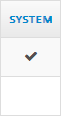
}The BoolField simply displays a checkmark (a Bootstrap "ok" icon glyph) when your Boolean value is true and displays nothing if it is false.
<Rock:BoolField DataField="IsSystem" HeaderText="System" SortExpression="IsSystem" />
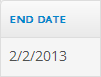
This field will render your DateTime properties using Rock standard date formatting and will not include the time part of the item's value.
<Rock:DateField DataField="EndDate" HeaderText="End Date" SortExpression="EndDate"/>
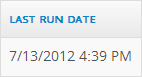
This field will render your DateTime properties using Rock standard date formatting and will not include the time part of the item's value.
<Rock:DateTimeField DataField="LastRunDateTime" HeaderText="Last Run Date" SortExpression="LastRunDateTime" />
This field adds a standard "delete" button for each item in the grid. You need to write the OnClick handler to actually perform the delete.
<Rock:DeleteField OnClick="gCampuses_Delete" />

This field adds a standard "edit" button for each item in the grid.
<Rock:EditField OnClick="gGridExample_Edit" />

You need to write the OnClick handler for the edit action.
    protected void gGridExample_Edit( object sender, RowEventArgs e )
    {
        // this will be whatever you used for your Grid's DataKeyName
        Guid aGuid = (Guid)e.RowKeyValue;
        ShowEdit( aGuid );
}Similar to the Rock:EditField, this is actually intended for use with editing an item's column value. You can see this used in combination with the Rock:ModalDialog in the Attributes.ascx block.
<Rock:EditValueField OnClick="rGrid_EditValue" />

You need to write the OnClick handler for the edit action.
    protected void rGrid_EditValue( object sender, RowEventArgs e )
    {
        ShowEditValue( (int)rGrid.DataKeys[e.RowIndex]["id"], true );
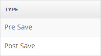
}This field can bind to an entity property that is an enum. For example, consider the Workflow entity's WorkflowTriggerType property; it is an enum such as shown here:
    public enum WorkflowTriggerType
    {
        PreSave = 0,
        PostSave = 1,
        PreDelete = 2,
        PostDelete = 3
    }
When binding in a grid using the Rock:EnumField like this:
<Rock:EnumField DataField="WorkflowTriggerType" HeaderText="Type" />
It will display the item's enum name value using a 'split on camelCase' and/or 'split on TitleCase' algorithm.
This is a draggable reorder widget that let's the user reorder an entity item's order.
<Rock:ReorderField />

You will need to implement a GridReorder handler to deal with the reorder action when it occurs. Your method can access the OldIndex and NewIndex values from the GridReorderEventArgs. Consider this condensed example from the Tags.ascx.cs block type:
    protected override void OnInit( EventArgs e )
    {
        base.OnInit( e );
        rGrid.GridReorder += rGrid_GridReorder;
    }

    void rGrid_GridReorder( object sender, GridReorderEventArgs e )
    {
        var tagService = new Rock.Model.TagService();
        var queryable = tagService.Queryable().
            Where( t => t.EntityTypeId == _entityTypeId &&
                ( t.EntityTypeQualifierColumn ?? string.Empty ) == _entityQualifierColumn &&
                ( t.EntityTypeQualifierValue ?? string.Empty ) == _entityQualifierValue );

        var items = queryable
            .OrderBy( t => t.Order )
            .ToList();

        tagService.Reorder( items, e.OldIndex, e.NewIndex, CurrentPersonId );

        BindGrid();
}If your item supports security, adding this column will display a security icon button which will allow the user to set the item's security via a modal popup.
<Rock:SecurityField />

Clicking on the security icon will create a modal popup for editing the items security.
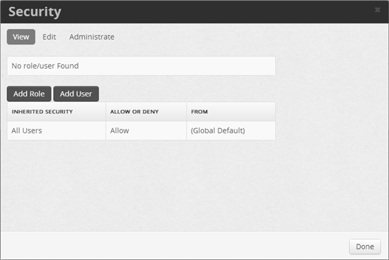
To properly use this field, you need to set the EntityType to the appropriate Rock Entity in your Block's OnInit method as seen in this example from the SiteList.ascx.cs block:
    protected override void OnInit( EventArgs e )
    {
        base.OnInit( e );

        // ...
        SecurityField securityField = gSites.Columns[3] as SecurityField;
        securityField.EntityType = typeof( Rock.Model.Site );
}Based on Mattia Larentis' Bootstrap Switch project, the ToggleField will generate a modern toggle-style switch that's useful for letting the user change a boolean property inline. You bind it to your items' property by setting the DataField value and you can control the on and off text with the OnText and OffText respectively.
    <Rock:ToggleField DataField="IsApproved" HeaderText="Approval Status" CssClass="switch-large"
        Enabled="True" OnText="yes" OffText="no" OnCheckedChanged="gPrayerRequests_CheckChanged" />

You will also need to define an OnCheckedChanged handler to make the corresponding changes when the user clicks the toggle button. See the gPrayerRequests_CheckChanged handler in the PrayerRequestList.ascx.cs block for an example implementation.
By default the field will use the switch-mini CSS style, but you can override it by setting the CssClass property.
NOTE: If you need to disable the toggle field based on a users permissions, since their is currently no way to attach your Block's custom security actions (example
[AdditionalActions( new string[] { "Approve" } )]) into the grid, you will need to disable each toggle field during the grid'sOnRowDataBoundevent. See thegPrayerRequests_RowDataBoundmethod in thePrayerRequestList.ascx.csblock for an example implementation.