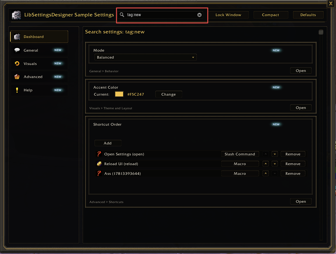
Search And New Badges
Contents
Search text is built from the metadata users can reasonably know:
- control label/title/text/id
- description
- key
control.keywords or control.searchtags- page title
- group title
- category title
- note title/text/blocks
Runtime search returns controls, not standalone pages. Use aliases when users might search for a different term than the visible label.
Use keywords or searchtags on a control when users may search for terms that
are not visible in the label or description.
Both fields are accepted. Prefer keywords for new direct LibSettingsDesigner
metadata and use searchtags when bridging existing wrapper APIs. If both are
set on a control, the current runtime indexes keywords.
app:RegisterControl("interface.names", {
  id = "showNicknames",
  key = "showNicknames",
  type = "toggle",
  label = "Show nicknames",
  description = "Use nicknames in group frames.",
  keywords = { "alias", "display name", "social name" },
  default = false,
})
Per-setting tags are useful for:
- old setting names
- common abbreviations
- user slang
- feature module names
- related UI words
- slash command terms
- names from another addon or older UI
Avoid keyword spam. Search aliases should help users find the setting, not turn every setting into a result for every query.
Page-level keywords and searchtags are not indexed by the current runtime.
Put page-level aliases on important controls, or implement page search support
before documenting page aliases:
app:RegisterControl("interface.action-bars", {
  id = "fadeActionBars",
  key = "fadeActionBars",
  type = "toggle",
  label = "Fade action bars",
  keywords = { "bars", "hotkeys", "buttons" },
  default = false,
})
Wrapper bridge example:
app:RegisterLegacyControl({
  id = data.id or data.var,
  key = data.var,
  type = "toggle",
  label = data.text,
  description = data.desc,
  keywords = data.keywords or data.searchtags,
})When a setting was renamed from "Mouseover bars" to "Fade action bars", keep the old term as an alias:
app:RegisterControl("interface.action-bars", {
  id = "fadeActionBars",
  key = "fadeActionBars",
  type = "toggle",
  label = "Fade action bars",
  description = "Fade action bars until hovered.",
  keywords = { "mouseover bars", "bar opacity", "hide bars" },
  default = false,
})
New badges are host-addon state. LibSettingsDesigner only asks whether a stable tag is still new.
Use this model:
- Store new/seen state in the host addon's SavedVariables or release metadata.
- Provide
isNewTag(tagID)inConfig:RegisterAddOn. - Put
newTagIDon pages and controls that should show the badge. - Clear or expire the tag in host-addon code when the user has seen it, when a release age expires, or when the host addon's own "mark all as seen" action runs.
The app decides whether a tag is new:
local app = Config:RegisterAddOn(addonName, {
  isNewTag = function(tagID)
    local db = MyAddonDB.global
    return db
      and db.newTags
      and db.seenNewTags
      and db.newTags[tagID] == true
      and db.seenNewTags[tagID] ~= true
  end,
})
A page or control declares its tag:
newTagID = "FadeActionBars"Prefer explicit newTagID values. The current runtime also checks fallback
identifiers, which can make a badge appear through an id or DB key:
- pages:
page.newTagID,page.id,page.pageKey,page.key - controls:
control.newTagID,control.id,control.key
Badge on a page card/detail:
app:RegisterPage({
  id = "interface.action-bars",
  category = "interface",
  title = "Action Bars",
  description = "Configure action bar behavior.",
  newTagID = "ActionBarsPage",
  order = 100,
})
Badge on a specific control:
app:RegisterControl("interface.action-bars", {
  id = "fadeActionBars",
  key = "fadeActionBars",
  type = "toggle",
  label = "Fade action bars",
  newTagID = "FadeActionBars",
  default = false,
})
Use page badges for a new page or feature area. Use control badges for a new option inside an existing page.
LibSettingsDesigner does not own seen-state policy. Keep that in the host addon so different addons can use different release workflows.
Simple "mark when page opens" pattern:
local function markNewTagSeen(tagID)
  if not tagID then return end
  MyAddonDB.global = MyAddonDB.global or {}
  MyAddonDB.global.seenNewTags = MyAddonDB.global.seenNewTags or {}
  MyAddonDB.global.seenNewTags[tagID] = true
end

app:RegisterPage({
  id = "interface.action-bars",
  category = "interface",
  title = "Action Bars",
  newTagID = "ActionBarsPage",
  onOpen = function(page, app, state)
    markNewTagSeen(page.newTagID)
  end,
})
If the host addon does not have a page-open hook, clear tags from the wrapper or slash-command path that opens the settings page:
markNewTagSeen("ActionBarsPage")
ConfigUI:Open(app, "interface.action-bars")
For release-based badges, store the release id with the tag and expire it when the current addon version is newer than the introduction version.
MyAddonDB.global.newTags = {
  FadeActionBars = "2.4.0",
}
Do not use localized labels as tags. A translation update must not reset new badge state.
Wrapper helpers should forward newTagID to LibSettingsDesigner instead of
making feature modules call the raw API.
function addon.SettingsCreateCheckbox(category, data)
  app:RegisterLegacyControl({
    id = data.id or data.var,
    key = data.var,
    type = "toggle",
    label = data.text,
    description = data.desc,
    default = data.default,
    newTagID = data.newTagID,
    setValue = data.func,
  })
end
Feature module:
addon.SettingsCreateCheckbox(category, {
  var = "fadeActionBars",
  text = L["fadeActionBars"],
  desc = L["fadeActionBarsDesc"],
  default = false,
  newTagID = "FadeActionBars",
})- Search aliases are real terms users might type.
- Per-setting tags use
keywordsorsearchtags. - Renamed settings keep old names in
keywords. -
newTagIDvalues are stable and not localized. -
opts.isNewTag(tagID)exists before relying on badges. - Badge state and seen-state belong to the host addon, not LibSettingsDesigner.
- Wrappers forward
newTagIDwhen feature modules do not call raw Config APIs. - Tags are cleared or expired by explicit host-addon policy.