Checklist
Is your feature request related to a problem? Please describe.
I would like to compare values for different sensors at a glance. Namely, temperature sensors.
The radialBar could work, but it is relatively complex to judge the interval between values due to its curvature. For instance, if a sensor is just at the begining of the bar, and another at the end with a few more bars in between, it becomes hard to read.
Describe the solution you'd like
Simply add Apex's bar chart type, that display one value on each bar, with the same scale. I believe semantics could be kept similar to other graphs.
Bar charts are generally understood to be superior to other charts for readability, I'd very much like to see them included in this card.
Describe alternatives you've considered
Feel free to expand both sections for screenshot and code.
I tried making an equivalent with columns, but they are really narrow, which wastes a lot of space. I also believe this is slower than just taking the last sensor value from HA.
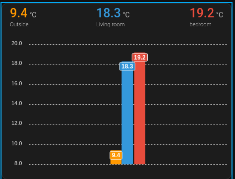
type: custom:apexcharts-card
header:
  show: true
  show_states: true
  colorize_states: true
all_series_config:
  type: column
  show:
    datalabels: true
graph_span: 3m
update_delay: 3m
show:
  loading: false
span:
  start: minute
entities:
  - entity: sensor.tempsensor3_temperature
    name: Outside
    group_by:
      func: last
      start_with_last: true
      duration: 40m
  - entity: sensor.thermometer_i9g_temperature
    name: Living room
    group_by:
      func: last
      start_with_last: true
      duration: 40m
  - entity: sensor.tze200_yvx5lh6k_ts0601_temperature
    name: bedroom
    group_by:
      func: last
      start_with_last: true
      duration: 3m
apex_config:
  legend:
    show: false
  xaxis:
    labels:
      show: false
    axisBorder:
      show: false
    axisTicks:
      show: false
    crosshairs:
      show: false
    tooltip:
      enabled: false
I also used mini-graph-card to create a similar card, but I like headers and tags from Apex.
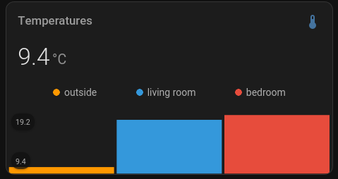
type: custom:mini-graph-card
name: Temperatures
hours_to_show: 2
aggregate_func: last
smoothing: false
entities:
  - entity: sensor.tempsensor3_temperature
    name: outside
  - entity: sensor.thermometer_i9g_temperature
    name: living room
  - entity: sensor.tze200_yvx5lh6k_ts0601_temperature
    name: bedroom
show:
  graph: bar
  labels: true
I also tried overriding Apex's chart: type: bar, but it didn't seem to work, as it gave me an empty graph.
Checklist
devbranchIs your feature request related to a problem? Please describe.
I would like to compare values for different sensors at a glance. Namely, temperature sensors.
The
radialBarcould work, but it is relatively complex to judge the interval between values due to its curvature. For instance, if a sensor is just at the begining of the bar, and another at the end with a few more bars in between, it becomes hard to read.Describe the solution you'd like
Simply add Apex's
barchart type, that display one value on each bar, with the same scale. I believe semantics could be kept similar to other graphs.Bar charts are generally understood to be superior to other charts for readability, I'd very much like to see them included in this card.
Describe alternatives you've considered
Feel free to expand both sections for screenshot and code.
I tried making an equivalent with columns, but they are really narrow, which wastes a lot of space. I also believe this is slower than just taking the last sensor value from HA.
I also used mini-graph-card to create a similar card, but I like headers and tags from Apex.
I also tried overriding Apex's
chart: type: bar, but it didn't seem to work, as it gave me an empty graph.