[ResourceList] Trunctate long sortOption label #2957
Conversation
|
🟢 This pull request modifies 2 files and might impact 1 other files. Details:All files potentially affected (total: 1)📄
|
 carolopolo
changed the title
carolopolo
force-pushed
the
resource-list/fix-sort-overflow
branch
from
carolopolo
changed the title
carolopolo
force-pushed
the
resource-list/fix-sort-overflow
branch
from
7e3a7a5 to
c875edf
Compare
 loic-d
left a comment
loic-d
left a comment
loic-d
left a comment
There was a problem hiding this comment.
🎩 LGTM
I think it makes sense to have the ellipsis on all viewports and not just small devices.
Would be great to get a second 👀 from a Polaris expert.
|
Looks like the focus ring gets cut off with the overflow hidden:
|


| // overflow: hidden; | ||
| // } | ||
|
|
||
| .SortWrapper { |
There was a problem hiding this comment.
@beefchimi this is a possible solution... tested on chrome, firefox & safari
but would love some input 🥬
There was a problem hiding this comment.
Okay, so this can actually be fixed rather easily 😄
You can replace ALL of your changed code in this file with:
.SortWrapper {
  @include layout-flex-fix;

  // Required to apply styles to the <Labelled /> component
  > * {
    max-width: 100%;
  }
}
That is the most simple solution. Two things to potentially alter:
1. Apply "layout fix" to all children
Personally, I would apply that layout-flex-fix mixin to ALL children of .HeaderContentWrapper. So, you could instead do:
.HeaderTitleWrapper,
.CheckableButtonWrapper,
.AlternateToolWrapper,
.SortWrapper,
.SelectButtonWrapper {
  @include layout-flex-fix;
}

.SortWrapper {
  // Required to apply styles to the <Labelled /> component
  > * {
    max-width: 100%;
  }
}
2. Try to avoid reaching into other components to override styles
The > * selector is specifically targeting the .Labelled direct child. It would be preferable if we did not have to apply this snowflake override style... so I'm wondering if max-width: 100% can live comfortably on the .Labelled selector within Labelled.scss. I think its worth experimenting with that change to see if it causes issues any where else <Labelled /> is used.
Explanation
We need to utilize this layout-flex-fix mixin on direct children ("flex items") of a display: flex parent in order to get truncation to work correctly. This is a very common problem/solution! All that mixin is doing is applying the following styles:
min-width: 0;
max-width: 100%;
This seems... silly, because those prop + values seem obvious and should be default behaviour.... right?!?! The short answer is: flex box items will not shrink below their minimum content size. So, if the minimum content size is computed as the full width of a sentence, it cannot be below that width in order to truncate. In comes out handy "flex fix" styling to say "well actually min-width can be 0".
For a better explanation, our very own @dfmcphee wrote a blog post on it!
https://dfmcphee.com/flex-items-and-min-width-0/
There was a problem hiding this comment.
thanks so much @beefchimi! really appreciate that.
fyi for posterity's sake:
adding the max-width: 100% on the .Labelled selector in Labelled.scss results in:
adding the @include layout-flex-fix; to all children of .HeaderContentWrapper results in:
so i'm going with your very fist suggestion. thanks again for your input!
There was a problem hiding this comment.
We could improve this further with some tweaks to the other HeaderContentWrapper, mainly to that SelectWrapper so that it has a min-width of at least the:
widthof acheckbox+spacing()
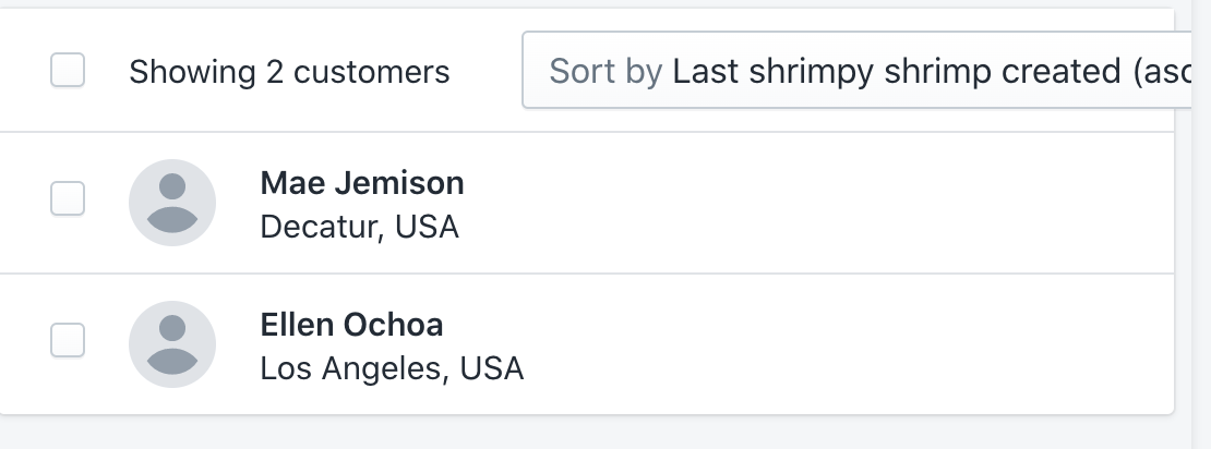
But just so other reviews know - the label of that "select checkbox" will truncate as well. Its just that Caroline's example is soooo long that it goes beyond the text label and starts encroaching onto the checkbox input. Realistically, we probably wouldn't end up in the scenario.
@carolopolo would you mind opening an issue with your 2nd screenshot to track this? You can link to this comment + include any relevant context.
 beefchimi
left a comment
beefchimi
left a comment
beefchimi
left a comment
There was a problem hiding this comment.
Alternate solution suggested in my review 😄
| // overflow: hidden; | ||
| // } | ||
|
|
||
| .SortWrapper { |
There was a problem hiding this comment.
Okay, so this can actually be fixed rather easily 😄
You can replace ALL of your changed code in this file with:
.SortWrapper {
  @include layout-flex-fix;

  // Required to apply styles to the <Labelled /> component
  > * {
    max-width: 100%;
  }
}
That is the most simple solution. Two things to potentially alter:
1. Apply "layout fix" to all children
Personally, I would apply that layout-flex-fix mixin to ALL children of .HeaderContentWrapper. So, you could instead do:
.HeaderTitleWrapper,
.CheckableButtonWrapper,
.AlternateToolWrapper,
.SortWrapper,
.SelectButtonWrapper {
  @include layout-flex-fix;
}

.SortWrapper {
  // Required to apply styles to the <Labelled /> component
  > * {
    max-width: 100%;
  }
}
2. Try to avoid reaching into other components to override styles
The > * selector is specifically targeting the .Labelled direct child. It would be preferable if we did not have to apply this snowflake override style... so I'm wondering if max-width: 100% can live comfortably on the .Labelled selector within Labelled.scss. I think its worth experimenting with that change to see if it causes issues any where else <Labelled /> is used.
Explanation
We need to utilize this layout-flex-fix mixin on direct children ("flex items") of a display: flex parent in order to get truncation to work correctly. This is a very common problem/solution! All that mixin is doing is applying the following styles:
min-width: 0;
max-width: 100%;
This seems... silly, because those prop + values seem obvious and should be default behaviour.... right?!?! The short answer is: flex box items will not shrink below their minimum content size. So, if the minimum content size is computed as the full width of a sentence, it cannot be below that width in order to truncate. In comes out handy "flex fix" styling to say "well actually min-width can be 0".
For a better explanation, our very own @dfmcphee wrote a blog post on it!
https://dfmcphee.com/flex-items-and-min-width-0/
 carolopolo
force-pushed
the
resource-list/fix-sort-overflow
branch
from
carolopolo
force-pushed
the
resource-list/fix-sort-overflow
branch
from
65a19e4 to
d781690
Compare
| // overflow: hidden; | ||
| // } | ||
|
|
||
| .SortWrapper { |
There was a problem hiding this comment.
We could improve this further with some tweaks to the other HeaderContentWrapper, mainly to that SelectWrapper so that it has a min-width of at least the:
widthof acheckbox+spacing()
But just so other reviews know - the label of that "select checkbox" will truncate as well. Its just that Caroline's example is soooo long that it goes beyond the text label and starts encroaching onto the checkbox input. Realistically, we probably wouldn't end up in the scenario.
@carolopolo would you mind opening an issue with your 2nd screenshot to track this? You can link to this comment + include any relevant context.
|
🎉 Thanks for your contribution to Polaris React! |
4 participants
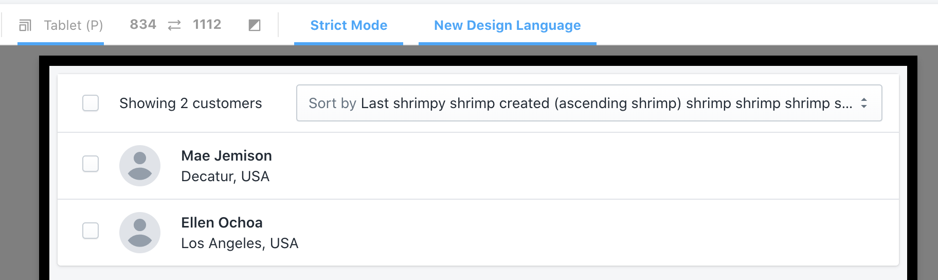
WHY are these changes introduced?
Fixes https://github.com/Shopify/store/issues/14834
WHAT is this pull request doing?
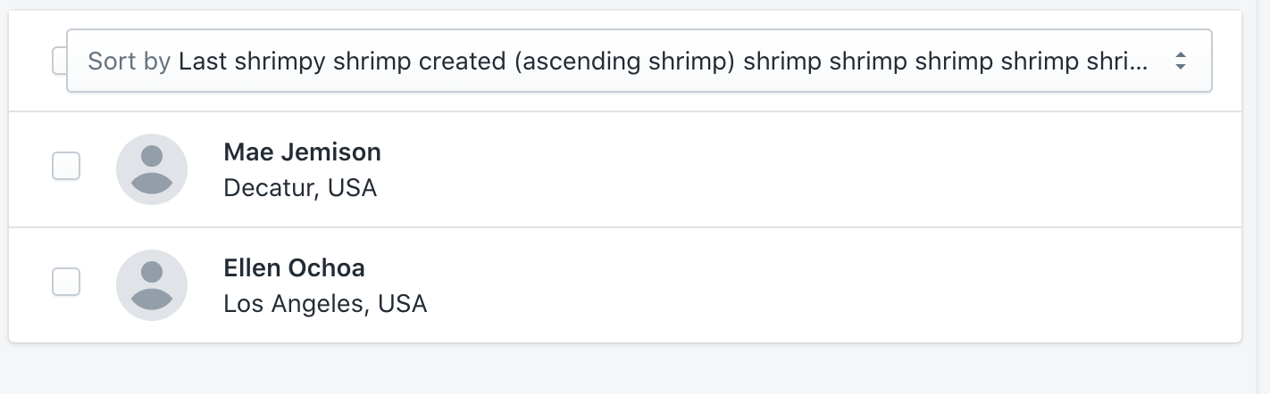
No matter the viewport size, it truncates the sortOption label if it doesn't fit. Previously, we were only truncating for mobile/small screens. This PR addresses running into the same problem on various screens.
How to 🎩
🖥 Local development instructions
🗒 General tophatting guidelines
📄 Changelog guidelines
Copy-paste this code in
playground/Playground.tsx:🎩 checklist
README.mdwith documentation changes