Two components. Zero boilerplate. One less headache.


⭐ If this saves you time, consider starring the repo — it helps other developers find it.
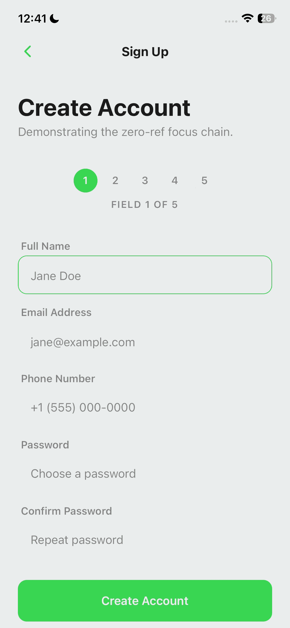
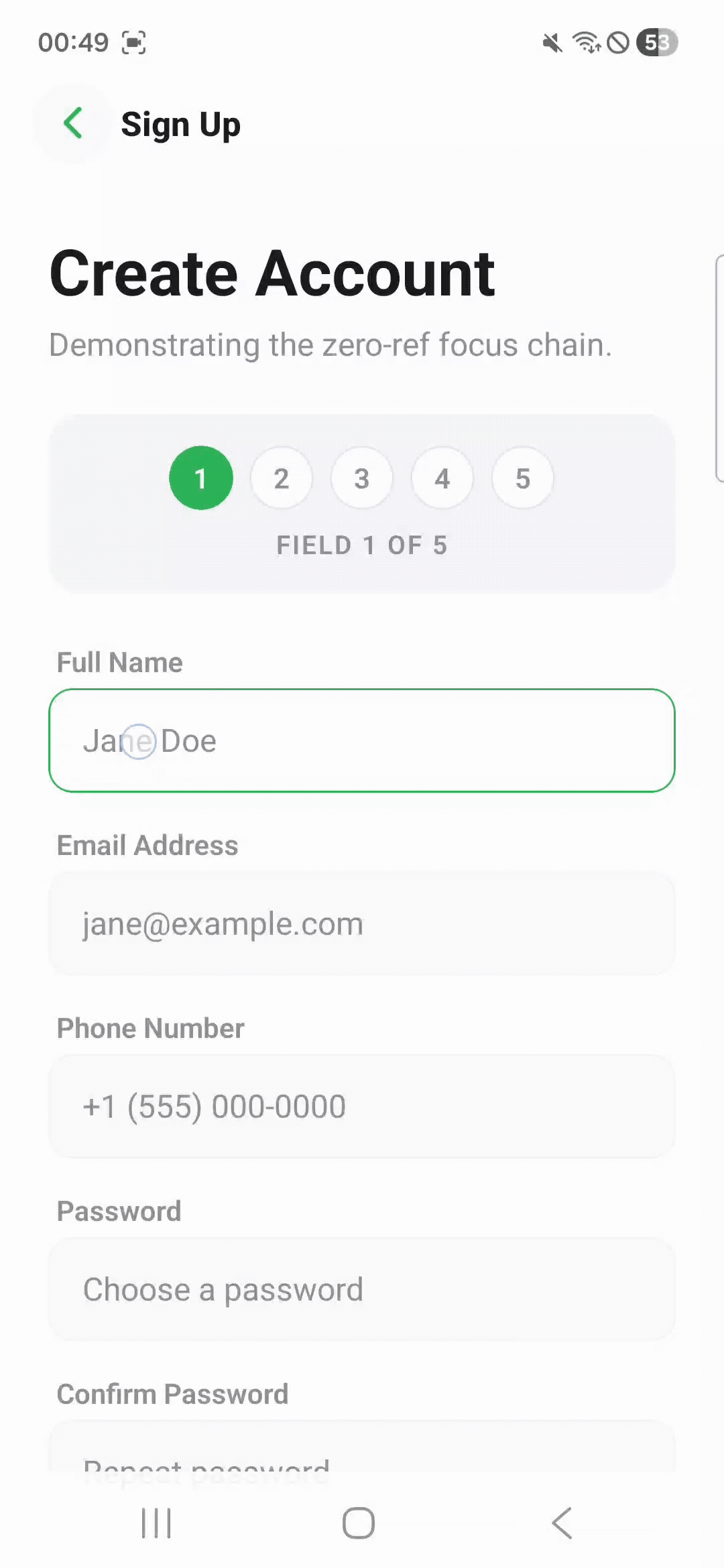
| Focus Chaining — iOS | Focus Chaining — Android |
|
|
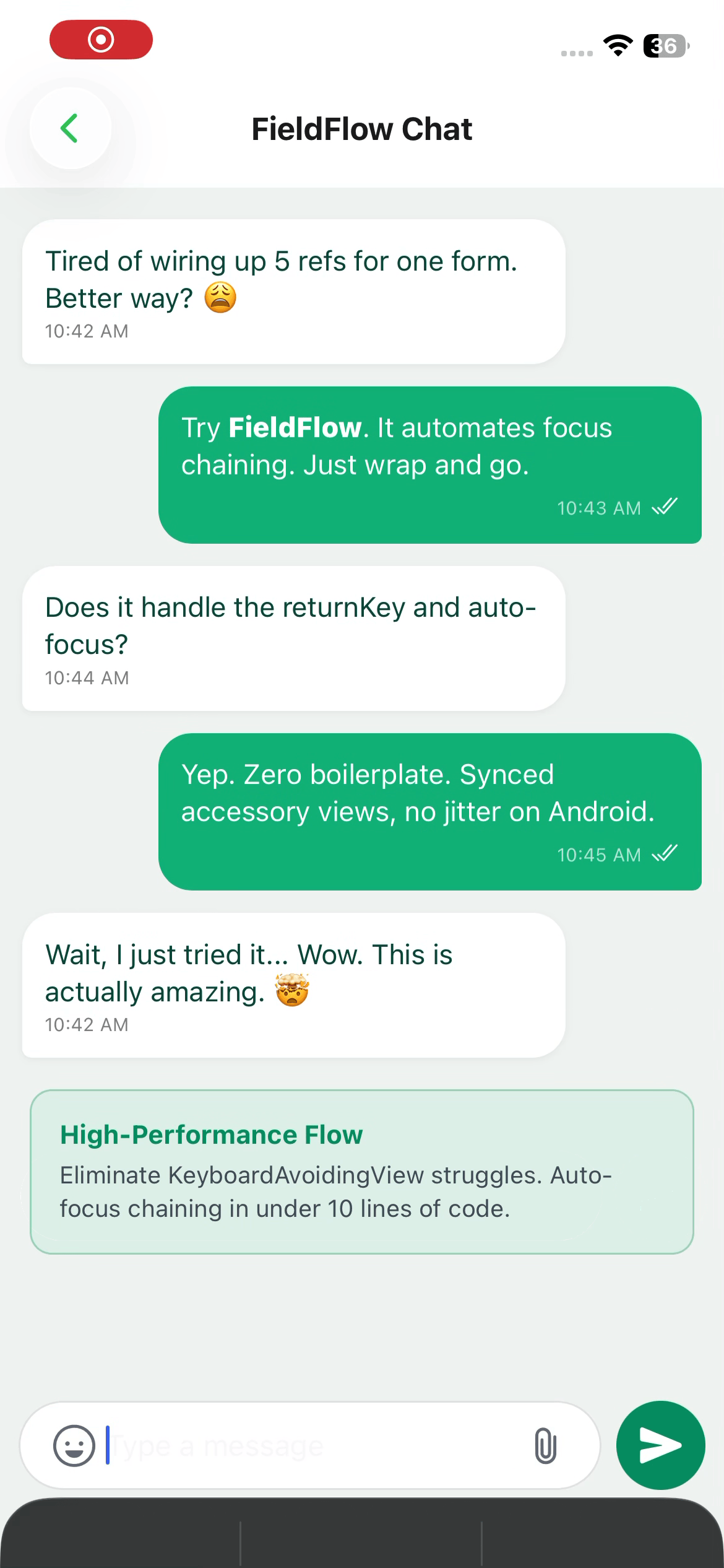
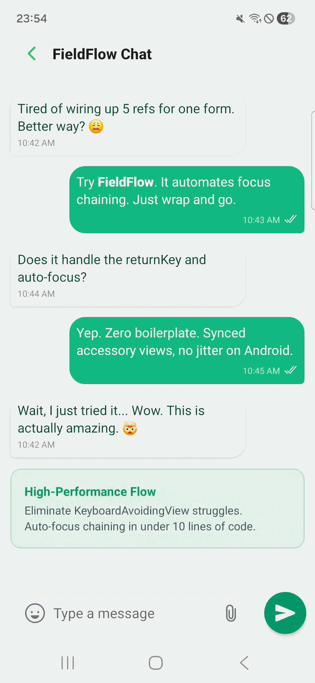
| Accessory Toolbar — iOS | Accessory Toolbar — Android |
|
|
npm install react-native-fieldflowRequirements: React Native ≥ 0.68 ·
react-native-reanimated· Expo & bare RN supported · Zero native modules · Nopod install
Drop FieldForm and FieldInput into any screen. Focus chaining, keyboard avoidance, and return key types are all handled automatically.
import { FieldForm, FieldInput } from "react-native-fieldflow";

export default function SignUpScreen() {
  return (
    <FieldForm onSubmit={handleSubmit}>
      <FieldInput placeholder="Full name" textContentType="name" />
      <FieldInput
        placeholder="Email"
        textContentType="emailAddress"
        keyboardType="email-address"
        autoCapitalize="none"
      />
      <FieldInput
        placeholder="Phone"
        textContentType="telephoneNumber"
        keyboardType="phone-pad"
      />
      <FieldInput
        placeholder="Password"
        textContentType="newPassword"
        secureTextEntry
      />
      <FieldInput
        placeholder="Confirm password"
        textContentType="newPassword"
        secureTextEntry
      />
    </FieldForm>
  );
}
What you get for free:
| 🔗 Focus chaining | Fields 1–4 get returnKeyType="next", the last field gets "done" |
| ⌨️ Keyboard avoidance | Smooth layout shift via Reanimated worklet — no jumps |
| 📜 Auto scroll | Focused field is always scrolled into view above the keyboard |
| 📱 Cross-platform | Identical behavior on iOS and Android, no Platform.OS switches |
const nameRef = useRef<TextInput>(null);
const emailRef = useRef<TextInput>(null);
const phoneRef = useRef<TextInput>(null);
const passRef = useRef<TextInput>(null);
const confirmRef = useRef<TextInput>(null);

<KeyboardAvoidingView
  behavior={Platform.OS === "ios" ? "padding" : "height"}
  keyboardVerticalOffset={Platform.OS === "ios" ? 64 : 0}
  style={{ flex: 1 }}
>
  <ScrollView keyboardShouldPersistTaps="handled">
    <TextInput
      ref={nameRef}
      returnKeyType="next"
      blurOnSubmit={false}
      onSubmitEditing={() => emailRef.current?.focus()}
    />
    <TextInput
      ref={emailRef}
      returnKeyType="next"
      blurOnSubmit={false}
      onSubmitEditing={() => phoneRef.current?.focus()}
    />
    <TextInput
      ref={phoneRef}
      returnKeyType="next"
      blurOnSubmit={false}
      onSubmitEditing={() => passRef.current?.focus()}
    />
    <TextInput
      ref={passRef}
      returnKeyType="next"
      blurOnSubmit={false}
      onSubmitEditing={() => confirmRef.current?.focus()}
    />
    <TextInput
      ref={confirmRef}
      returnKeyType="done"
      onSubmitEditing={handleSubmit}
    />
  </ScrollView>
</KeyboardAvoidingView>;import { FieldForm, FieldInput } from "react-native-fieldflow";
<FieldForm onSubmit={handleSubmit}>
<FieldInput placeholder="Full name" />
<FieldInput
placeholder="Email"
keyboardType="email-address"
autoCapitalize="none"
/>
<FieldInput placeholder="Phone" keyboardType="phone-pad" />
<FieldInput placeholder="Password" secureTextEntry />
<FieldInput placeholder="Confirm" secureTextEntry />
</FieldForm>;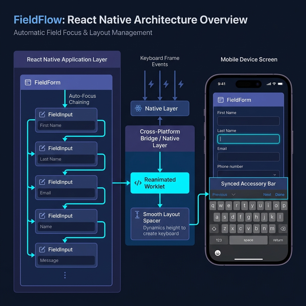
| Layer | What happens |
|---|---|
| Keyboard tracking | useAnimatedKeyboard() runs on the UI thread via a C++ Reanimated worklet — zero JS bridge involvement during keyboard animation |
| Spacer | An Animated.View at the bottom of the scroll content grows to match the keyboard frame, pushing content up in sync |
| Focus chain | Every FieldInput registers itself into an ordered list; tapping Next calls focus() on the next ref and scrolls it into view above the keyboard |
| Submit | The last field's Done button calls onSubmit and dismisses the keyboard |
Everything runs in JS — no native modules required. Works on Expo, bare RN, and New Architecture (Fabric).
The wrapper component that manages keyboard avoidance, scroll behavior, and the focus chain.
| Prop | Type | Default | Description |
|---|---|---|---|
onSubmit |
() => void |
— | Called when the last field's Done is tapped |
extraScrollPadding |
number |
140 |
Gap (px) between the active field and the keyboard top edge |
scrollable |
boolean |
true |
Wrap children in a managed ScrollView |
avoidKeyboard |
boolean |
true |
Enable the animated keyboard spacer |
keyboardAccessoryView |
ReactNode |
— | Toolbar that floats above the keyboard on both platforms |
keyboardAccessoryViewMode |
'always' | 'whenKeyboardOpen' |
'always' |
always — always visible, lifts with keyboard · whenKeyboardOpen — hidden until keyboard opens |
autoScroll |
boolean |
true |
Scroll to focused field automatically |
chainEnabled |
boolean |
true |
Auto-focus next field on Next / Done |
autoReturnKeyType |
boolean |
true |
Auto-set returnKeyType to next / done |
dismissKeyboardOnTap |
boolean |
false |
Tap outside any input to dismiss the keyboard |
submitOnLastFieldDone |
boolean |
false |
Call onSubmit when Done is pressed on the final field |
chatMode |
boolean |
false |
High-performance mode for chat screens — bypasses padding and uses native scrollToEnd() |
scrollViewProps |
ScrollViewProps |
— | Forwarded directly to the internal ScrollView |
keyboardVerticalOffset |
number | (platform) => number |
0 / 25 |
Static offset or per-platform resolver function |
onKeyboardShow |
(payload) => void |
— | Fired when keyboard appears |
onKeyboardHide |
() => void |
— | Fired when keyboard dismisses |
A drop-in replacement for TextInput. Accepts all standard TextInput props, plus:
| Prop | Type | Default | Description |
|---|---|---|---|
skip |
boolean |
false |
Exclude this field from the auto-focus chain |
nextRef |
RefObject<TextInput> |
— | Override: focus a specific ref instead of the next detected field |
onFormSubmit |
() => void |
— | Override: called when this is the last field and Done is tapped |
isAccessoryField |
boolean |
false |
Set to true if this input lives inside keyboardAccessoryView to bypass scroll measurements |
A cross-platform floating toolbar, animated in sync with the keyboard on both iOS and Android.
<FieldForm
  keyboardAccessoryView={
    <View style={styles.toolbar}>
      <TouchableOpacity onPress={Keyboard.dismiss}>
        <Text>Done</Text>
      </TouchableOpacity>
    </View>
  }
  keyboardAccessoryViewMode="whenKeyboardOpen"
>
  <FieldInput placeholder="Message..." />
</FieldForm>| Mode | Behavior |
|---|---|
'always' (default) |
Bar is always visible; slides up when the keyboard opens, back down when it closes |
'whenKeyboardOpen' |
Bar is hidden when the keyboard is closed; fades in and slides up when the keyboard opens |
Animation details: Appearance uses an exponential ease-out curve so the bar settles exactly when the keyboard spring does. Dismissal in always mode uses a subtle spring bounce for a natural gravity-drop feel. Bar height is auto-measured and injected as paddingBottom on the ScrollView so the last field is always reachable.
Two lightweight hooks for when you need keyboard state outside of FieldForm.
import { useKeyboardHeight, useKeyboardVisible } from "react-native-fieldflow";

const height = useKeyboardHeight(); // number — 0 when keyboard is hidden
const visible = useKeyboardVisible(); // boolean
Both hooks use keyboardWillShow / keyboardWillHide on iOS and keyboardDidShow / keyboardDidHide on Android. No polling, no timers.
Example — a submit button that lifts above the keyboard:
function SubmitButton() {
  const height = useKeyboardHeight();

  return (
    <Animated.View style={{ marginBottom: height }}>
      <TouchableOpacity onPress={handleSubmit}>
        <Text>Continue</Text>
      </TouchableOpacity>
    </Animated.View>
  );
}| Feature | KeyboardAvoidingView |
keyboard-aware-scroll-view |
keyboard-controller |
✦ FieldFlow |
|---|---|---|---|---|
| Zero native modules | ✅ | ✅ | ❌ Custom C++ module | ✅ |
| No layout jumps | ❌ | ✅ | ✅ | |
| Identical iOS + Android | ❌ | ✅ | ✅ | |
| Auto Next / Done keys | ❌ Manual | ❌ Manual | ❌ Manual | ✅ Auto |
| Ref management | ❌ Manual | ❌ Manual | ❌ Manual | ✅ Zero |
| Expo compatible | ✅ | ✅ | ✅ via plugin | ✅ |
| New Architecture (Fabric) | ✅ | ✅ | ✅ |
Does it work with React Navigation?
Yes. FieldFlow measures the available window height, not screen height, so headers, tab bars, and custom chrome are accounted for automatically. No keyboardVerticalOffset guessing needed.
What if I have a custom Input component?
Wrap it with forwardRef and render FieldInput internally — it's picked up by the chain automatically.
const MyInput = forwardRef<TextInput, MyInputProps>((props, ref) => (
  <View>
    <Text>{props.label}</Text>
    <FieldInput ref={ref} {...props} />
  </View>
));
Can I skip a field in the chain?
Yes. Add skip={true} to any FieldInput. The field remains fully functional — it just doesn't participate in Next/Done handling.
Can I manually control which field comes next?
Yes. Pass a nextRef to override the auto-detected next field.
const notesRef = useRef<TextInput>(null);

<FieldInput placeholder="Email" nextRef={notesRef} />
<FieldInput placeholder="Phone" skip />
<FieldInput placeholder="Notes" ref={notesRef} />
Does it support the New Architecture (Fabric)?
Yes. FieldFlow uses Animated, Keyboard, and standard event listeners — all fully supported on both the old and new React Native architectures.
An Expo Router example app ships with 11 demo screens covering real-world patterns:
cd example
npx expo start| Screen | What it demonstrates |
|---|---|
| Login / Sign-up | Basic focus chaining |
| Checkout | Dynamic field skipping with nextRef |
| Chat | chatMode + keyboardAccessoryView toolbar |
| Long form | RefreshControl + auto-scroll |
| Collapsing header | Scroll-linked animated header |
| Hooks demo | useKeyboardHeight + useKeyboardVisible |
| React Navigation | Header offset handling |
Bug reports, feature requests, and pull requests are all welcome.
If you find an edge case — a device, navigation setup, or keyboard type that breaks the chain — please open an issue with a minimal reproduction.