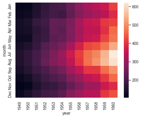
Seaborn Heatmap
seaborn.heatmap
The heatmap is nice. It creates a great Visual representation of our data.
Source: https://seaborn.pydata.org/generated/seaborn.heatmap.html
Example code:
import numpy as np; np.random.seed(0)
import seaborn as sns; sns.set()
uniform_data = np.random.rand(10, 12)
ax = sns.heatmap(uniform_data)
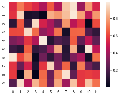
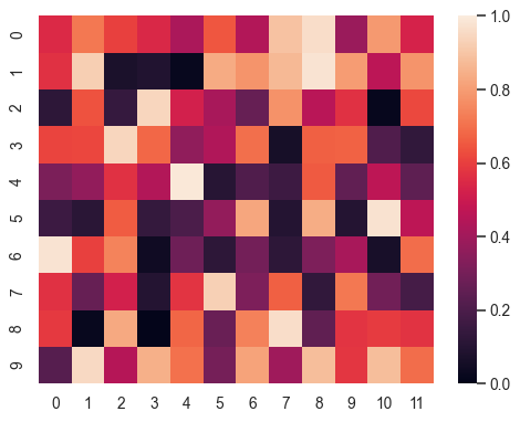
ax = sns.heatmap(uniform_data, vmin=0, vmax=1)
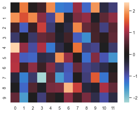
normal_data = np.random.randn(10, 12)
ax = sns.heatmap(normal_data, center=0)
flights = sns.load_dataset("flights")
flights = flights.pivot("month", "year", "passengers")
ax = sns.heatmap(flights)