Mobile bottom sheet component #13612
Conversation
 etoledom
added
the
Mobile App - i.e. Android or iOS
etoledom
added
the
Mobile App - i.e. Android or iOS
| onClose={ onImageSettingsClose } | ||
| rightButtonConfig={ { text: __( 'Done' ), color: '#0087be', onPress: onImageSettingsClose } } | ||
| > | ||
| <TouchableOpacity style={ inspectorStyles.bottomSheetCell } onPress={ () => { } }> |
There was a problem hiding this comment.
This could probably be part of BottomSheet which would have its default style and could accept a prop containerStyle or style to customize it.
There was a problem hiding this comment.
Do you mean, similar to the Button above?
To have a Cell kind-of component exposed from BottomSheet?
There was a problem hiding this comment.
I meant more like update the BottomSheet render method to something like:
render() {
	const { isVisible, leftButtonConfig, rightButtonConfig, containerStyle, onContainerPress } = this.props;
 	return (
		<Modal
			....
			<View style={ styles.separator } />
			<TouchableOpacity style={ { ... defaultContainerStyle, ...containerStyle } } onPress={ onContainerPress || noop }>
				{ this.props.children }
			</TouchableOpacity>
			<View style={ { flexGrow: 1 } }></View>
			....
		</Modal>
	);
}There was a problem hiding this comment.
Right, the problem there is that the buttons or cells are defined by the caller side. And each of those cells will have a TouchableOpacity component. Later on we will add more cells to it:
<BottomSheet
	isVisible={ this.state.showSettings }
	title={ __( 'Image Settings' ) }
	onClose={ onImageSettingsClose }
	rightButtonConfig={ { text: __( 'Done' ), color: '#0087be', onPress: onImageSettingsClose } }
>
	<TouchableOpacity style={ inspectorStyles.bottomSheetCell } onPress={ () => { } }>
		<Text style={ inspectorStyles.bottomSheetCellLabel }>{ __( 'Alt Text' ) }</Text>
		<Text style={ inspectorStyles.bottomSheetCellValue }>{ __( 'None' ) }</Text>
	</TouchableOpacity>
	<TouchableOpacity style={ inspectorStyles.bottomSheetCell } onPress={ () => { } }>
		<Text style={ inspectorStyles.bottomSheetCellLabel }>{ __( 'Size' ) }</Text>
		<Text style={ inspectorStyles.bottomSheetCellValue }>{ __( 'Full Size' ) }</Text>
	</TouchableOpacity>
</BottomSheet>
That's why I thought that maybe extracting the whole cell as a small component would be good:
<TouchableOpacity style={ inspectorStyles.bottomSheetCell } onPress={ () => { } }>
	<Text style={ inspectorStyles.bottomSheetCellLabel }>{ __( 'Size' ) }</Text>
	<Text style={ inspectorStyles.bottomSheetCellValue }>{ __( 'Full Size' ) }</Text>
</TouchableOpacity>There was a problem hiding this comment.
Oh I see, so the TouchableOpacity is for a "cell" I thought it was for the whole content. Yeah makes sense. I'm not sure the concept of a cell needs to be part or BottomSheet but it looks like a nice addition at this point 👍
…-sheet header buttons
|
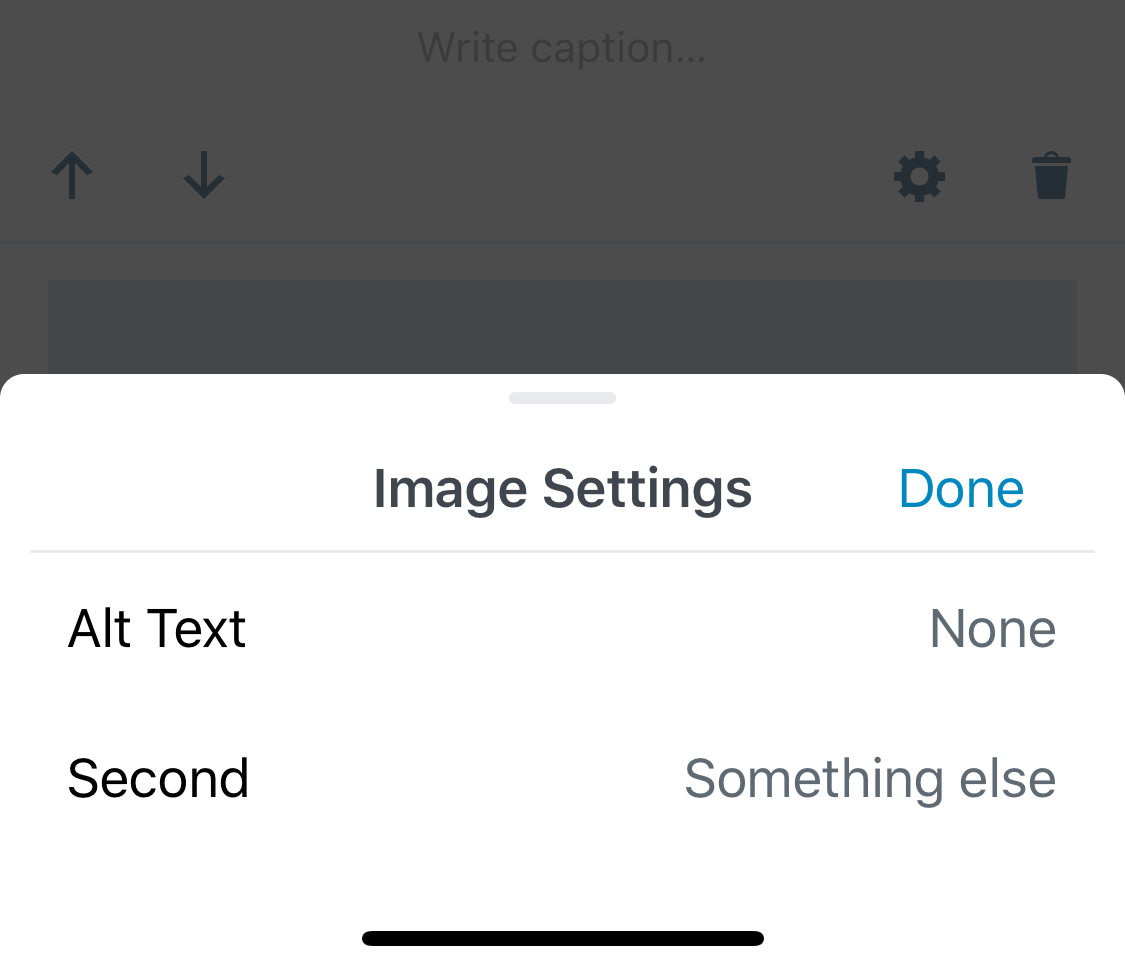
Hey @Tug - Thanks for the review! Now when we need more cells we just do: <BottomSheet.Cell label={ __( 'Alt Text' ) } value={ __( 'None' ) } onPress={ () => {} } />
<BottomSheet.Cell label={ __( 'Second' ) } value={ __( 'Something else' ) } onPress={ () => {} } />And it will look like this: Let me know if you like that. |
|
@Tug - Another info: We will continue to iterate in the design and implementation of the BottomSheet. I'm already working on:
All these on a separate PR (based on this one) |
|
Thank you! |
…rnmobile/372-use-RichText-on-Title-block

* 'master' of https://github.com/WordPress/gutenberg:
  Try alternate list item jump fix. (#12941)
  Mobile bottom sheet component (#13612)
  Remove unintentional right-margin on last odd-item. (#12199)
  Introduce left and right float alignment options to latest posts block (#8814)
  Fix Google Docs table paste (#13543)
  Increase bottom padding on gallery image caption (#13623)
  Fix the editor save keyboard shortcut not working in code editor view (#13159)
  Plugin: Deprecate gutenberg_add_admin_body_class (#13572)
  Rnmobile/upload media failed state (#13615)
  Make clickOnMoreMenuItem not dependent on aria labels (#13166)
  Add: className prop support to server side render. (#13568)
  Fix: Categories Block: hierarchical Dropdown (#13567)
  Docs: Add clarification about git workflow (#13534)
  Plugin: Remove `user_can_richedit` filtering (#13608)
  eslint-plugin: Add rule `no-unused-vars-before-return` (#12828)
  Image settings button (#13597)
  Fixed wording for the color picker saturation (#13479)

# Conflicts:
#	packages/block-library/src/image/edit.native.js
* rnmobile: Implement image settings button using InspectorControls.Slot pattern.

* rnmobile: Add missing semicolon

* rnmobile: Adding bottom-sheet component to mobile

* rnmobile: Styling bottom-sheet header

* rnmobile: Bottom-sheet clean up

* rnmobile: Fix lint issues on bottom-sheet related code.

* rnmobile: Fix small lint issues

* rnmobile: Move inline toolbar button definition out of constant.

* rnmobile: Remove extra white-spaces

* revert package-lock.json changes

* rnmobile: Fix merge issue

* rnmobile: exporting component BottomSheet.Button to be used as bottom-sheet header buttons

* rnmobile: Adding BottomSheet.Cell component as an extraction for BottomSheet users.

* Fix lint issues

* Reverting changes to package-lock.json

* Fix merge issues
Description
This PR introduces a
BottomSheetcomponent to be used on mobile. It's a special use-case of thereact-native-modalcomponent implementing our design and animations.It has props for the header's left and right buttons and title, and the
onCloseaction.It's firstly implemented as the Image Settings interface for the Image block.
To test:
gutenberg-mobileside PR (Bottom sheet component (Image Settings) wordpress-mobile/gutenberg-mobile#529).Donebutton.