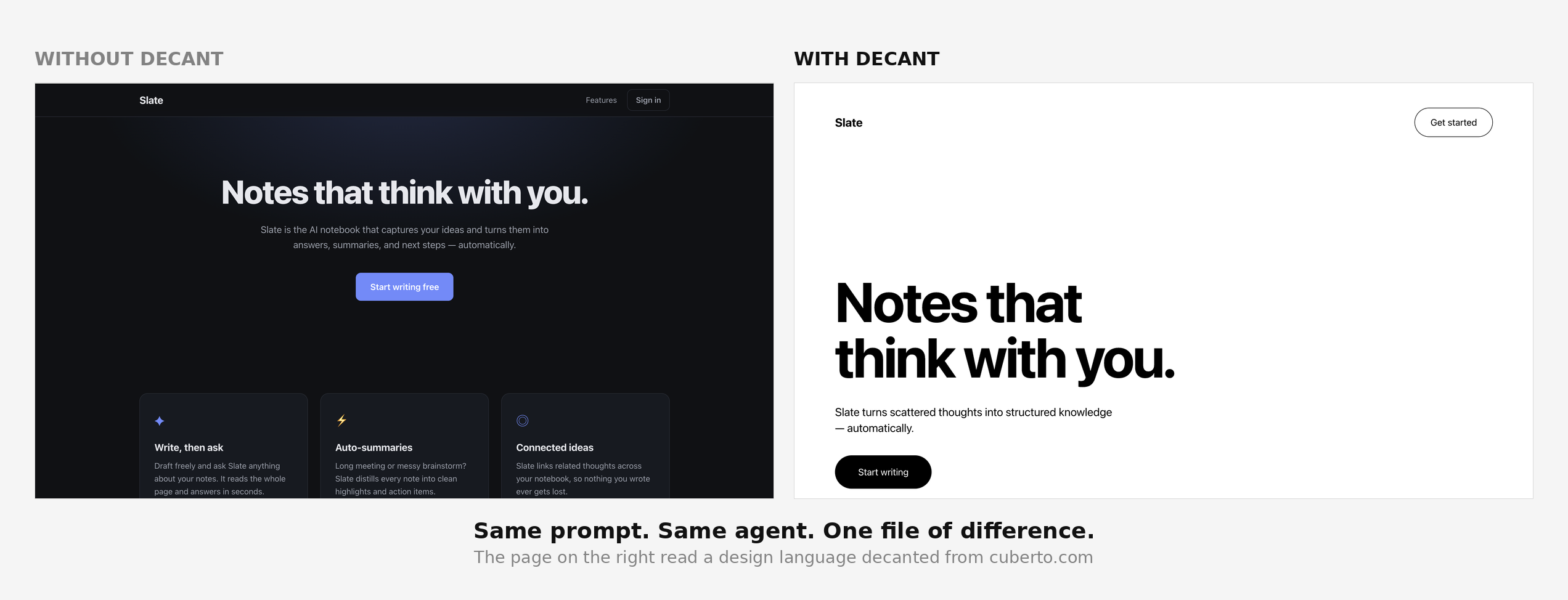
Give your AI coding agent taste.
Extract the design language of any website into something an agent can actually follow.
npx @yjc730/decant https://cuberto.com
| Without decant | With decant |
|---|---|
 |
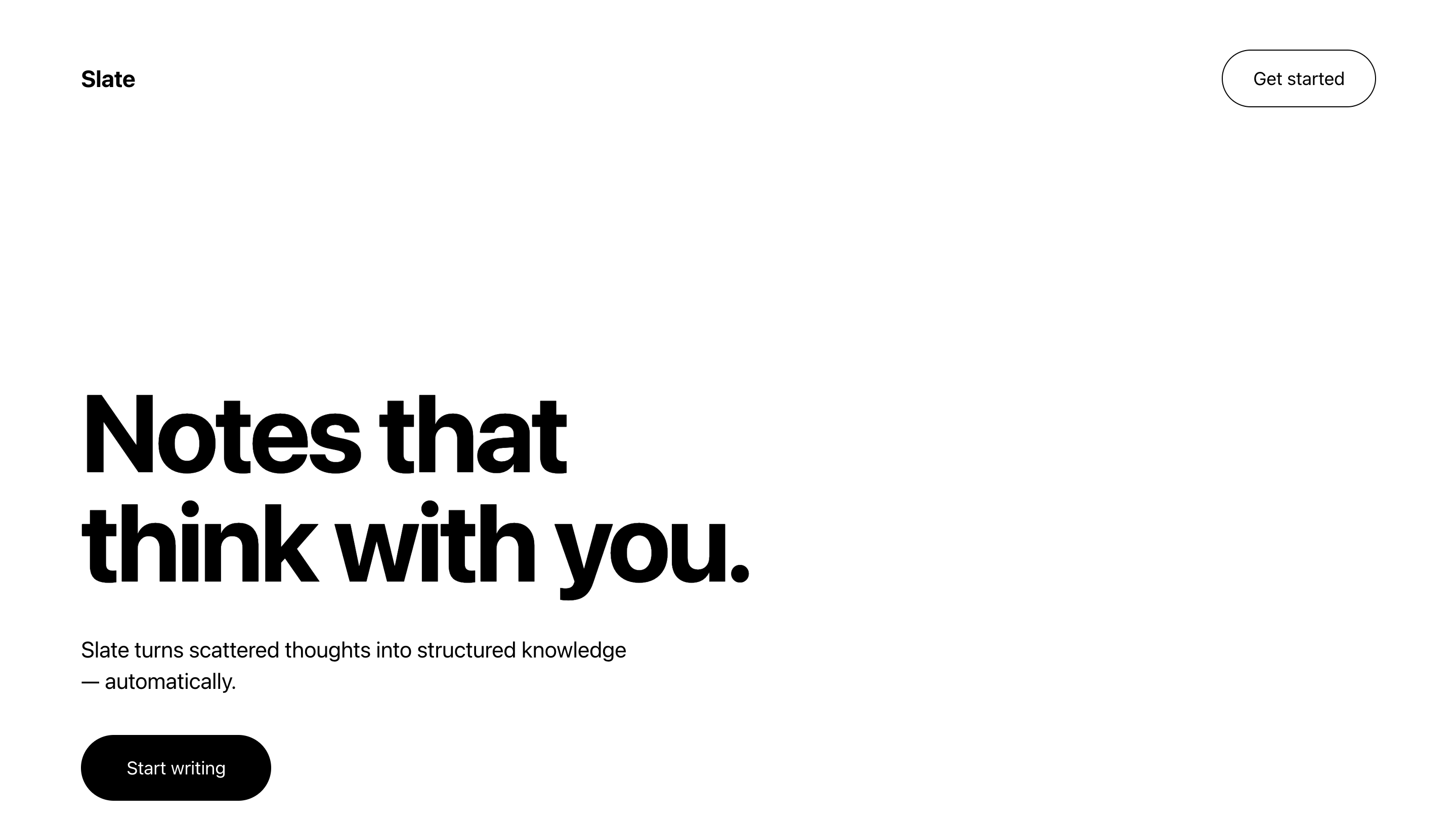 |
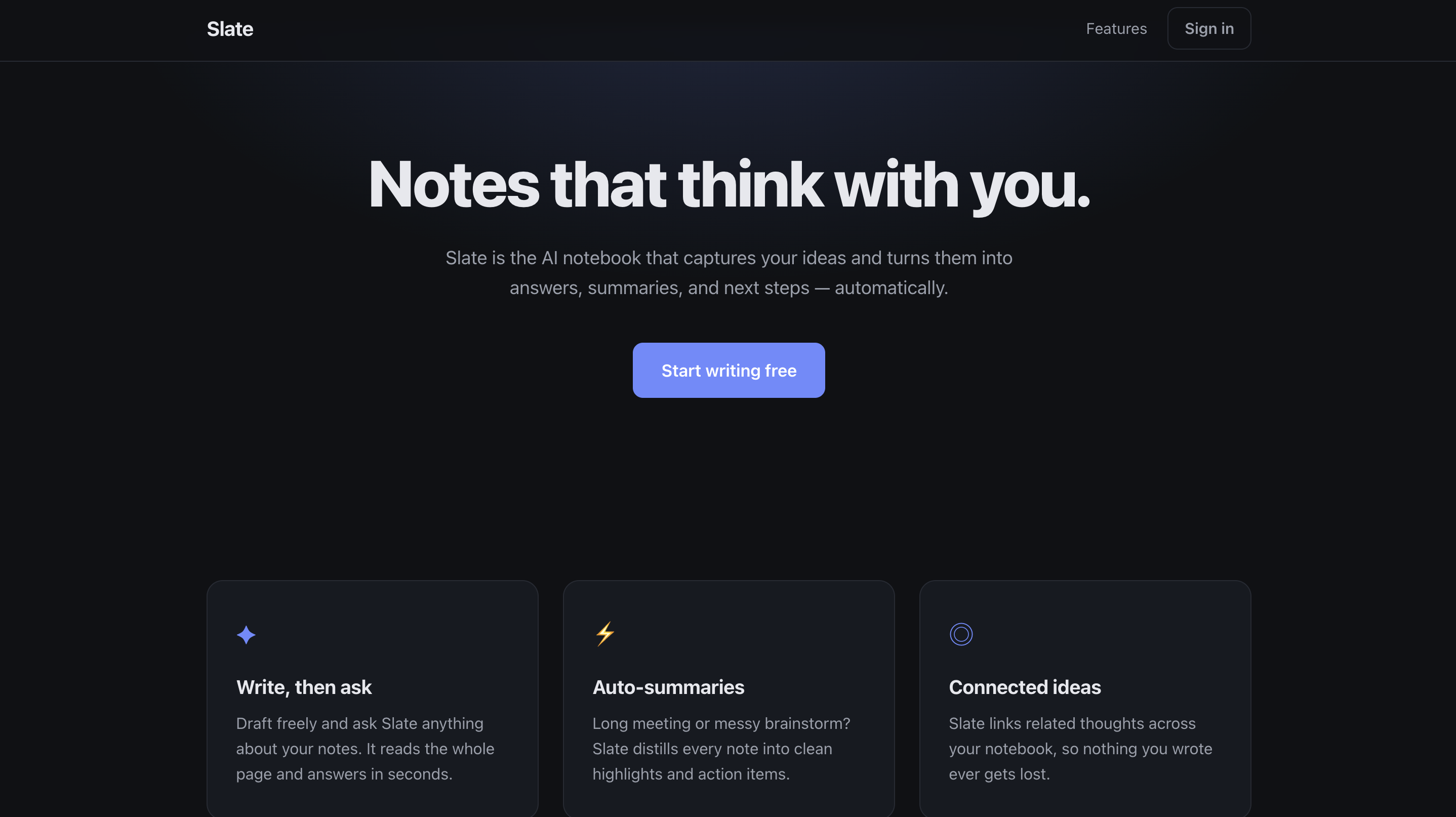
| Dark, centered, gradient glow, emoji icons. | Left-aligned, monochrome, huge type, room to breathe. |
Both pages were generated from the identical prompt: "a landing page for an AI notes app called Slate."
The only difference is that the second agent had read a design-dna.md decanted from cuberto.com.
AI agents write UI that all looks the same.
Not badly — identically. Dark background, indigo accent, gradient glow, emoji as icons, everything centered. It's what an agent produces when it has no taste to work from: it piles on every signifier of "designed" because it doesn't know which ones to leave out.
You already know what you want. You want it to look like that site. But there's no way to hand "that site" to an agent.
decant is that way.
Point it at a site. It reads the rendered page, weighs every computed style by how much of the screen it actually occupies, and lets the noise collapse into a system.
npx @yjc730/decant https://stripe.com --out .claude/design-dna.mdThen tell your agent to follow it. That's it.
Not a pile of numbers — instructions.
## Design language (decanted from cuberto.com)

Use these values. Do not invent new ones.

### Type scale
- Sizes (px): 18 / 22 / 23 / 38 / 81 / 108
- Base unit ≈ 10px. Snap text to these sizes; do not pick in-between sizes.

### Spacing
- Character: **art-directed whitespace** (92.8% of spacing weight is large section gaps).
- Be bold with negative space. This is the defining trait — do not crowd the layout.
- Section gaps: go large, in the **216px** range (~45× the base unit). Dramatic breathing room between sections.
- Component-level spacing base ≈ 5px, but treat the scale below as secondary detail — the whitespace is the point.

### Corners
- Radii (px): 72 / 18 / 9999 (pill) / 50. Use only these.

### Color
- **Dominant surface**: `#ffffff` (76.6%)
  - text (primary): `#000000`
- **Accent surface**: `#000000` (23.4%)
  - text (primary): `#ffffff`

- Tight, coherent palette.
  Put each text color only on its own surface; never mix a color onto the wrong background.
A site with a different character gets a different set of orders:
## Design language (decanted from stripe.com)

Use these values. Do not invent new ones.

### Type scale
- Sizes (px): 16 / 18 / 22 / 26 / 32 / 48
- Base unit ≈ 8px. Snap text to these sizes; do not pick in-between sizes.

### Spacing
- Character: **mixed** — modular base (57.5%) plus deliberate large gaps (42.5%).
- Base unit = **4px** for component spacing: 16 / 24 / 32 / 36 / 40 / 48.
- Use large gaps (~71px) for section breaks; keep component spacing on the base.

### Corners
- Radii (px): 6 / 4 / 8 / 16 / 2. Use only these.

### Color
- **Dominant surface**: `#ffffff` (72.8%)
  - text (primary): `#061b31`
  - text (body): `#64748d`
  - text (secondary): `#50617a`
- **Accent surface**: `#0d1738` (14.1%)
  - text (primary): `#ffffff`
  - text (body): `#839bc8`
- **Accent surface**: `#f8fafd` (10.4%)
  - text (primary): `#061b31`
  - text (body): `#50617a`
- Interactive / brand: `#533afd`, `#0000ee` (links and buttons). Reserve for interactive elements — do not use for body text or surfaces.

- Rich palette (26 colors, loosely held) — real, but not a tight system.
Lead with the dominant surface and its primary text; treat the rest as range, not rules.Point it at a site with no design system and it says so, instead of inventing one:
## Design language (decanted from paulgraham.com)

Use these values. Do not invent new ones.

### Type scale
- No clear type scale — no scale (only 1 value, needs ≥2 steps).
- Dominant size: 13px. Keep type flat and uniform; do not fabricate a scale.

### Spacing
- No clear spacing system — insufficient data (6 samples < 8).
- Use minimal, consistent spacing. Do not invent a rhythm the source does not have.

### Corners
- No radius system — corners are square (0px). Keep them sharp.

### Color
- **Dominant surface**: `#ffffff` (100%)
  - text (primary): `#000099`
  - text (body): `#000000`
- Interactive / brand: `#000099` (links and buttons). Reserve for interactive elements — do not use for body text or surfaces.

- Minimal color — essentially one combination.
  Do not introduce a color system the source does not have.
A tool that always has an answer is a tool that lies.
Honest limits, up front:
- It does not copy layouts. It extracts a design system — type scale, spacing rhythm, colour weight, surface treatment. Not your competitor's homepage.
- It cannot see motion. Easing curves and scroll choreography live in JS, not in computed styles. This is the biggest gap, and the next thing being built.
- It cannot see text on video or images. Colour pairs behind media are reported as unresolved rather than guessed.
npx @yjc730/decant <url>MIT