Progress bar documentation #240
Conversation
 ross-pfahler
requested review from
dannify,
devongovett and
snowystinger
as code owners
ross-pfahler
requested review from
dannify,
devongovett and
snowystinger
as code owners
Codecov Report
@@            Coverage Diff            @@
##             master     #240   +/-   ##
=========================================
  Coverage          ?   70.57%
=========================================
  Files             ?      206
  Lines             ?     3973
  Branches          ?      847
=========================================
  Hits              ?     2804
  Misses            ?      587
  Partials          ?      582
|

|
Build successful! 🎉 |
|
Build successful! 🎉 |
|
Build successful! 🎉 |
|
Build successful! 🎉 |
|
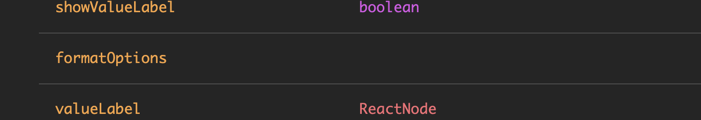
formatOptions also missing type information |
|
Build successful! 🎉 |
| ### Accessibility | ||
|
|
||
| Progress Bars are made accessible as per the ["progressbar" role in WAI-ARIA 1.1](https://www.w3.org/TR/wai-aria-1.1/#progressbar). | ||
| Depending on the visualization being used (ie depending on the `showValueLabel` prop), a `label`, `aria-label`, or `aria-labelledby` attribute are required. |
There was a problem hiding this comment.
i.e. instead of ie
| ### Over background | ||
| [View guidelines](https://spectrum.adobe.com/page/bar-loader/#Over-background) | ||
|
|
||
| When a loader needs to be placed on top of a colored background, use the over background loader. |
There was a problem hiding this comment.
Same as with the progress circle pull, I'm wondering should this be: ... use the overBackground loader variant.
| ```tsx example | ||
| <p><ProgressBar label="Loading…" /></p> | ||
| <p><ProgressBar label="Loading…" labelPosition="side" /></p> | ||
| <p><ProgressBar label="Loading…" showValueLabel={false} /></p> |
There was a problem hiding this comment.
Would be good to include a value for all examples. They look strange if the value is 0 IMO.
| When a loader needs to be placed on top of a colored background, use the over background loader. | ||
|
|
||
| ```tsx example | ||
| <div style={{background: 'rgba(0,0,0,0.4)', padding: '10px'}}> |
There was a problem hiding this comment.
We might want to use a color other than black. It looks strange in dark mode. Maybe use <View> with a spectrum color variable?
| [View guidelines](https://spectrum.adobe.com/page/bar-loader/#Size) | ||
|
|
||
| ```tsx example | ||
| <p><ProgressBar aria-label="Loading…" size="S" /></p> |
There was a problem hiding this comment.
We could maybe use a <Flex> container for these instead of <p> tags?
| </div> | ||
| ``` | ||
|
|
||
| ### Indeterminate |
There was a problem hiding this comment.
Should we include this under the value section above similar to Checkbox? @dannify
| </div> | ||
| ``` | ||
|
|
||
| If using the over background variant, ensure the background offers enough contrast for the loader to be legible and meets color contrast guidelines. |
There was a problem hiding this comment.
We're a bit inconsistent between "loader" and "progress bar". "Loader" is the old term for it (design may still be using), so I think we should be consistent with "progress bar".
|
|
||
| ## Value | ||
|
|
||
| By default Progress Bars are controlled with the `value` prop representing current percentage (as an integer). |
|
|
||
| ### Accessibility | ||
|
|
||
| Progress Bars are made accessible as per the ["progressbar" role in WAI-ARIA 1.1](https://www.w3.org/TR/wai-aria-1.1/#progressbar). |
There was a problem hiding this comment.
Maybe not needed? We haven't linked to the spec in other docs pages... Definitely will from @react-aria docs.
| To internationalize a Progress Bar, a localized string should be passed to the `label` prop, `aria-label` prop, or value of associated `aria-labelledby` element. | ||
|
|
||
| For RTL (right-to-left) languages, the layout of the bar loader is mirrored for both determinate and indeterminate options. | ||
| The placement of the percent sign differs depending on the locale. |
There was a problem hiding this comment.
Is this paragraph needed? It's really just an implementation detail, not something the user needs to know about. Not sure. @dannify
|
Build successful! 🎉 |
|
Build successful! 🎉 |
|
Build successful! 🎉 |
…nto progress-bar-docs
|
Build successful! 🎉 |
| To internationalize a Progress Bar, a localized string should be passed to the `label` prop, `aria-label` prop, or value of associated `aria-labelledby` element. | ||
|
|
||
| For RTL (right-to-left) languages, the layout of the bar loader is mirrored for both determinate and indeterminate options. | ||
| The placement of the percent sign differs depending on the locale. |
|
Build successful! 🎉 |
|
Build successful! 🎉 |
 ktabors
left a comment
ktabors
left a comment
ktabors
left a comment
There was a problem hiding this comment.
I noticed that the TypeScript interfaces aren't get Java doc style comments describing them or setting defaults like top for labelPosition.
|
|
||
| ## Value | ||
|
|
||
| Progress Bars are controlled with the `value` prop representing current percentage (as an integer). |
There was a problem hiding this comment.
I thought there was a slack chat where we decided the names in the docs to match the names in the code, so ProgressBar matches <ProgressBar />?
There was a problem hiding this comment.
im happy to do which ever, but we should prob be consistent since the existing packages that were merged (eg StatusLight) also do not do this. let me know which i should do and i'll convert!
| <Flex flexDirection="column" maxWidth="250px"> | ||
| <ProgressBar label="Loading…" marginBottom="25px" value={30} /> | ||
| <ProgressBar label="Loading…" marginBottom="25px" labelPosition="side" value={30} /> | ||
| <ProgressBar label="Loading…" showValueLabel={false} value={30} /> |
There was a problem hiding this comment.
Would this last example be better without the label="Loading…"?
There was a problem hiding this comment.
presumably it also sets aria-label, so i can either convert to that or leave it as is. lmk
There was a problem hiding this comment.
the label is different from the valuelabel so either label or aria-label will be needed anyway.
Yes, we have a follow up in RSP-1574 |
| <ProgressBar label="Loading…" value={50} /> | ||
| ``` | ||
|
|
||
| Use an indeterminate Progress Bars when progress is happening but the time or effort to completion can’t be determined. |
There was a problem hiding this comment.
bar should be singular
|
Build successful! 🎉 |
|
Build successful! 🎉 |
|
Build successful! 🎉 |
|
Build successful! 🎉 |
* * updating TableView documentation at https://react-spectrum.corp.adobe.com/components/TableView.
* for issues:
  adobe/react-spectrum#239
  adobe/react-spectrum#240

* Update TableView.mdx

added explanation for needing styling

* Update TableView.mdx

* missing `%` in TableView.styl
* changed heading to "Why doesn't my table render" instead of "Example source code" and moved code to bottom

* - added style height to div in StoryBook for stories/TableView.js, so deleted stories/TableView.styl
- updated TableView.mdx with simpler troubleshooting and links to examples

* Update TableView.mdx

* Removing link that contains contradictory documentation

If we need a simpler example, we can explore that in another PR
Closes RSP-1570
✅ Pull Request Checklist:
📝 Test Instructions:
🧢 Your Team: