Conversation
 reidbarber
requested review from
dannify,
devongovett and
snowystinger
as code owners
reidbarber
requested review from
dannify,
devongovett and
snowystinger
as code owners
|
Build successful! 🎉 |
|
Build successful! 🎉 |
|
Build successful! 🎉 |
|
Build successful! 🎉 |
 LFDanLu
left a comment
LFDanLu
left a comment
LFDanLu
left a comment
There was a problem hiding this comment.
Partial review, will followup tmrw
|
Build successful! 🎉 |
| getDropOperation(target, types) { | ||
| let typesSet = types.types ? types.types : types; | ||
| let draggedTypes = [...typesSet.values()]; |
There was a problem hiding this comment.
Note that this has a typescript error since the type for types doesn't actually have types.type. There is a ticket for investigating why types returns a Set or a object with a types property that is a Set and either fixing that or updating the typescript type.
|
Build successful! 🎉 |
| for (let item of e.items) { | ||
| for (let acceptedType of acceptedDragTypes) { | ||
| if (item.kind === 'text' && item.types.has(acceptedType)) { | ||
| let {id} = JSON.parse(await item.getText(acceptedType)); | ||
| keysToMove.push(id); | ||
| } | ||
| } | ||
| } |
There was a problem hiding this comment.
Ideally I would've liked to exit the inner loop early upon finding the matching acceptedType but e.items can either be an array of length X, where X is the number of dragged items OR is an array of a single item with a types key that is a Set of size X. The second case happens specifically if dragging multiple items that have different types via mouse.
Still digging into why this is and whether or not it is expected
There was a problem hiding this comment.
Looks to be due to
react-spectrum/packages/@react-aria/dnd/src/utils.ts
Lines 111 to 126 in 26990c2
When there are multiple items w/ the same type or a item with multiple types present in the drag operation, we enter the custom data path, but if you drag a single folder + single item then we hit this path:
react-spectrum/packages/@react-aria/dnd/src/utils.ts
Lines 117 to 120 in 26990c2
resulting in a
DataTransferItemList of two DataTransferItems
This will then hit the non-custom data path in readFromDataTransfer, eventually cumulating to
react-spectrum/packages/@react-aria/dnd/src/utils.ts
Lines 231 to 238 in 26990c2
which will transform a
stringItems list of
stringItems Map(2) {'file' => 'Adobe Photoshop', 'folder' => 'Documents'}
to a single item representation of
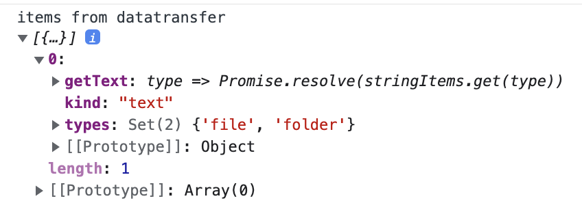
This feels like it is intentional due to limitations in the current DataTransferAPI, but the comment "All string items are different representations of the same item" sounds incorrect here? Not entirely sure what that means tbh, need to dig more into the DataTransferApi
There was a problem hiding this comment.
All in all, it feels hard to tell between a drag + drop operation of a single file + folder and a drag + drop operation of a single item that has multiple types tied to it
|
Build successful! 🎉 |
|
I think one concern I have is, what is the difference between ListBox and ListView, how do I (a user) know which one I should be using? |
| <details> | ||
| <summary style={{fontWeight: 'bold'}}><ChevronRight size="S" /> Show code</summary> | ||
|
|
||
| ```tsx example export=true render=false |
There was a problem hiding this comment.
this example is a bit strange, you can empty the list, but once you do, you can't drag anything into it because root drop is not allowed. Until that point you can drag back and forth all you like.
 reidbarber
left a comment
reidbarber
left a comment
reidbarber
left a comment
There was a problem hiding this comment.
Some super-nit suggestions (probably some are my typos tbh)
| By default, ListView uses the checkbox selection style, which includes a checkbox in each row for selection. When the `selectionStyle` prop is set to `"highlight"`, the checkboxes are hidden, | ||
| and the selected rows are displayed with a highlighted background instead. | ||
|
|
||
| In addition to changing the appearance, the selection behavior also changes depending on the `selectionStyle` prop. In the default checkbox selection style, clicking, tapping, | ||
| or pressing the <Keyboard>Space</Keyboard> or <Keyboard>Enter</Keyboard> keys toggles selection for the focused row. Using the arrow keys moves focus but does not change selection. | ||
|
|
||
| In the highlight selection style, however, clicking a row with the mouse _replaces_ the selection with only that row. Using the arrow keys moves both focus and selection. | ||
| To select multiple rows, modifier keys such as <Keyboard>Ctrl</Keyboard>, <Keyboard>Cmd</Keyboard>, and <Keyboard>Shift</Keyboard> can be used. To move focus without moving | ||
| selection, the <Keyboard>Ctrl</Keyboard> key on Windows or the <Keyboard>Option</Keyboard> key on macOS can be held while pressing the arrow keys. Holding this modifier while pressing | ||
| the <Keyboard>Space</Keyboard> key toggles selection for the focused row, which allows multiple selection of non-contiguous items. On touch screen devices, selection always behaves as toggle | ||
| since modifier keys may not be available. This behavior emulates native platforms such as macOS and Windows. |
There was a problem hiding this comment.
I think we can simplify with something like this:
By default, ListView uses the checkbox selection style, which includes a checkbox in each row for selection. When the
selectionStyleprop is set to"highlight", the checkboxes are hidden, and the selected rows are displayed with a highlighted background instead.In addition to changing the appearance, the selection behavior also changes depending on the
selectionStyleprop. In the default checkbox selection style, clicking, tapping, or pressing the Space or Enter keys toggles selection for the focused row. Using the arrow keys moves focus but does not change selection.In the highlight selection style, however, clicking a row with the mouse replaces the selection with only that row. Using the arrow keys moves both focus and selection. To select multiple rows, modifier keys such as Ctrl, Cmd, and Shift can be used. On touch screen devices, selection always behaves as toggle since modifier keys may not be available.
These selection styles implement the behaviors defined in Aria Practices.
Mostly the same except the last paragraph, which includes a bit fewer nitty gritty details that are defined in the Aria practices link.
| On touch devices, `onAction` is always the primary tap interaction, and tapping on the row's checkbox or long pressing the row will select the row. In highlight selection, a long press will also shift the ListView into selection mode, | ||
| which displays checkboxes to perform selection. While the ListView is in this state, tapping the row will toggle selection instead of triggering `onAction`. Deselecting all items exits selection mode and hides the checkboxes. | ||
| Double clicking matches the behavior of desktop platforms like macOS and Windows, and a separate selection mode matches mobile platforms like iOS and Android. | ||
|
|
There was a problem hiding this comment.
I think I would suggest to flip this around a bit to describe the different modes rather than by interaction method:
ListView supports row actions via the
onActionprop, which is useful for functionality such as navigation. When nothing is selected, the ListView performs actions by default when clicking or tapping a row. Items may be selected using the checkbox, or by long pressing on touch devices. When at least one item is selected, the ListView is in selection mode, and clicking or tapping a row toggles the selection. Actions may also be triggered via the Enter key, and selection using the Space key.This behavior is slightly different in the highlight selection style, where single clicking selects the row and actions are performed via double click. Touch and keyboard behaviors are unaffected.
| please see the [drag and drop documentation](dragAndDrop.html). | ||
|
|
||
| The example below demonstrates how to create a draggable ListView and a droppable ListView. | ||
|
|
There was a problem hiding this comment.
The dnd examples are good. We should probably do some API work separately so they can be simplified though. They are a bit overwhelming, and since many of these use cases are so common, we might be able to provide some helpers to make things easier.
There was a problem hiding this comment.
Sounds good, I'll write a ticket
|
I think the anatomy diagram is a bit large, and I think only the first part showing the parts of the item are necessary rather than the whole listview. Also the font looks off... Gonna push an update for this, hope that's ok. |
|
Build successful! 🎉 |
|
Build successful! 🎉 |
| ```tsx example | ||
| // Using the same list as above | ||
| <PokemonList disabledKeys={[3]} aria-label="ListView with disabled rows" /> | ||
| ``` |
There was a problem hiding this comment.
Realized we don't cover disabledBehavior here. Probably a good followup item.
…docs

# Conflicts:
#	packages/@react-spectrum/list/package.json
|
Build successful! 🎉 |
|
Build successful! 🎉 |
7 participants
Closes #2730
✅ Pull Request Checklist:
📝 Test Instructions:
Open ListView page of docs (react-spectrum/ListView.html). New link is in Collections section of sidenav.
🧢 Your Project:
RSP