Round ListView item borders in quiet #3105
Conversation
|
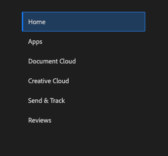
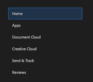
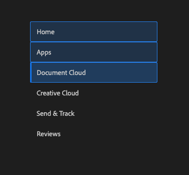
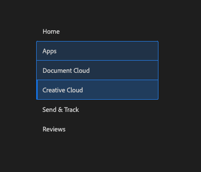
I've only implemented this for single selection mode so far. It should look like this: Multiple selection mode is a little odd, off the bat it looks like this: So the question is, do we want to do square corners for ranges but round the first and last for multiple? like this: |
|
Build successful! 🎉 |
|
Build successful! 🎉 |
 snowystinger
changed the title
snowystinger
changed the title
|
+1 for rounded corners on first and last of a group of selected items. Looks sophisticated. |
 LFDanLu
left a comment
LFDanLu
left a comment
LFDanLu
left a comment
There was a problem hiding this comment.
I definitely like the square corners for quiet + multiple selection when consecutive rows are selected. Should the hover style and keyboard focused but not selected style have rounded corners as well?
Hover style:
keyboard focus but not selected:
| background-color: var(--spectrum-alias-background-color-transparent); | ||
| border-width: 0; | ||
| border-radius: 0; | ||
| &:not(.react-spectrum-ListView--multipleSelection) { |
There was a problem hiding this comment.
This is... quite the CSS. Not sure I follow completely, but there's no way this can be simplified?
There was a problem hiding this comment.
I see a place i can simplify a little 👍🏻
|
A weird case |
# Conflicts:
#	packages/@react-spectrum/list/src/ListView.tsx
#	packages/@react-spectrum/list/src/styles.css
|
Build successful! 🎉 |
|
Build successful! 🎉 |
|
|
||
| let hasAnyChildren = useMemo(() => [...collection].some(item => item.hasChildNodes), [collection]); | ||
| let [hoveredKey, setHoveredKey] = useState<Key>(); | ||
| let hoverState = {hoveredKey, setHoveredKey}; |
There was a problem hiding this comment.
lol might be overkill but let's see what people think. IMO it's a little strange that the corners change when hovering over an adjacent item 😂
There was a problem hiding this comment.
tried out in f39193e
which has this storybook URL https://reactspectrum.blob.core.windows.net/reactspectrum/f39193ea5b900737675e16dc5fcb061d05b9af2c/storybook/index.html
| import type {DraggableItemResult} from '@react-aria/dnd'; | ||
| import {FocusRing, useFocusRing} from '@react-aria/focus'; | ||
| import {Grid} from '@react-spectrum/layout'; | ||
| import {isFocusVisible as isFocusVisibleFn, useHover, usePress} from '@react-aria/interactions'; |
There was a problem hiding this comment.
assuming this is just a naming thing, then I've renamed it
| 'focus-ring': isFocusVisible | ||
| 'focus-ring': isFocusVisible, | ||
| 'round-tops': !state.selectionManager.isSelected(item.prevKey) && (state.selectionManager.focusedKey !== item.prevKey || !isFocusVisibleFn()) && hoverState.hoveredKey !== item.prevKey, | ||
| 'round-bottoms': !state.selectionManager.isSelected(item.nextKey) && (state.selectionManager.focusedKey !== item.nextKey || !isFocusVisibleFn()) && hoverState.hoveredKey !== item.nextKey |
There was a problem hiding this comment.
I think the focus visible behavior isn't quite right. It shouldn't be if anything on the page has keyboard modality, it should only be if focus is somewhere inside the listview. Right now if you select something and then tab away from the listview the corners aren't rounded anymore.
|
Build successful! 🎉 |
|
Build successful! 🎉 |
|
Build successful! 🎉 |
|
Build successful! 🎉 |
|
Build successful! 🎉 |
|
|
||
| return ( | ||
| <ListViewContext.Provider value={{state, dragState, isListDraggable, layout}}> | ||
| <ListViewContext.Provider value={{state, dragState, isListDraggable, layout, isFocusWithin}}> |
There was a problem hiding this comment.
I think selectionManager.isFocused should already have this info?
There was a problem hiding this comment.
odd, i tried that, but i must have had a bad combo with something else, as it appears to be working when i change that to use selectionManager
|
Build successful! 🎉 |
 reidbarber
left a comment
reidbarber
left a comment
reidbarber
left a comment
There was a problem hiding this comment.
LGTM, new styles render as expected
|
Build successful! 🎉 |
|
Build successful! 🎉 |
LFDanLu
left a comment
LFDanLu
left a comment
There was a problem hiding this comment.
LGTM, I'll approve if you think we can ignore that wiggle :D
| /* Box shadow for bottom border for non-selected rows that is immmediately above a selected row. */ | ||
| &.is-next-selected { | ||
| &:after { | ||
| box-shadow: inset 0 -1px 0 0 var(--spectrum-global-color-blue-500); | ||
| } | ||
| } |
There was a problem hiding this comment.
Minor note, potentially ignorable:
By simplifying this, a wiggle case has returned:
- Go to https://reactspectrum.blob.core.windows.net/reactspectrum/59530d349cab3e68b3c57100957b6659c7effe87/storybook/index.html?path=/story/listview--selection-multiple-checkbox and select the second row.
- Repeatedly select and deselect the first row. Note that the border between the two rows wiggles
I'm fine with ignoring it in favor of simpler css, I probably overengineered this css to avoid this wiggle in the first place haha
There was a problem hiding this comment.
Ok, I'll have a look at this separately. good find though
 devongovett
left a comment
devongovett
left a comment
devongovett
left a comment
There was a problem hiding this comment.
Approving in case you want to look at Daniel's wiggle separately
Closes
✅ Pull Request Checklist:
📝 Test Instructions:
🧢 Your Project: