Fix wiggle in listview selection #3119
Merged
Conversation
This file contains hidden or bidirectional Unicode text that may be interpreted or compiled differently than what appears below. To review, open the file in an editor that reveals hidden Unicode characters.
Learn more about bidirectional Unicode characters
|
Build successful! 🎉 |
|
Build successful! 🎉 |
|
Build successful! 🎉 |
…t-spectrum into fix-wiggle-listview-selection
|
Build successful! 🎉 |
devongovett
reviewed
May 12, 2022
Member
Author
|
Also fixes this case i just noticed on main, a result of CMD+A
|
|
Build successful! 🎉 |
LFDanLu
requested changes
May 18, 2022
|
Build successful! 🎉 |
|
Build successful! 🎉 |
|
Build successful! 🎉 |
Sign up for free
to join this conversation on GitHub.
Already have an account?
Sign in to comment
Add this suggestion to a batch that can be applied as a single commit.
This suggestion is invalid because no changes were made to the code.
Suggestions cannot be applied while the pull request is closed.
Suggestions cannot be applied while viewing a subset of changes.
Only one suggestion per line can be applied in a batch.
Add this suggestion to a batch that can be applied as a single commit.
Applying suggestions on deleted lines is not supported.
You must change the existing code in this line in order to create a valid suggestion.
Outdated suggestions cannot be applied.
This suggestion has been applied or marked resolved.
Suggestions cannot be applied from pending reviews.
Suggestions cannot be applied on multi-line comments.
Suggestions cannot be applied while the pull request is queued to merge.
Suggestion cannot be applied right now. Please check back later.
Closes
https://github.com/adobe/react-spectrum/pull/3105/files#r869689633
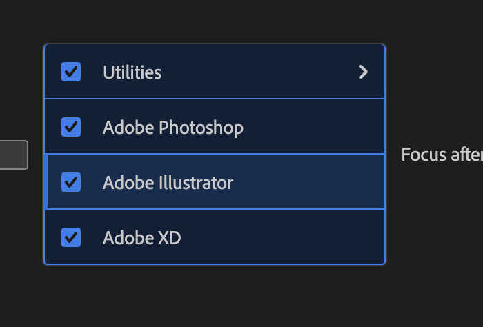
This removes overflow hidden on our items so that borders can extend out beyond them, much like cards and focus rings. The reason for this is so that items can share borders. This is important because when they can't, then the border is either on one item or its neighbor. We've been doing this for a while, always using the bottom border of the item directly above in order to provide a top border to an item. This is a good way to fake sharing borders.
With rounded corners, the border must always be on the item with the rounded corners. There is no way to invert the rounded corner. As a result, we can't use the bottom border of the item above to provide the top border for a rounded item.
If we use the bottom border of the item above most of the time, but then have to switch to the items own border when rounded, this leads to a 2px difference which causes the item to change apparent size to users when selecting and deselecting.
The solution is for every item to always have a full border when selected, but to actually share the border space with neighbors when both are selected.
note if we ever move to using "rowHeight" a bit of CSS will need to be written to accommodate that to prevent overflow inside of items
✅ Pull Request Checklist:
📝 Test Instructions:
Smoketest Menu/ListBox/Picker/Combobox
🧢 Your Project: