Remove pointer cursor from non-link elements #449
Conversation
|
Build successful! 🎉 |
There was a problem hiding this comment.
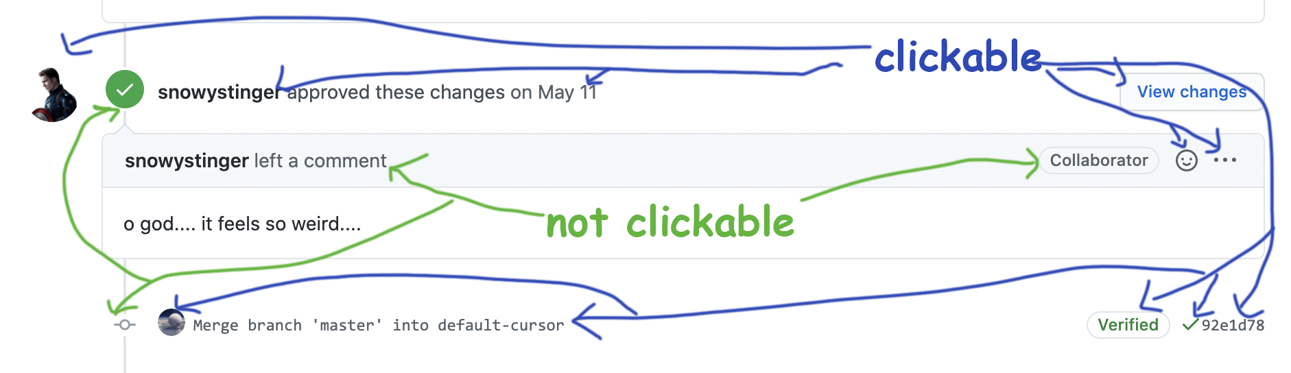
Only one that concerns me is that text only quiet ActionButtons are even harder to distinguish from normal text now (https://reactspectrum.blob.core.windows.net/reactspectrum/c337a31b1679cb334d9281457e82653f2c21c43b/storybook/index.html?path=/story/button-actionbutton--quiet). Hovering over one no longer gives you the hand cursor and the coloration of the button itself doesn't change that much already so it looks the same as normal text. Maybe something to ask design about (perhaps make it so the hover style makes it even darker)?
|
Yeah that's a good one. Feels like an issue regardless of the cursor though. e.g. on mobile, there is no cursor or hover state anyway. |
|
Build successful! 🎉 |
|
Build successful! 🎉 |
|
A thought - In desktop apps, nearly everything we can see is clickable, when there's both interactive and non-interactive elements, the interactive elements are almost always in their own separate section (taskbar, toolbar)
In browsers / web-apps, non-interactive elements (i.e. "content" and "data") is more numerous, and interactive/non-interactive elements tend to more closely mixed together e.g.. A lot of these "things that aren't buttons that also need to be clickable", at a glance, aren't immediately obvious that they're clickable
A possibly interesting .. case study? (might be a bit of a stretch to call it that, lol) of "the same app" in two different contexts |

|
(maybe a prop on Provider so we can specify whether buttons should have cursor pointer? :P) |
|
This was a decision made by the Spectrum design team. See the comment above for some resources about why the decision was made. Basically, the pointer cursor is reserved for links, and the arrow cursor is used on all other elements. The cursor is less important these days due to touch anyway, so it's better to make it clear what elements are clickable without relying on the cursor to indicate it. |
Following the new Spectrum cursor guidelines, this removes the pointer (hand) cursor from most clickable elements, except navigational elements like links, and uses the default arrow cursor instead. This may be controversial on the web where the pointer cursor is often misused, but better aligns with native elements, the CSS spec, both Microsoft and Apple's human interface guidelines, browser native
<button>, checkboxes, radios, etc.The remaining components that use the pointer cursor are: