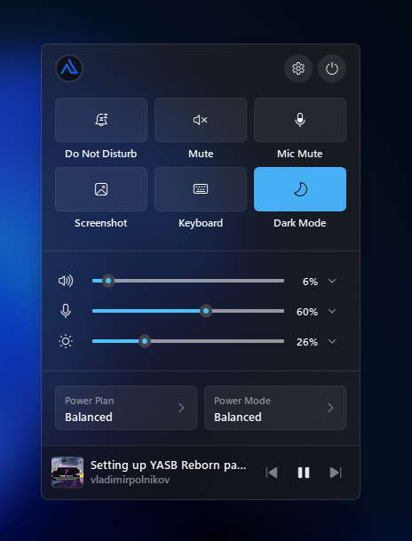
(Widget) Control Center
A customizable quick-settings control center. It sits in your status bar as a simple launcher icon and opens an interactive popup panel where you can toggle quick actions, adjust brightness and audio levels, check media playback, and manage power plans.
| Option | Type | Default | Description |
|---|---|---|---|
label |
string | "<span>\ue90a</span>" |
Main widget launcher icon. |
tooltip |
boolean | False |
Enable launcher tooltip. When enabled, buttons inside the popup will also display tooltips. |
sections |
dict | all enabled | Control visibility and settings of each popup section (system_controls, quick_actions, sliders, power, media). |
sections_order |
list | ["system_controls", "quick_actions", "sliders", "power", "media"] |
Defines visibility and render order of sections from top to bottom. |
popup |
dict | standard popup options | Popup positioning and backdrop effect settings. |
callbacks |
dict | {'on_left': 'toggle_menu'} |
Mouse callbacks for the launcher widget. |
control_center:
  type: "yasb.control_center.ControlCenterWidget"
  options:
    label: "<span>\ue713</span>"
    tooltip: true
    sections_order:
      - "system_controls"
      - "quick_actions"
      - "sliders"
      - "power"
      - "media"
    popup:
      alignment: "center"
      direction: "down"
      border_color: System
      round_corners: true
      round_corners_type: normal
      offset_top: 8
    sections:
      system_controls:
        profile_image_size: 28
        power_icon: "\uE7E8"
        lock_icon: "\uE72E"
        settings_icon: "\uE713"
      quick_actions:
        show: true
        columns: 3
        label_position: "default"
        actions:
          - id: "toggle_dnd"
            label: "Do Not Disturb"
            icon: "\uf285"
          - id: "toggle_mute"
            label: "Mute"
            icon: "\ue74f"
          - id: "toggle_mic_mute"
            label: "Mic Mute"
            icon: "\uF12E"
          - id: "screenshot"
            label: "Screenshot"
            icon: "\ue91b"
          - id: "touch_keyboard"
            label: "Keyboard"
            icon: "\uE765"
          - id: "toggle_theme"
            label: "Dark Mode"
            icon: "\uE708"
      sliders:
        show: true
        brightness:
          show_slider: true
          icon: "\uE706"
          show_source_selector: true
          source_selector_icon: "\uE972"
        volume:
          show_slider: true
          icon: "\uE767"
          show_source_selector: true
          source_selector_icon: "\uE972"
        microphone:
          show_slider: true
          icon: "\uE720"
          show_source_selector: true
          source_selector_icon: "\uE972"
      media:
        show: true
        thumbnail_size: 36
        thumbnail_radius: 4
        icons:
          prev_track: "\ue622"
          next_track: "\ue623"
          play: "\uf5b0"
          pause: "\ue62e"
      power:
        show: true
        power_plan_title: "Power Plan"
        power_mode_title: "Power Mode"
        button_menu_icon: "\ue76c"
    callbacks:
      on_left: "toggle_menu"
Note
All default icon glyphs used in this widget (e.g., \uE713, \uE7E8, etc.) belong to the Segoe Fluent Icons font family.
- label: The icon or label displayed on the status bar.
-
tooltip: If
true, hovering over the bar launcher will show a tooltip. Also enables tooltips for buttons inside the popup. -
callbacks: Maps mouse click events (e.g.
on_left,on_right) to callbacks.-
toggle_menu- Toggles the visibility of the control center popup.
-
- blur: Enable background blur backdrop effect.
- round_corners: Enable rounded window corners.
-
round_corners_type: Set corner rounding style (
"normal","small","none"). - border_color: Set popup border color (maps to design theme tokens or system defaults).
-
alignment: Alignment relative to the bar icon (
"left","right","center"). -
direction: Vertical slide/expansion direction (
"up","down"). - offset_top: Vertical position spacing offset in pixels.
- offset_left: Horizontal position spacing offset in pixels.
- sections_order: Defines which sections are visible and their order from top to bottom. Any section omitted from this list will be hidden.
- sections: Nested settings for each of the popup sections.
Top bar showing profile photo and system shortcuts.
- show: Toggle section visibility.
- profile_image_size: Profile photo circle size in pixels.
- settings_icon: Opens the Windows Settings app.
- lock_icon: Immediately locks the Windows user session.
- power_icon: Opens a dropdown menu to Sleep, Hibernate, Restart, or Shut Down.
A grid of action buttons.
- show: Toggle section visibility.
- columns: Number of columns in the button grid.
-
label_position:
"default"(icon above text) or"inline"(icon next to text). -
actions: List of buttons. Built-in
idtriggers include:toggle_theme,toggle_dnd,cycle_dnd,toggle_mute,toggle_mic_mute,screenshot,touch_keyboard. -
Custom Commands: To execute arbitrary commands, specify a
commandparameter.Supports executables, URLs, files, folders, and explorer shortcuts.- id: "terminal" label: "Terminal" icon: "\uE765" command: "wt"
The screenshot action opens an interactive fullscreen region selector:
- Draw Selection: Click and drag to define your capture area.
- Resize & Move: Once selection is complete, 8 handles will appear on the borders. Hovering over a handle changes the mouse cursor to a resize pointer, allowing you to drag and resize the box. Hovering inside the box changes the cursor to a move pointer, allowing you to shift the entire selection.
-
Floating Toolbar: A floating toolbar will appear directly under the selection containing three options:
-
Copy - Copies the cropped image to your clipboard (you can also double-click inside the selection or press
Enter/Returnto copy). -
Save as - Opens a native File Explorer save dialog to choose a custom filename, format, and folder. The dialog opens in
Pictures/Screenshotsby default and remembers your last-saved directory for the rest of your current YASB session. -
Cancel - Closes the selector window without capturing (you can also press
Escto cancel).
-
Copy - Copies the cropped image to your clipboard (you can also double-click inside the selection or press
- Screen Clamping: Bounding boxes, resizes, and moves are strictly clamped to your screen boundaries, ensuring crops line up perfectly with your monitor's native dimensions.
Systems sliders for volume, microphone, and display brightness.
- show: Toggle section visibility.
- show_slider: Toggle visibility of the specific slider.
- icon: Glyph for the slider icon.
- show_source_selector: Toggle visibility of device selection dropdowns (e.g. switch active audio output, input, or target monitor).
- source_selector_icon: Dropdown arrow icon glyph.
Manage system power profiles.
- show: Toggle section visibility.
- power_plan_title: Header text for the power plan selector dropdown.
- power_mode_title: Header text for the power mode selector dropdown.
- button_menu_icon: Dropdown arrow icon glyph.
Note
The Power Mode selector requires Windows 11 system APIs and is not available on Windows 10.
Compact media player controls.
- show: Toggle section visibility.
- thumbnail_size: Media artwork cover image size in pixels.
- thumbnail_radius: Corner radius for the media artwork.
- icons: Glyph definitions for previous track, next track, play, and pause.
Common class names for styling the control center. Each section is wrapped in .section.{name}.
/* Bar widget */
.control-center-widget {}
.control-center-widget .widget-container {}
.control-center-widget .icon {}
.control-center-widget .label {}

/* Popup window */
.control-center-menu {}

/* System controls profile image, settings and power buttons */
.control-center-menu .section.system-controls {}
.control-center-menu .section.system-controls .button {}
.control-center-menu .section.system-controls .button.profile-image {}
.control-center-menu .section.system-controls .button.settings {}
.control-center-menu .section.system-controls .button.power {}

/* Quick actions grid */
.control-center-menu .section.quick-actions {}
.control-center-menu .section.quick-actions .button {}
.control-center-menu .section.quick-actions .button.active {}
.control-center-menu .section.quick-actions .button .icon {}
.control-center-menu .section.quick-actions .button .title {}

/* Sliders brightness, volume, microphone */
.control-center-menu .section.sliders {}
.control-center-menu .section.sliders .slider {}
.control-center-menu .section.sliders .slider.brightness {}
.control-center-menu .section.sliders .slider.volume {}
.control-center-menu .section.sliders .slider.microphone {}
.control-center-menu .section.sliders .slider .icon {}
.control-center-menu .section.sliders .slider .slider-control {}
.control-center-menu .section.sliders .slider .value {}
.control-center-menu .section.sliders .slider .source-selector {}

/* Power plan and mode selectors */
.control-center-menu .section.power {}
.control-center-menu .section.power .button.plan-name {}
.control-center-menu .section.power .button.mode-name {}
.control-center-menu .section.power .button .title {}
.control-center-menu .section.power .button .subtext {}
.control-center-menu .section.power .button .icon {}

/* Media */
.control-center-menu .section.media {}
.control-center-menu .section.media .thumbnail {}
.control-center-menu .section.media .track-info {}
.control-center-menu .section.media .title {}
.control-center-menu .section.media .subtext {}
.control-center-menu .section.media .controls {}
.control-center-menu .section.media .button {}
.control-center-menu .section.media .button.prev {}
.control-center-menu .section.media .button.play {}
.control-center-menu .section.media .button.next {}
.control-center-menu .section.media .button.disabled {}
Note
The .context-menu class is used by global configurations. For general customization, refer to Styling.md.
If you need a widget-specific context menu style for the Control Center, you can scope the rules using a selector like .control-center-menu .context-menu.
/* POPUP WINDOW */
.control-center-menu {
    background: rgba(32, 32, 32, 0.6);
    min-width: 360px;
}

/* SECTIONS */
/* Left and right padding of 12 px + 4 px margin for quick action and power plan,
which is 16 pixels same as the other sections. */
.control-center-menu .section {
    background: rgba(255, 255, 255, 0);
    margin: 0;
    padding: 16px 12px;
    border-bottom: 1px solid rgba(255, 255, 255, 0.1);
}
/* We dont want a padding at the bottom of the first section. */
.control-center-menu .section.system-controls {
    padding: 12px 16px 0 16px;
}
.control-center-menu .section.sliders {
    padding: 16px;
}
.control-center-menu .section.media,
.control-center-menu .section.power,
.control-center-menu .section.system-controls {
    border-bottom: 1px solid rgba(255, 255, 255, 0);
}

/* SHARED SEGOE FLUENT ICONS */
.control-center-menu .section.system-controls .button,
.control-center-menu .section.quick-actions .button .icon,
.control-center-menu .section.sliders .slider .icon,
.control-center-menu .section.sliders .slider .source-selector,
.control-center-menu .section.power .plan-name .icon,
.control-center-menu .section.power .mode-name .icon,
.control-center-menu .section.media .button {
    font-family: "Segoe Fluent Icons";
    font-weight: 400;
}

/* SHARED HOVER & TRANSITION TRANSITIONS */
.control-center-menu .section.quick-actions .button .icon,
.control-center-menu .section.system-controls .button,
.control-center-menu .section.sliders .slider .source-selector,
.control-center-menu .section.power .plan-name,
.control-center-menu .section.power .mode-name,
.control-center-menu .section.media .button {
    transition: background-color 0.08s, opacity 0.08s;
    opacity: 1;
}

/* SHARED CLICKED / PRESSED STATES */
.control-center-menu .section.system-controls .button:clicked,
.control-center-menu .section.system-controls .button:pressed,
.control-center-menu .section.quick-actions .button .icon:clicked,
.control-center-menu .section.quick-actions .button .icon:pressed,
.control-center-menu .section.sliders .slider .source-selector:clicked,
.control-center-menu .section.sliders .slider .source-selector:pressed,
.control-center-menu .section.power .plan-name:clicked,
.control-center-menu .section.power .plan-name:pressed,
.control-center-menu .section.power .mode-name:clicked,
.control-center-menu .section.power .mode-name:pressed,
.control-center-menu .section.media .button:clicked,
.control-center-menu .section.media .button:pressed {
    opacity: 0.5;
}

/* SHARED DISABLED STATES */
.control-center-menu .section.quick-actions .button.disabled .title,
.control-center-menu .section.quick-actions .button.disabled .icon,
.control-center-menu .section.sliders .slider.disabled,
.control-center-menu .section.media .button.disabled,
.control-center-menu .section.media .button.disabled:hover {
    opacity: 0.5;
}

/* SYSTEM CONTROLS */
.control-center-menu .section.system-controls .button {
    background-color: rgba(255, 255, 255, 0.08);
    border-radius: 16px;
    min-height: 32px;
    max-height: 32px;
    min-width: 32px;
    max-width: 32px;
    font-size: 14px;
    color: rgb(255, 255, 255);
    transition: background-color 0.08s, opacity 0.08s;
}
.control-center-menu .section.system-controls .button:hover {
    background-color: rgba(255, 255, 255, 0.2);
}

/* QUICK ACTIONS */
.control-center-menu .section.quick-actions .button {
    margin: 0 4px;
    cursor: pointer;
}
.control-center-menu .section.quick-actions .button .icon {
    font-size: 16px;
    background-color: rgba(255, 255, 255, 0.06);
    border: 1px solid rgba(255, 255, 255, 0.08);
    min-height: 48px;
    border-radius: 6px;
    color: rgb(255, 255, 255);
}
.control-center-menu .section.quick-actions .button .icon:hover {
    background-color: rgba(255, 255, 255, 0.08);
    border: 1px solid rgba(255, 255, 255, 0.1);
}
.control-center-menu .section.quick-actions .button.active .icon {
    background-color: #47AFF5;
    border: 1px solid #47AFF5;
    color: #000;
}
.control-center-menu .section.quick-actions .button.active .icon:hover {
    background-color: #42a0df;
    border: 1px solid #42a0df;
    color: #000;
}
.control-center-menu .section.quick-actions .button.disabled .icon:hover {
    background-color: rgba(255, 255, 255, 0.06);
    border: 1px solid rgba(255, 255, 255, 0.1);
}
.control-center-menu .section.quick-actions .button.active .icon:pressed {
    background-color: #3795d3;
    border: 1px solid #3795d3;
}
.control-center-menu .section.quick-actions .button .title {
    font-size: 12px;
    margin: 4px 0 8px 0;
    padding: 0;
    font-weight: 600;
    color: rgb(255, 255, 255);
}

/* SLIDERS */
.control-center-menu .section.sliders .slider {
    background: transparent;
    border: none;
    min-height: 34px;
    margin: 0 4px 0 4px;
}
.control-center-menu .section.sliders .slider .icon {
    font-size: 16px;
    color: rgb(255, 255, 255);
    min-width: 36px;
}
.control-center-menu .section.sliders .slider .value {
    min-width: 36px;
    font-size: 12px;
    font-weight: 600;
    color: rgb(255, 255, 255);
}
.control-center-menu .section.sliders .slider .source-selector {
    font-size: 12px;
    color: rgba(255, 255, 255, 0.6);
    width: 24px;
    height: 24px;
    border-radius: 6px;
    background-color: rgba(255, 255, 255, 0);
    margin-left: 4px;
}
.control-center-menu .section.sliders .slider .source-selector:hover {
    background-color: rgba(255, 255, 255, 0.1);
}

/* POWER PLAN & POWER MODE */
.control-center-menu .section.power .plan-name,
.control-center-menu .section.power .mode-name {
    background: rgba(255, 255, 255, 0.06);
    border: 1px solid rgba(255, 255, 255, 0.08);
    border-radius: 6px;
    min-height: 36px;
    margin: 0 4px;
    padding: 6px 10px;
    cursor: pointer;
}
.control-center-menu .section.power .plan-name:hover,
.control-center-menu .section.power .mode-name:hover {
    background: rgba(255, 255, 255, 0.08);
}
.control-center-menu .section.power .mode-name.disabled,
.control-center-menu .section.power .mode-name.disabled:hover {
    opacity: 0.5;
    background: rgba(255, 255, 255, 0.06);
}
.control-center-menu .section.power .plan-name .title,
.control-center-menu .section.power .mode-name .title {
    font-size: 11px;
    font-weight: 600;
    color: rgba(255, 255, 255, 0.5);
}
.control-center-menu .section.power .plan-name .subtext,
.control-center-menu .section.power .mode-name .subtext {
    font-size: 13px;
    font-weight: 600;
    color: #ffffff;
}
.control-center-menu .section.power .plan-name .icon,
.control-center-menu .section.power .mode-name .icon {
    color: rgba(255, 255, 255, 0.5);
    font-size: 14px;
}

/* MEDIA CONTROLS */
.control-center-menu .section.media {
    background-color: rgba(0, 0, 0, 0.2);
    padding: 12px;
    border-top: 1px solid rgba(255, 255, 255, 0.1);
}
.control-center-menu .section.media .track-info {
     padding-left: 8px;
}
.control-center-menu .section.media .title {
    font-size: 13px;
    font-weight: 600;
    color: rgb(255, 255, 255);
}
.control-center-menu .section.media .subtext {
    font-size: 12px;
    font-weight: 600;
    color: rgba(255, 255, 255, 0.5);
}
.control-center-menu .section.media .button {
    font-size: 14px;
    background-color: rgba(255, 255, 255, 0);
    min-width: 32px;
    min-height: 32px;
    max-width: 32px;
    max-height: 32px;
    border-radius: 6px;
    margin: 0 0 0 4px;
}
.control-center-menu .section.media .button:hover {
    background-color: rgba(255, 255, 255, 0.06);
}
.control-center-menu .section.media .button.disabled,
.control-center-menu .section.media .button.disabled:hover {
    background-color: rgba(255, 255, 255, 0);
}

/* Context menu styles for dropdowns and menus inside the Control Center panel */
.control-center-menu .context-menu {
    background-color: rgba(48, 48, 48, 0.86);
    padding: 4px 0px;
    font-family: "Segoe UI Variable", "Segoe UI";
    font-weight: 600;
    font-size: 12px;
    color: rgba(255, 255, 255, 0.9);
}
.control-center-menu .context-menu::item {
    background-color: transparent;
    padding: 6px 12px;
    margin: 2px 6px;
    border-radius: 4px;
    min-width: 100px;
}
.control-center-menu .context-menu::item:selected  {
    background-color: rgba(255, 255, 255, 0.1);
    color: #FFFFFF;
}
.control-center-menu .context-menu::separator {
    height: 1px;
    background-color: rgb(68, 68, 68);
    margin: 4px 0;
}
.control-center-menu .context-menu::indicator:unchecked {
    width: 4px;
    height: 12px;
    margin-left: 0;
    color: transparent;
    background-color: transparent;
}
.control-center-menu .context-menu::indicator:checked {
    width: 4px;
    height: 12px;
    background-color: #47AFF5;
    border-radius: 2px;
    margin-left: 0;
}