feat: add freemium upsell experiment changes - #2739
Conversation


| }; | ||
|
|
||
| const UploadsManager = ({ | ||
| freemiumUpsellCTACb, |

There was a problem hiding this comment.
love this re-alphabetization

| case ERROR_CODE_UPLOAD_CHILD_FOLDER_FAILED: | ||
| return <FormattedMessage {...messages.uploadsOneOrMoreChildFoldersFailedToUploadMessage} />; | ||
| case ERROR_CODE_UPLOAD_FILE_SIZE_LIMIT_EXCEEDED: | ||
| if (maxFileSize) { |

There was a problem hiding this comment.
I'm not sure we want to have two sources of truth (client, server) for the maximum file size. Can we add a new error code on the backend that we can key off of to ask the user to upgrade, instead?
There was a problem hiding this comment.
The plan is to get the maxFileSize from the server in the EUA (exist as CurrentUserRecord) rather than passing in a hardcoded data in the FE repo. This avoids adding new endpoint/changing current APIs for this experimental change. (reference maxFileSizeAsString in EUA)
| measureRef, | ||
| isTouch, | ||
| fileLimit, | ||
| onFreemiumUpsellCTAClick, |
There was a problem hiding this comment.
ContentUploader can used by platform developers in their own applications, outside of Box's webapp. We should try to keep the component API simple and general, when possible. Do we plan to add more experiences like this one? If so, should we wrap them in an object to avoid further prop bloat?
There was a problem hiding this comment.
These are the final current planned ContentUploader changes for this project. No other prop needed. I suspect that once the experiment concludes, I will make a PR to clean up these changes (2 props)
| } | ||
|
|
||
| if (STATUS_ERROR && code === ERROR_CODE_UPLOAD_FILE_SIZE_LIMIT_EXCEEDED && !!onFreemiumUpsellCTAClick) { | ||
| return ( |
There was a problem hiding this comment.
We generally try to avoid multiple returns, as it can lead to confusing behavior. Can we tie into the status switch above and the existing onClick handler, instead?
There was a problem hiding this comment.
The PrimaryButton design (a new resin tag, no tooltip) is quite different from the current Plain Button icon with tooltip. Classname bcu-item-action also limits the width and height of this component which would cause the PrimaryButton to be cut off or misaligned. In addition, code clean up may be easier in the future.

4 participants


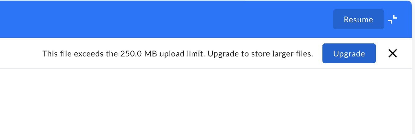
With Experiment Enabled. Upgrade Button
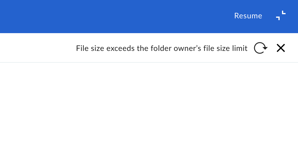
Without Experiment Enabled.