Chart Modes
- Timeline (default)
- Candlestick (OHLC)
- Scatter
- Pie Chart
- Ranking
- Heatmap
- Calendar
- Radial Bar
- Gauge
- Polar Area
- Radar
- State Timeline
- Box Plot (new in v3.21)
- Waterfall (new in v3.21)
- Histogram (new in v3.21)
- Chart Mode Compatibility
The chart_mode option at the card level controls the overall visualization. Each mode takes over the entire graph area.
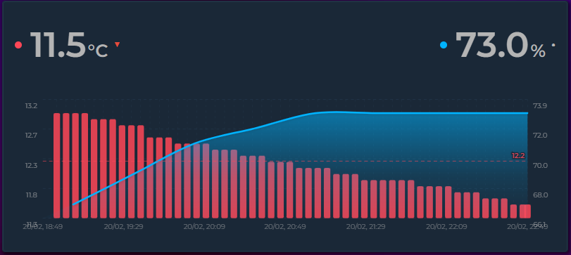
Classic time-series chart. Entities can individually be line, step, bar, or candlestick. Interval bars and candles align to clean clock boundaries and sit centered on the X-axis ticks. All Timeline-specific options (axes, grid, stacked, scroll, annotations, offset, zoom) are available.
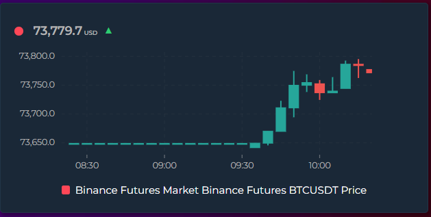
Set graph_type: candlestick on any entity to draw it as trading-style candles instead of a line or bar. Each candle summarizes one time bucket:
- Body — spans the bucket's open (first value) and close (last value)
- Wick — the thin line spanning the bucket's high (max) and low (min)
- Color — green when the value rose over the bucket (close ≥ open), red when it fell
Hovering a candle shows its Open / High / Low / Close in the tooltip. Candles align to clean clock intervals (e.g. :00 / :15 / :30) and stay centered on the matching X-axis tick, so they don't drift as time advances.
Custom colors: the green/red defaults can be overridden with the entity's existing Rise/Fall Colors feature — turn it on and the Rising color paints up candles while the Falling color paints down candles. No separate candlestick color options are needed.
type: custom:statistics-graph-chart-card
entities:
  - entity: sensor.btc_price
    graph_type: candlestick
    # Optional — recolor up/down candles via the Rise/Fall Colors feature:
    rise_fall_colors:
      enabled: true
      increase: "#26a69a"   # up candle (close ≥ open)
      decrease: "#ef5350"   # down candle (close < open)
hours_to_show: 2
points_per_hour: 12   # 12 → one candle every 5 minutes
Tip: each candle covers exactly one data bucket. Use points_per_hour (history) or group_by: date / week / month (long-range statistics) to choose how much time a candle spans. Fewer, wider candles give clearer wicks; very high point counts produce thin single-sample candles with little or no wick.
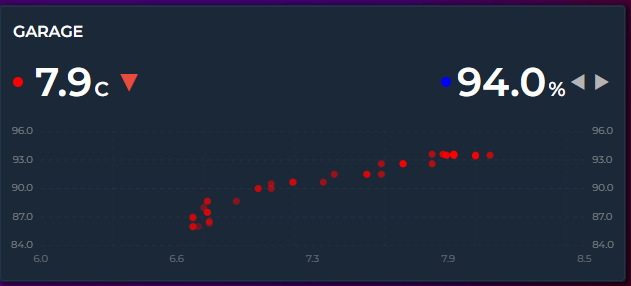
Plots the first entity on the X axis and the second on the Y axis to reveal correlations. Exactly 2 entities required.
chart_mode: scatter
entities:
  - entity: sensor.temperature
    color: "#ff4757"
  - entity: sensor.humidity
    color: "#378ADD"
Points are matched by timestamp (5-minute tolerance). Older dots are faded, newer dots are vivid. X/Y axes show entity value ranges, not time.
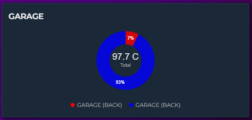
Centered chart showing proportional shares. Slice labels show the actual value with the unit (or percentage in Ranking mode).
Style presets — choose how the pie ring looks:
- Classic — full pie with no center hole
- Thick — wide donut ring, plenty of fill
- Donut (default) — standard donut with a center hole
- Thin — narrow ring, modern minimal look
3D effect — set pie_3d: true to add depth, perspective and a subtle highlight on top. Works with any preset.
Slice spacing — set pie_spacing (in degrees, 0–15) for visible gaps between slices. Spaced slices automatically get rounded corners. Only applies to donut styles, not Classic.
Center total — when show_tooltip_total: true, the total value appears in the donut hole. Disable to make Classic a true full pie.
Label and color customization — fine-tune the look of slice labels and the center total to match your theme:
-
pie_label_font_size— slice value label size in pixels (leave empty for auto) -
pie_label_color— slice value label color (CSS color orvar(--…); auto = white) -
pie_center_font_size— center total size in pixels (leave empty for auto) -
pie_center_color— center total color; the small "Total" sub-label inherits this with reduced opacity
All four accept theme variables, so pie_label_color: var(--accent-color) updates with your active theme.
Past dates — using a date picker to scroll back to a period with no data shows an empty ring with a friendly "No data" message instead of returning today's value.
chart_mode: pie
height: 200
pie_style: donut       # classic | thick | donut | thin
pie_spacing: 4         # 0-15 degrees, gap between slices
pie_3d: true           # depth/perspective effect
pie_label_font_size: 14
pie_label_color: var(--primary-text-color)
pie_center_font_size: 32
pie_center_color: var(--accent-color)
show_tooltip_total: true  # center total
entities:
  - entity: sensor.hvac_energy
    aggregate_func: sum
    color: "#E24B4A"
  - entity: sensor.lighting_energy
    aggregate_func: sum
    color: "#EF9F27"
  - entity: sensor.kitchen_energy
    aggregate_func: sum
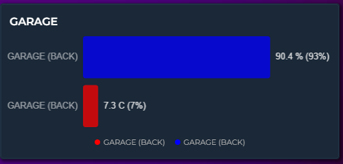
color: "#1D9E75"Horizontal bars sorted by value (highest first). Each bar shows name, proportional width, value, unit, and share percentage.
chart_mode: ranking
height: 200
entities:
  - entity: sensor.bedroom_temp
    color: "#E24B4A"
  - entity: sensor.living_room_temp
    color: "#378ADD"
  - entity: sensor.kitchen_temp
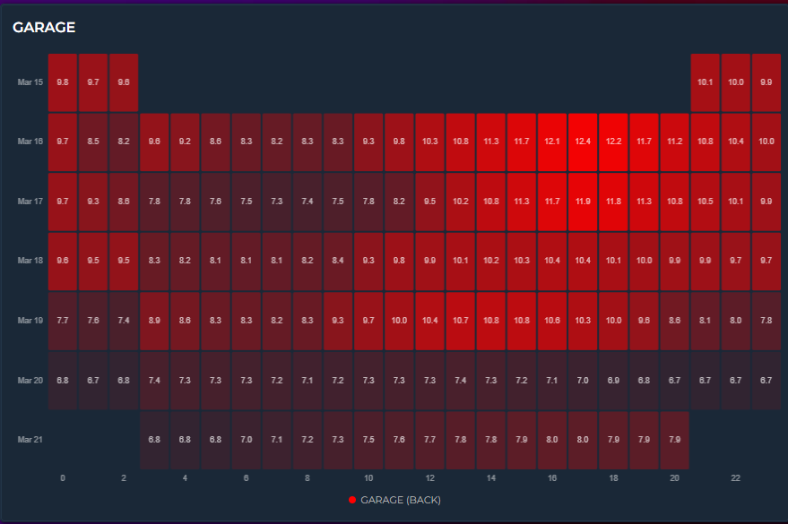
color: "#EF9F27"Days × hours color grid. Each cell represents one hour of one day, colored by intensity. Only the first entity is used.
chart_mode: heatmap
hours_to_show: 168
height: 250
entities:
  - entity: sensor.temperature
    color: "#ff4757"
The color range can be controlled three ways:
- Automatic — min/max derived from data
-
Manual bounds — set entity
lower_bound/upper_boundfor a fixed color scale -
Color thresholds — enable
color_thresholdsfor multi-color heatmaps (e.g., blue → green → red)
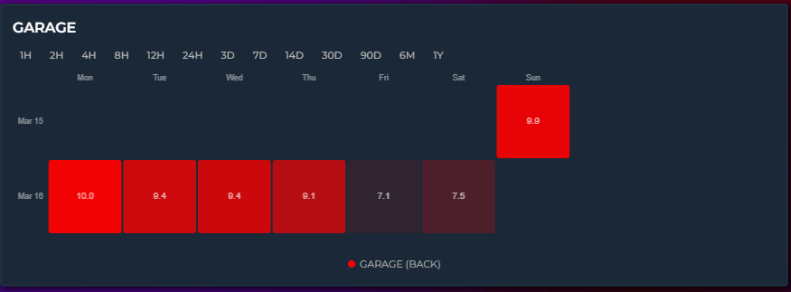
GitHub-contribution-style weekly grid. Each cell = one day. Only the first entity is used.
chart_mode: calendar
hours_to_show: 720
height: 200
entities:
  - entity: sensor.energy_daily
    aggregate_func: sum
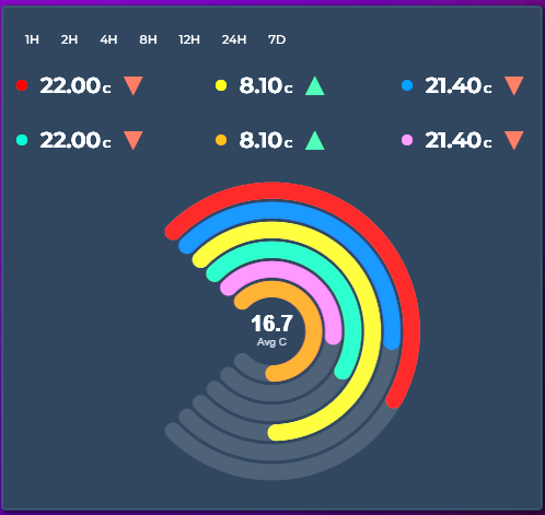
color: "#1D9E75"Concentric progress arcs — each entity is a ring showing its value as a percentage of a defined range. The center displays the average.
chart_mode: radialbar
height: 250
entities:
  - entity: sensor.living_room_temp
    color: "#ff4757"
    lower_bound: 0
    upper_bound: 40
  - entity: sensor.bedroom_temp
    color: "#378ADD"
    lower_bound: 0
    upper_bound: 40
  - entity: sensor.garage_temp
    color: "#2ecc71"
    lower_bound: 0
    upper_bound: 40
Set lower_bound / upper_bound per entity to define the 0–100% range. If not set, the entity's historical min/max from the current time window is used. Supports color thresholds for dynamic ring colors.
A needle dial per entity, arranged in a column grid. Unlike the Gauge display (which replaces a single state row), chart_mode: gauge is a full chart mode — every entity becomes its own dial.
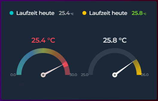
chart_mode: gauge
height: 240
gauge_columns: 2              # grid columns (empty = auto)
gauge_span: 180               # arc sweep in degrees (90-360)
gauge_value_position: below   # below | above
gauge_value_size: 18          # px (empty = auto)
gauge_show_minmax: true       # show the 0 / max labels at the arc ends
entities:
  - entity: sensor.living_room_temp
    name: Living Room
    lower_bound: 0            # dial start (Min)
    upper_bound: 30           # dial end (Max)
    needle_color: "#e2d4d4"
    color_thresholds:
      enabled: true
      values:
        - { value: 0,  color: "#47fff3" }
        - { value: 15, color: "#eaff47" }
        - { value: 25, color: "#ff4757" }
  - entity: sensor.bedroom_temp
    name: Bedroom
    color: "#378ADD"
How it reads:
-
Dial scale comes from each entity's
lower_bound/upper_bound(default0-100), relabeled Gauge Range -> Min / Max in the editor. -
The arc fills the value range seen in the period — from the period minimum to the period maximum, not from the dial start. With
lower_bound: 0,upper_bound: 30and a day that ranged 24-30, the arc spans 24 -> 30. -
The needle marks the live value — the entity's current
hassstate (falls back to the last data point when there is no live state). -
Color thresholds paint the dial — the bright band and the faint background zones follow
color_thresholds. With Last Color enabled, the whole dial uses a single color taken from the current value instead of a per-step gradient. -
needle_colorsets the needle color independently (see Entity Colors) —threshold, a CSS color, or empty to follow the value color. -
gauge_show_minmaxprints the bound labels at the two arc ends; the hover tooltip shows the current value plus the period Peak and Low.
Each gauge is independent, so you can mix ranges, colors, and thresholds across entities in the same card. Columns wrap automatically (gauge_columns) and the value sits above or below each dial (gauge_value_position) so it never overlaps the needle.
Equal-angle slices with variable radius — larger values produce bigger slices. Like a pie chart but comparing magnitudes instead of shares.
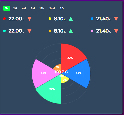
chart_mode: polararea
height: 250
entities:
  - entity: sensor.living_room_temp
    color: "#ff4757"
  - entity: sensor.bedroom_temp
    color: "#378ADD"
  - entity: sensor.garage_temp
    color: "#2ecc71"
Includes concentric grid circles for reference. Percentage labels appear on slices ≥ 4%. The center shows the total.
Spider/polygon chart where each entity forms one spoke. The filled polygon reveals the overall sensor profile at a glance.
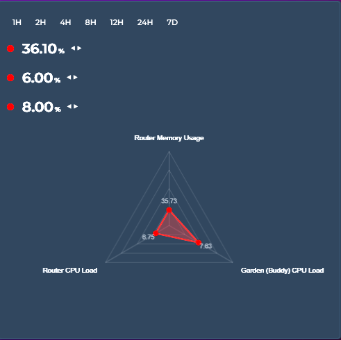
chart_mode: radar
height: 300
entities:
  - entity: sensor.temperature
    name: "Temperature"
    lower_bound: 0
    upper_bound: 40
  - entity: sensor.humidity
    name: "Humidity"
    lower_bound: 0
    upper_bound: 100
  - entity: sensor.co2
    name: "CO₂"
    lower_bound: 400
    upper_bound: 2000
  - entity: sensor.pm25
    name: "PM2.5"
    lower_bound: 0
    upper_bound: 50
Requires at least 3 entities. Each entity's value is normalized to its lower_bound / upper_bound range. Polygon grid rings provide reference levels. Colored dots at each vertex show the exact position, with value labels nearby. Supports color thresholds for per-dot colors.
Displays horizontal colored bars showing state changes over time — one row per entity. Entity names appear on the left, state labels inside each segment when wide enough. Hover for a tooltip showing state name, duration, and time range. Works with binary_sensor, input_boolean, input_select, and any entity with a state_map.
type: custom:statistics-graph-chart-card
chart_mode: state_timeline
hours_to_show: 24
state_timeline_corner_radius: 3       # 0 = sharp, higher = rounder
entities:
  - entity: binary_sensor.window_living_room
    name: Living Room
    tap_action:                        # tap a row to open more-info or run an action
      action: more-info
    state_map:
      - value: "off"
        label: "Closed"
        color: "#e74c3c"
      - value: "on"
        label: "Open"
        color: "#5dade2"
v2.28 additions:
-
Corner radius is configurable via
state_timeline_corner_radius(0–20 px, default 3). Set to0for sharp edges or use higher values for pill-shaped segments. -
Horizontal scroll works via
max_visible_interval+scroll_mode, just like in regular Timeline. Load a week of history (hours_to_show: 168) but only show 24 hours on screen at once (max_visible_interval: 24) — the chart scrolls to reveal the rest. -
Tap action is supported on each row. Because every row in state_timeline corresponds to exactly one entity and its segments fill the row, tapping a row naturally means "do something with this entity". If the entity has a
tap_actionset it fires; otherwise a standard more-info dialog opens. -
Attribute history (#219) — set an entity's
attributetogether with astate_mapto plot the recorded history of a categorical attribute instead of its main state. Ideal for values HA already records as attributes — a Wi-Fi band, a media remote'scurrent_activity, an HVAC action, a router/AP name — without creating a template sensor. The attribute's values are mapped throughstate_map, so the samelabelandcolorfields apply. Numeric attributes with nostate_mapare unaffected.
# Plot a TV remote's current activity instead of the remote's on/off state
- entity: remote.living_room_tv
  name: Activity
  attribute: current_activity
  state_map:
    - value: "Youtube"
      label: YouTube
      color: red
    - value: "Netflix"
      label: Netflix
      color: "#E50914"
v3.25 addition:
-
Segment labels toggle — card-level
state_timeline_show_labels: falsehides the state labels drawn inside the segments for clean, label-free color bands; the hover tooltip still names each state. Defaulttrue— and labels only render in segments wide enough to fit them anyway. In the editor the checkbox sits next to Corner Radius in state_timeline mode. Accepts{{ }}templates — see Template Toggles. - Row labels wrap instead of being cropped — the entity-name column is measured against the actual text (not estimated from character counts), so it is exactly as wide as the longest name needs, capped at about a third of the card. A name that still doesn't fit wraps onto up to three lines, left-aligned, with the row growing to match — so a long friendly name stays fully readable even on a narrow card, a More Info dialog or a phone, and a short one gives all its space back to the timeline. Only a name too long for three lines is ellipsized, and it keeps the full text as a hover tooltip. The label is also clipped to its own column, so it can never paint past the edge of the card. (v3.31)
-
Label size —
state_timeline_label_font_sizesets the font size in pixels (6–40) for both the state label inside each segment (default 10) and the entity name in the label column on the left (default 11) (v3.32). Both budgets follow it: a bigger segment label shows fewer characters with an ellipsis instead of spilling out, and a bigger entity name re-wraps across up to three lines with the row growing to fit. The editor field sits next to Show State Labels in state_timeline mode and is no longer tied to that toggle — because the size now also drives the entity-name column, it stays available for the whole of State Timeline mode even with Show State Labels off. (v3.32)
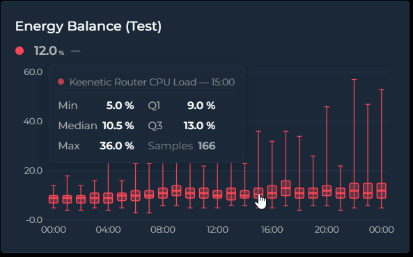
Set chart_mode: box to draw the value distribution per time bucket as classic
box-and-whisker plots. Each box summarizes every source sample that fell into its bucket:
- Whiskers — the thin line and caps spanning the bucket's minimum and maximum
- Box — spans Q1 → Q3, the middle 50% of the samples
- Median line — the thick line inside the box
Samples come straight from the dense source data, independent of points_per_hour, and pass
through the same per-entity transforms as every other mode (value_factor, invert,
value_transform, state_map, aggregate_func: diff). Hovering a box shows Min / Q1 / Median /
Q3 / Max and the sample count in a compact two-column tooltip.
Box Plot vs Candlestick — they look like cousins, but the body means something different. A candlestick body is open → close of the bucket: direction matters, color tells you up/down, and the order of values is essential — it's a momentum chart. A box plot body is Q1 → Q3 with the median inside: order is irrelevant, there is no open/close and no direction. "Where did it go?" → candlestick. "What was typical, and how much did it spread?" → box plot.
type: custom:statistics-graph-chart-card
chart_mode: box
card_header: Living Room — Daily Temperature Spread
hours_to_show: 720        # 30 days
group_by: date            # one box per day
entities:
  - entity: sensor.living_room_temperature
    name: Living Room
    decimals: 1
Tip: the bucket width follows group_by (hour, 2h … 12h, date, week, month,
year). With the default interval the card picks automatically from the window: ≤ 2 days → one
box per hour, ≤ 1 month → per day, ≤ 6 months → per week, longer → per month. The newest 60
buckets are shown when the window produces more.
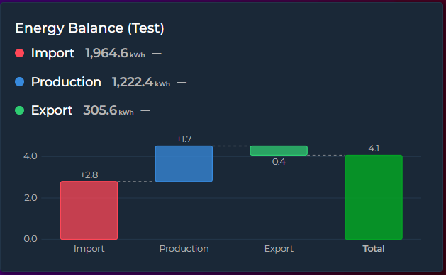
Set chart_mode: waterfall to turn each entity into one +/− step of a running total — the
classic bridge chart for energy balances, budgets, or any "these parts add up to this total"
story:
-
Steps — one bar per entity; the step value is the entity's aggregate over the visible window (default
sum— steps are meant to add up) -
Total — an automatic summary bar from zero to the running total (hide with
waterfall_total: false) - Connectors — dashed guide lines carry each bar's end level to the next bar
Colors: an explicit entity color always wins; otherwise positive steps use the theme success
color, negative steps the error color, and Total the primary color. The tooltip shows the step
value and the running total after it (the running-total line follows show_tooltip_total).
type: custom:statistics-graph-chart-card
chart_mode: waterfall
card_header: Energy Balance (30 days)
hours_to_show: 720
entities:
  - entity: sensor.grid_import_energy
    name: Grid Import
    aggregate_func: diff      # cumulative kWh counters need diff!
  - entity: sensor.solar_energy_produced
    name: Solar Production
    aggregate_func: diff
  - entity: sensor.grid_export_energy
    name: Grid Export
    aggregate_func: diff
    invert: true              # exported energy leaves the house → negative step
Tip: for total_increasing counters (energy meters) always use aggregate_func: diff — a
plain sum would add the meter reading over and over instead of the consumption. invert: true
makes a step subtract from the bridge.
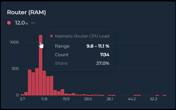
Set chart_mode: histogram to show the value-frequency distribution over the visible window:
the X axis is value ranges (bins), the Y axis is how often the value landed in each range. Time is
discarded entirely — it answers "what value does this sensor usually sit at, and how often?".
Histogram vs Bar — a bar chart's X axis is time: each bar is the value of one time slot ("CPU was 62% at 14:00"). A histogram's X axis is value ranges and Y is the count: "CPU spent most of this month in the 55–65% band". Bar tells you what happened when; histogram tells you what's typical and how often. Technically the bar chart draws the
points_per_hourdisplay series, while the histogram counts the dense source samples.
type: custom:statistics-graph-chart-card
chart_mode: histogram
card_header: Room Temperature Distribution
hours_to_show: 168        # one week
entities:
  - entity: sensor.living_room_temperature
    name: Living Room
    decimals: 1
Tip: bin count is automatic (Freedman–Diaconis, clamped to 5–40) — override it with
histogram_bins: 20 (2–80). X-axis labels sit centered under the bars and show each bin's
midpoint value. Multiple entities share the same bins side by side, so their distributions are
directly comparable; the tooltip shows the bin range, the count, and the share (the share line
follows show_tooltip_total).
Not all card options apply to every mode — the ✅ / — cells below describe what each mode actually draws.
Since v3.32 the visual editor also hides options per chart mode, down to the individual toggle: a heading disappears once everything under it is hidden, a tab once all its headings are, and you are moved to the first surviving tab. It only hides what provably does nothing — anything that reaches the shared data pipeline, the legend, the state row or the tooltip stays visible in every mode, so entity Graph Type, Range Band, y_axis, break_on_null, points_per_hour, invert and the colour thresholds remain editable even in modes where this table shows a dash. Nothing is deleted either: a hidden option keeps its YAML value and reappears when you switch back.
| Feature | Timeline | State Timeline | Scatter | Pie | Ranking | Radial Bar | Polar Area | Radar | Heatmap | Calendar | Gauge | Box Plot | Waterfall | Histogram |
|---|---|---|---|---|---|---|---|---|---|---|---|---|---|---|
| Y / X axes | ✅ | X only | ✅ | — | — | — | — | — | Own axes | Own axes | Dial | Own axes | Own axes | Own axes |
| Grid | ✅ | — | ✅ | — | — | — | Grid circles | Polygon grid | — | — | — | Own grid | Own grid | Own grid |
| Stacked | ✅ | — | — | — | — | — | — | — | — | — | — | — | — | — |
| Offset | ✅ | — | — | — | — | — | — | — | — | — | — | ✅ | ✅ | ✅ |
| Period compare | ✅ | — | — | — | — | — | — | — | — | — | — | — | — | — |
| Annotations | ✅ | — | — | — | — | — | — | — | — | — | — | — | — | — |
| Zoom brush | ✅ | — | — | — | — | — | — | — | — | — | — | — | — | — |
| Drill down | ✅ | — | — | — | — | — | — | — | — | — | — | — | — | — |
| Scroll | ✅ | ✅ | — | — | — | — | — | — | — | — | — | — | — | — |
| Sparkline | ✅ | — | — | — | — | — | — | — | — | — | — | — | — | — |
| Range Band | ✅ | — | — | — | — | — | — | — | — | — | Arc = range | Box = spread | — | — |
| Entity limit | ∞ | ∞ | 2 | ∞ | ∞ | ∞ | ∞ | 3+ | 1 | 1 | ∞ | ∞ | ∞ | ∞ |
| Entity graph_type | line/step/bar/candlestick | — | — | — | — | — | — | — | — | — | — | — | — | — |
| lower/upper_bound | Y axis range | — | — | — | — | 0–100% range | — | Normalization | Color scale | Color scale | Dial Min/Max | — | — | — |